Hedge Fund Brand Identity & Website
Aleto Investment Platform
Overview
Aleto didn’t enter the market simply to compete; it came to change the conversation. In an industry shaped by scepticism & conformity, Aleto’s mission is clear: to offer genuine differentiation by discovering under-appreciated talent & bringing true innovation to portfolio construction. Trust had to be earned, not assumed & Aleto approached this challenge with confidence, precision, & transparency.
Breaking away from the outdated Fund-of-Funds model was essential. Aleto’s fee structure is intentionally disruptive, eliminating the traditional second layer of fees while preserving firm profitability for advisors. Better access, lower costs, & full transparency aren’t just promises, they are built into Aleto’s DNA.


Redefining Hedge Fund Investing
At the heart of Aleto’s story is a belief in clarity, in investment strategy, in client relationships, & in design. Aleto’s brand identity reflects the same principles that drive its investment philosophy. Every visual decision speaks to elevation, the idea of uncovering potential & lifting clients toward new possibilities. In an industry often clouded by complexity, Aleto’s design brings sharp focus, structure, & movement.
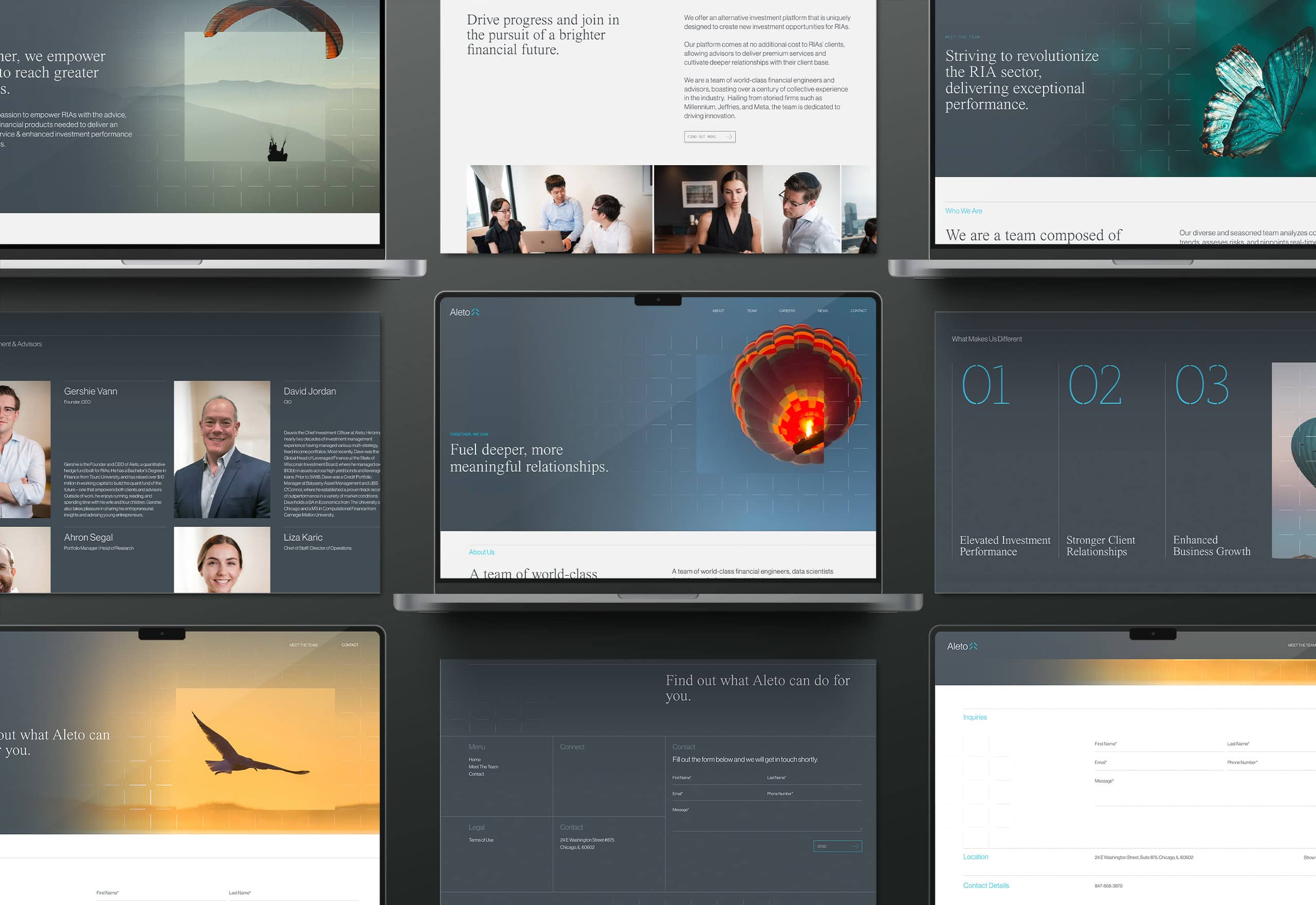
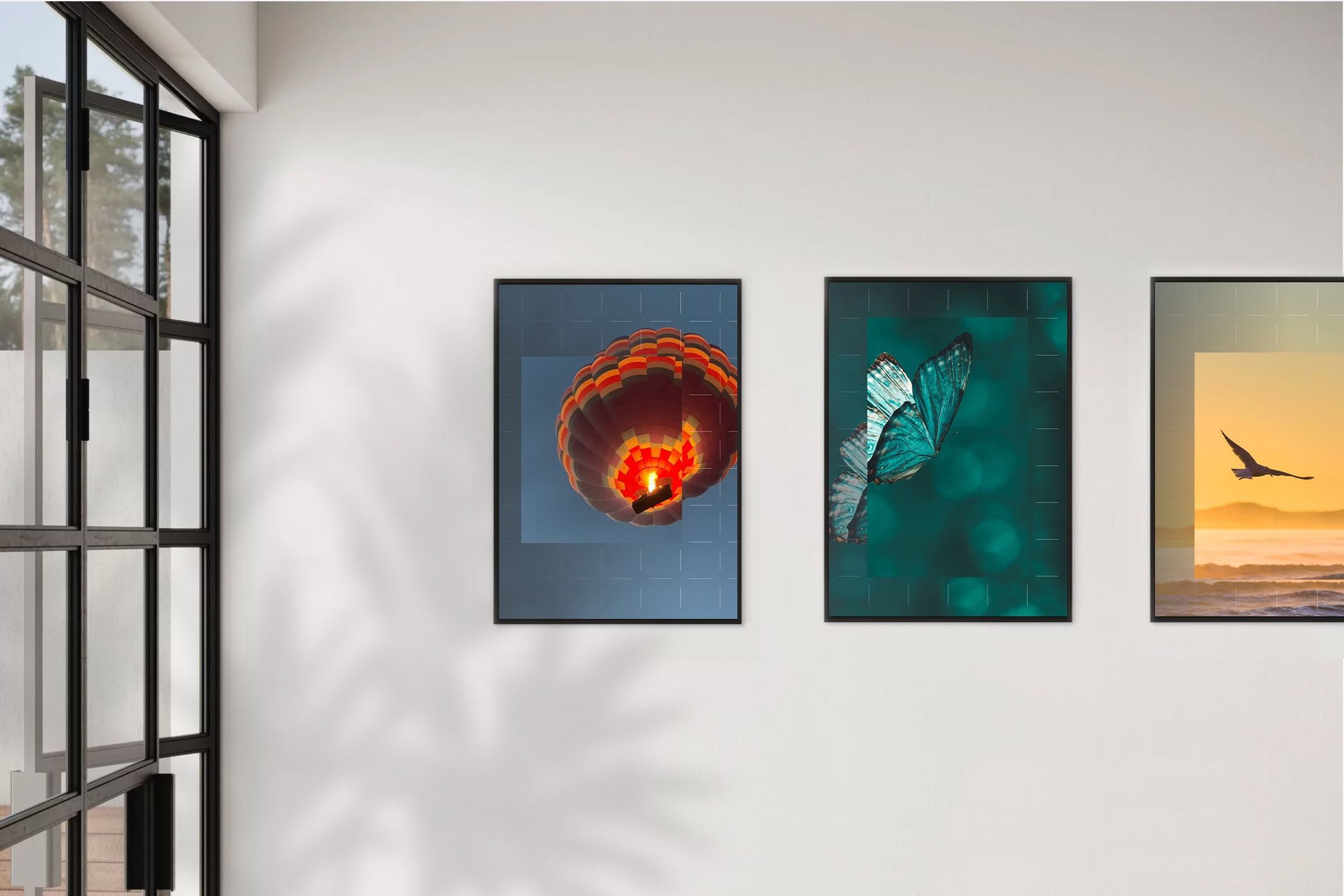
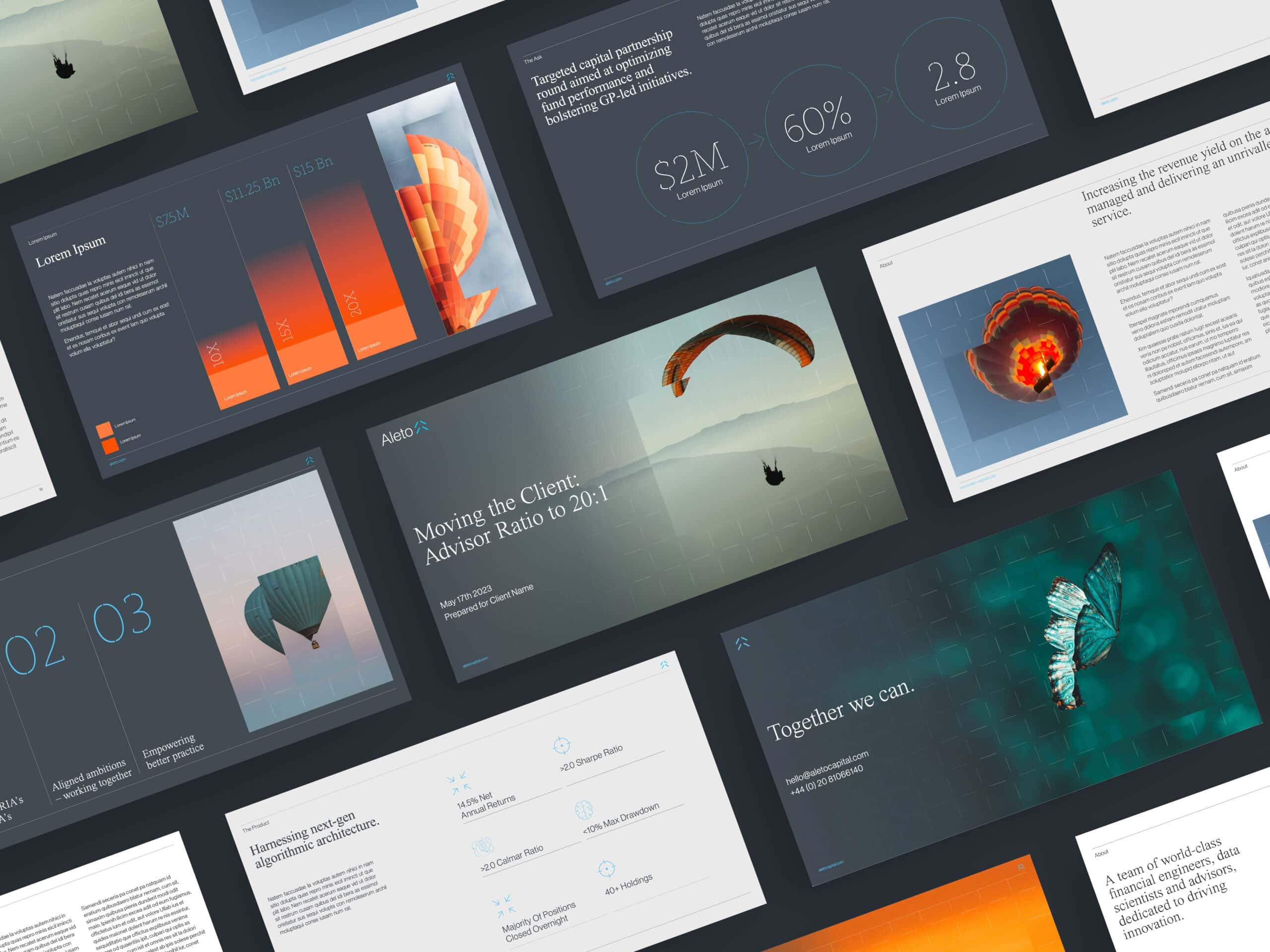
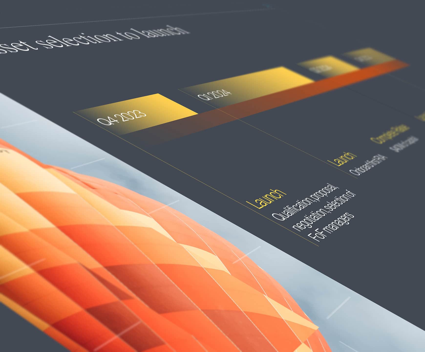
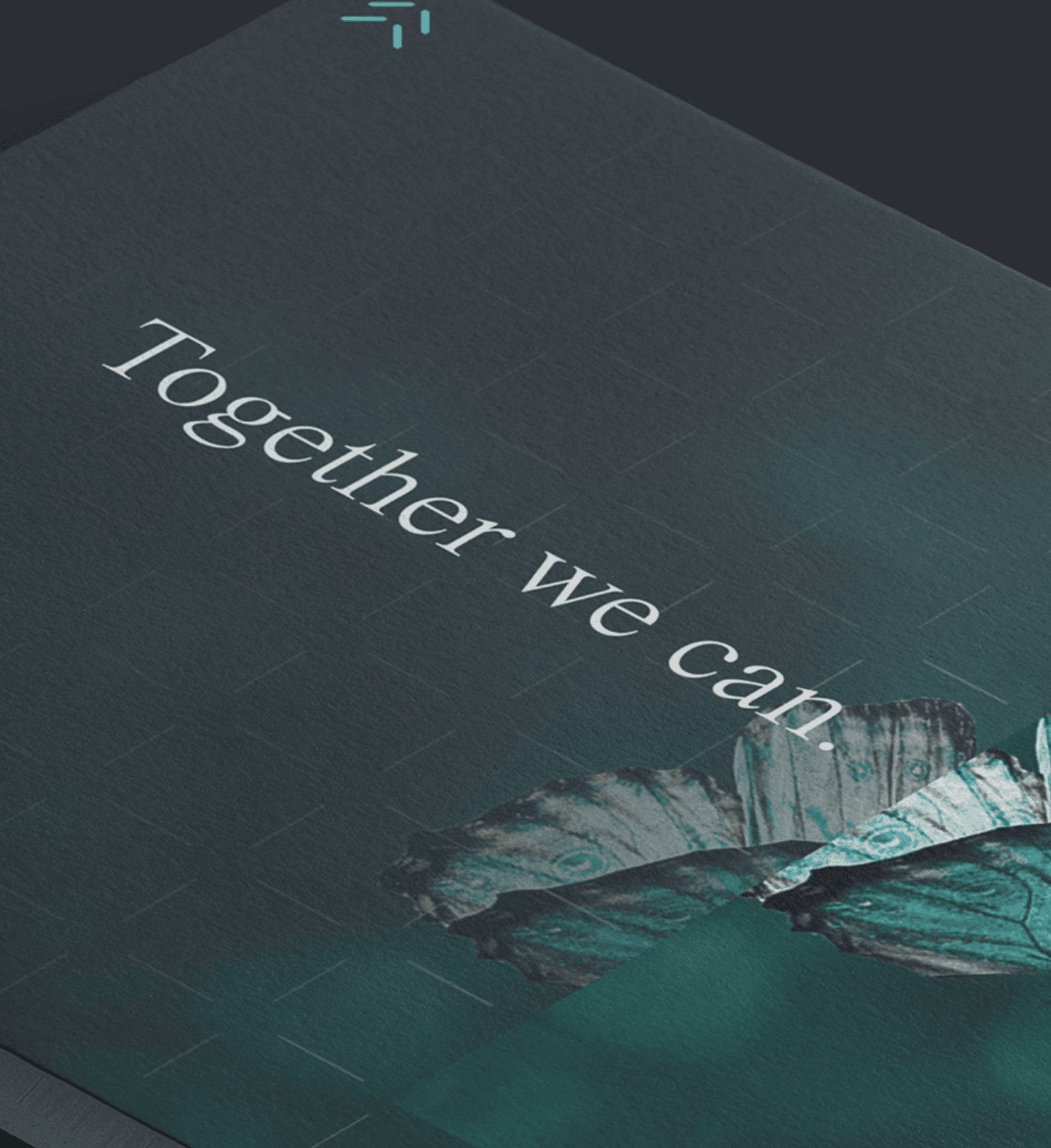
The grid overlay represents Aleto’s analytical precision – a structured lens that uncovers clarity where others see only chaos. Each visual moment, such as a soaring bird, a butterfly in flight, 0r hot air balloon ascending is brought into crisp focus, symbolising the transformative opportunities Aleto helps bring to light.
This approach reflects not just how Aleto sees the world, but how it acts within it: deliberate, intelligent, & always seeking higher ground.


The Visual Identity
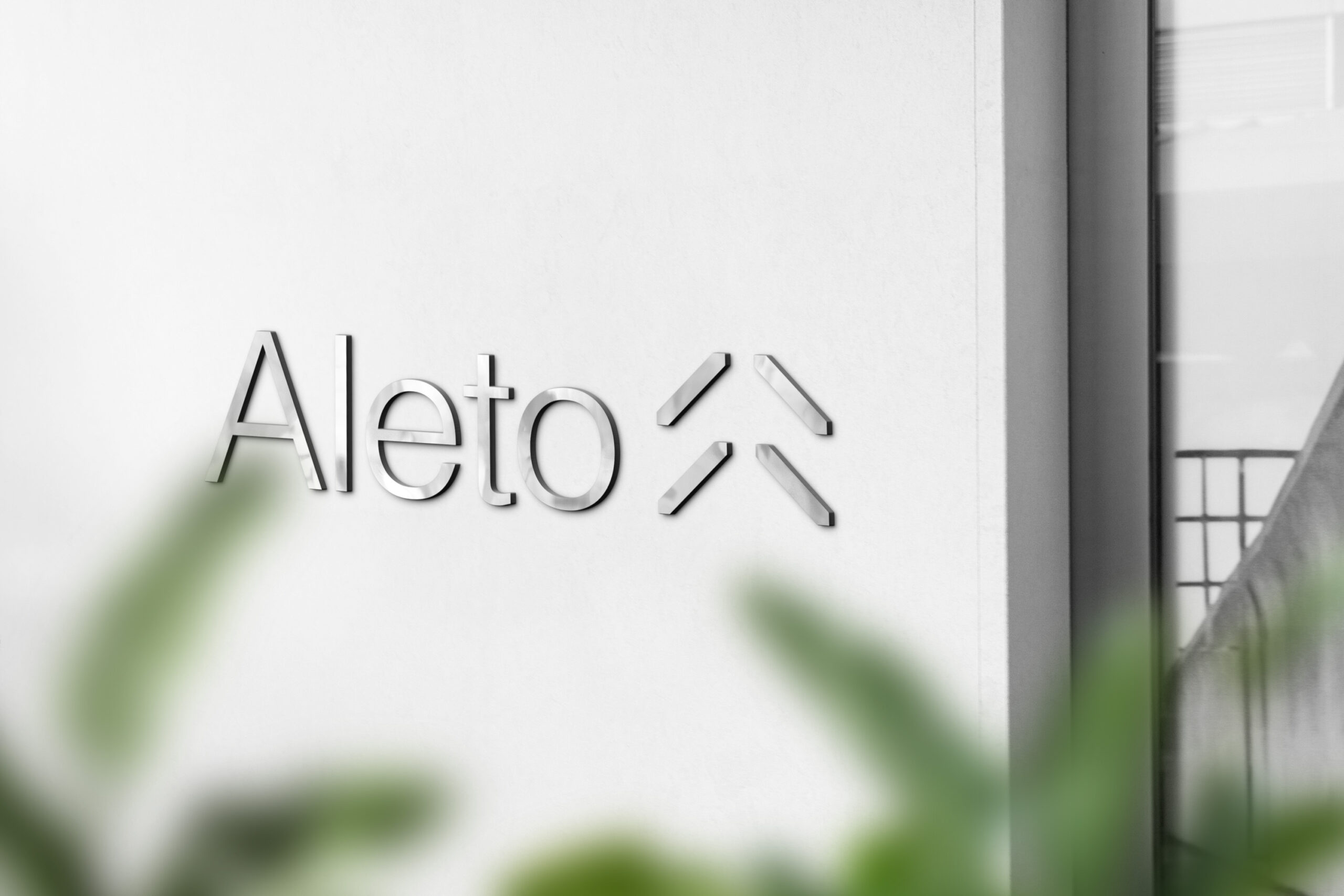
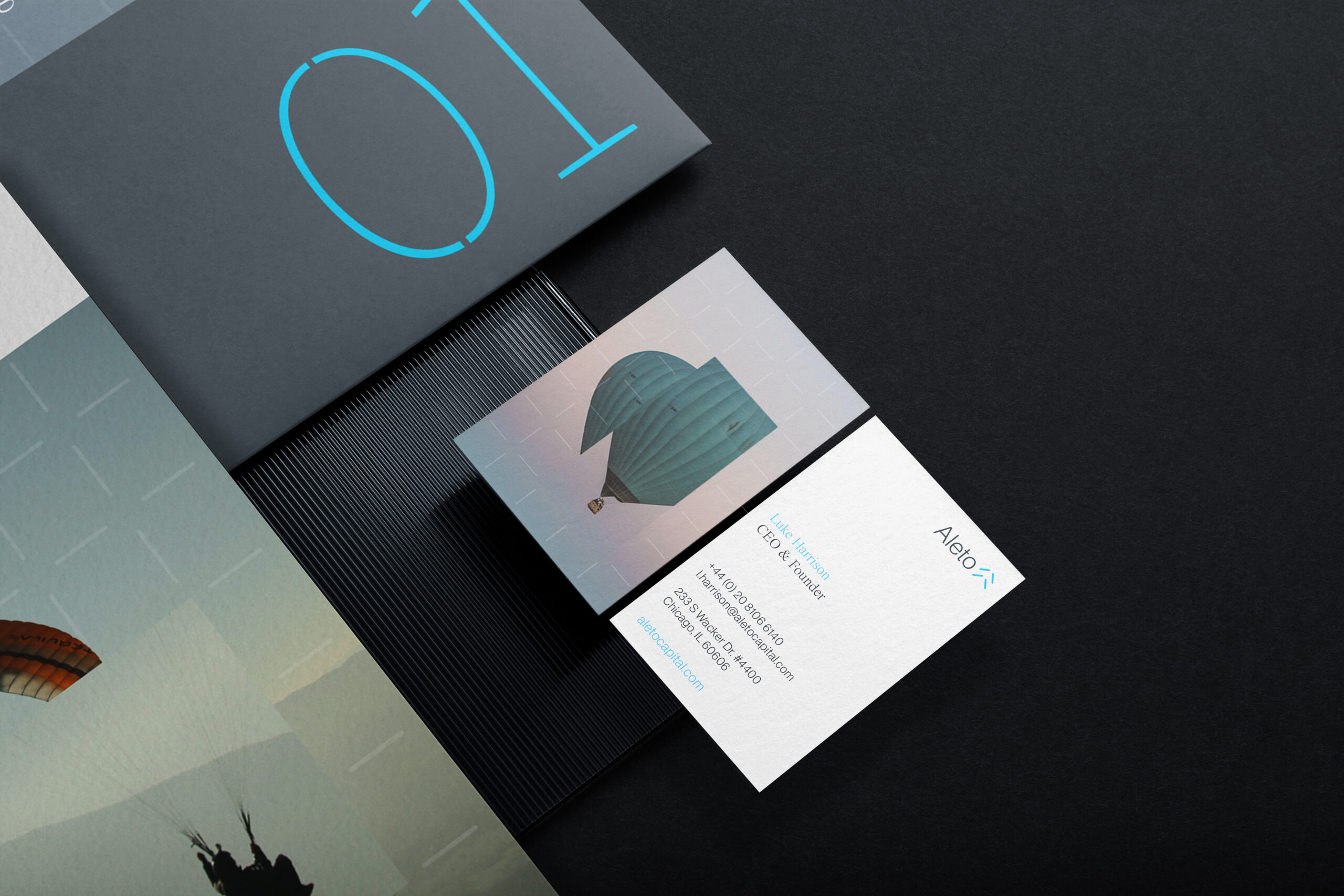
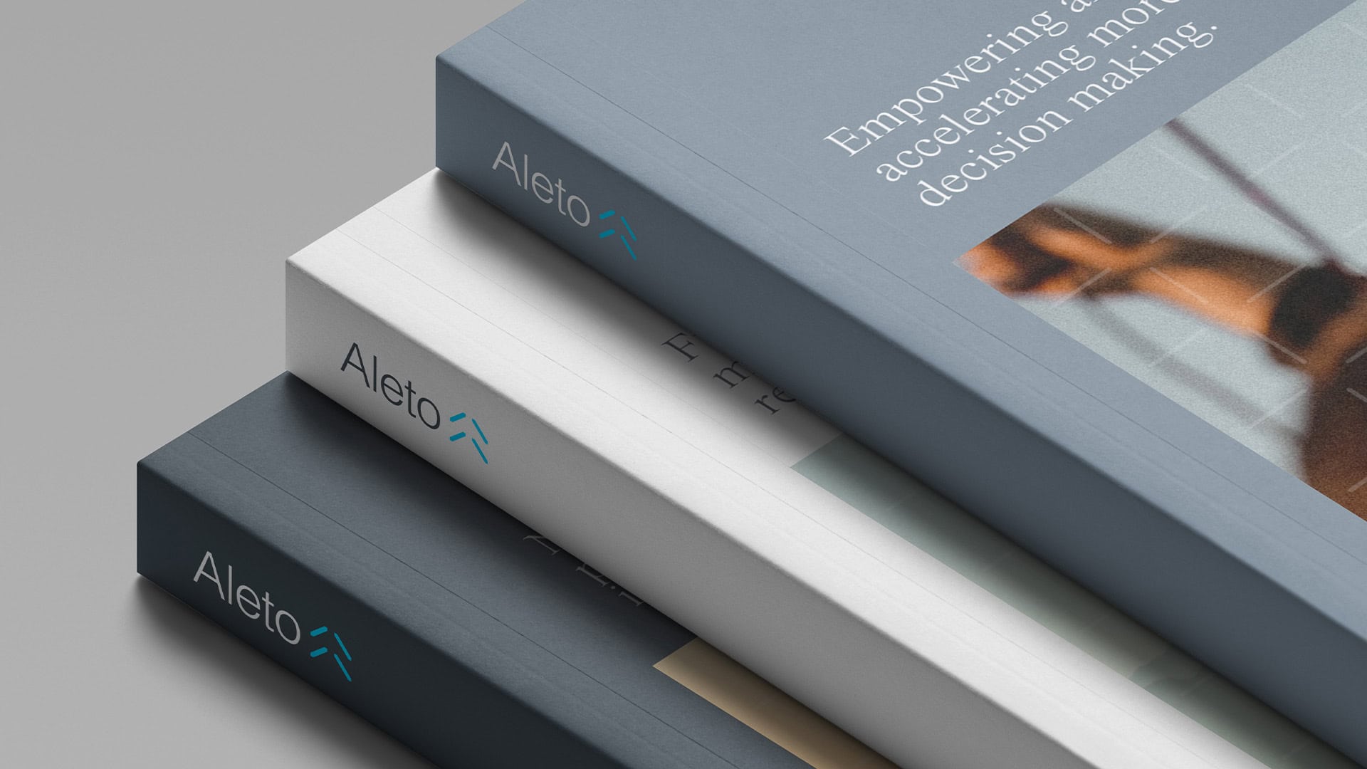
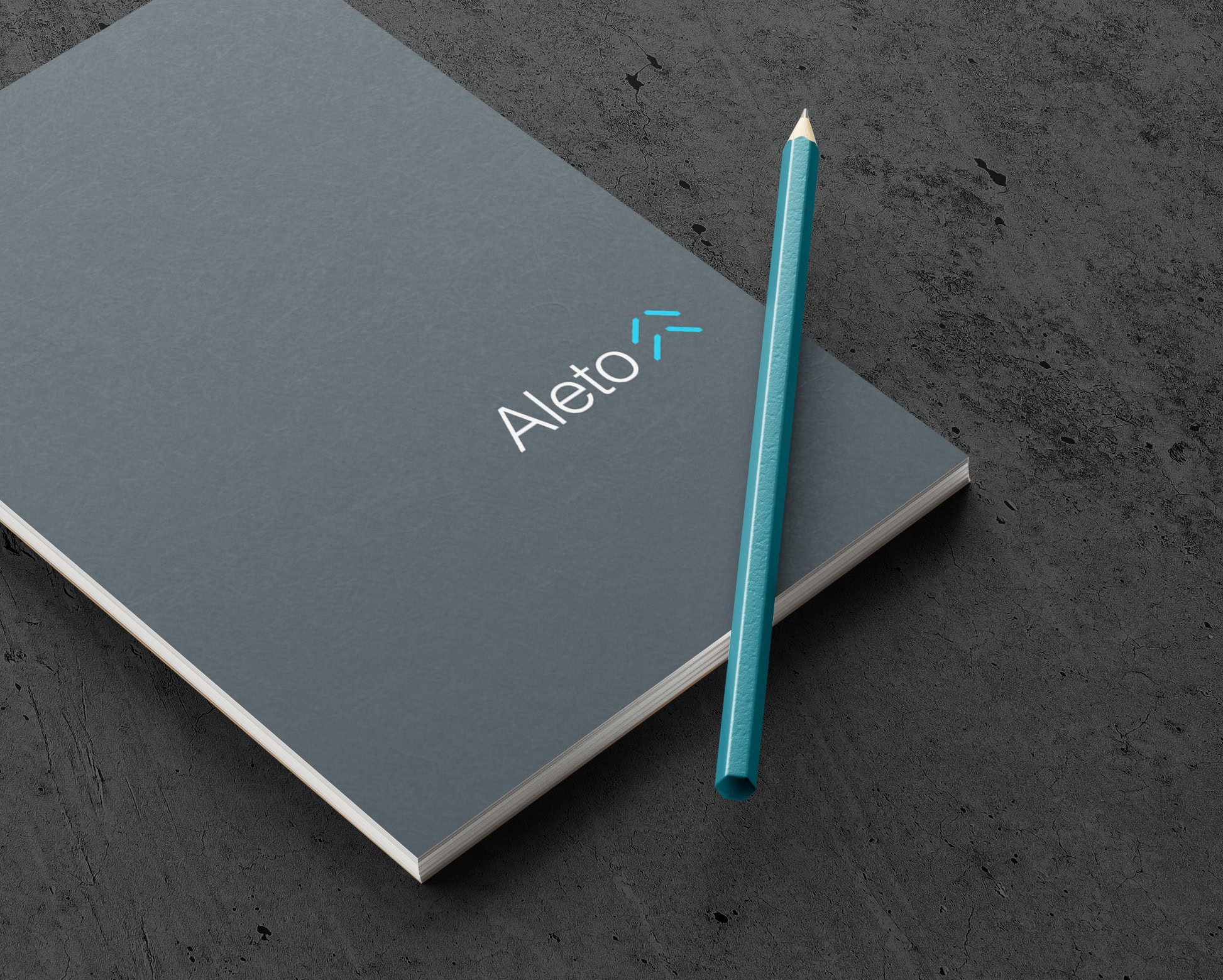
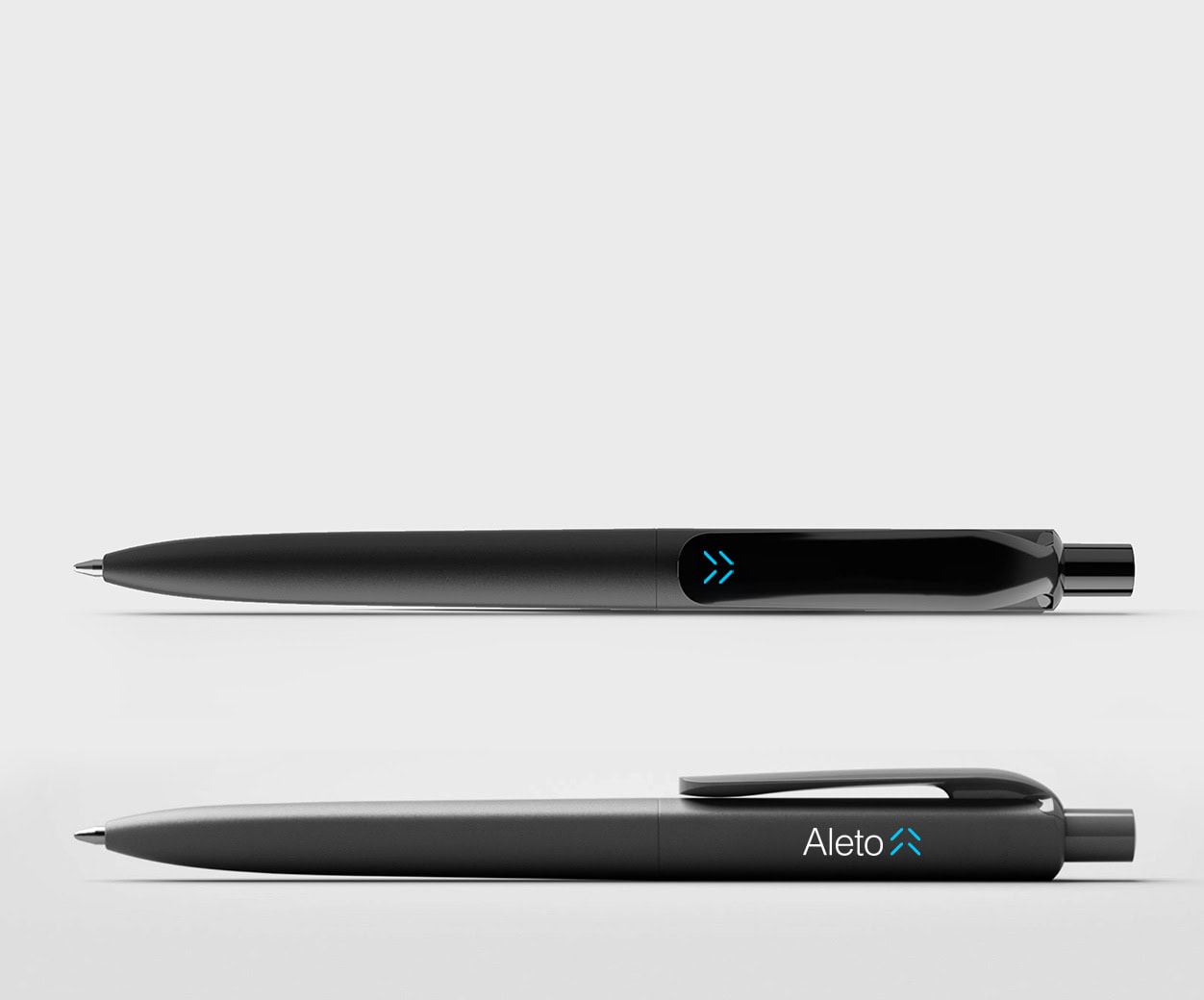
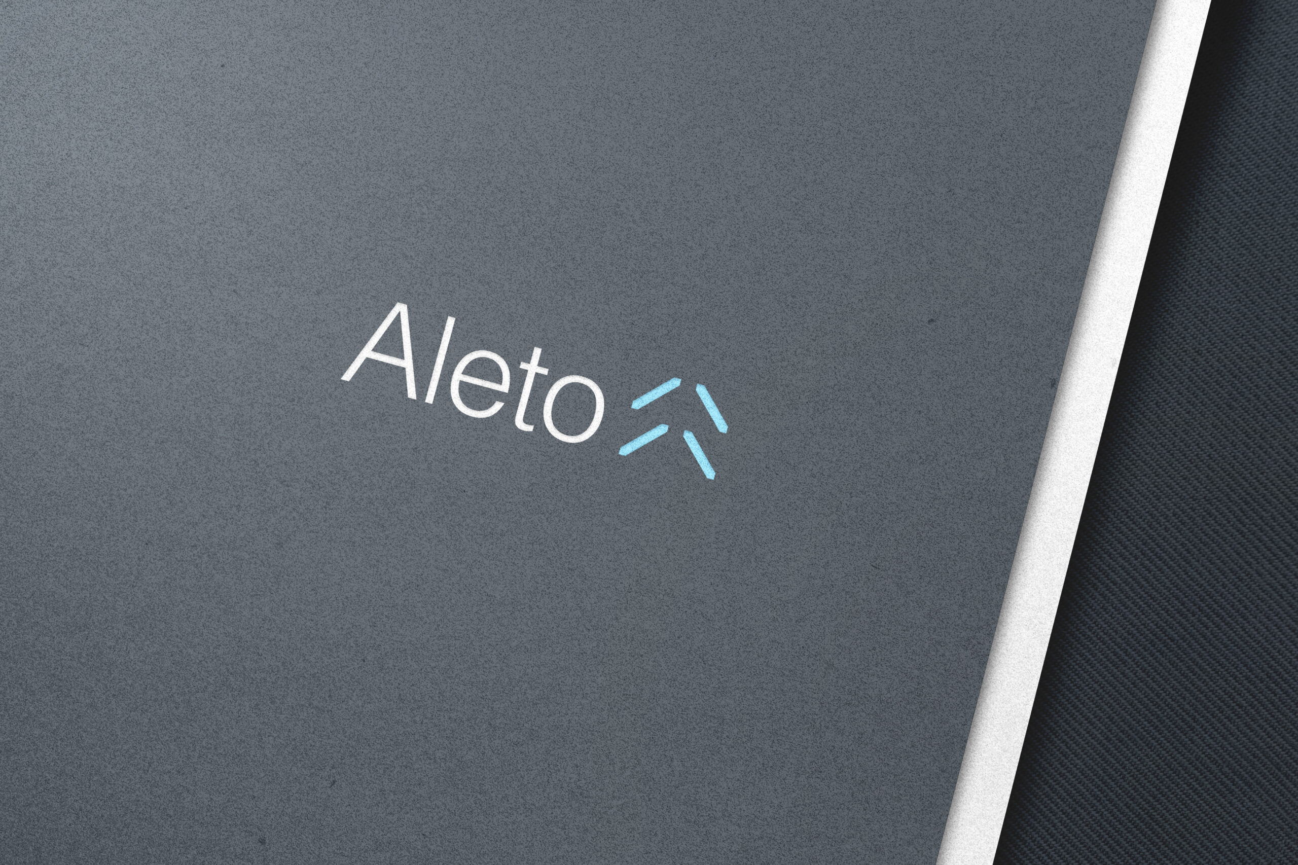
Aleto’s logo is an elegant emblem of upward motion – four minimalist, ascending strokes that subtly form an arrow. This mark captures movement, growth, & precision without needing to shout. Paired with a modern, clean sans-serif typeface, the identity strikes the perfect balance of credibility & innovation.
The colour palette further reinforces this tone: a deep slate grey anchors the brand in trust & stability, while a bright sky blue injects optimism & energy. Typography choices focus on clarity & approachability, reinforcing Aleto’s commitment to making sophisticated investing accessible & intuitive.
Photography & visual motifs continue the narrative of discovery & elevation, using powerful, aspirational imagery framed within the analytical grid. Every design decision reminds viewers: Aleto doesn’t follow trends; it finds what others miss & brings it into sharp focus.
Brand Positioning
Aleto’s brand was designed to walk a fine but powerful line, blending professionalism with distinctiveness, modern minimalism with progressive thinking, & strategic precision with emotional resonance. Every element was crafted to ensure that Aleto not only stands apart visually but also feels different, inspiring trust & ambition in equal measure.
At its core, Aleto’s identity projects unwavering professionalism. The deep slate grey foundation signals credibility, experience, & stability are critical attributes in a financial landscape where trust is earned through consistency & clarity. Typography choices, layout structures, & restrained colour usage reinforces a disciplined, refined aesthetic.
Yet, Aleto refuses to blend into the sameness of the traditional financial sector. Through a subtle but meaningful use of modern design elements – the brand differentiates itself with a forward-thinking spirit. It speaks to a new generation of advisors & investors who expect transparency, innovation, & thoughtful design from the partners they trust.


Project Deliverables
Brand Workshop
Research & Brand Strategy
Brand Positioning
Brand Identity
Logo Design
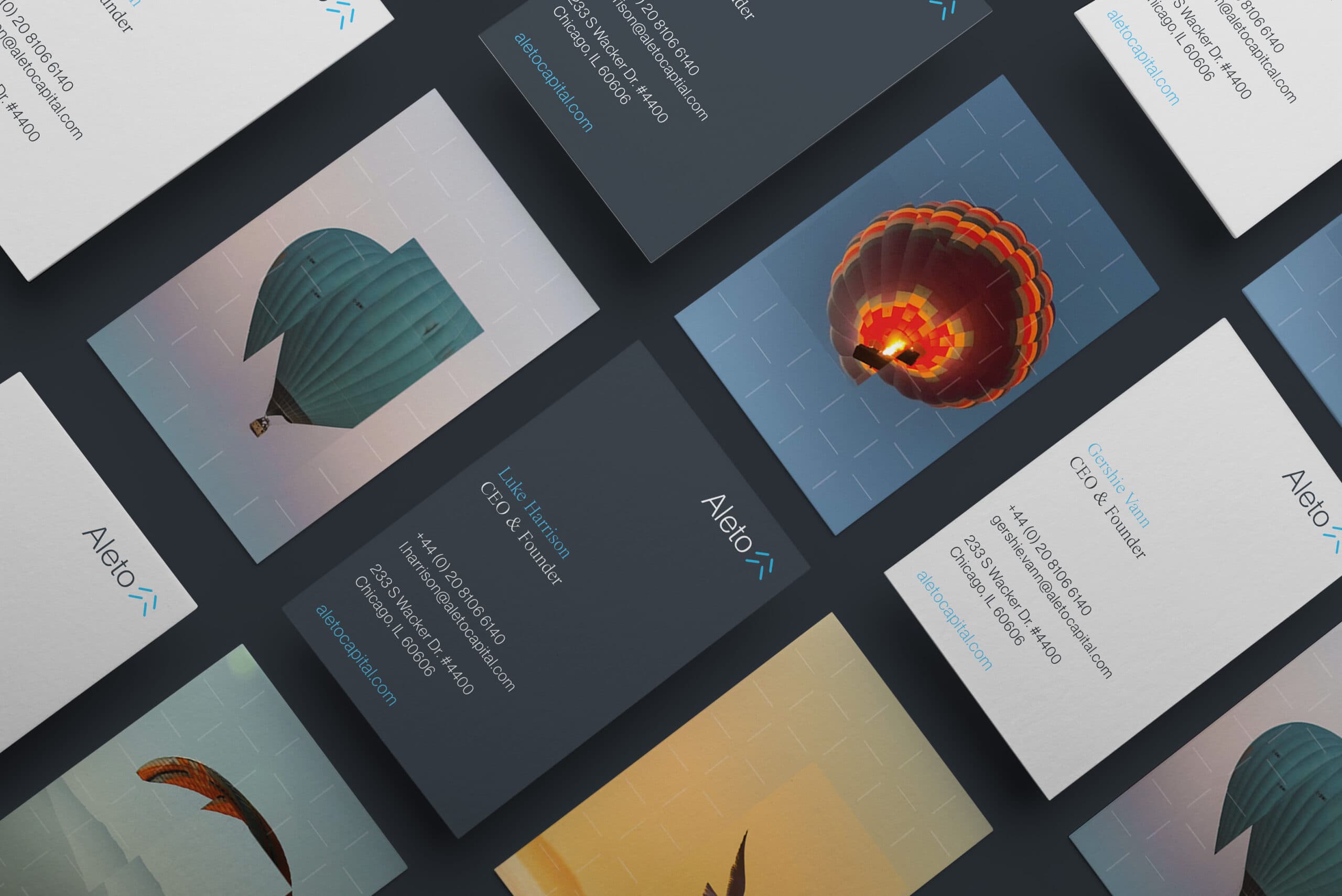
Corporate Stationery Design
Copy Writing
Website Design & Development
Social Media Page Design
Creative Consultancy & Project Management
Brand Personality
At the same time, Aleto’s brand is undeniably human & inspiring. The imagery of balloons ascending into a clear sky, butterflies in mid-transformation, birds soaring towards freedom, stirs emotion without relying on clichés.
These motifs remind viewers that behind every data point & decision lies real opportunity: to grow, to rise, to discover potential often left unseen. The interplay between the analytical grid & the organic imagery perfectly captures Aleto’s dual mastery of science & intuition.
The result is a brand that feels fresh yet timeless, grounded yet ambitious. It resonates not just on a rational level but on an emotional one, communicating to advisors & clients alike that Aleto is a platform built for those who see the world not just for what it is, but for what it could be.


In Summary
Professional. Distinctive. Modern. Progressive. Inspiring. Emotional. In the world Aleto is building, these qualities aren’t contradictions they are essential companions, woven together to create a brand identity that doesn’t just support the mission, but amplifies it.



“The Aleto brand was designed to bring clarity & distinction to a complex, traditional space. Our goal was to reflect Aleto’s precision-driven investment approach while creating a visual identity that felt modern, human, & trustworthy.
Aleto doesn’t just look different; it thinks differently & the brand is built to express exactly that.”
