Reef + Partners Corporate Rebrand

Pioneering a new era of urban regeneration, Reef + Partners is known for shaping bold, future-focused developments throughout Central London & beyond. Formerly operating as Reef Group, the company has evolved, entering a new chapter as Reef + Partners—a name that captures its deep-rooted belief in collaboration, innovation, & meaningful impact.

Driven by purpose & powered by partnership, Reef + Partners brings together diverse stakeholders to create places that are not only commercially successful, but socially & environmentally resonant. Their work goes beyond buildings—it’s about crafting bold, intelligent spaces that inspire connection, unite communities, & leave a lasting legacy.


Reef + Partners combines strategy, design, & sustainability to shape the future of cities through thoughtful, purpose-driven development. The rebrand needed to reflect this evolution—creating a bold, collaborative identity that mirrors the strength & vision of the communities it helps to shape.

Inspired by Nature, Driven by Partnership
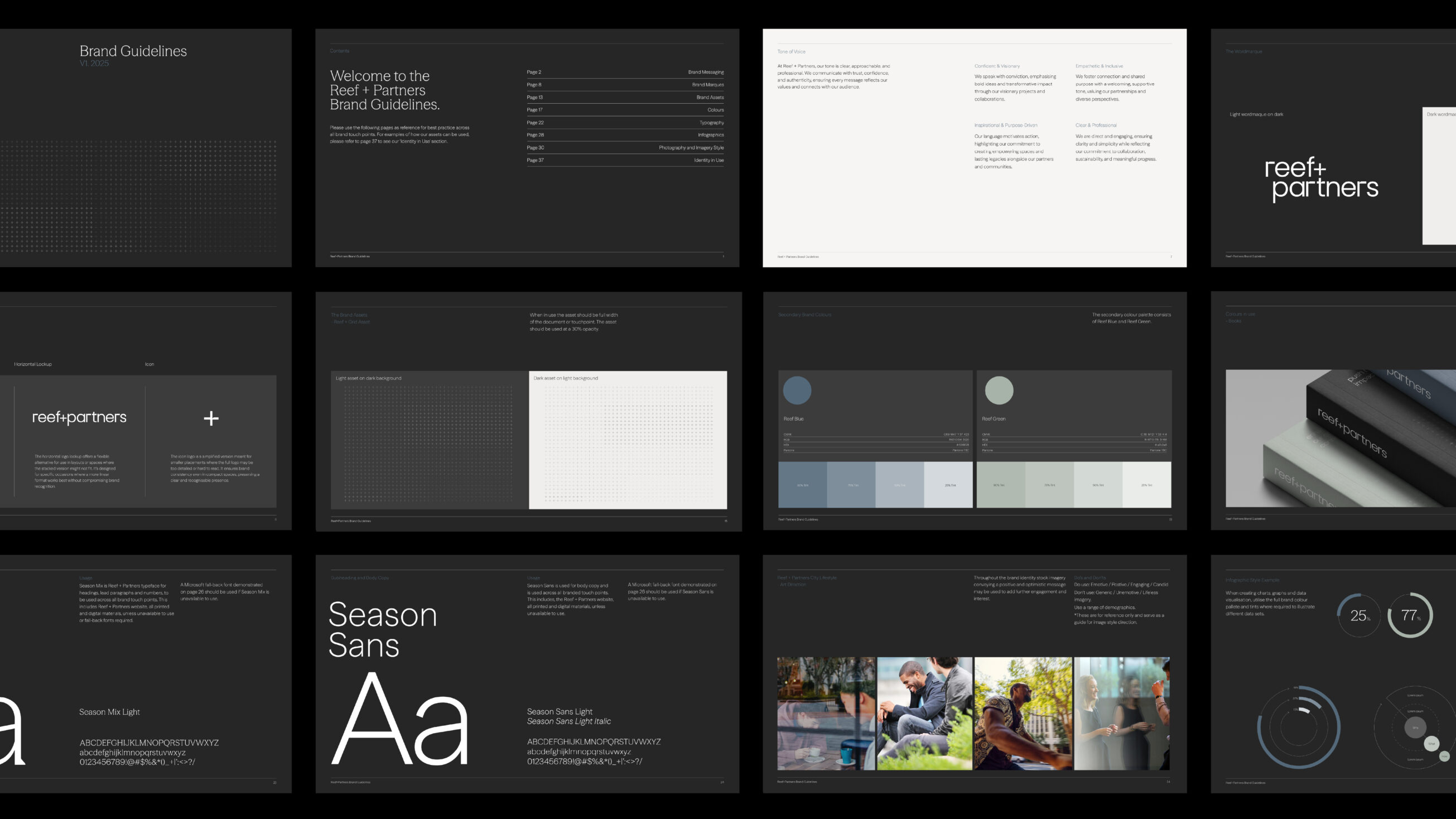
At the core of the Reef + Partners brand is a powerful metaphor: the reef—a natural ecosystem known for its strength, complexity & life-sustaining connectivity. Reefs are some of the most vibrant, & resilient environments on the planet, & this became the perfect conceptual foundation for a brand rooted in collaboration, regeneration, & purposeful growth.

The reef metaphor doesn’t just inform the story—it shapes the aesthetic, tone, & design system. The ‘+’ motif used across the visual identity acts like a living reef pattern: modular, rhythmic, & deeply interconnected.

The colour palette nods to the materials & tones found in natural & built environments. The brand language speaks with clarity & empathy, mirroring the balance of structure & softness that makes reefs such powerful, & vital, ecosystems.


The Visual Identity

At the heart of the Reef + Partners identity is a logo that is both minimal & meaningful, striking a balance between visual restraint & symbolic richness. It’s a mark that feels intelligent, architectural, & human—a perfect encapsulation of a brand built on connection, progress, & purpose.

The logotype is set entirely in lowercase, a deliberate choice that conveys humility, openness, & approachability.

The typeface used is clean & geometric, with subtle softness in its curves & a grounded, engineered weight in its verticals. This duality reflects Reef + Partners’ ability to blend creativity with precision, & empathy with execution.

The most defining element of the logo — and the brand — is the ‘+’ symbol, placed carefully between “reef” & “partners.” This mark isn’t ornamental. It is the visual embodiment of the brand’s purpose.

More than just a name, the Reef + Partners logo serves as a visual philosophy. It signals that this is a brand where design is thoughtful, where partnerships are central, & where every detail is considered.

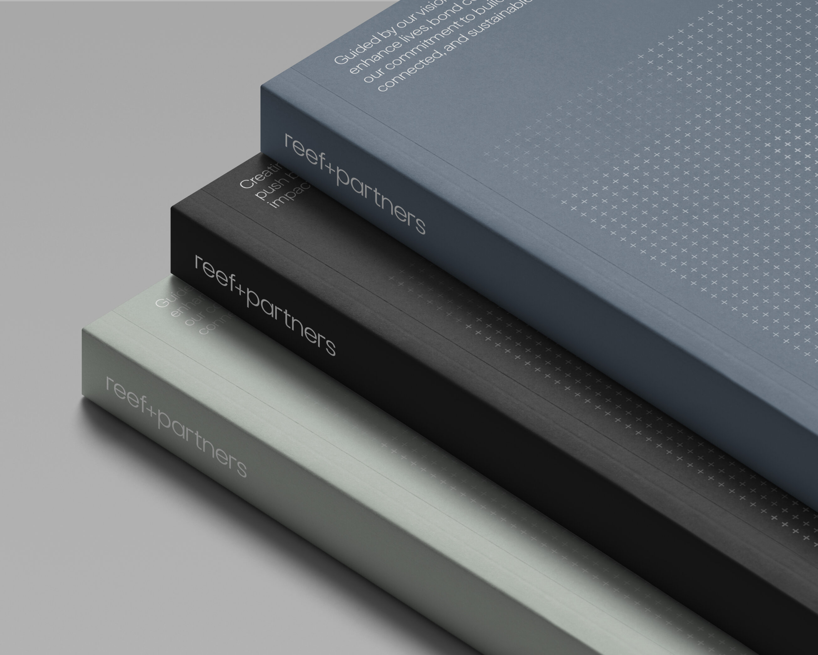
A Pattern with Purpose

One of the most compelling features of the Reef + Partners identity is the subtle yet powerful ‘+’ pattern. At first glance, it appears as a clean, modern design element, but its meaning runs much deeper. Much like the brand name itself, the repeated ‘+’ motif is more than decoration—it’s a metaphor.

This repeating grid of ‘+’ symbols mimics the structure & intricacy of a reef: a dense, interconnected system where every element plays a vital role. Just as coral reefs are formed through thousands of individual organisms coming together to build something strong, complex, & full of life, this visual pattern represents the collaborative strength at the heart of Reef + Partners.

Interconnectedness: Each ‘+’ on its own is simple. But when multiplied & arranged in a thoughtful structure, it becomes a visual representation of unity & scale—mirroring how people, ideas, & skills come together to create something greater than the sum of its parts.

In essence, the ‘+’ pattern isn’t just a brand asset. It’s a visual philosophy: a living reef of possibility, collaboration, & enduring impact.

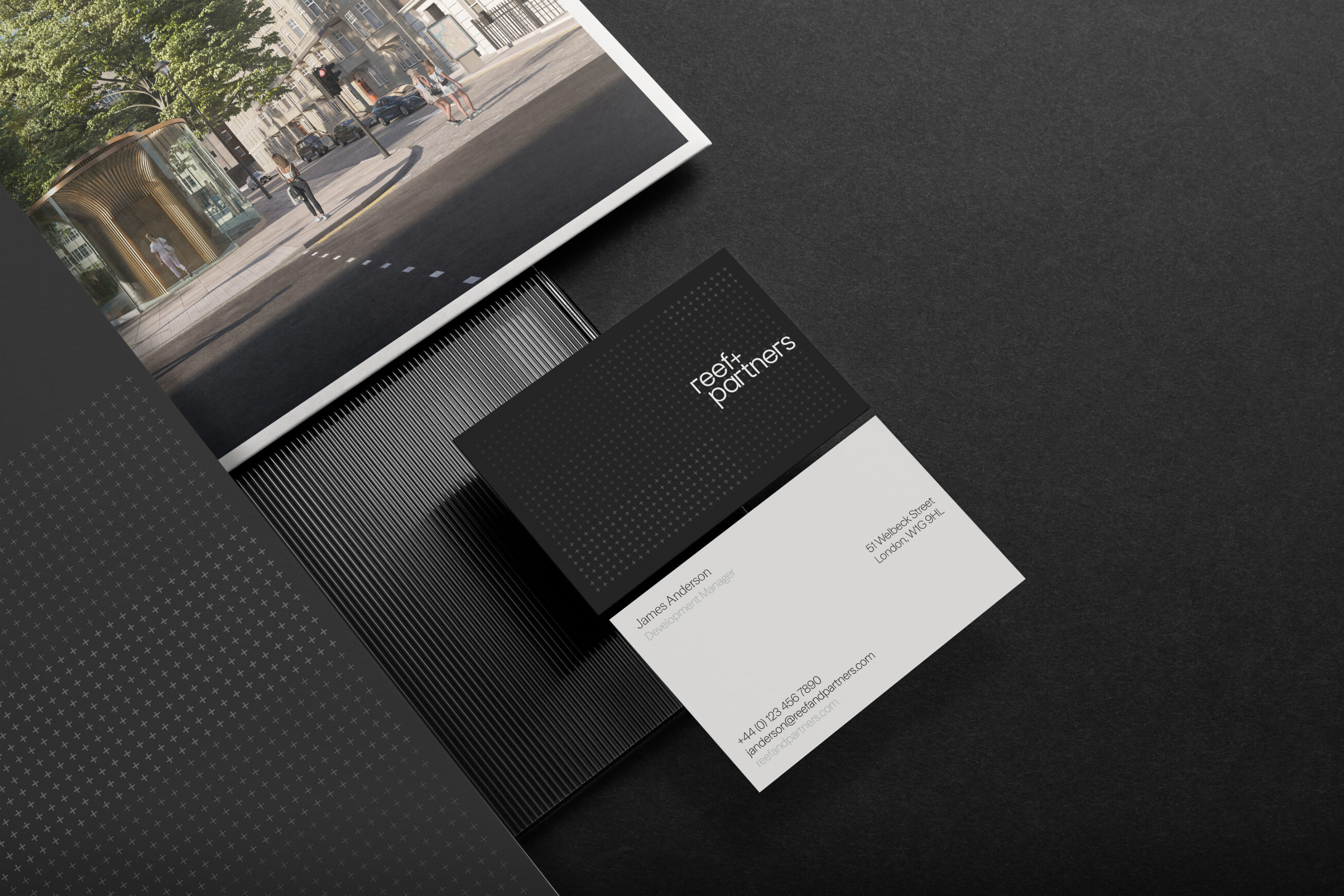
Project Deliverables

Brand Workshop
Research & Brand Strategy
Brand Positioning
Brand Identity
Logo Design
Corporate Stationery Design
Copy Writing
Website Design & Development
Social Media Page Design
Creative Consultancy & Project Management

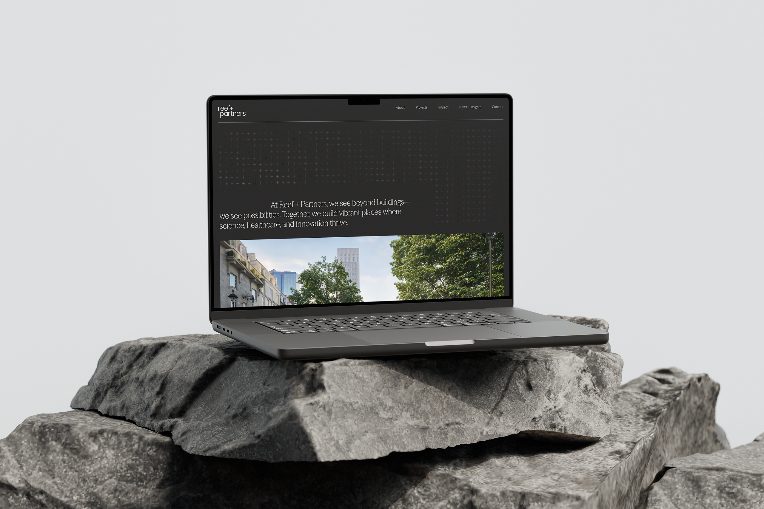
The Online Experience

The website design embraces a sleek editorial layout with high contrast, elegant fonts, & sharp imagery. It’s an immersive experience that tells the Reef + Partners story with clarity & emotion. From project highlights to impact metrics, every detail reinforces the brand’s purpose: to create places that elevate lives & redefine the future.

Visuals of built environments are paired with people-focused imagery, reinforcing the brand’s human-centric approach. The interface is intuitive, calm, & confidence-inspiring—a natural extension of the brand’s voice.


The tone is progressive, authentic, & quietly powerful. Messaging is clear & aspirational, capturing the idea that true success comes from trust, collaboration, & a shared vision. It balances commercial ambition with emotional resonance—always rooted in purpose & partnership.

In Summary

The new identity for Reef + Partners is bold yet understated, technical yet emotive. It establishes the firm as a visionary leader in modern development—an organisation not just building structures, but building futures.

Its understated elegance communicates strength through clarity & precision, setting Reef + Partners apart from conventional developers. Internally, the brand has unified teams & partners around a clear purpose, reinforcing the power of collaboration.

Most importantly, it lays a strong foundation for future growth—scalable, values-driven, & ready to shape lasting legacies.


Creating a brand identity & digital presence for Reef + Partners that reflects their collaborative, purpose-driven approach to urban development has been a rewarding and inspiring journey—one that celebrates meaningful design & the power of thoughtful collaboration. Reef + Partners are now perfectly positioned to grow their impact, attracting like-minded collaborators & driving meaningful regeneration projects that shape the cities of tomorrow.

– Ross Davison, Managing / Creative Director, Fable&Co.

Related

Projects