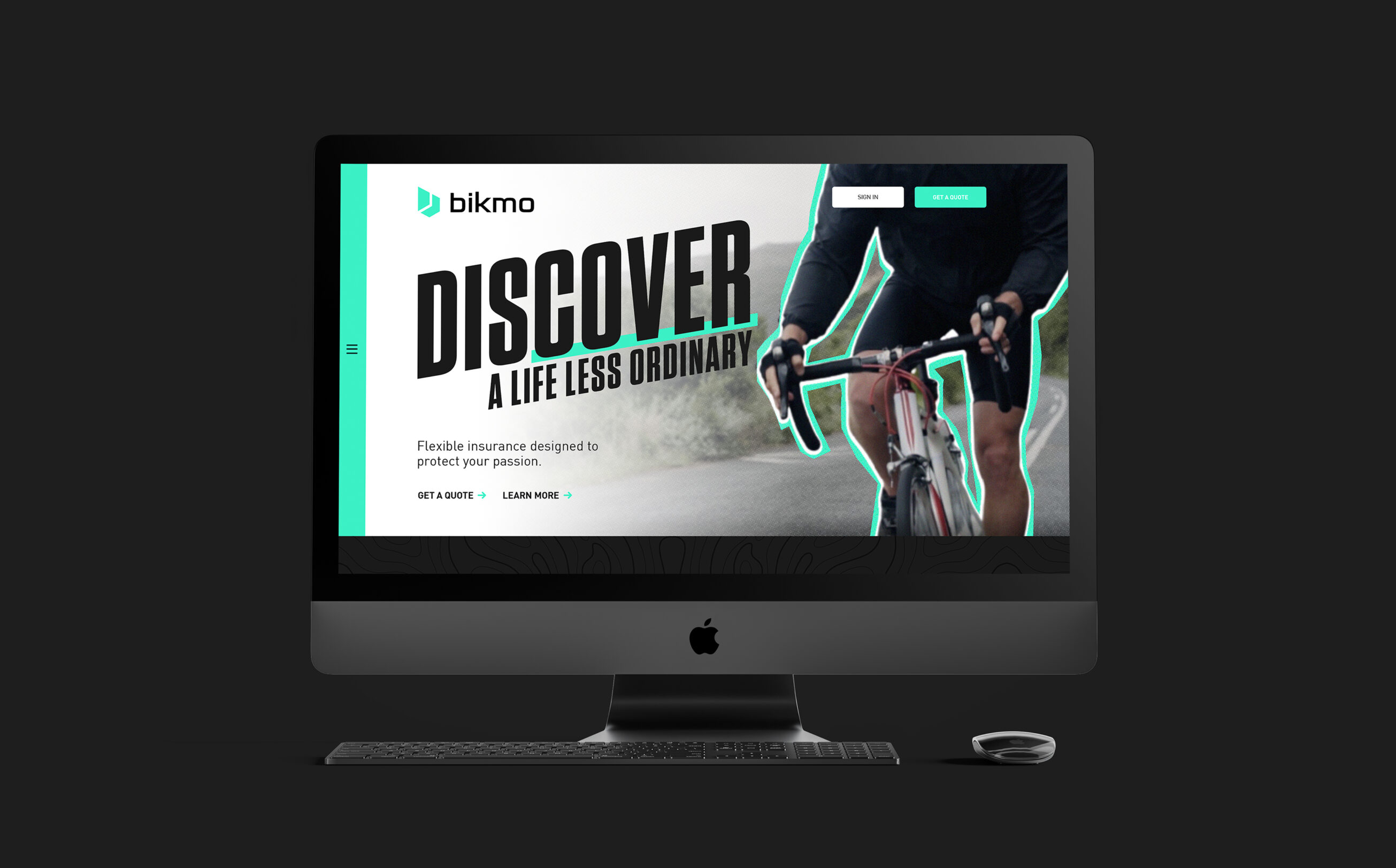
Rebranding a leading cycle insurer

Launching as a dedicated cycle insurer in 2014, Bikmo soon became synonymous for unrivalled customer experience for bike enthusiasts throughout Europe. Their ethos remained true - to utilise tech to enable customers to spend more time riding.

Fable&Co. were commissioned to strategically rebrand Bikmo, securing their position as the insurer of choice for those adventurers seeking a life less ordinary.

The brand positioning centred around empowering the intrepid to live better & discover more, enabling a more rewarding life, safe in the confidence that if something does go wrong they can rely on Bikmo to put it right.


Fable&Co. worked in close collaboration on reimagining & crafting the new Bikmo brand identity with everyone involved. Experiencing first hand the authentic ‘purpose led’ mission & infectious passion from the very core of the brand.

Research & Strategy

What did we discover? An underlying bigger brand purpose. A true passion to protect their customers from unexpected events, using sophisticated technology to simplify the insurance process & above all, provide an exceptional customer experience at every interaction.

Fable&Co. developed a series of passionate statements, along with beautifully powerful & inspiring messaging that set the framework for the rebrand, connecting with the emotional drivers that outdoor sports enthusiasts share in abundance.

A new brand tagline, ‘Discover a Life Less Ordinary’, further supported the brand strategy & positioning.

Emphasising the letters of the word ‘cover’ set within the brand tagline offered a smart, double meaning, reinforcing the brand category & proposition as a cycle & sports insurer.

The Logo

The new Bikmo logo icon was inspired by the notion of both safety & discovery. This abstract, geometric ‘B’ was created to represent a directional symbol set within a crest shape denoting the sense of protection.

Fable&Co. created a stylised evolution of Bikmo’s original logo. This simple, clean & modern wordmarque perfectly complementing the new visual style & language.

The brand icon & wordmarque offers extensive flexibility & practicality for all usage requirements. The bright, glowing logo acting as a beacon of safety, authenticity & reliability.

Project Deliverables

Brand Workshop
Research & Brand Strategy
Logo Design
Brand Positioning
Brand Identity
Corporate Stationery Design
Promotional Merchandise Design
UI Design
UX Design
Brand Guidelines
Creative Consultancy & Project Management

Brand Personality

The creation of the new visual brand identity for Bikmo beyond the logo was inspired by the energetic, adrenaline-fuelled, fast-paced environment typically associated with the world of action sports.

The Bikmo brand identity utilises a playful use of typography, kinetic graphics, vibrancy & authentic inspiring imagery to promote a youthful & playful brand personality with passion & positivity in abundance.

Cut Media worked their magic, bringing this new proposition & personality to life through the creation of a high-impact, tongue-in-cheek video series.

Furthermore the notion of protection came into play, depicted by a simple yet irregular halo’s surrounding the silhouettes of sports enthusiasts that can feel confident that they are covered by an insurer that has their back.

Positive Brand Impact

The Bikmo brand proudly & authentically represents far more than just an insurer. As an active B Corp business, Bikmo acknowledge that responsible people & businesses need to step up to meet & address the challenges that the world faces.

For Bikmo, that means focussing not just on profit but continuing to put people – customers, team, wider society, & the environment – all as priority when making business decisions.

As a keen action sports enthusiast myself I was especially excited by this opportunity to strategically rebrand this progressive, purpose led business. Following the research & strategy the brand positioning the strategic messaging began to really began to take shape. Once this brand messaging had been refined & finessed the creation of the new brand identity was next to consider. Energy, passion & positivity was paramount to ensuring this brand positioning strategy was bought to life effectively. I am extremely proud of the outcomes & honoured to have played my role as part of a wider team to set the foundations for the future growth of the Bikmo brand.

– Ross Davison, Creative Director, Fable&Co.

“As riders themselves, the Bikmo team understand bikes and the needs of cyclists. I like to ride fast and hit the trails hard, and I have the peace of mind that the team will look after me should the worst happen.”

– Katy C - Bikmo Customer

Relevant Articles

Related Branding Projects