We created three bold, custom symbols that had elements of the angular Tquila wordmarque & icon, each designed to reflect one of the three service offerings:
01. Think & Discover: a ‘circle’ to represent their holistic, consultative & strategic approach to every project.
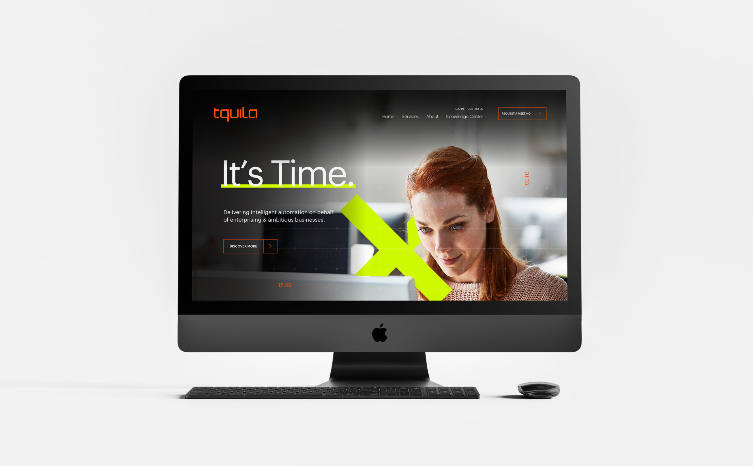
02. Design & Build: a ‘cross’ to represent how they collaborate with clients to truly understand the business needs & opportunities, then designing & building the right solution.
03. Operate & Run: a ‘plus’ to represent how Tquila will maintain performance & help keep things running smoothly, scale as needed & achieve efficiencies.
These symbols were then weaved throughout brand imagery to metaphorically highlight the areas that intelligent automation can transform business processes & support, or even free, the human workforce.
The striking & impactful highlighter yellow introduced a breath of fresh air in the blue-soaked automation space, whilst representing speed, agility, efficiency & reliability.
Coupled with the greys & blacks to provide a sense of professionalism, sophistication & credibility.
The vibrant orange accent was a subtle nod to the original Tquila colour & acknowledged their unique relationship with UiPath.