Technology Branding & Website Design

Fable&Co. were commissioned to re-position & re-brand an award-winning Salesforce consulting partner, Makepositive.

With over 120 Salesforce experts, the business operates between its offices located in London, Manchester & Gurgaon, India. Makepositive offer a wealth of experience across the entire Salesforce platform, earning them a Platinum consultancy status.

As the name would suggest, Makepositive are a highly passionate troup of Salesforce experts, delivering positive change & transformation throughout everything that they achieve. The brands boutique culture, spirited personality & compelling individuality was a clearly identifiable feature over their formidable competition.

The Visual Identity

The humble, friendly & emblematic ‘M’ logo subtly demonstrates the relationship between the Salesforce platform & the client’s business.

The middle crossover component referencing Makepositive’s pivotal role in tailoring & customising technology to transform their clients business efficiencies.

The look & feel of the new identity led Fable&Co. on a journey of discovery. We explored a narrative around a crew of intergalactic game changers – their mission, to make the world a far more positive place through the implementation of cutting edge technology.

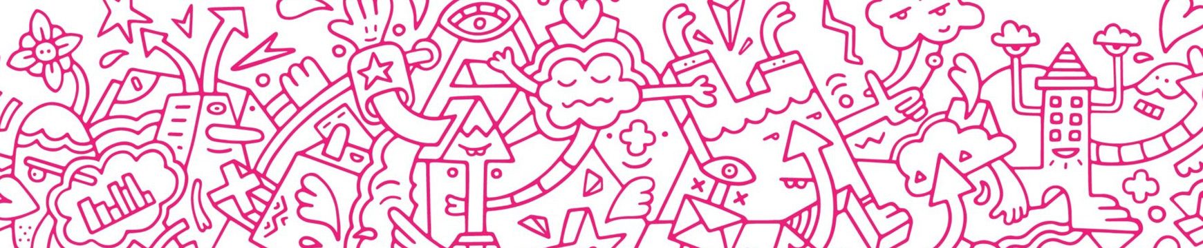
This unconventional & highly creative world comes to life through the use of striking, custom, bold illustrated artwork. The doodle style of the art promotes a friendly, boutique, tailored & custom proposition to reinforce the Makepositive brand values.

The illustration depicts relevant objects related to Makepositive’s business proposition, executed in a uniquely bold & identifiable visual style that builds a refreshing emotional connection with the varied brand audiences.

Project Deliverables

Research & Brand Strategy
Brand Workshop
Logo Design
Corporate Identity Design
Stationery Suite
Brand Messaging
Corporate Office Graphics
Responsive Website Design
Brand Guidelines
Powerpoint Design
Project Management

Fable&Co. developed an exciting new colour palette, to complement the existing ‘pink’ for which the Makepositive brand had become synonymous.

New, friendly & approachable fonts were introduced to the identity, along with key brand messaging, with a light-hearted tone-of-voice to accompany the vibrancy of the new visual brand aesthetic.

A comprehensive brand guideline kit was created to facilitate the ongoing application of this unique identity, enabling control & consistency of the brand identity for the foreseeable future.

Captured Moments

Photography of the Makepositive employees, going about their day-to-day roles within their office environment was captured – these images were used to add a strong sense of humanity across the branded marketing materials online & offline as well as to demonstrate the boutique, consultancy culture.

The balance of each of the visual assets was carefully considered to ensure that the identity was uniquely refreshing & memorable whilst maintaining a strong essence of quality & professionalism.

It’s been an exciting journey working on the re-brand for Makepositive. The project has taken us on an expedition of unconventional creative thinking through the use of a diverse range of mediums & art forms. We are all thrilled with the results that we were able to achieve through collaboration with not only Makepositive but also with Brighton based illustration artist, Mister Phil.

– Matt Jones, Brand Artist, Fable&Co.

Related Articles

Related Projects