Medical & Healthcare Branding & Website

The ambitious team at Medow approached Fable&Co. with an exciting challenge - to brand a new learning & development platform for ever-learning & overworked healthcare professionals.

For healthcare professionals, the journey of self-development is never complete. It is an industry that is ever-evolving, with new technologies, new methods, new treatments emerging on a daily basis. It’s therefore essential that they are armed with the latest information & practices to carry out their jobs as effectively as possible.

It’s also no secret that the UK is struggling to provide sufficient healthcare services, with staff shortages widespread & present across all disciplines. 

Enter Medow – a founding team who passionately believe that a career in healthcare, whilst demanding, should be rewarding & fulfilling. That’s why Medow made it their mission to inspire & nurture a positive change throughout the industry & beyond – providing healthcare professionals with all the support & resources they need to flourish in their career & in turn, provide world-class patient care.

The Messaging

Complementing the charm & relevance of the name ‘Medow’ was a beautiful tagline, ‘Flourish in your field’.

This perfectly captured the essence of their purpose & set strong foundations for the narrative used throughout the identity. We took this tone of voice, furthering its presence of nature & creating a sense of the ever-changing, ever-growing environment that healthcare professionals work within. 

Brand Proposition Statement

“Providing a personalised learning and development platform that empowers healthcare professionals to thrive in their career and deliver exceptional patient care.”

Project Deliverables

Brand Workshop
Research & Brand Strategy
Logo Design
Brand Positioning
Brand Identity
Corporate Stationery Design
Brand Guidelines
Website Design & Development
Social Media Page Design
Creative Consultancy & Project Management

The Logo

We created a perfectly balanced & harmonious logo wordmarque constructed from elementary geometric shapes.

The circular forms represent unity & perfection whilst the accompanying brand icon further communicates the concept of growth.

We crafted a simplistic logo icon that holds symbolic representations, such as an abstract tulip – representing spiritual insight, wisdom & love, along with the incomplete circle; demonstrating the audience’s need for continued development, education & knowledge.

The Colour Palette

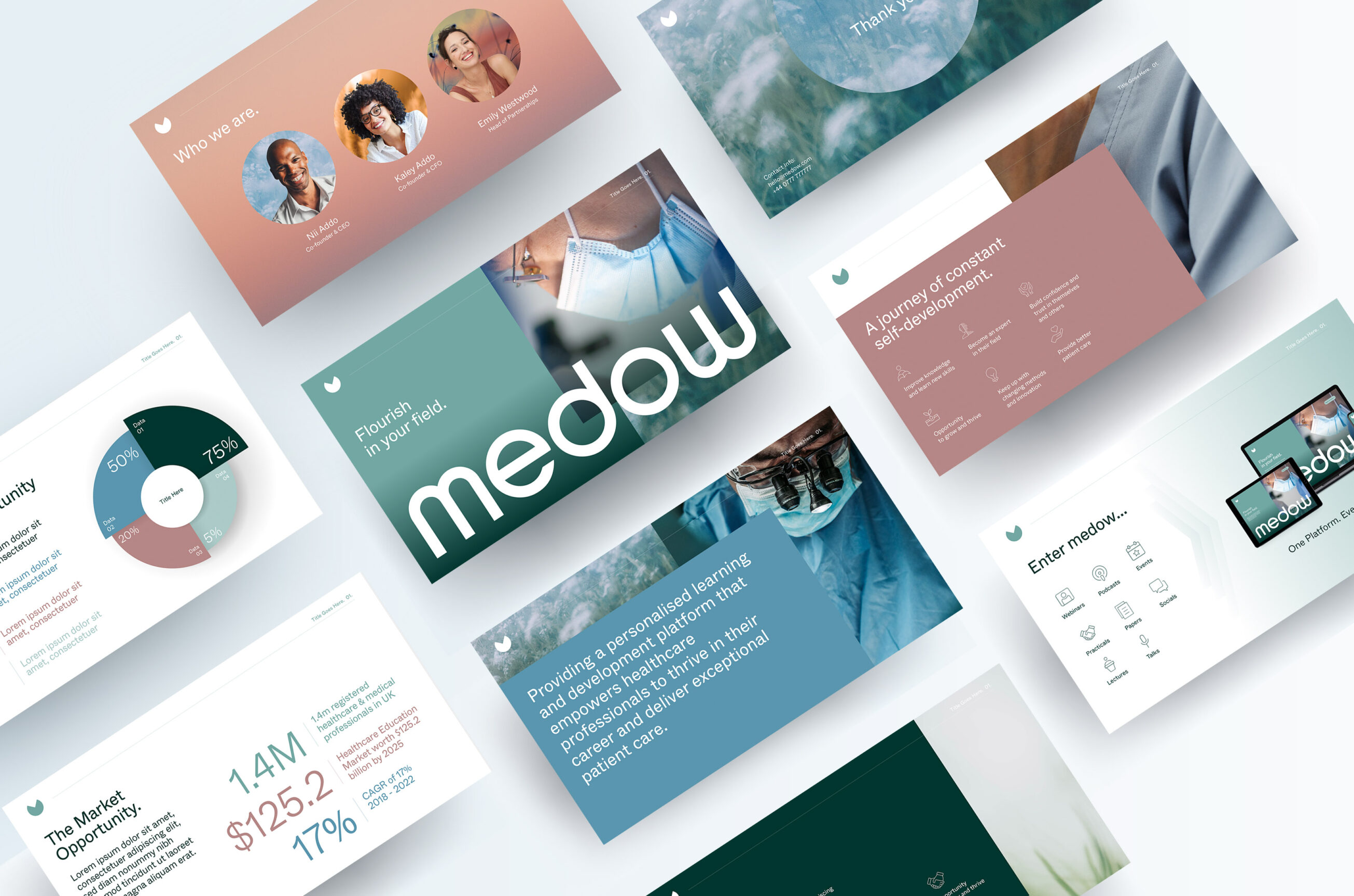
The colour palette was inspired by nature, utilising fresh, dewy greens that represent growth, health & abundance. Calming blue hues communicate responsibility, trust & professionalism, & warming pink tones that convey compassion, empathy & nurturing.

The Visual Identity

Fable&Co. created a contemporary identity system with a strong emphasis on simplicity, emotion & composure.

Through use of tranquil scenes of blooming florals & lush fields, we’ve created an identity that oozes calm & composure, complimented with abstract crops of healthcare workers in action to demonstrate the human & nurturing side of the brand. Utilising this combination of natural / organic imagery paired with close-ups of healthcare professionals from varied specialisms really brought the Medow brand identity to life. 

We are proud to have played our part in bringing this initiative to life through compelling branding & design, & we’re excited to support Medow as they continue their growth & pursue their noble ambitions.

It’s been a thoroughly enjoyable project, crafting this elegant brand identity for Medow. Working with the team continues to be a real pleasure. They are responsive to our suggestions & getting this identity delivered at such a high standard is a true testament to the collaborative process. We very much look forward to supporting Medow in the years to come.

– Issy Hall, Brand Artist, Fable&Co.

Related Projects