Insurance Broking Branding & Website
INCO Broking
Overview
Now, with their momentum building, INCO partnered with Fable&Co. to evolve their brand to position them for long-term growth, strengthen their market presence, and reflect the power behind their performance.
Alongside the team at INCO, Fable&Co. crafted a bold, intelligent identity that captures INCO’s dual strength: the heritage of trusted broking, powered by cutting-edge technology. From a refined visual language to a high-performance digital experience, the brand now mirrors exactly what INCO delivers – simplicity, precision, and impact at scale.

Brand Personality
INCO Broking needed an identity that felt both sharply modern and deeply grounded in trusted expertise. Fable&Co. was brought on to deliver a complete brand transformation, one that would amplify INCO’s pioneering spirit and market differentiation, while clearly communicating its agility, innovation and integrity.
INCO is bold, intelligent, and trustworthy – a modern disruptor with classic foundations. This tension between tradition and progress is at the heart of the brand personality. Every visual and verbal cue needed to evoke confidence, sophistication without pretension, and approachability without compromise.
INCO communicates with considered clarity. The tone is direct, the visuals precise, the layout intentionally minimal to convey speed, transparency, and data-driven insight.

The Visual Identity
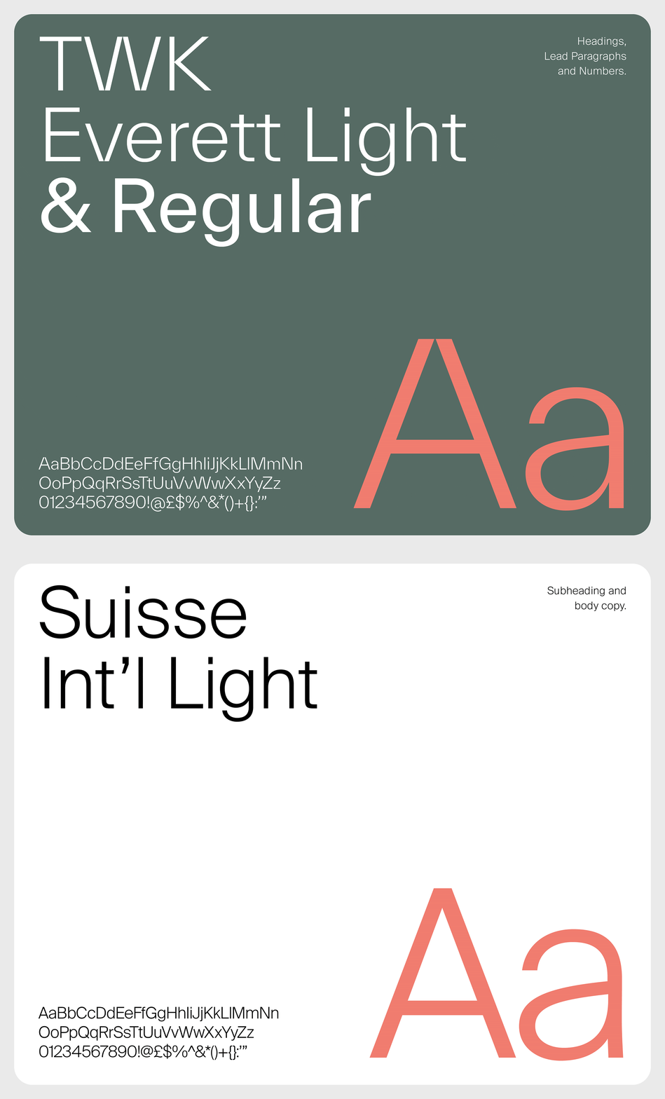
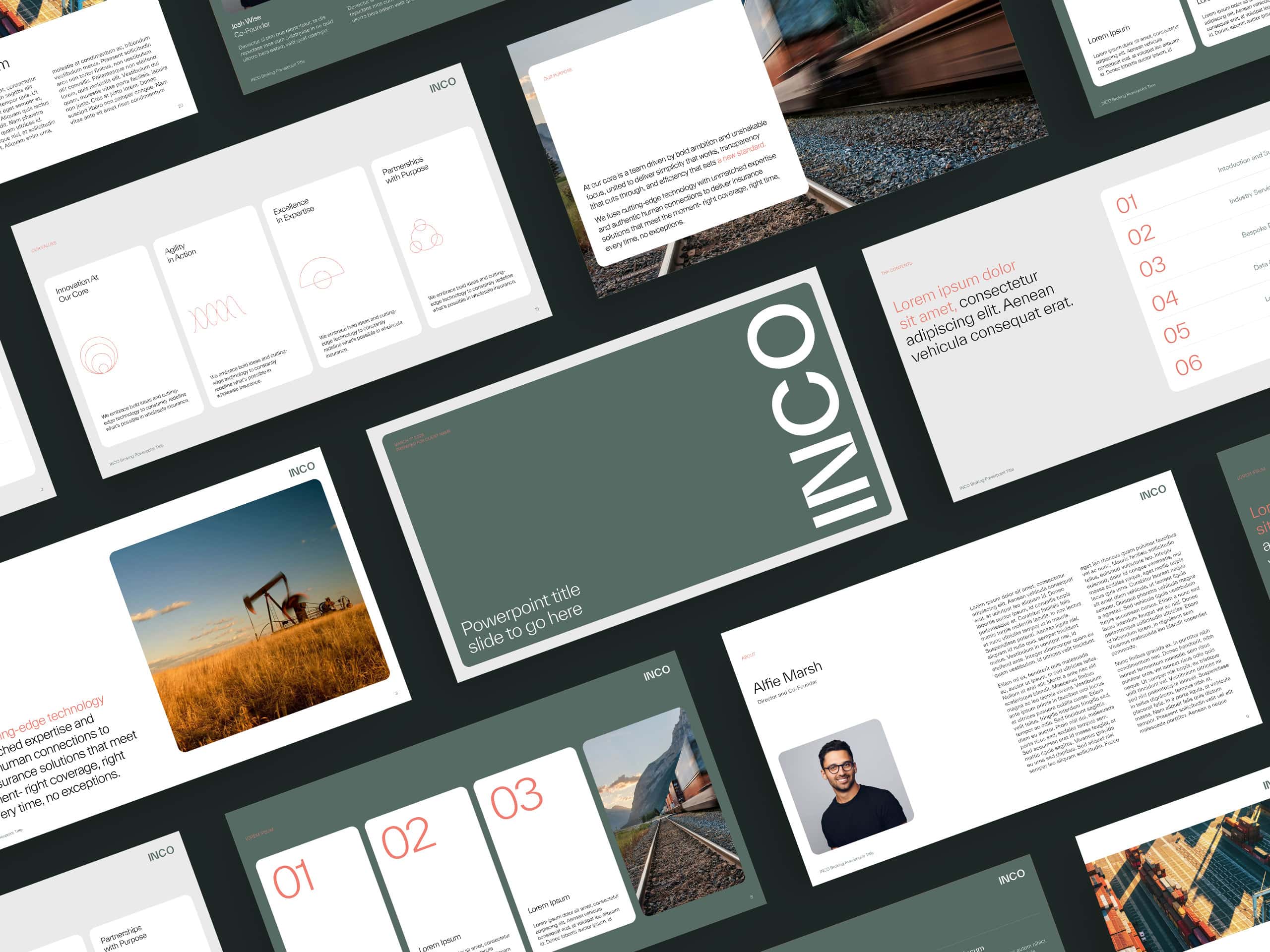
Typography across the system reinforces this balance of strength and simplicity. A clean grotesque style leads the way in headlines – commanding attention, while a more open, highly legible body type ensures clarity at every touchpoint. The interplay between the two adds rhythm, hierarchy, and a quiet sense of authority.
The result? A typographic system that works as hard as the business it represents – confident, clear, and built to cut through the noise. Just like INCO.
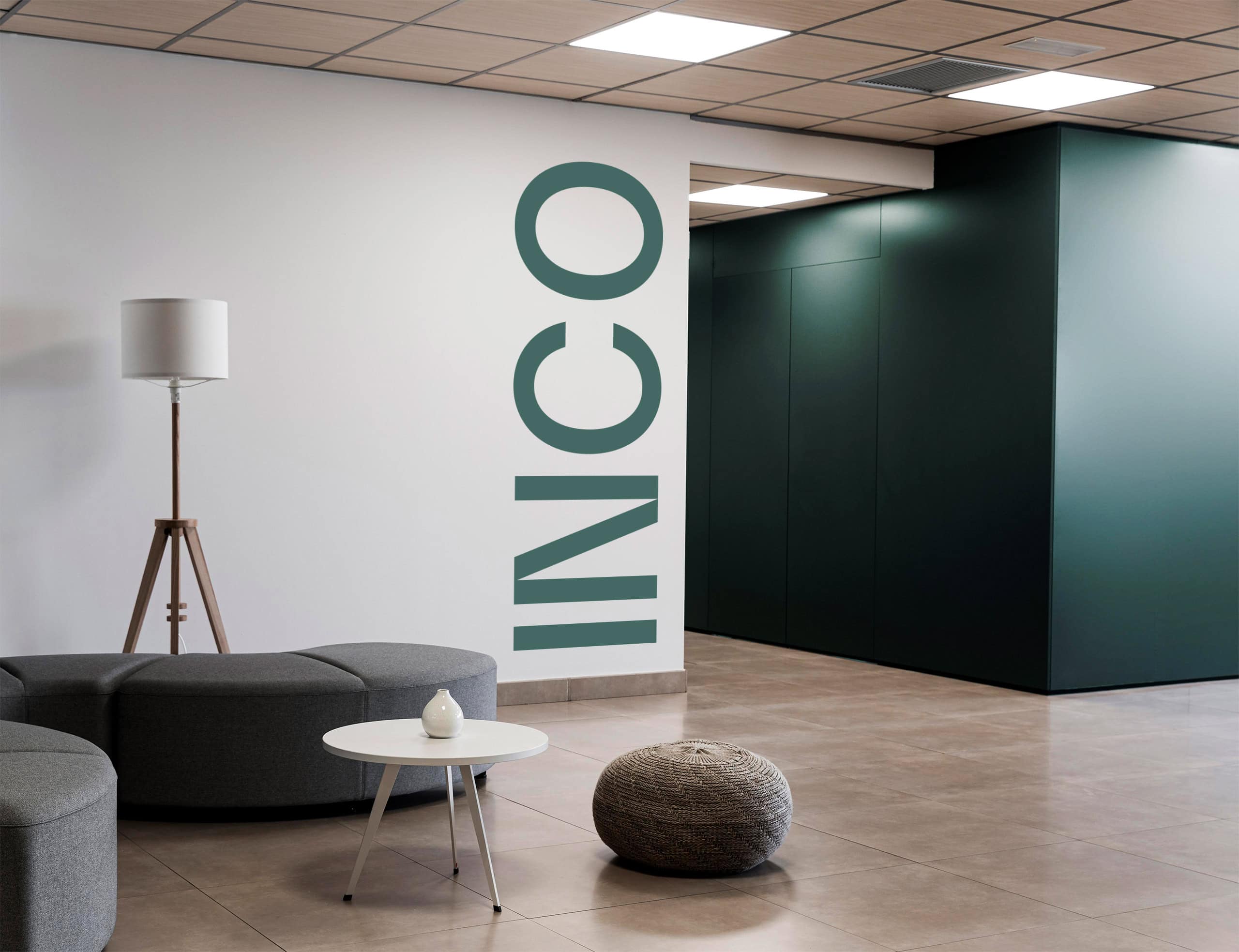
The new logotype is sharp, structured, and unapologetically modern – a geometric sans-serif built to project clarity, confidence, and control. Its form reflects a careful balance of structure and simplicity, capturing the efficiency and precision that define INCO’s approach to broking.
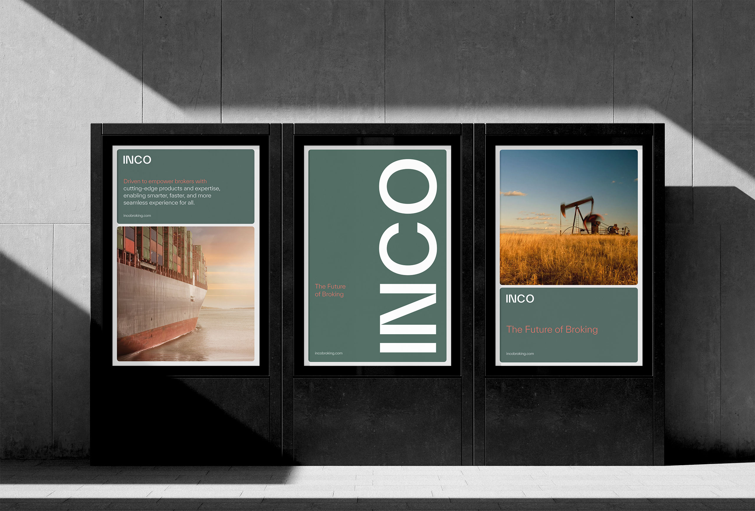
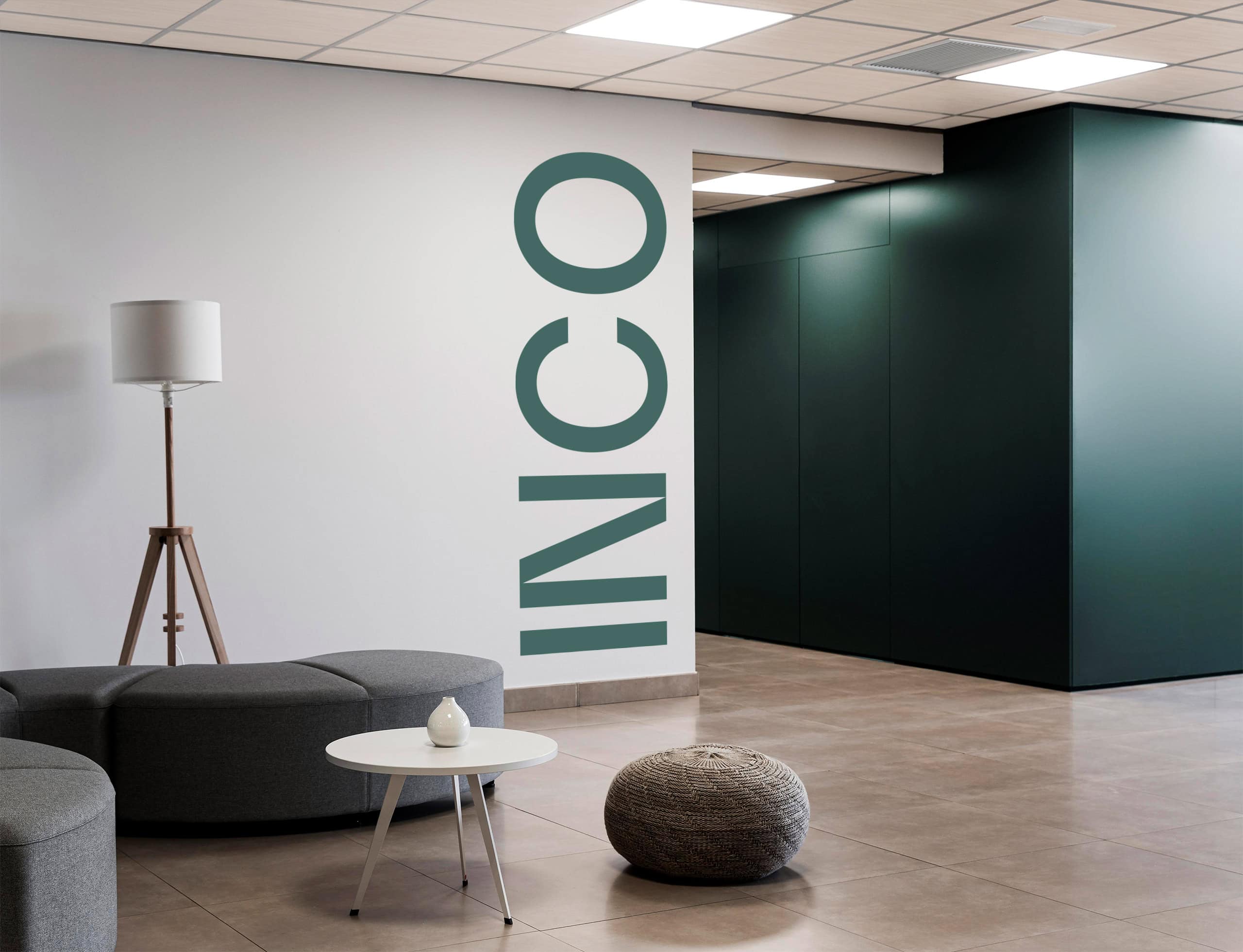
The vertical lock-up, bold, minimal, and unconventional – pushes the identity forward, creating a striking sense of momentum and upward motion. It’s a subtle nod to INCO’s progressive mindset and growing influence in the sector.


Brand Colour Palette
The INCO colour palette sets a new tone for the wholesale insurance space – confident, distinctive, and unmistakably modern. At its core is a signature sage green: a cool, industrial slate that communicates depth, resilience, and enduring expertise. Where others default to corporate blue, INCO carves out its own space – signalling trust without conformity.
This is complemented by a crisp white that brings clarity and lightness, and a warm coral accent that adds energy and momentum in all the right places. Used sparingly, the coral draws focus without overwhelming, creating contrast and forward motion.
White space is treated as a design element in itself – reinforcing simplicity, digital-first thinking, and a sense of ease. Together, the palette is bold in its restraint and unique in its composition – crafted to cut through the noise, stay memorable, and embody INCO’s distinct position in the market.

Project Deliverables
Brand Workshop
Research & Brand Strategy
Brand Positioning
Brand Identity
Logo Design
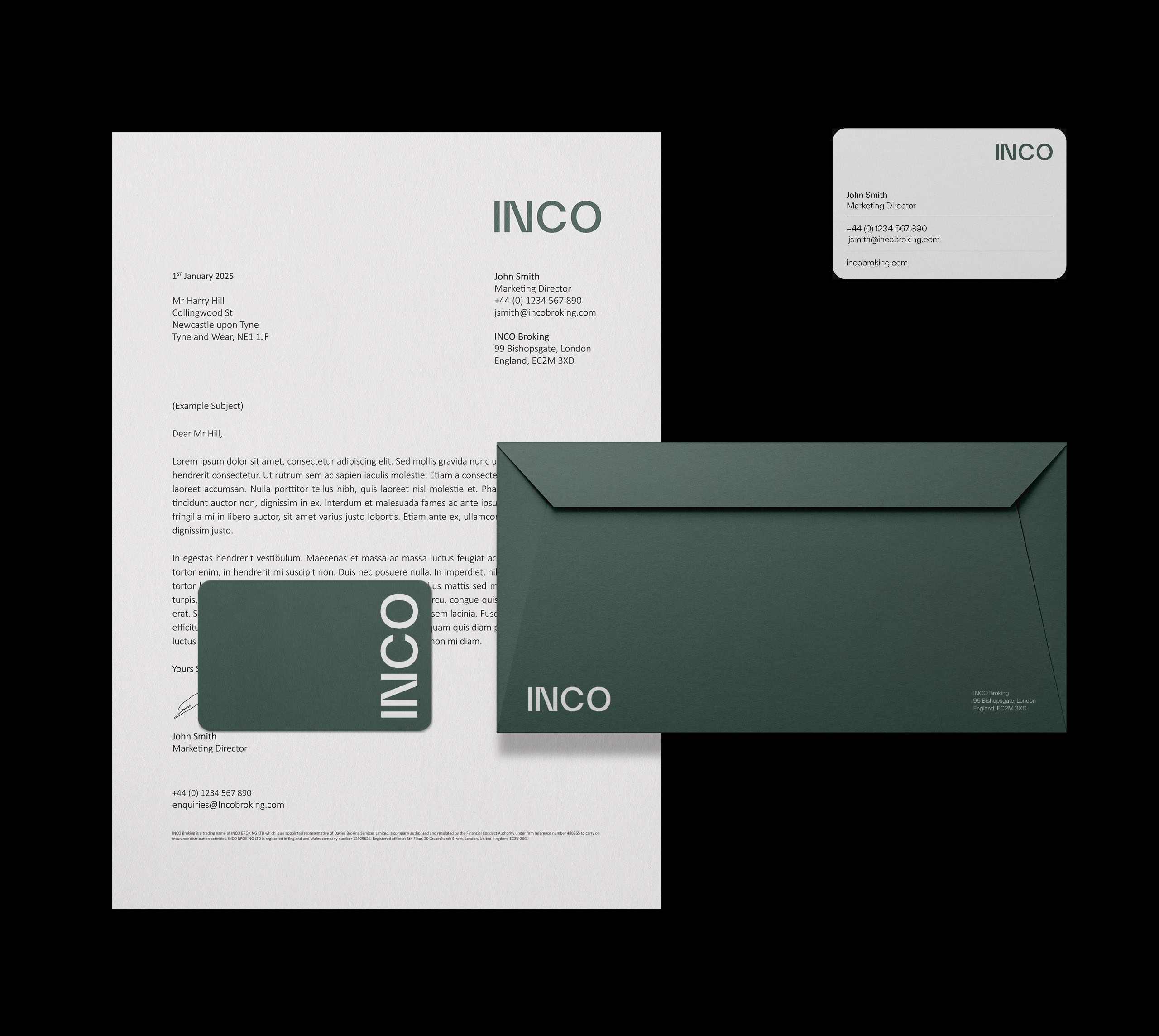
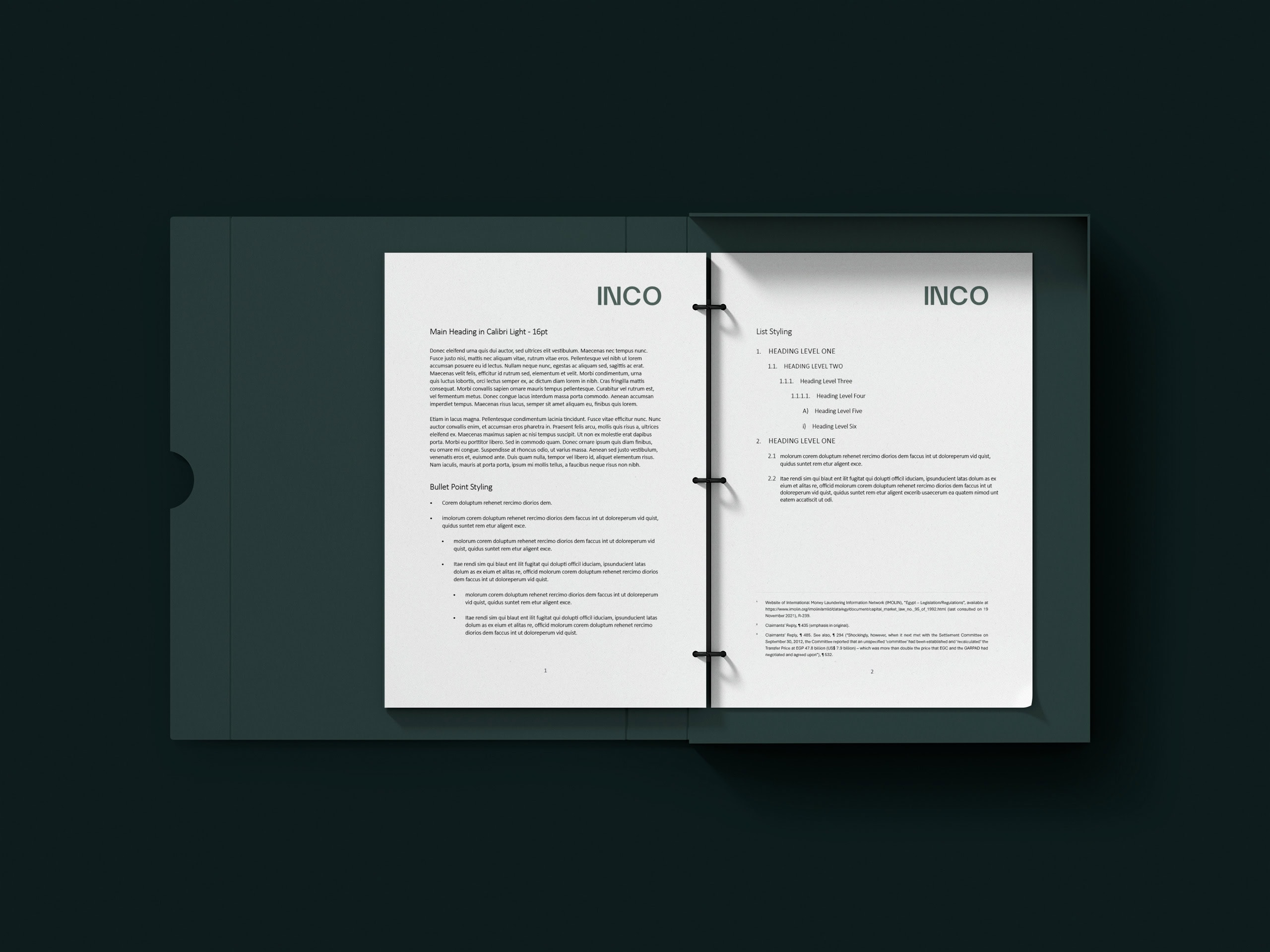
Corporate Stationery Design
Copy Writing
Website Design & Development
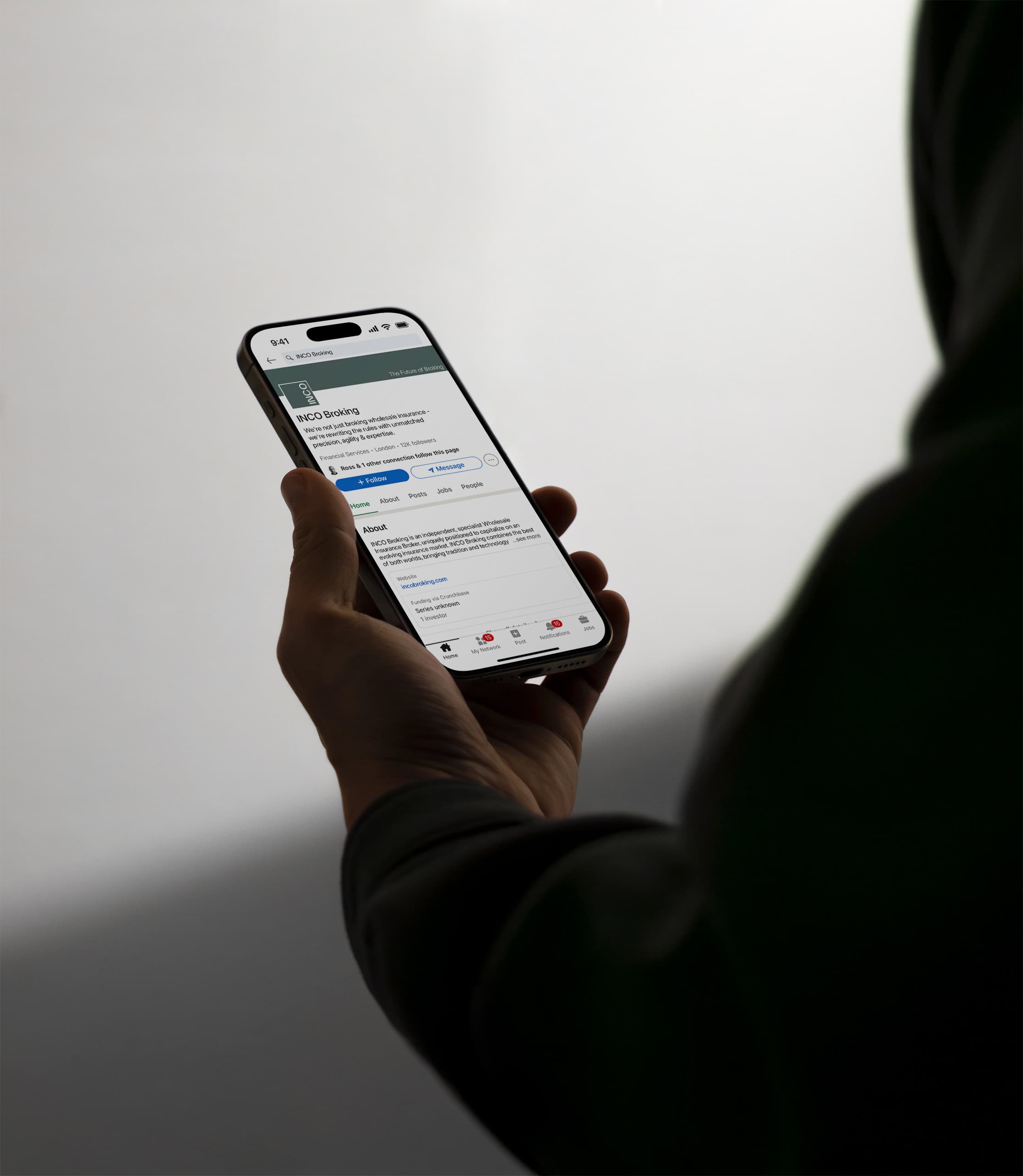
Social Media Page Design
Creative Consultancy & Project Management
Verbal Identity
INCO’s tone of voice is clear, concise, and purpose-driven – designed to make complex ideas simple. It avoids jargon, unnecessary detail, and overstatement, favouring direct language that gets to the point with confidence and ease.
Every message is crafted to be easily understood, while still conveying depth and expertise. The tone is professional and intelligent, but always accessible.
It reflects INCO’s core strength – making the complicated feel effortless and reinforces the brand’s promise of delivering clarity, speed, and results in an industry often defined by complexity.
Brand Consistency
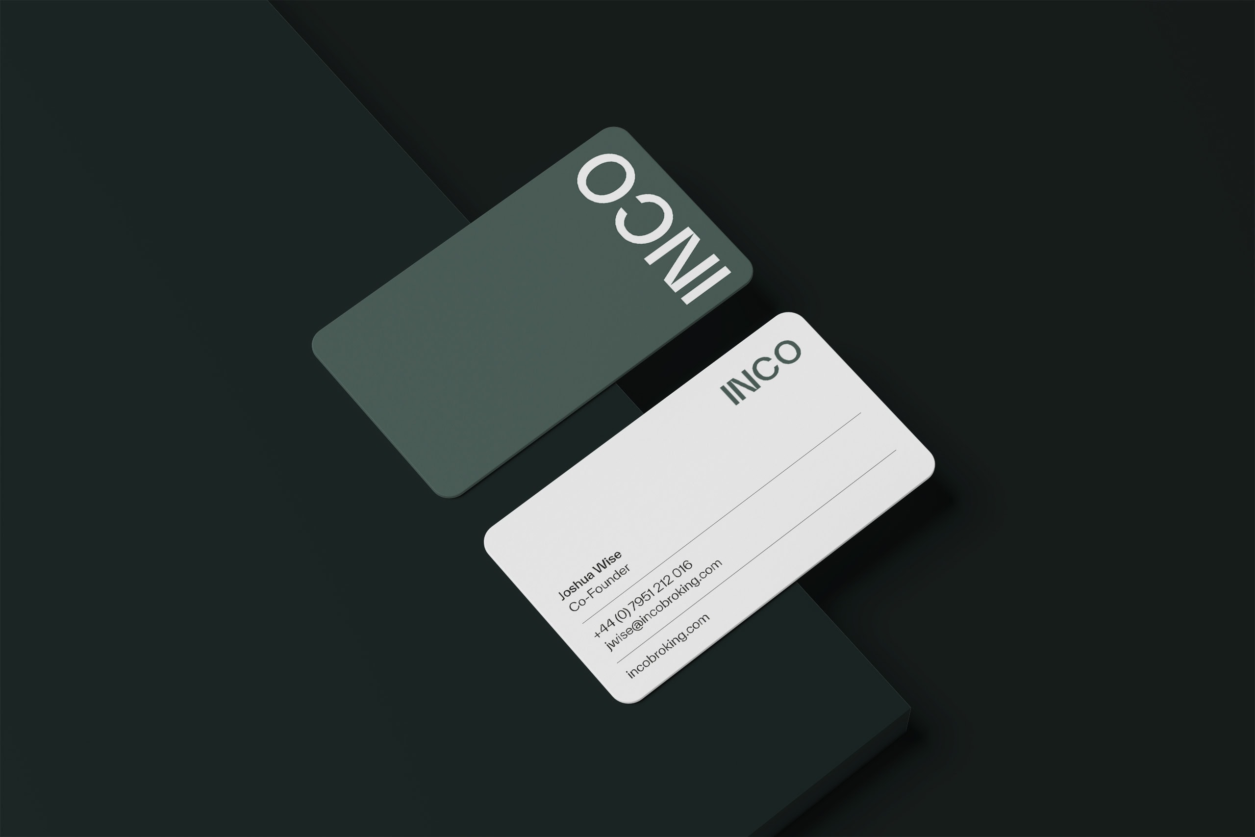
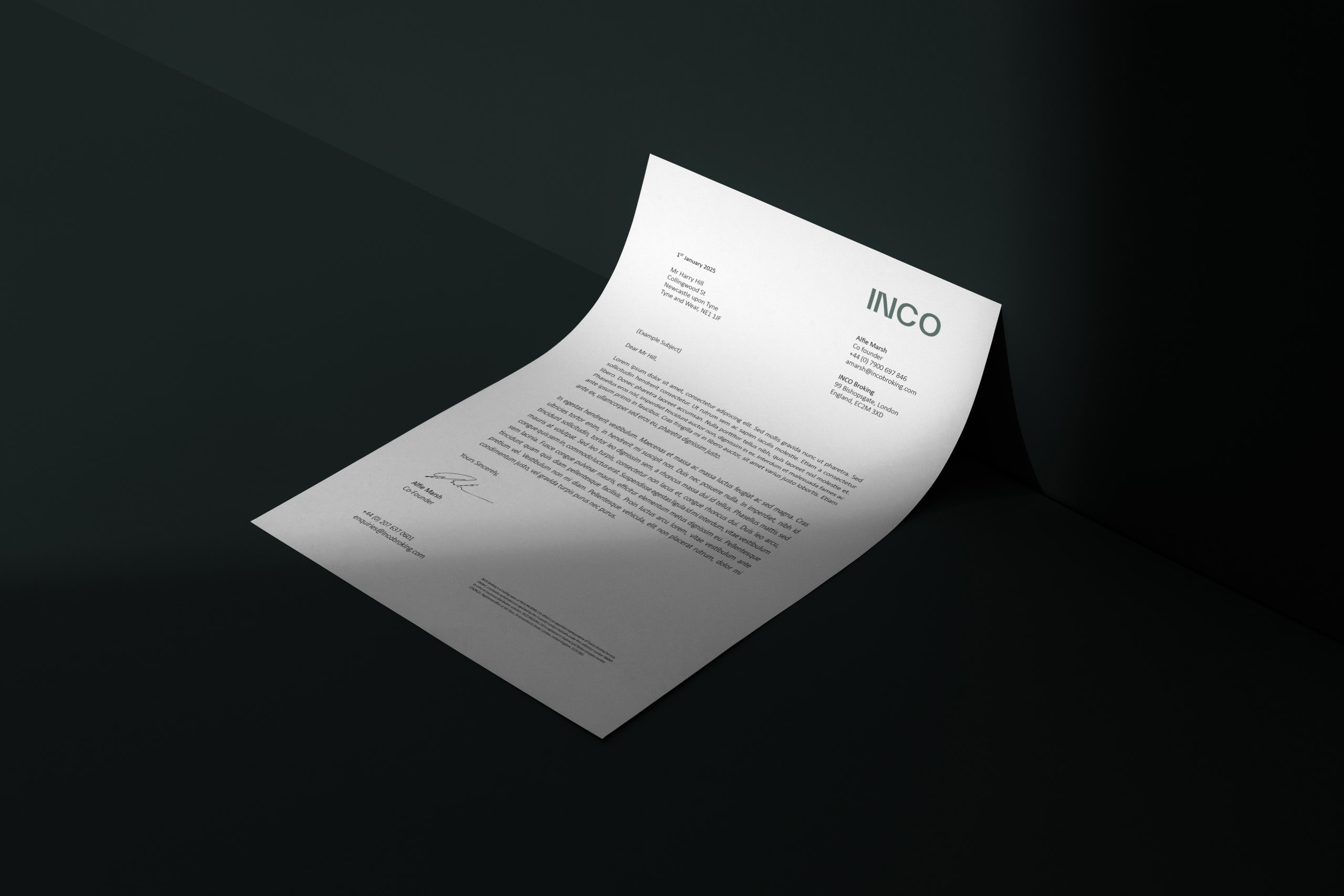
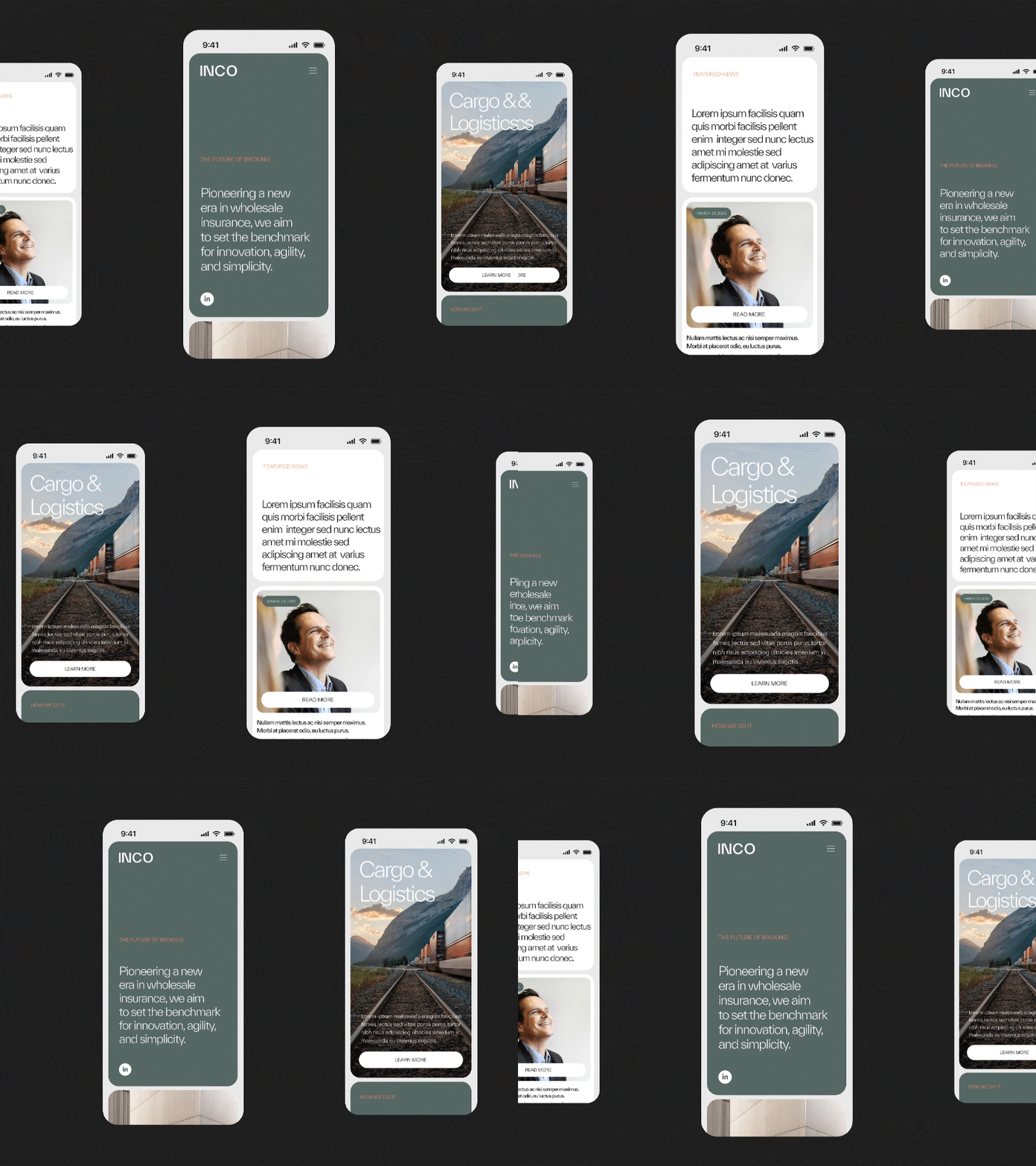
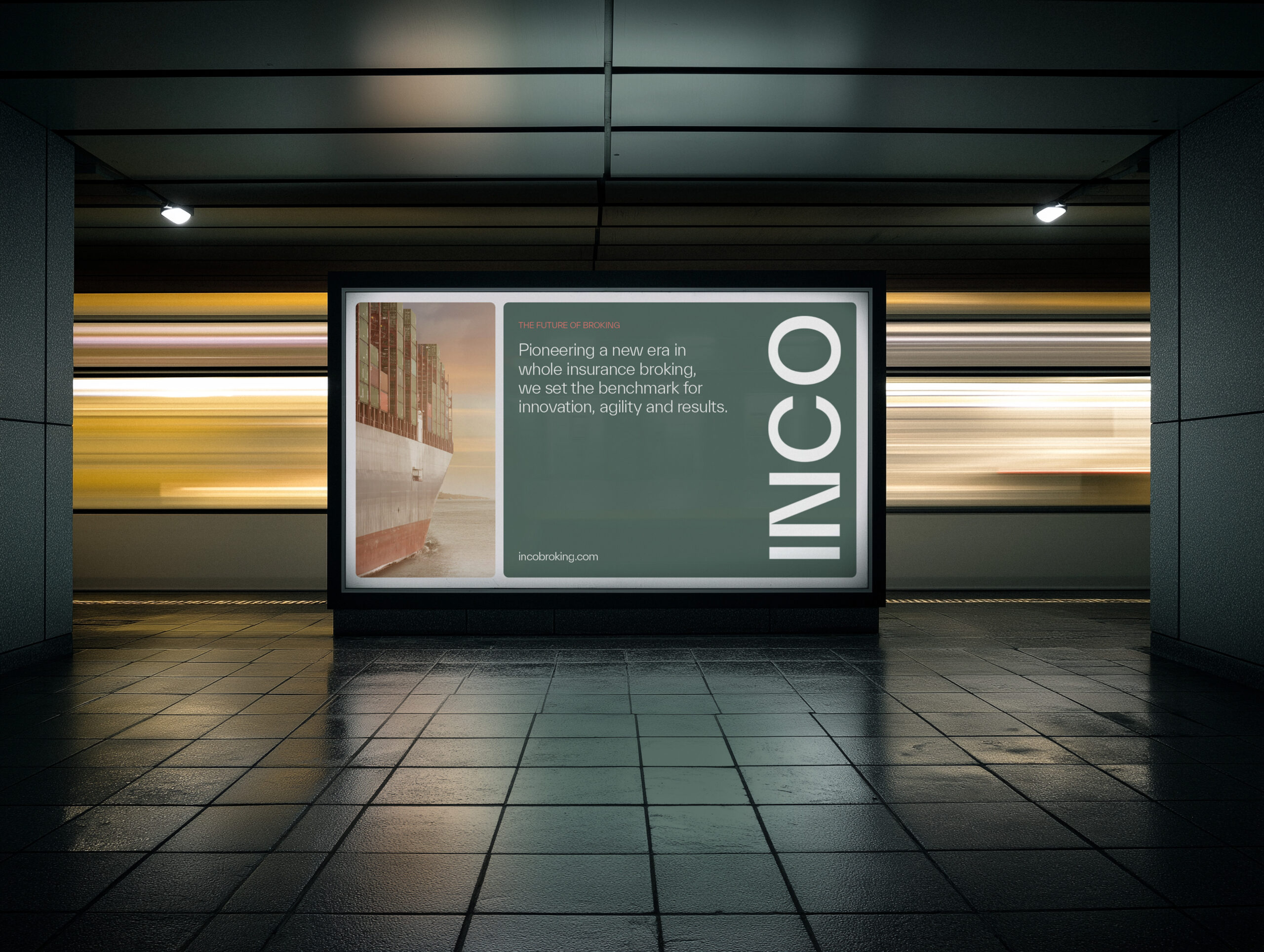
INCO’s brand is executed with precision and consistency across every touchpoint. From print to digital, internal tools to external campaigns, the identity is applied with a clear visual and tonal discipline that reinforces the core values of clarity, trust, and performance.
Every element – from layout and typography to colour and messaging feels considered and cohesive, ensuring the brand remains instantly recognisable and impactful in any context. Whether experienced on screen, in print, or in the built environment, the INCO brand communicates with the same confidence, simplicity, and intelligence that define the business itself.
The Online Experience
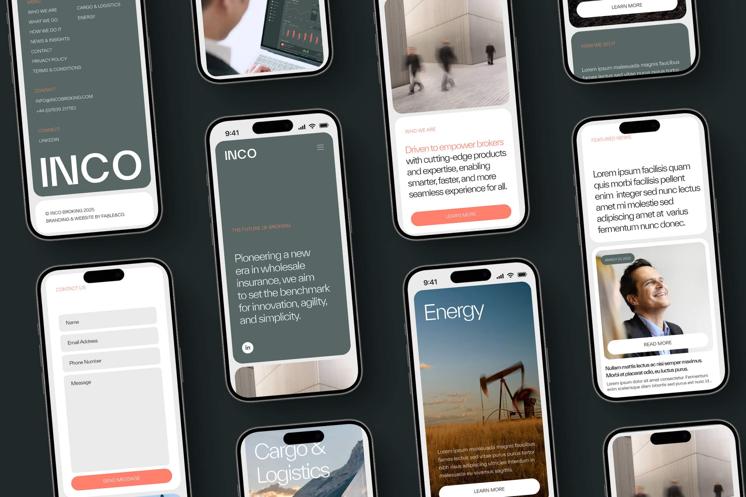
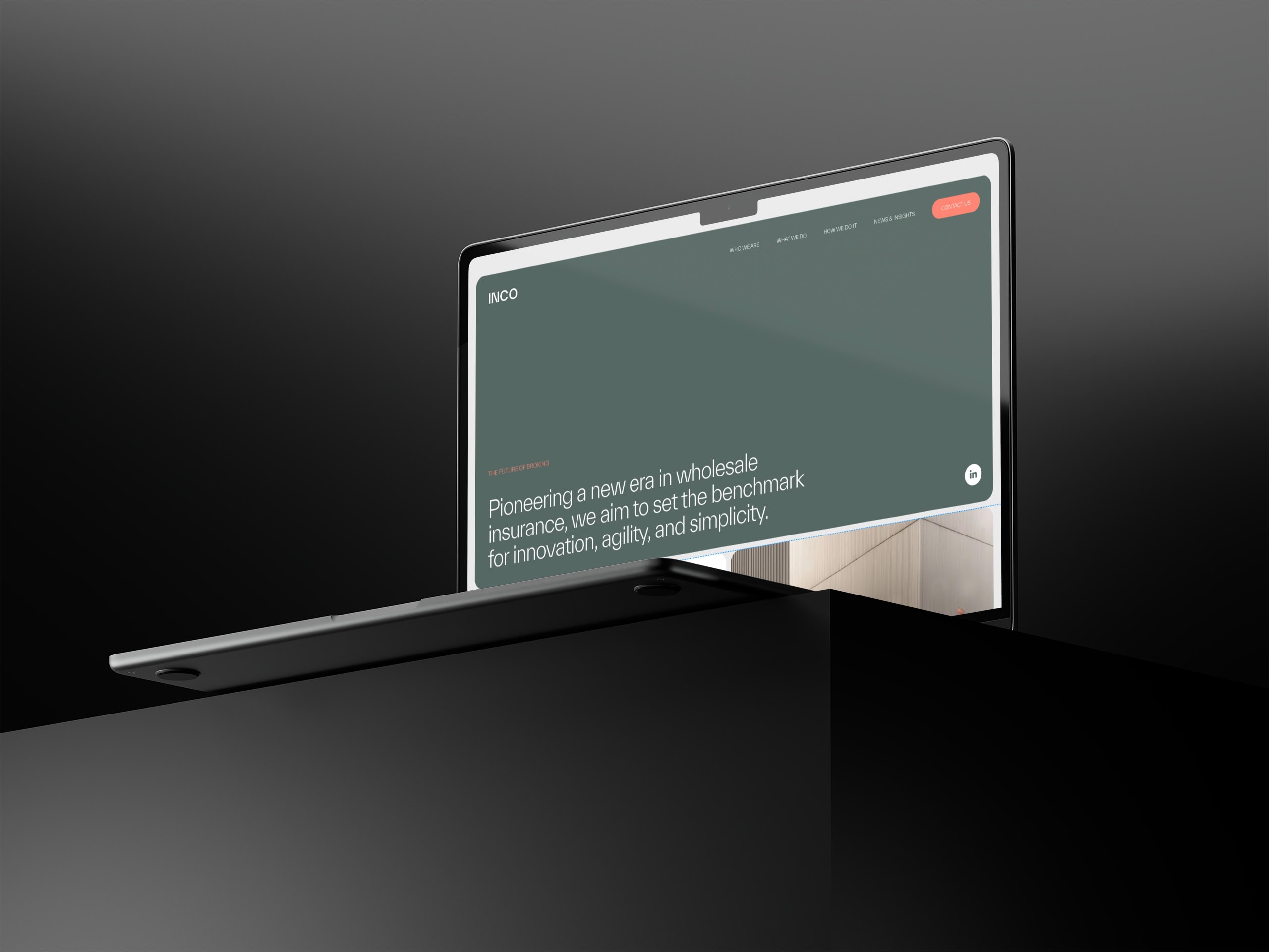
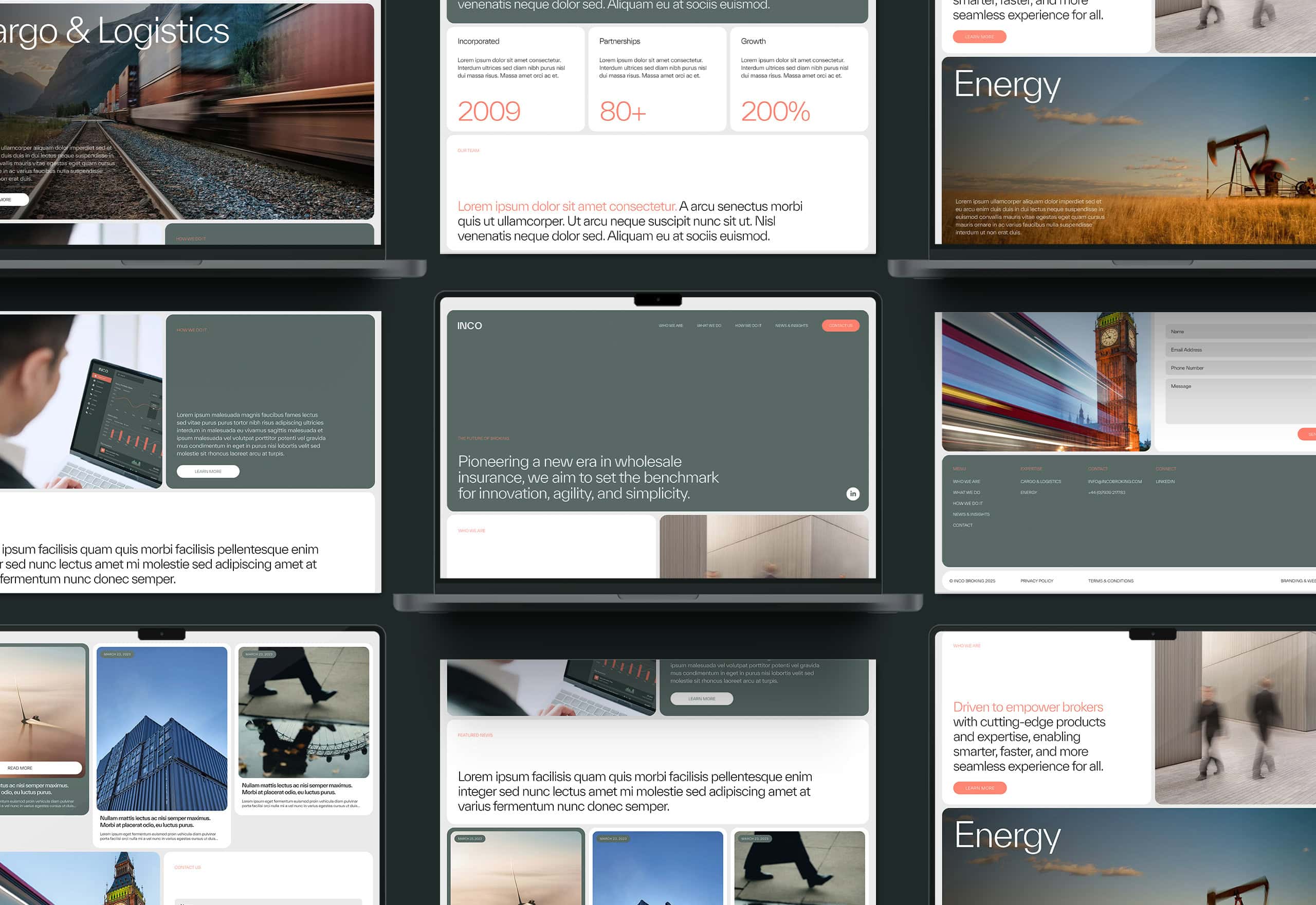
The INCO website is designed to be as seamless and intelligent as the service it represents. Every element of the experience is built to reflect INCO’s core strengths – clarity, speed, and precision, with a layout that’s clean, confident, and easy to navigate.
The structure is built on a modular grid, with generous white space that lets the content breathe and keeps the focus where it matters. Navigation is simple and intuitive, with a fixed top menu and subtle interactions that guide the user without distraction. A clear hierarchy leads visitors through INCO’s story – who they are, what they do, and how they do it – making complex services feel accessible and easy to understand.
Interactive elements are integrated naturally into the experience, making it easy for users to connect, explore, and take the next step. Whether browsing on desktop or mobile, the journey feels fast, focused, and frictionless – crafted to reinforce INCO’s expertise, transparency, and results-driven mindset.
Brand Differentiation
The new INCO brand cuts through the noise of a traditionally conservative industry with a presence that is clear, confident, and unmistakably modern. It doesn’t rely on disruption for its own sake, but instead redefines the category through clarity, precision, and a forward-thinking digital approach.
Fable&Co.’s work empowers INCO to articulate its proprietary technology advantage, position itself as a next-generation broker rooted in legacy expertise, and create deeper, more meaningful engagement with clients and partners across every touchpoint.

“Leading with clarity, confidence, and innovation, INCO Broking represents a new standard in wholesale insurance. This is a brand built on deep expertise and a forward-looking mindset - redefining the industry through precision, technology, and trust. At Fable&Co., we were proud to help bring that vision to life, creating an identity built to evolve, to inspire, and to move the industry forward.”
