Renewable Energy Branding & Website
Tion Renewables
Overview
Strategically motivated ambitions ignited the decision for Pacifico Renewables to evolve from a renewables native into the energy transition company of tomorrow – sparking significant new opportunities for investors.
Shifting their focus beyond purely solar & wind projects they set their sights on a wider & more diverse spectrum of global opportunities on offer, as the worlds electricity system seeks to decarbonise.
Strategic Brand Naming & Messaging
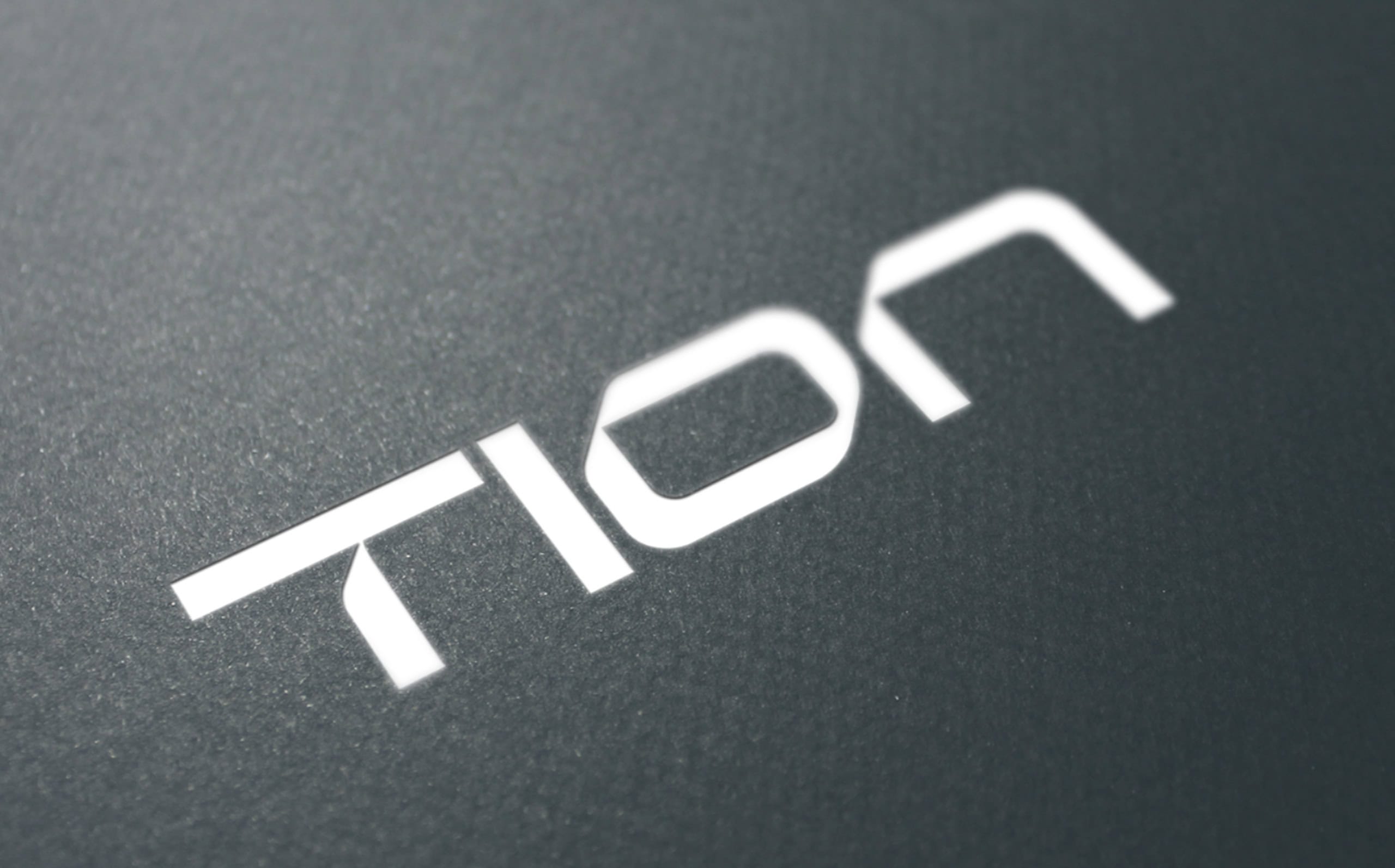
A new brand name was imperative to better reflect their new proposition & positioning. Following multiple naming workshops, the client made the decision to embrace the name ‘Tion’ – representing their lofty ambitions & future aspirations.
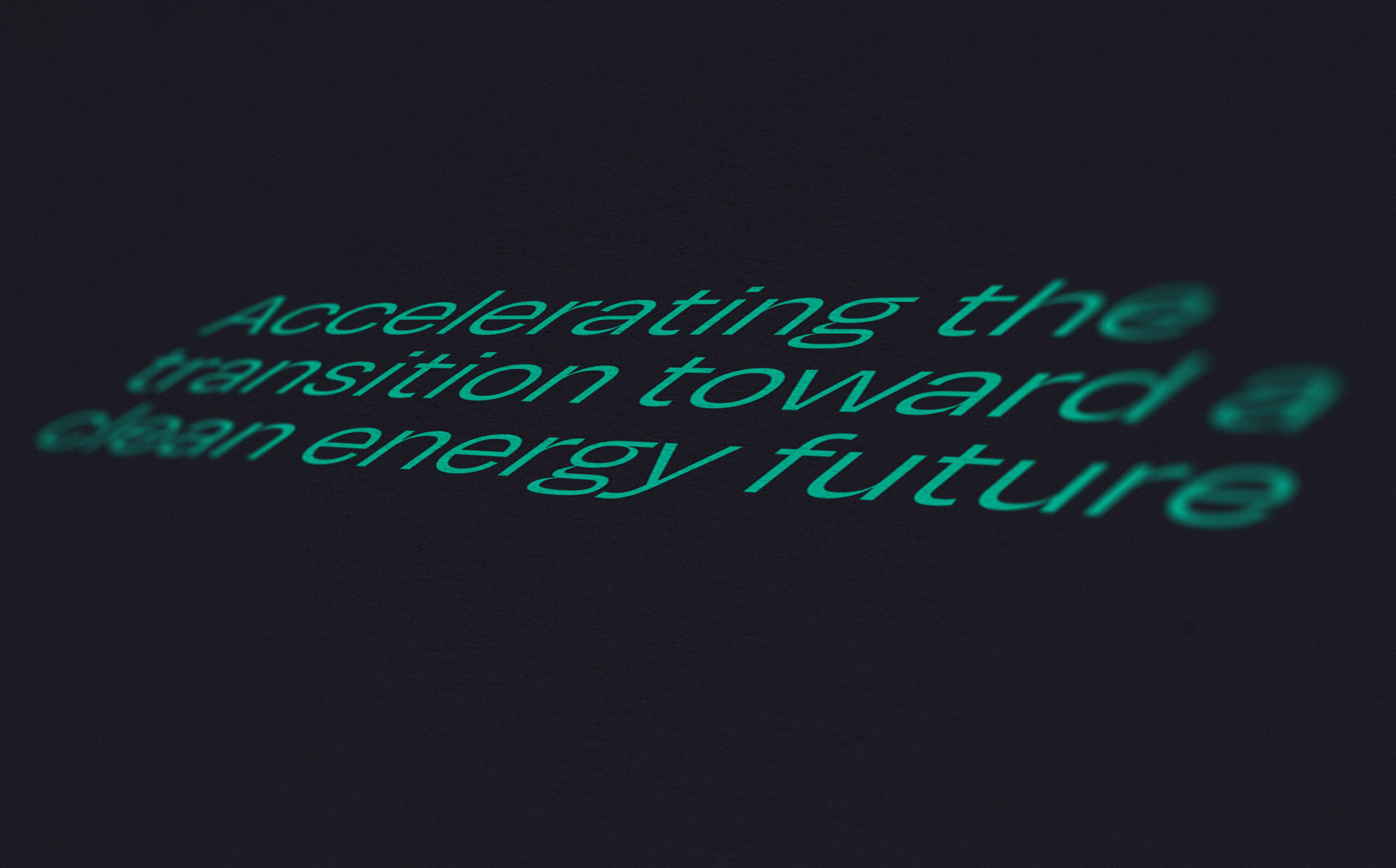
The suffix ‘-tion’ composes the last four letters of “transition”, whilst commonly found in nouns of action such as “acceleration”, “innovation” & “motion”. ‘Tion’ is memorable, modern & dynamic, & perfectly captured their progressive nature & agile approach, along with their purpose & virtues as a brand.The new brand mission statement, ‘Accelerating the transition toward a clean energy future’, is used front & centre throughout branded communications to clearly articulate the brands noble ambitions & objectives.
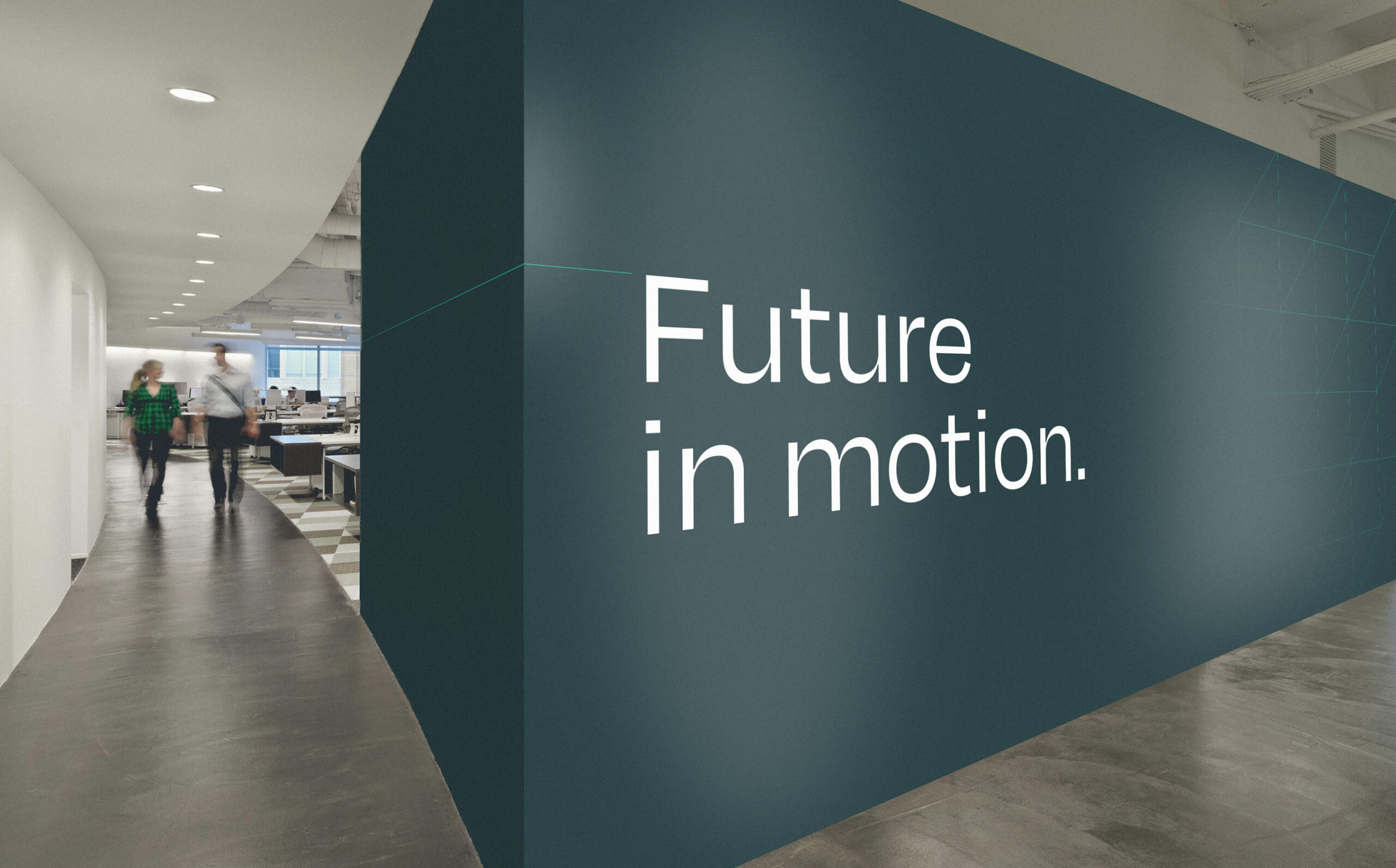
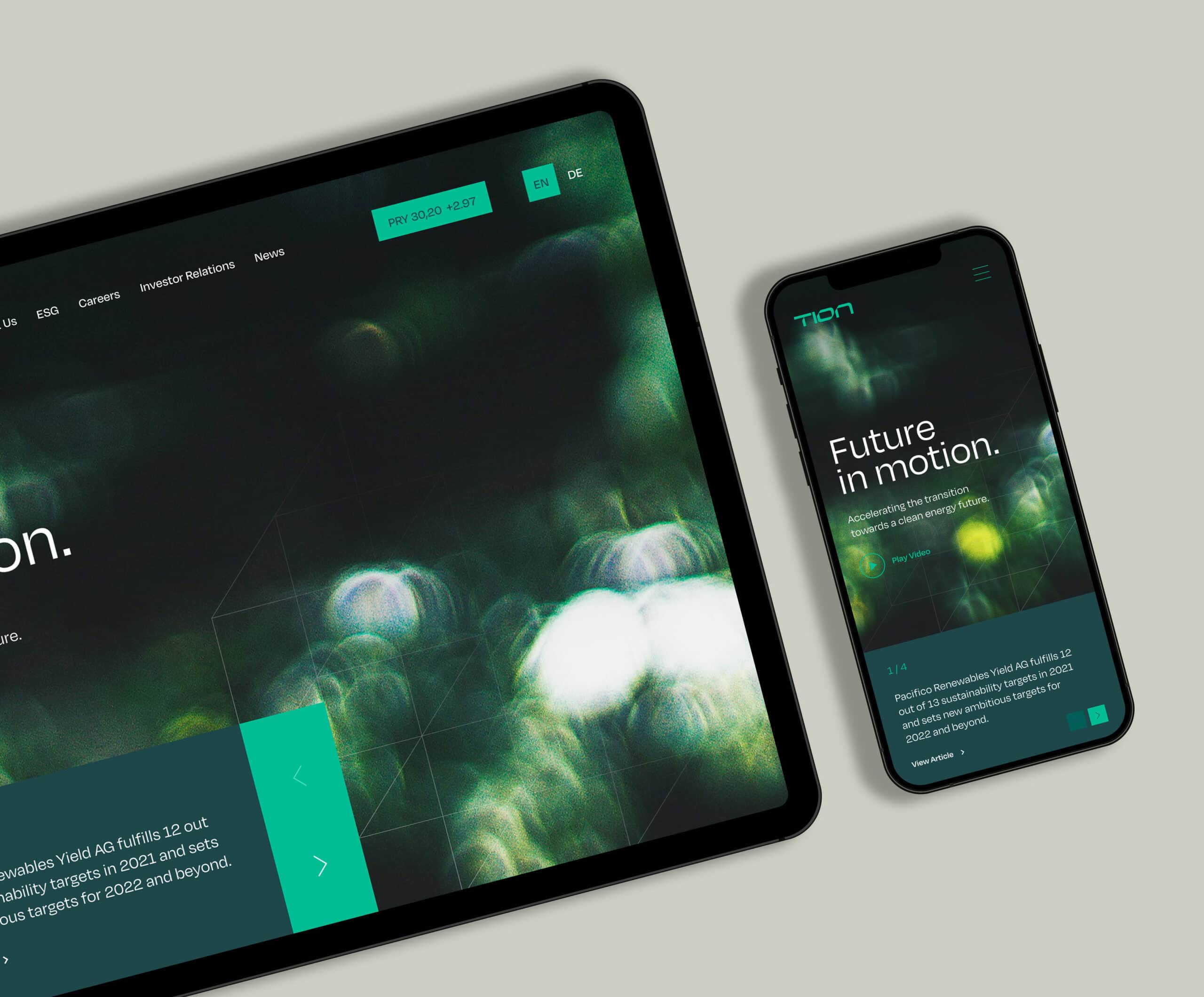
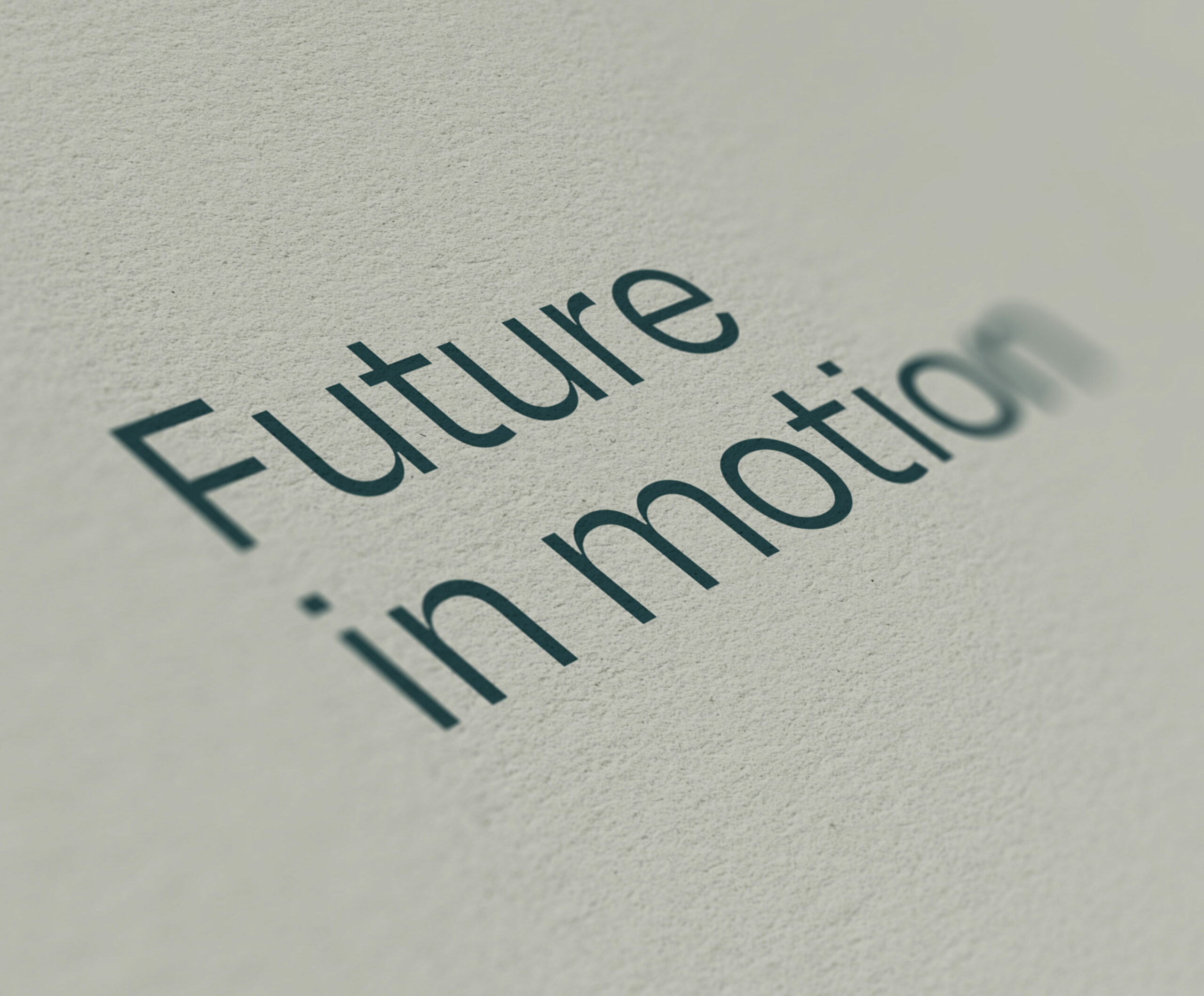
A shortened version of this mission statement was crafted – ‘Future in motion’. This emotive yet succinct new tagline balances a positive, inspirational & motivational sentiment throughout the brand messaging.
Visual Identity
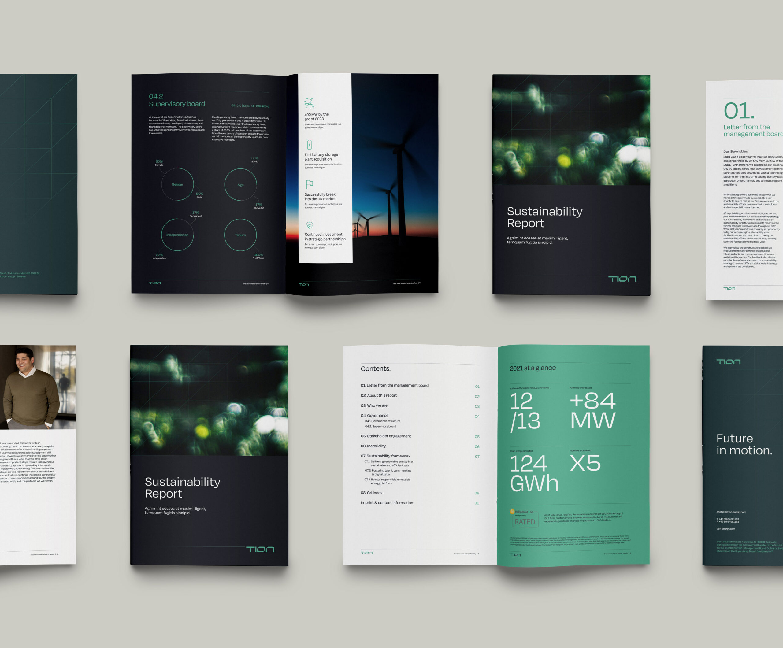
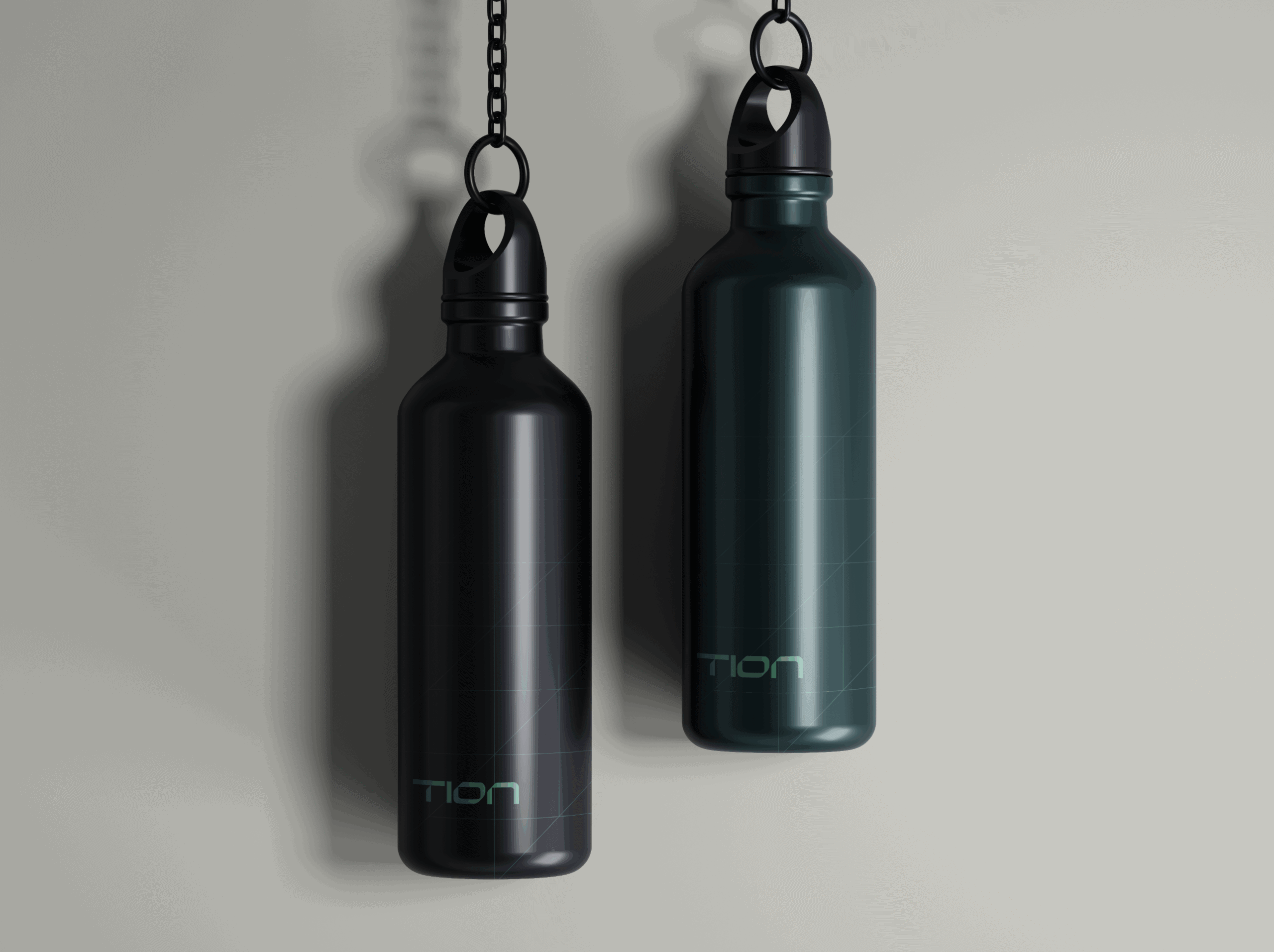
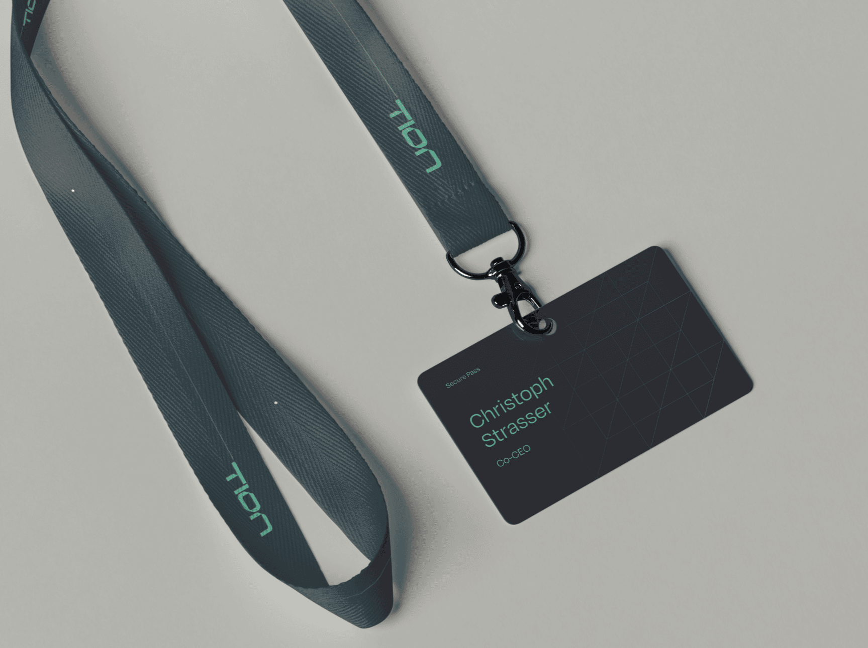
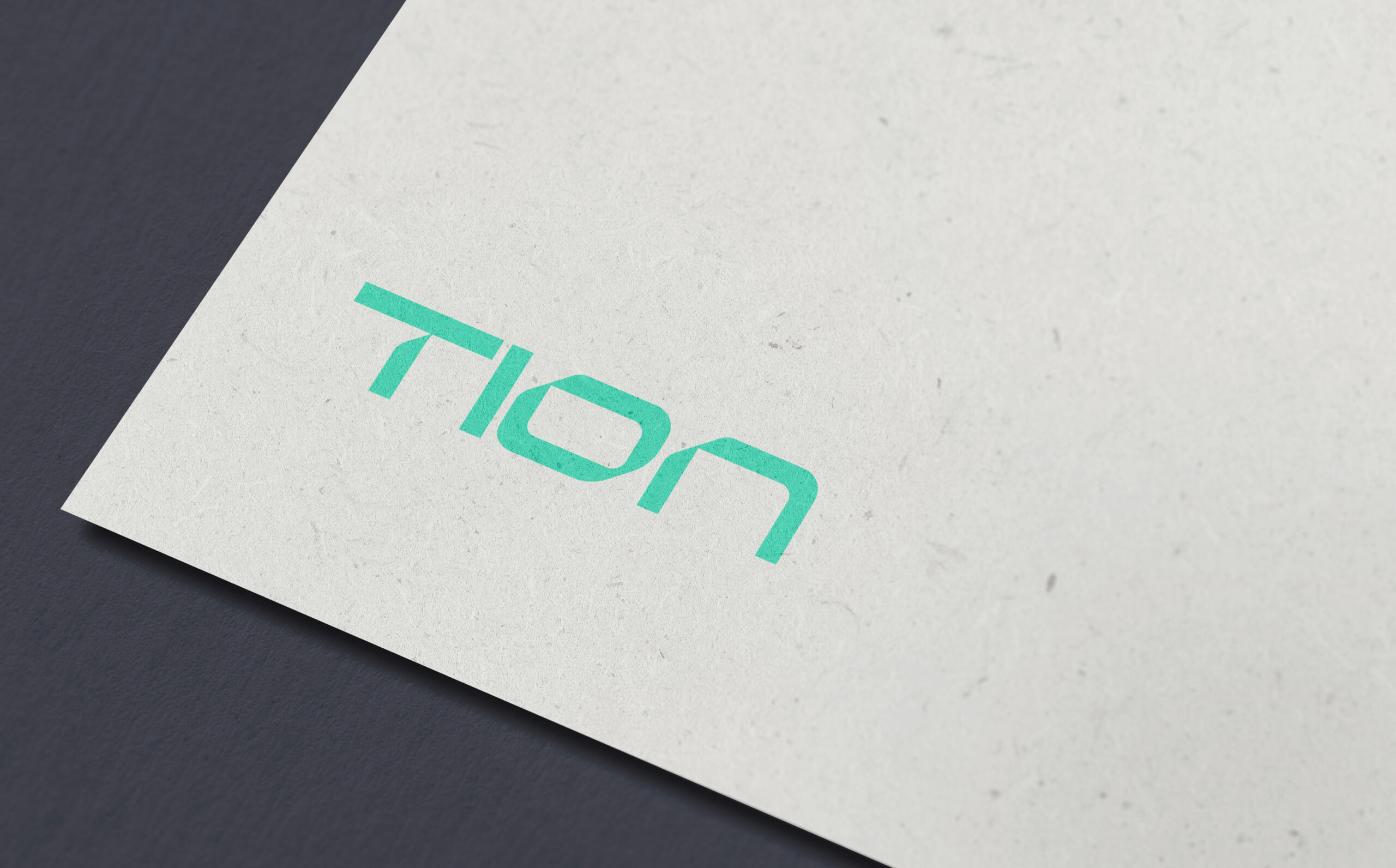
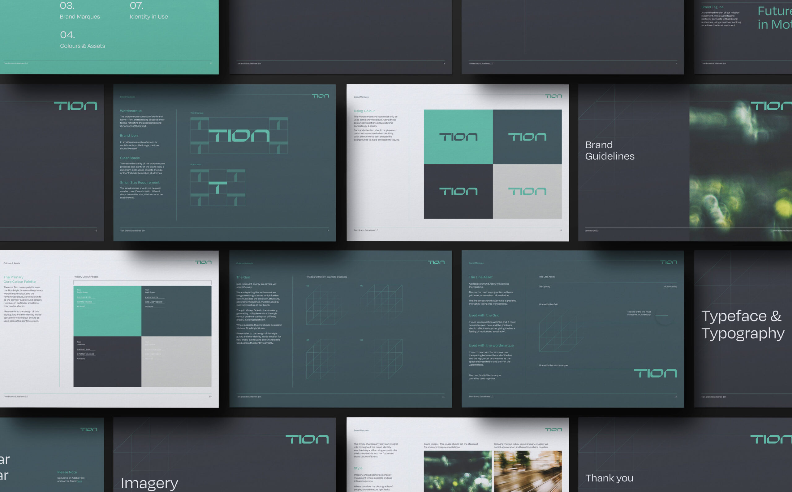
The visual identity was created to represent Tion Renewables as a highly progressive, innovative & forward thinking renewable energy company, whilst maintaining a crucial sense of quality, trust & reliability.
From the technical & confident character innate within the logo, through to the ‘ion’ inspired grid asset & motion influenced extending lines, the brand identity tells a subtle visual story of the brand mission, ‘accelerating the transition toward a clean energy future’, in a simple yet scientific way.
Depicting this narrative with precision, structure, accuracy, intelligence & innovation all found in abundance throughout the elements of the identity system.
Brand Colour Palette
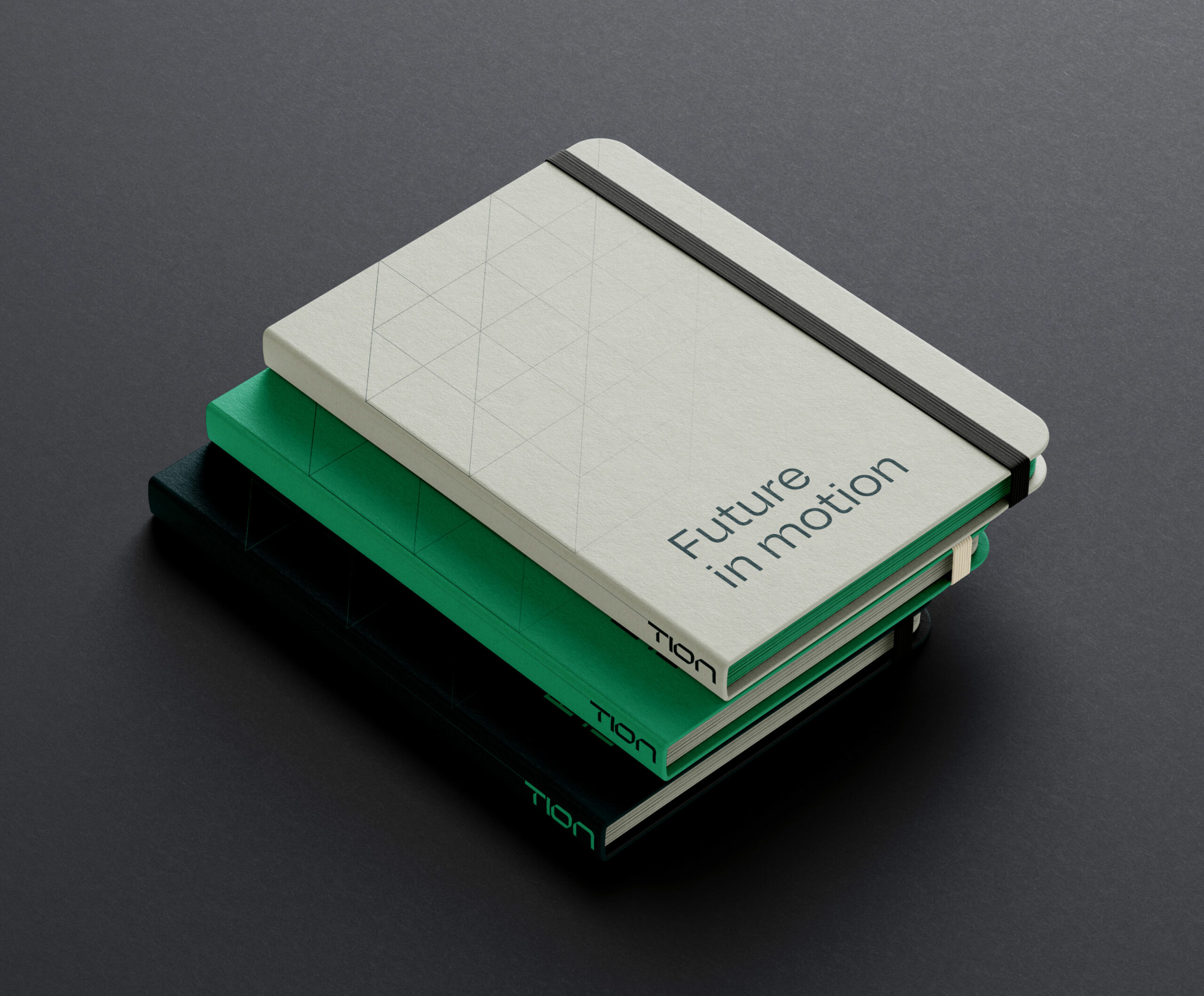
The brand colour palette has been curated to ensure that we communicate a careful balance between corporate financial professionalism & the progressive energy transition investment company of tomorrow.
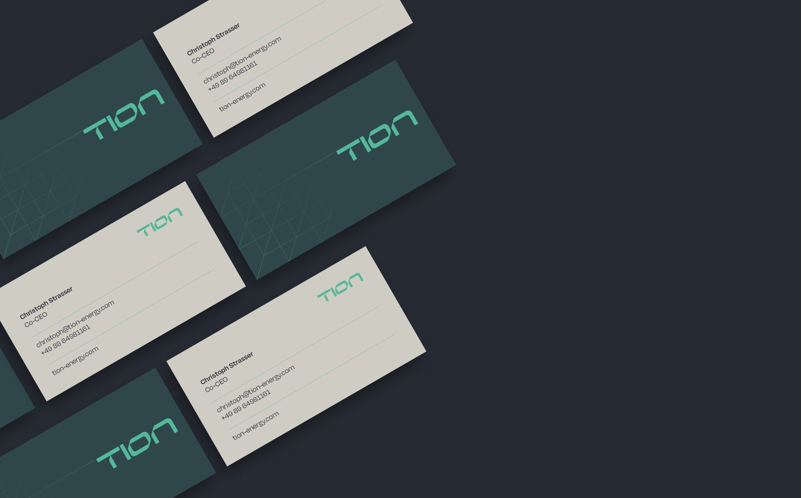
A light stone colour is fundamental to the overall brand look & feel. This colour underpins the identity by communicating strength, neutrality & balance. The dark charcoal provides a stylish, sophisticated, professionalism to the identity. This offers an alternative colour option to the dark green, allowing greater versatility.
The dark greens timeless elegance & naturalistic quality adds sophistication to the identity, along with promoting a greater sense of trust & reliability. The brighter green was chosen to contrast with the darker colours. Representing green energy & a greener future. This inspiring colour promotes the feeling of new beginnings, growth & abundance.



Imagery
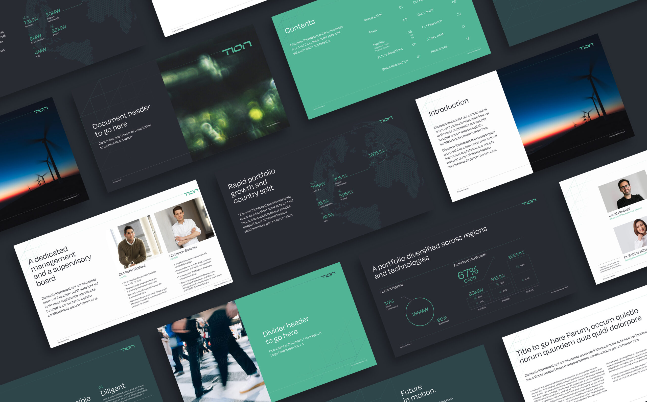
Subtle motion effects are present throughout many of the images used within the identity, further emphasising the narrative of ‘acceleration’. Imagery often shows a selection of impressive natural features & landscapes to reinforce the importance of Tion’s mission to create a cleaner more sustainable energy infrastructure.
Working alongside the curated stock photography a photoshoot was also conducted to capture the true personality & culture of the team at Tion, adding an important level of humanity & authenticity to the branding & website.
Project Deliverables
Brand Workshop
Research & Brand Strategy
Brand Positioning
Brand Identity
Logo Design
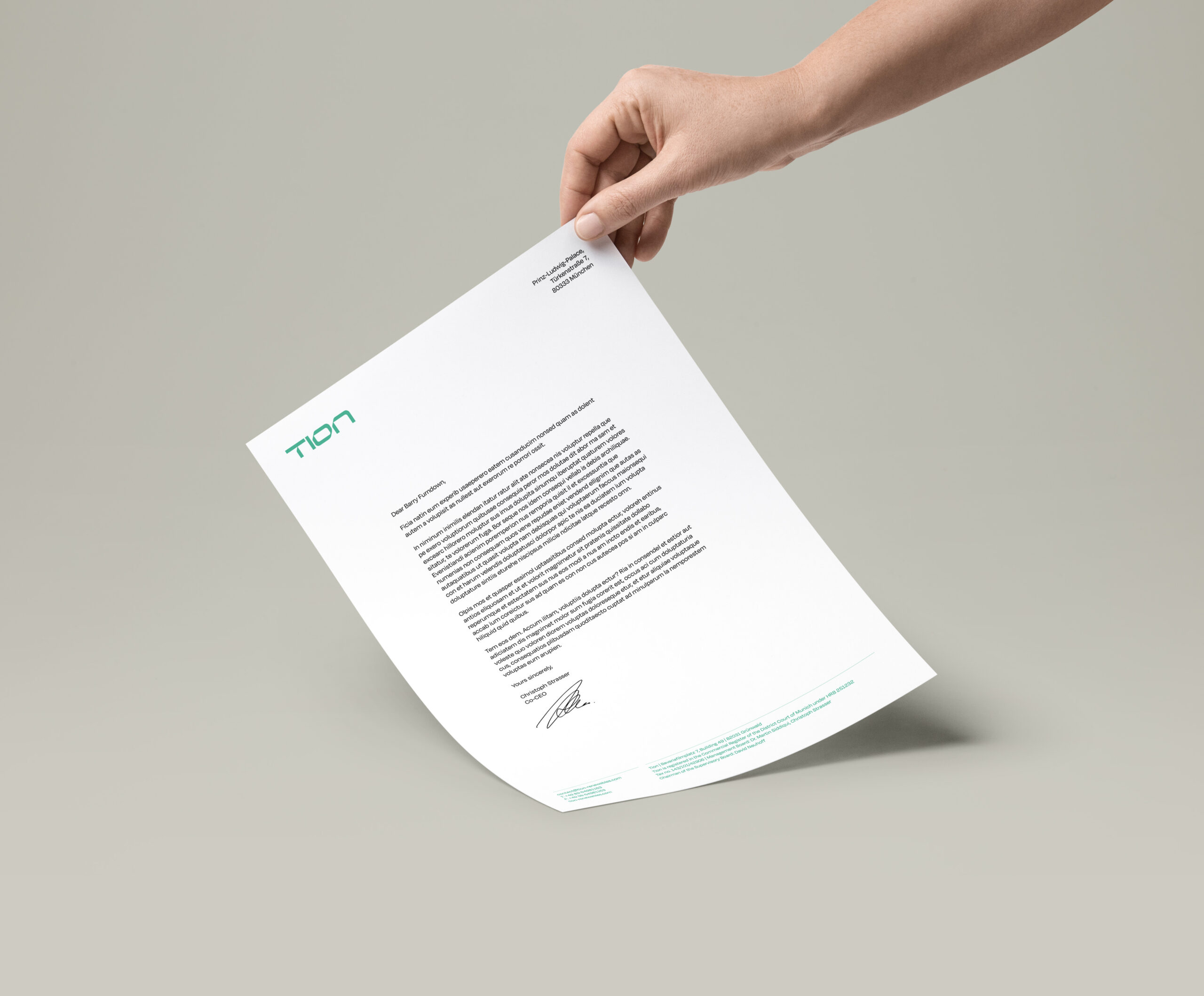
Corporate Stationery Design
Copy Writing
Website Design & Development
Social Media Page Design
Creative Consultancy & Project Management

Website Design & Development
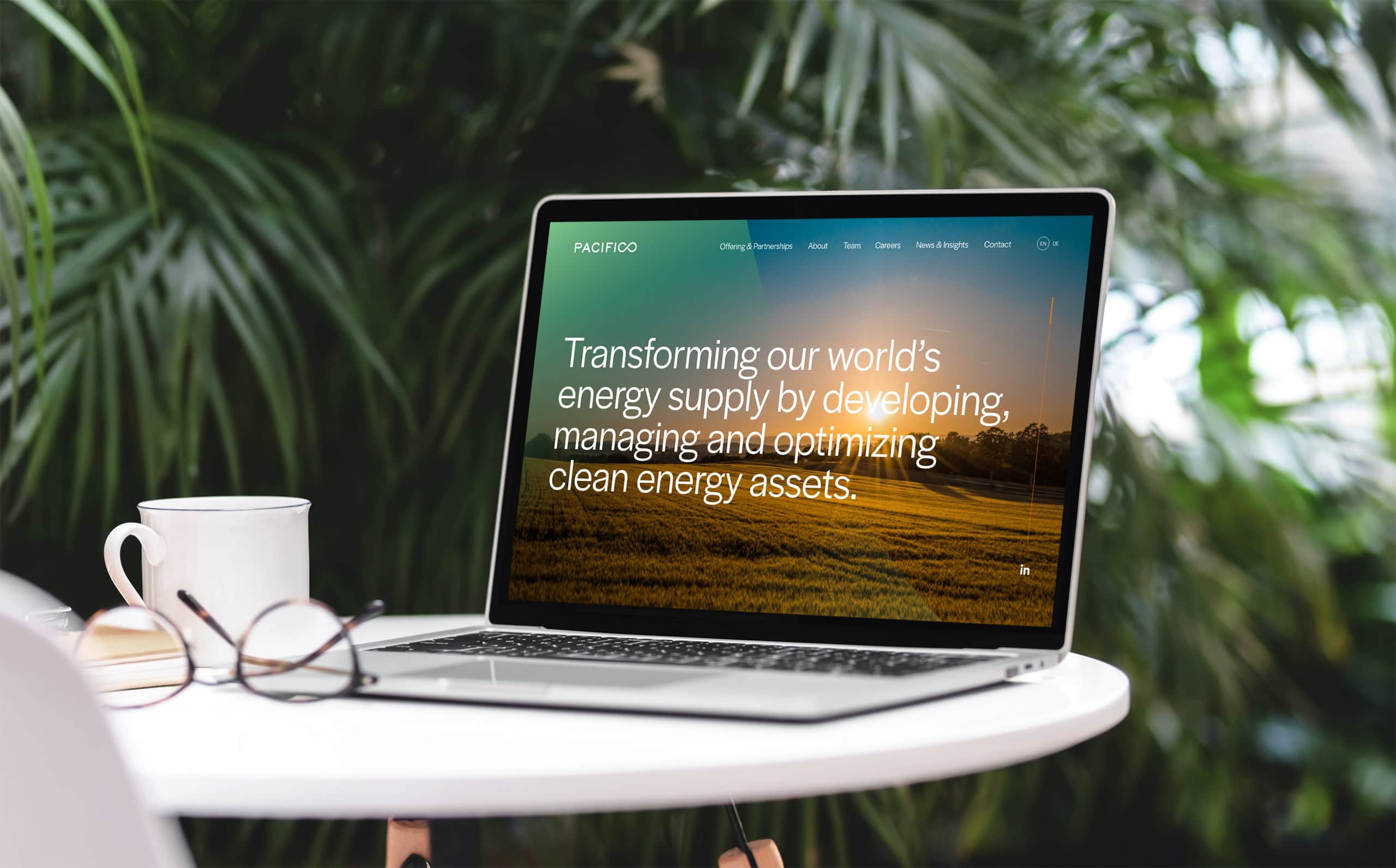
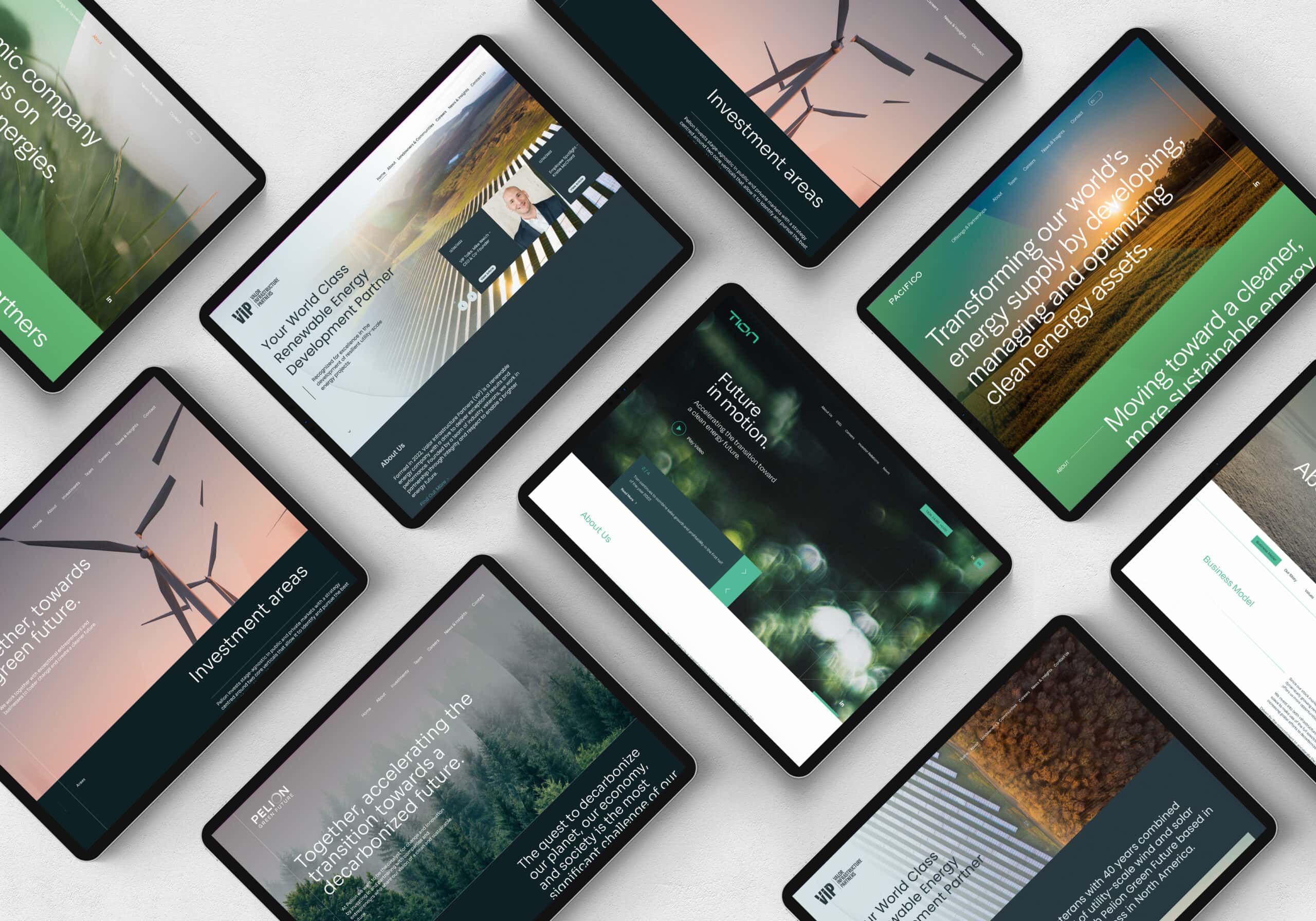
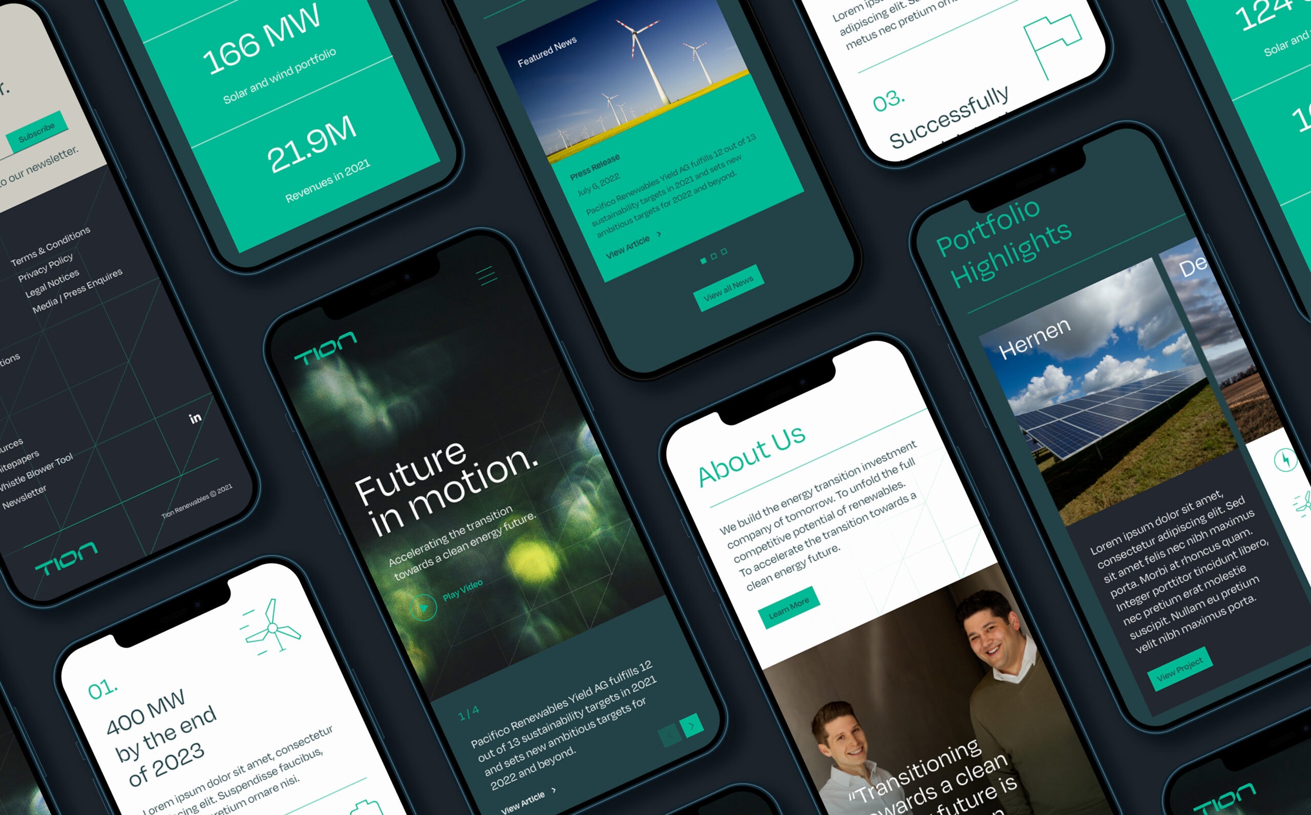
The new website would play a crucial role in promoting the brand by effectively communicating Tion’s brand mission, culture & personality. Becoming the employer of choice by attracting the brightest minds within the energy industry was fundamental to their continued growth & success.
As a publicly listed independent power producer, it was crucial that the website adhered to regulatory requirements, such as housing legacy data & reports. Integrations with real-time share information & third party HR software were also utilised to streamline business efficiencies.
It was important to strike just the right balance of practical & effective, with providing a progressive & rewarding user experience. This was achieved through the use of subtle line animations & on-page transitions that created an engaging experience, whilst thought-provoking statistics & statements reinforce Tion’s experience & credibility.



Brand Video
Video offered a dynamic and emotive platform to engage Tion’s diverse audiences. By combining key messaging, impactful statistics, striking visuals, and a compelling soundtrack, we created a powerful launch piece designed to captivate and inspire. Deployed across the website, media outlets, and social channels, the video became a central asset in a multi-channel PR campaign – driving awareness and positioning Tion as a brand to watch.
In Summary
Working alongside the dedicated & highly professional team at Tion has been a real pleasure. Without this level of teamwork & collaboration we would not have managed to achieve these results. We are tremendously proud of the role that we have played in this crafting this new brand identity & website.
We look forward to our continued relationship in supporting Tion as it continues on its valiant mission, leading a new era of sustainable energy.
“From start to finish, Fable&Co. were outstanding. We were taken aback by the depth of the research phases, which led to the formation of a truly unique brand strategy and messaging framework. They clearly understood our objectives and delivered our rebrand and website project with grace and poise throughout. Jack, Ross and the team have been exemplary, and as a result it’s my honour to highly recommend Fable&Co. ”

