Prominent Global Ad-Tech Brand
Technology Branding & Website Design
After meeting at Cambridge University, founders Martin Porter & John Snyder spent four years developing their unique technology before launching Grapeshot in 2002, going on to open offices in Cambridge, London, New York, Chicago, Singapore & Sydney. An intensive creative session included extensive research & strategic workshops, which enabled us to quickly comprehend the benefits of Grapeshot’s powerful technology as well as their valuable product offerings.
We discovered that by using their advanced probability algorithms, Grapeshot’s customers could effectively search for & analyse keywords on billions of webpages in real-time to reach the right audiences at the right moment. Grapeshot’s proposition is to enable brands, agencies & advertisers greater speed, scale & accuracy through Grapeshot’s advanced technology – ‘Live Context Engine’.
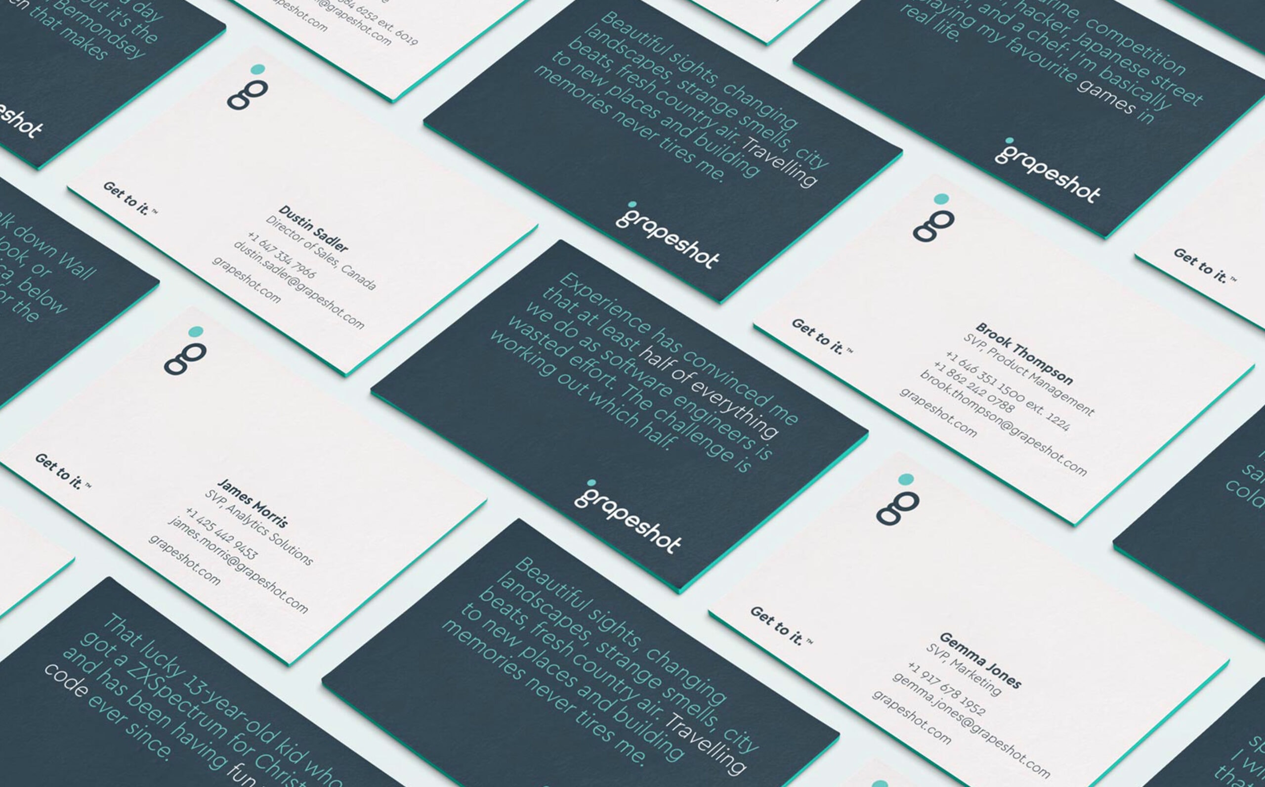
The Visual Positioning
Our research led us to explore the meaning of the word ‘grapeshot’ in more detail, learning of its origins as a type of artillery – a mass of small balls packed tightly into a canvas bag that when assemble, resembled a cluster of grapes. On firing, the balls would disperse from the muzzle. Much like Grapeshot’s technology, this type of artillery was devastatingly effective.


A Subtle Evolution
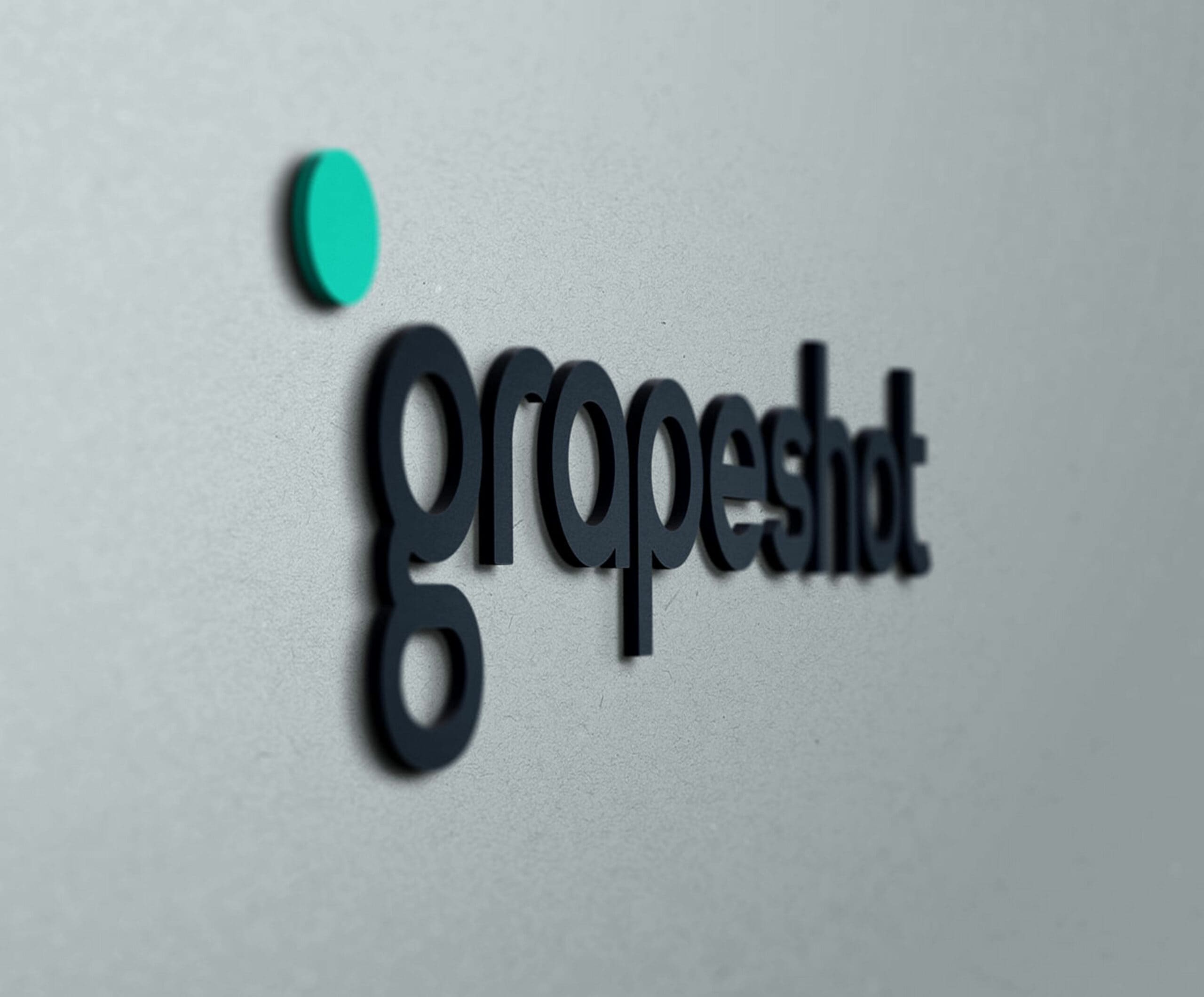
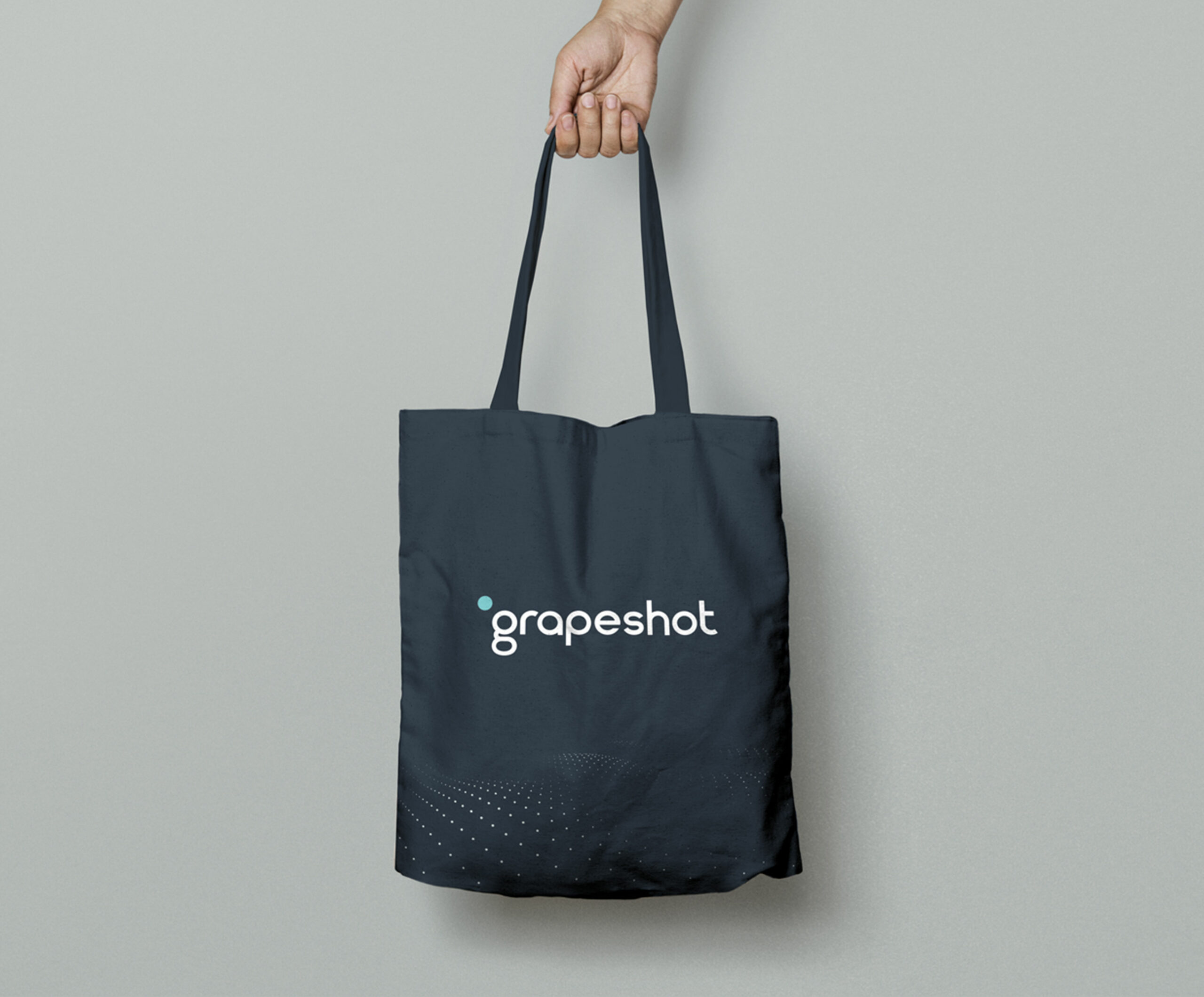
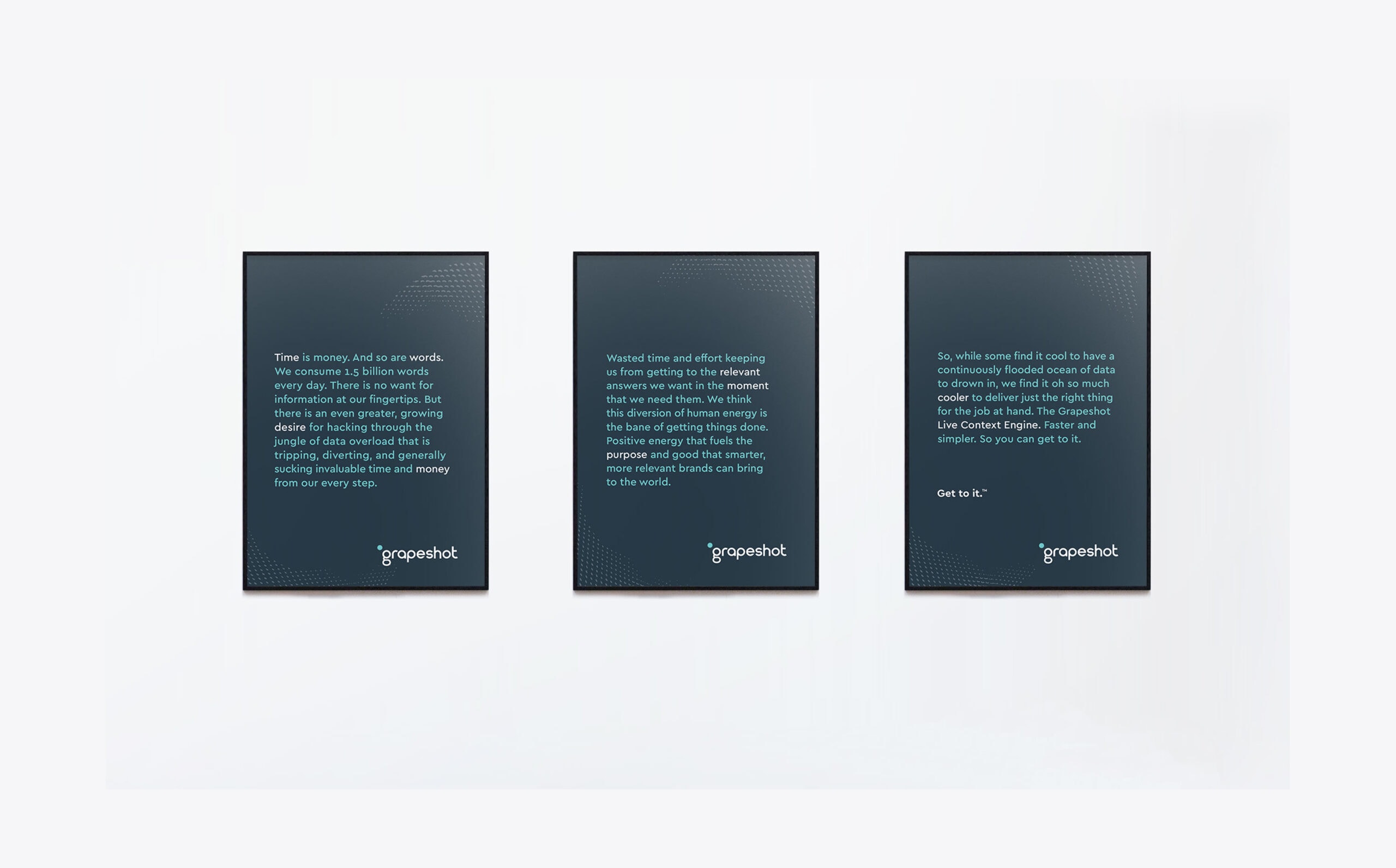
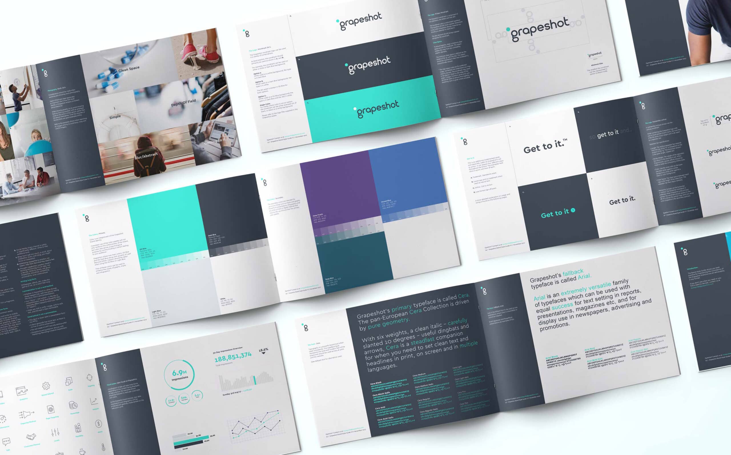
Fable&Co. explored a subtle evolution of the existing logo by making it more balanced & uniform – rounding the individual letters, reducing the line-weight & increasing the spacing.
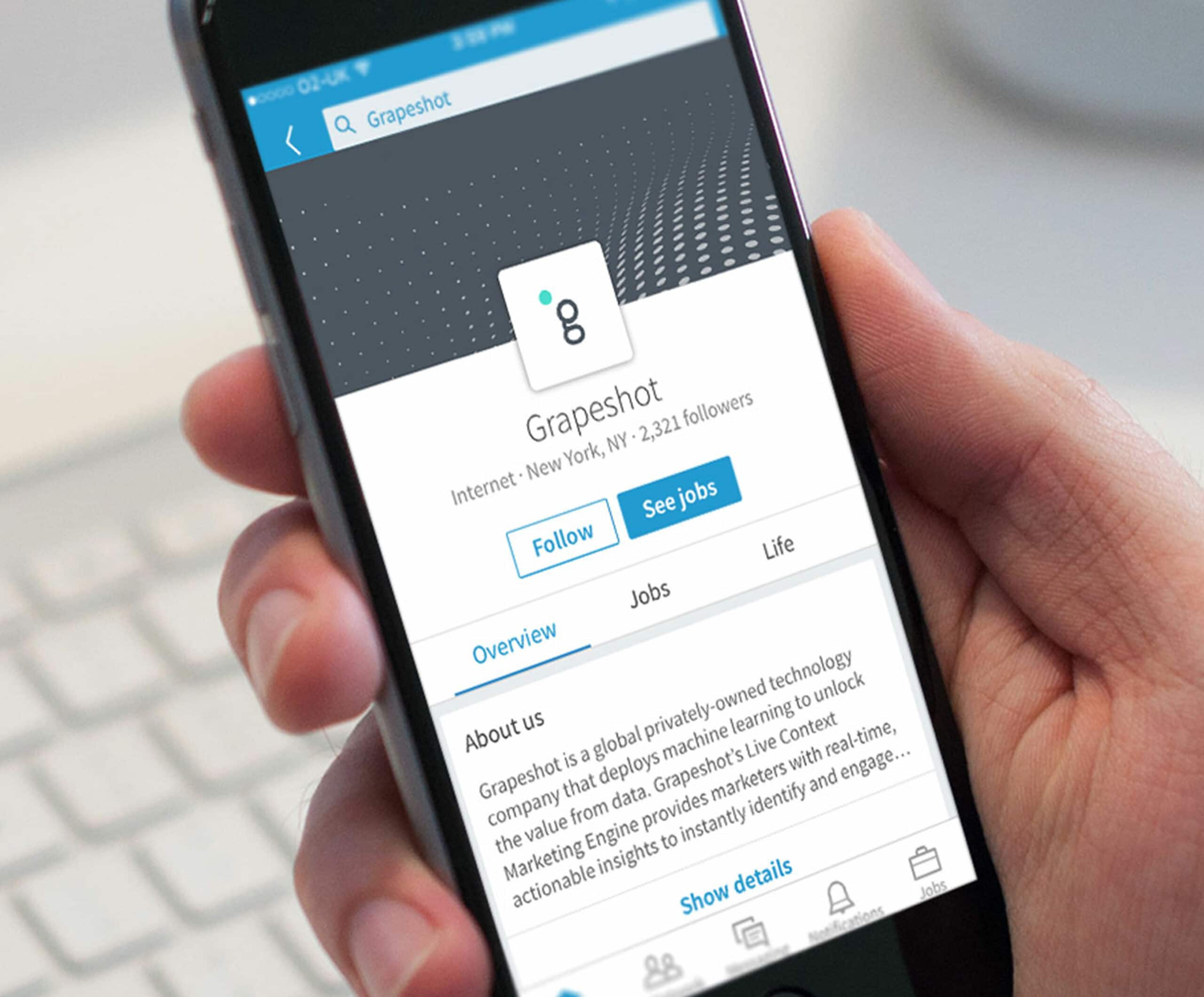
This led to a cleaner, more professional & tailored word mark. The bold, eye-catching cyan (‘Grapeshot blue’) dot sits proudly beside the letter g – reiterating Grapeshot’s role in providing users with the relevant content & context at speed, in the right moment.

The Visual Identity
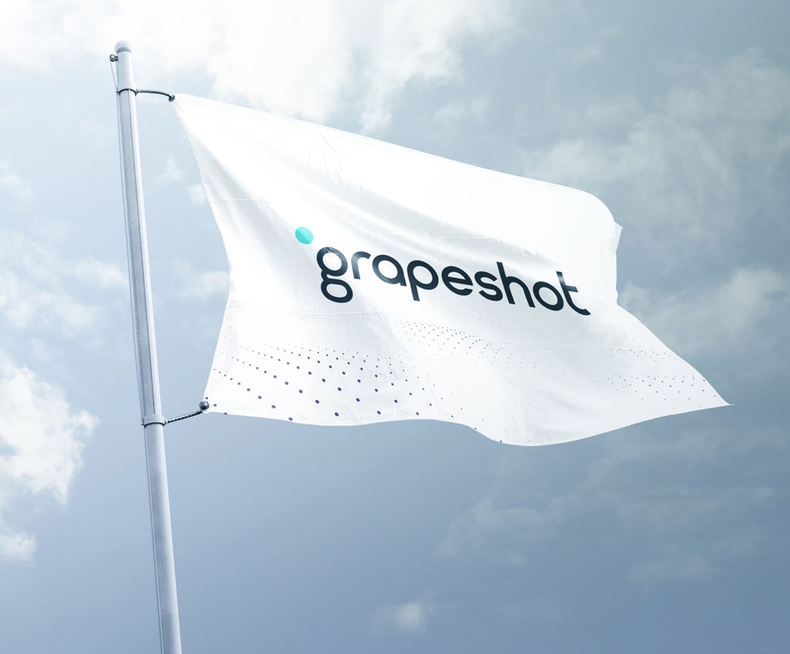
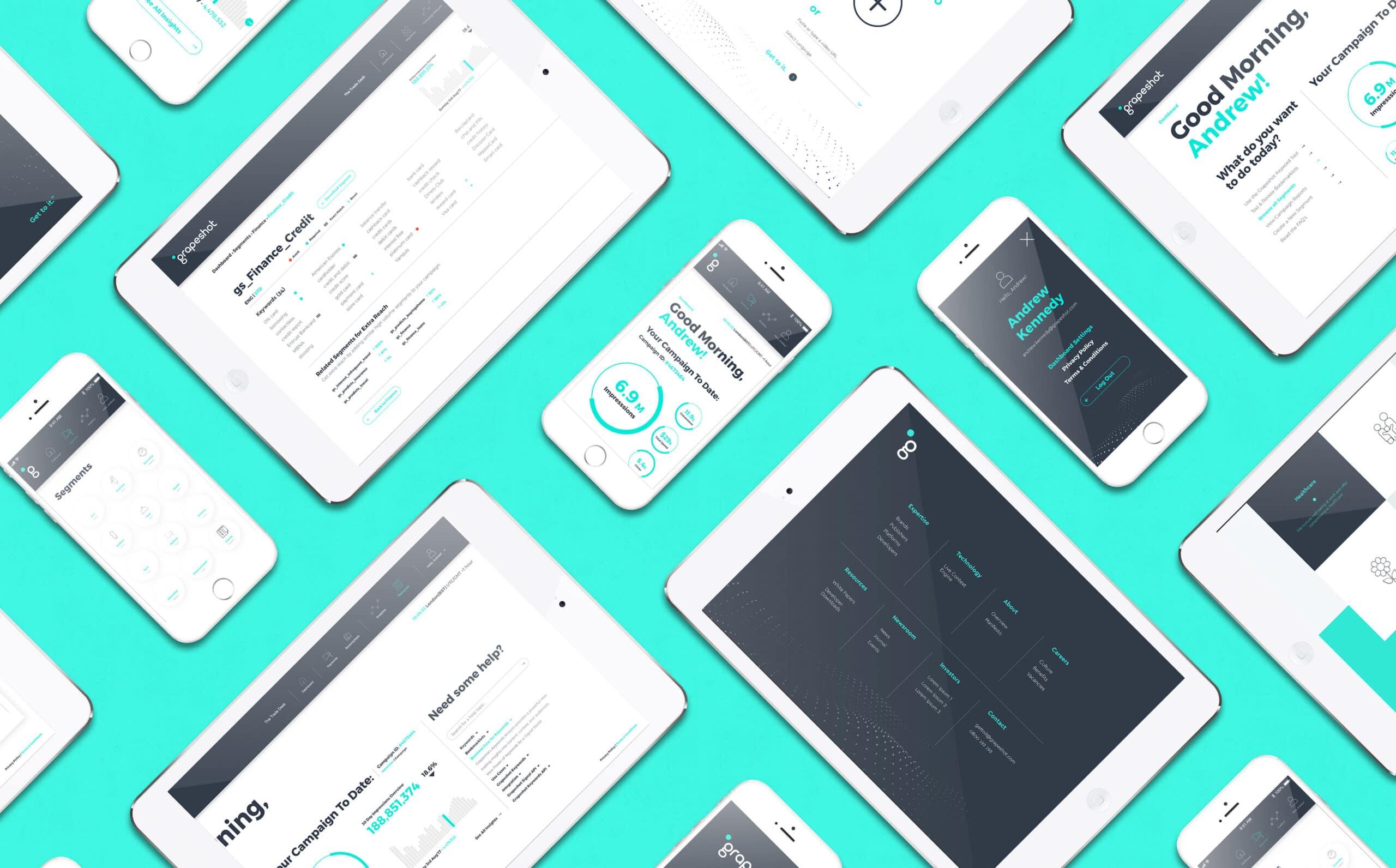
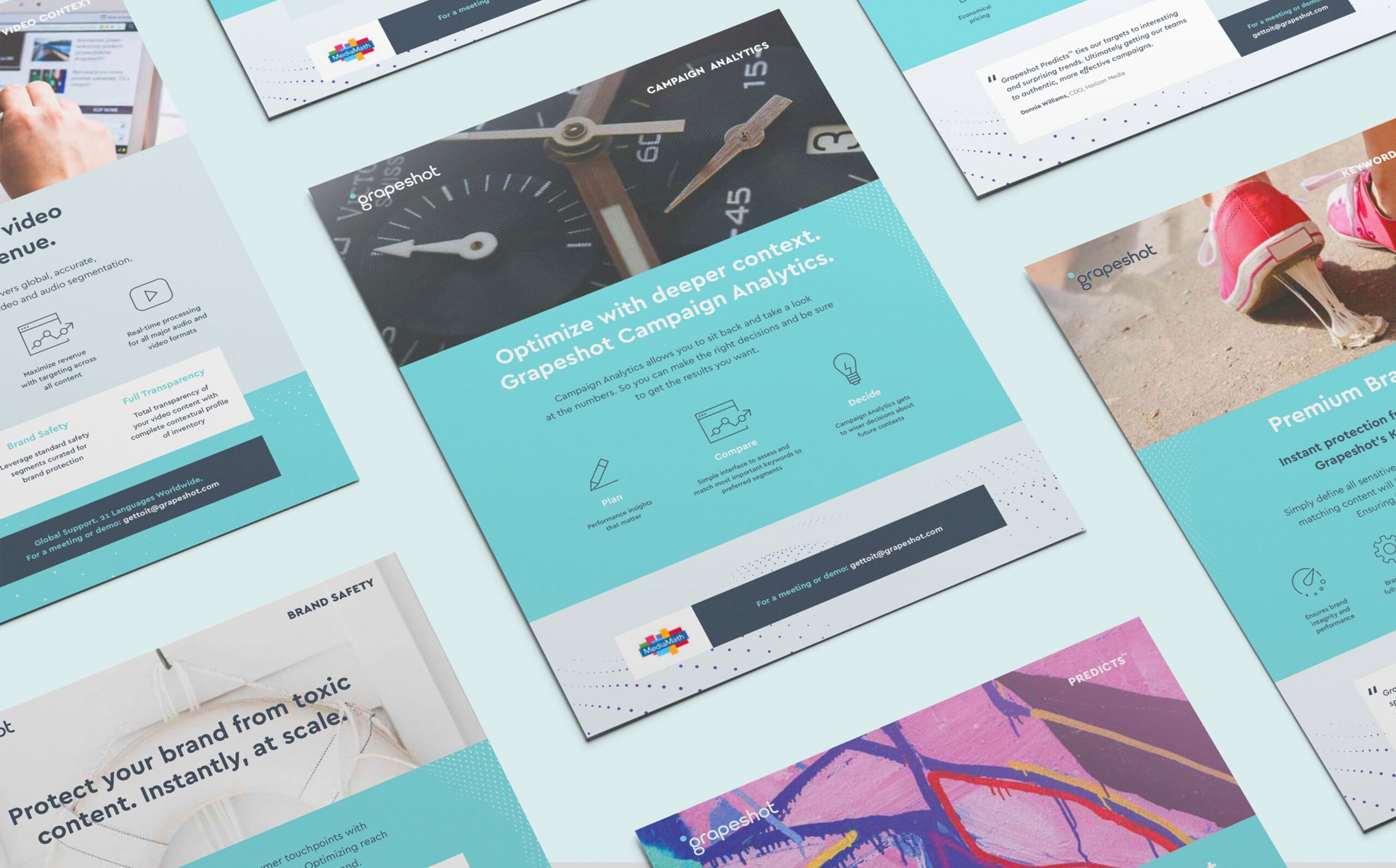
We drew inspiration from this unique, historical narrative when beginning to explore the new brand identity. We created an immersive ‘dot wave’ that represented the many billions of digital data signals & webpages that Grapeshot’s technology scans for relevant, contextual information.
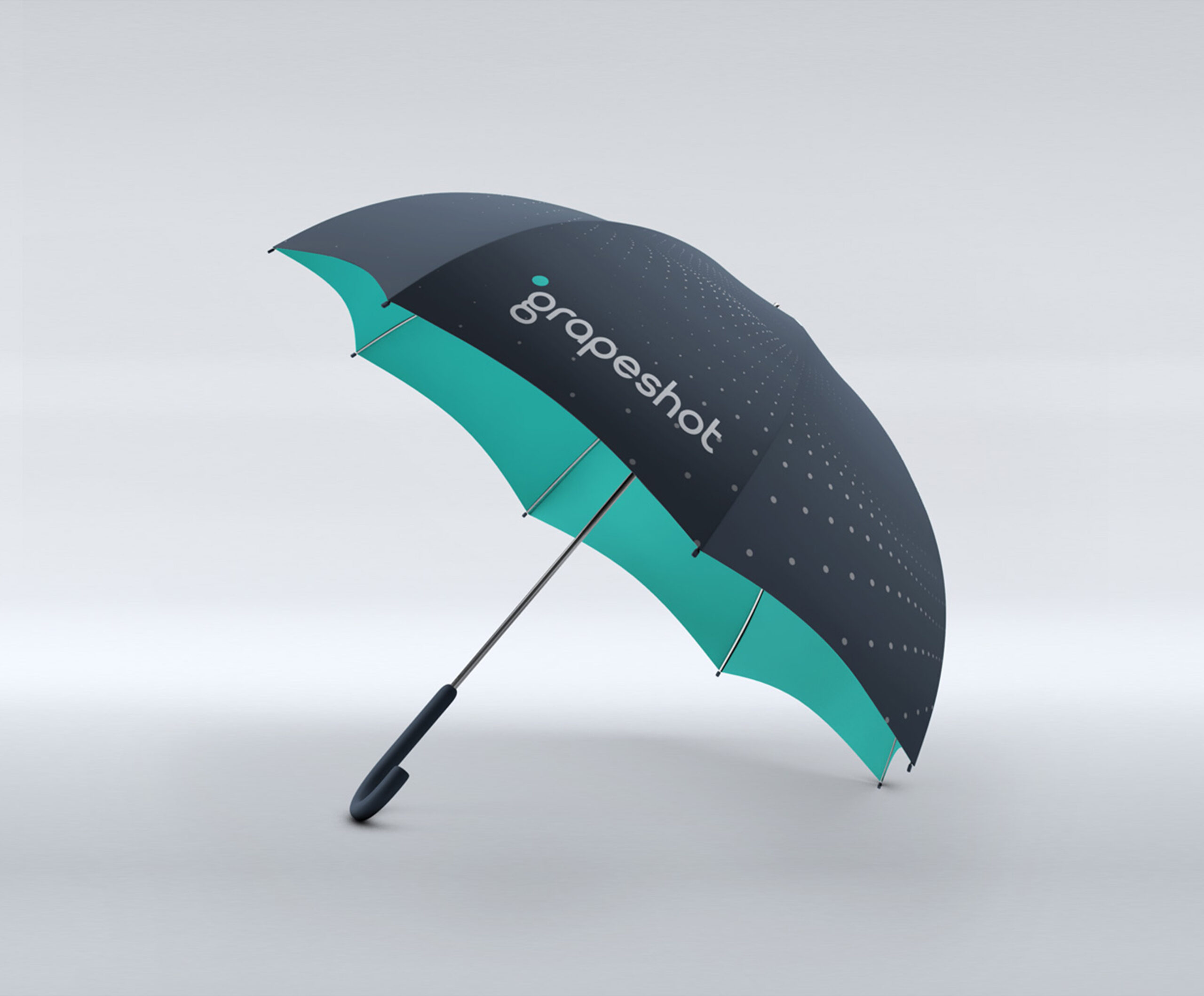
Fable&Co. produced a suite of 3D dot waves to be used throughout the brand identity, which provided a strong sense of scale, motion & energy.



Project Deliverables
Brand Workshop
Research & Brand Strategy
Brand Positioning
Brand Identity
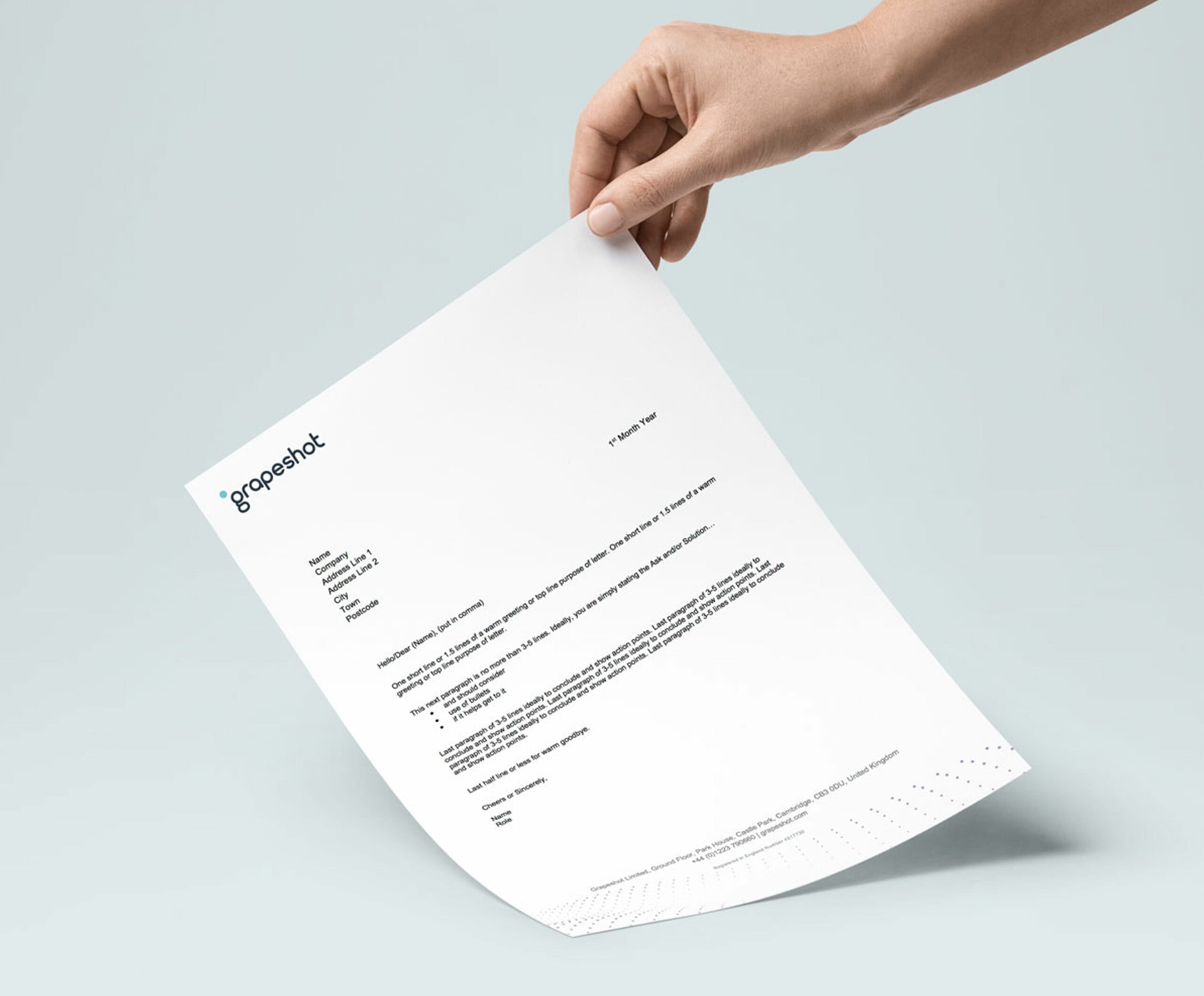
Corporate Stationery Design
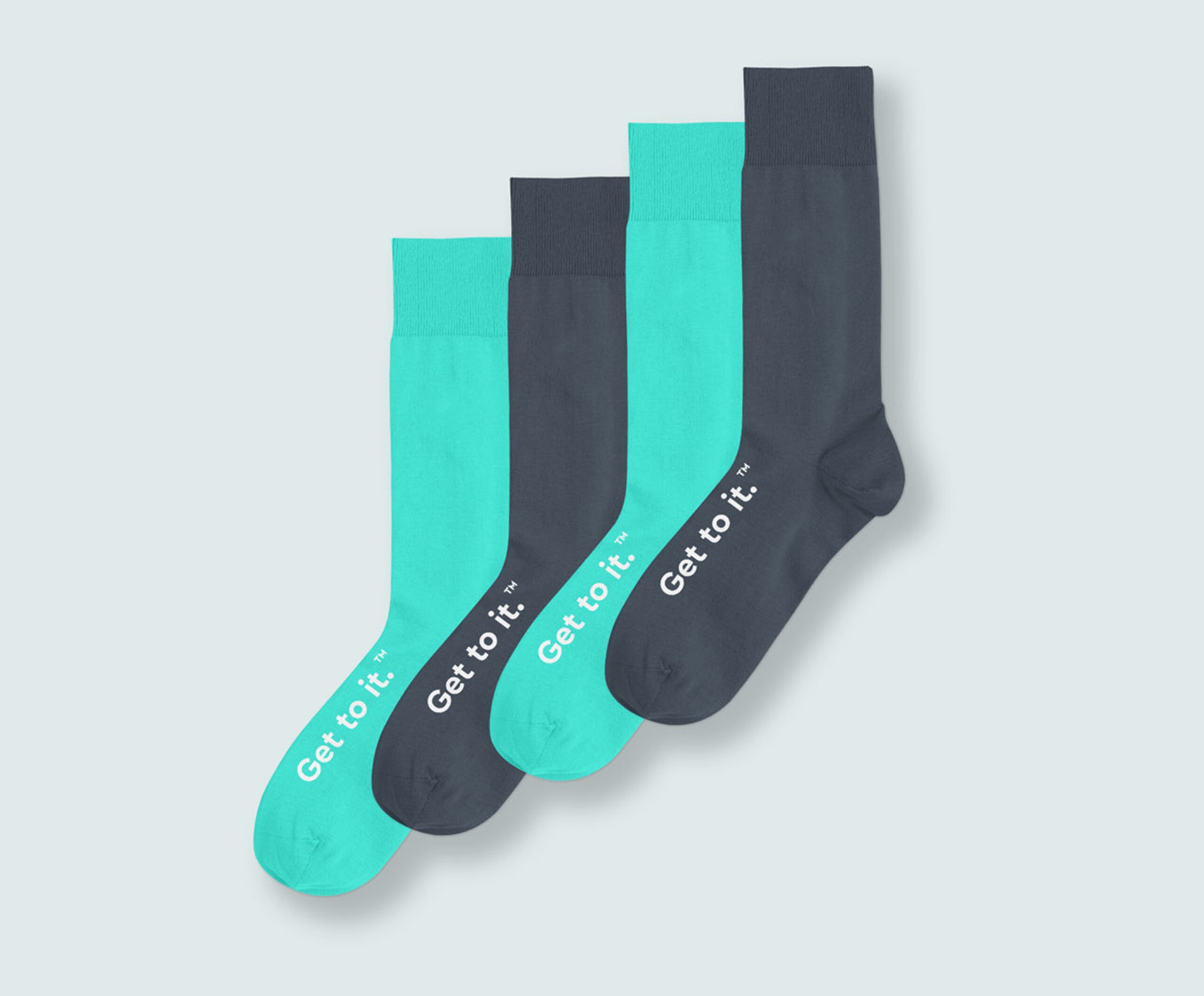
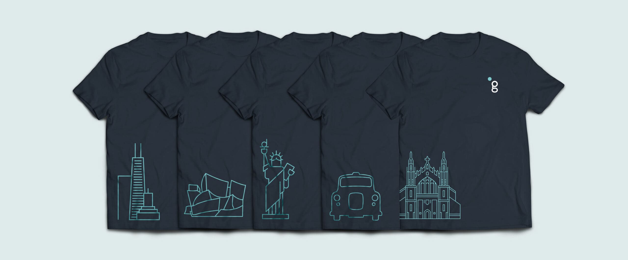
Promotional Merchandise Design
Product Sourcing
Interior Office Graphics
Exhibition Stand Design
Brand Video & Animation
Motion Graphics
Photography
Product Interface Design
Creative Consultancy & Project Management

Endangered Words
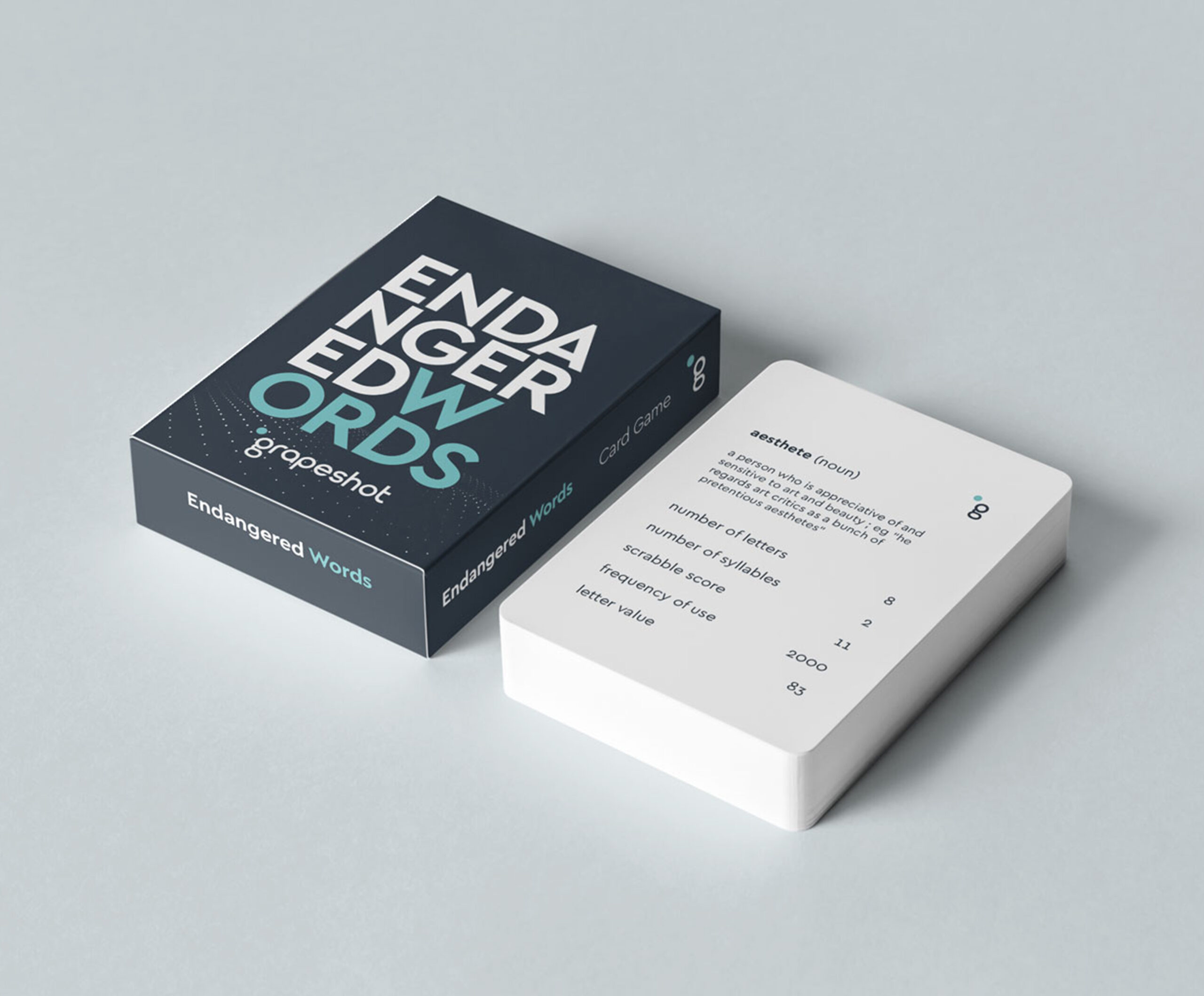
Fable&Co. created ‘Endangered Words, a bespoke card game. This was used to help promote the brand to new & existing audiences at DMexco (Digital Marketing Exposition & Conference).
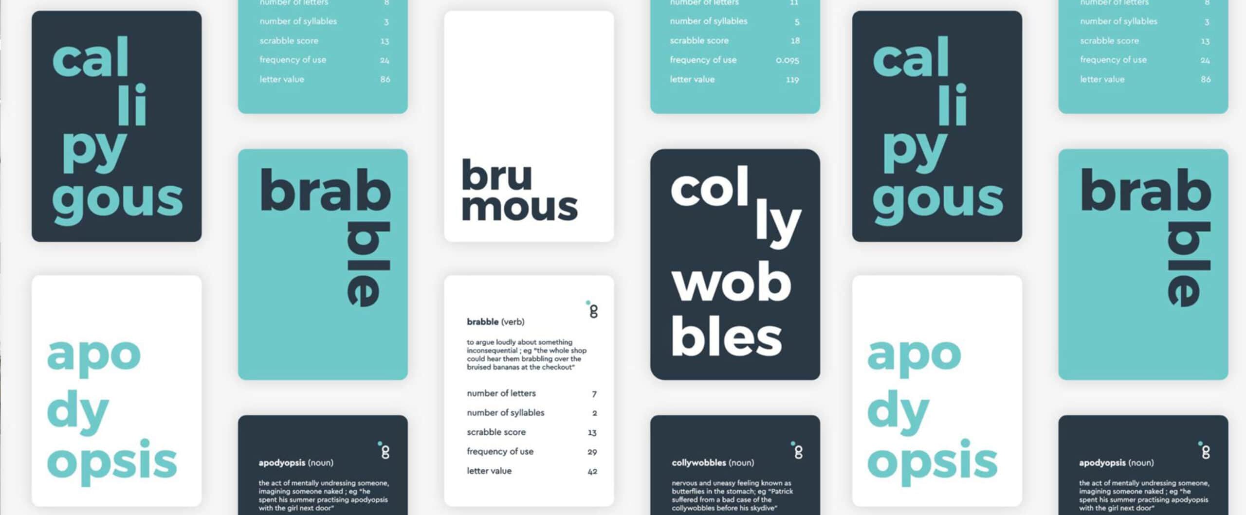
This top-trumps style game was an engaging & inspiring give-away which educated recipients as to the importance of words. Each card contains a list of rare & unique words, along with their word scores based on differing numerical data – such as number of letters, syllables, scrabble score, frequency of use & letter value.
The aim of the game is to compare these values to try to win your opponent’s cards. Grapeshot exhibited at DMexco in Cologne with the help of Fable&Co, who were also responsible for the design of the event stand & all associated event marketing materials.

Capturing Moments
With the Grapeshot London office home to sales & marketing employees, a photoshoot was conducted to capture natural & relaxed shots, with individuals & teams getting on with the task at hand. Energy, positivity, collaboration & youthfulness shone through in the images & complemented the new identity adding a genuine sense of humanity, personality & approachability.


Bold, Sophisticated & Confident
Bringing Grapeshot’s identity in line with their ambitions, there was a need to introduce a bold, sophisticated & confident colour palette, whilst maintaining a sense of approachability & youthfulness.
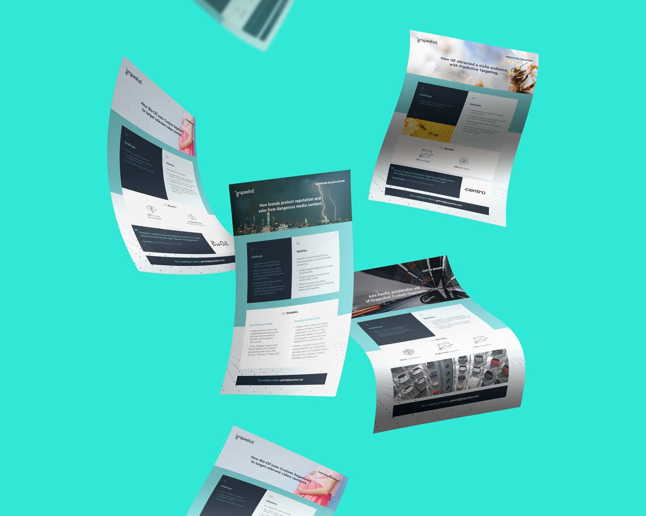
The original Grapeshot ‘Cambridge blue’ was given an injection of vibrancy, transforming a less spirited colour into a bright, impactful blue that aids recognition through playfulness, whilst maintaining a careful balance of corporate professionalism. A dark, calming French navy brought an air of sophistication & assuredness, whilst a soft grey & bright white provided important balance, complementing these two strong colours.
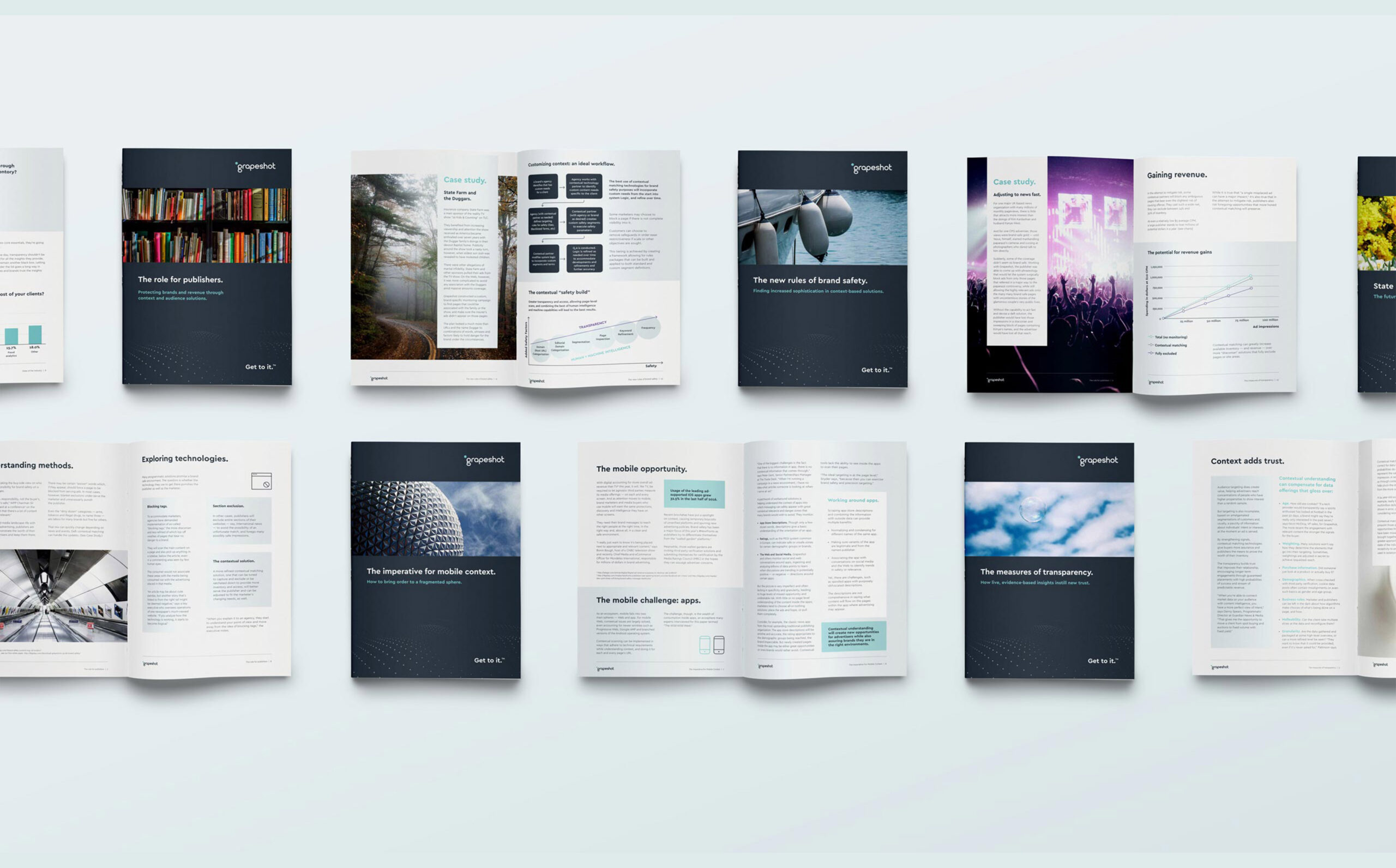


“Working with an ambitious, high-growth tech business presented us with an exciting challenge. We learnt just how innovative & powerful Grapeshot’s proposition is – the speed, scale & accuracy of the underlying technology is incredibly effective.
It was clear the current identity undersold their impressive credentials. Following intensive creative sessions & collaborative workshops, we developed a strong visual identity that brought a new sense of commercial professionalism, whilst retaining Grapeshot’s unique brand personality & culture. ”

Related Work

Ogury Corporate Rebrand
New Market Category for Global Ad-Tech Brand

PremFina Corporate Rebrand
Disruptive Premium Finance Company
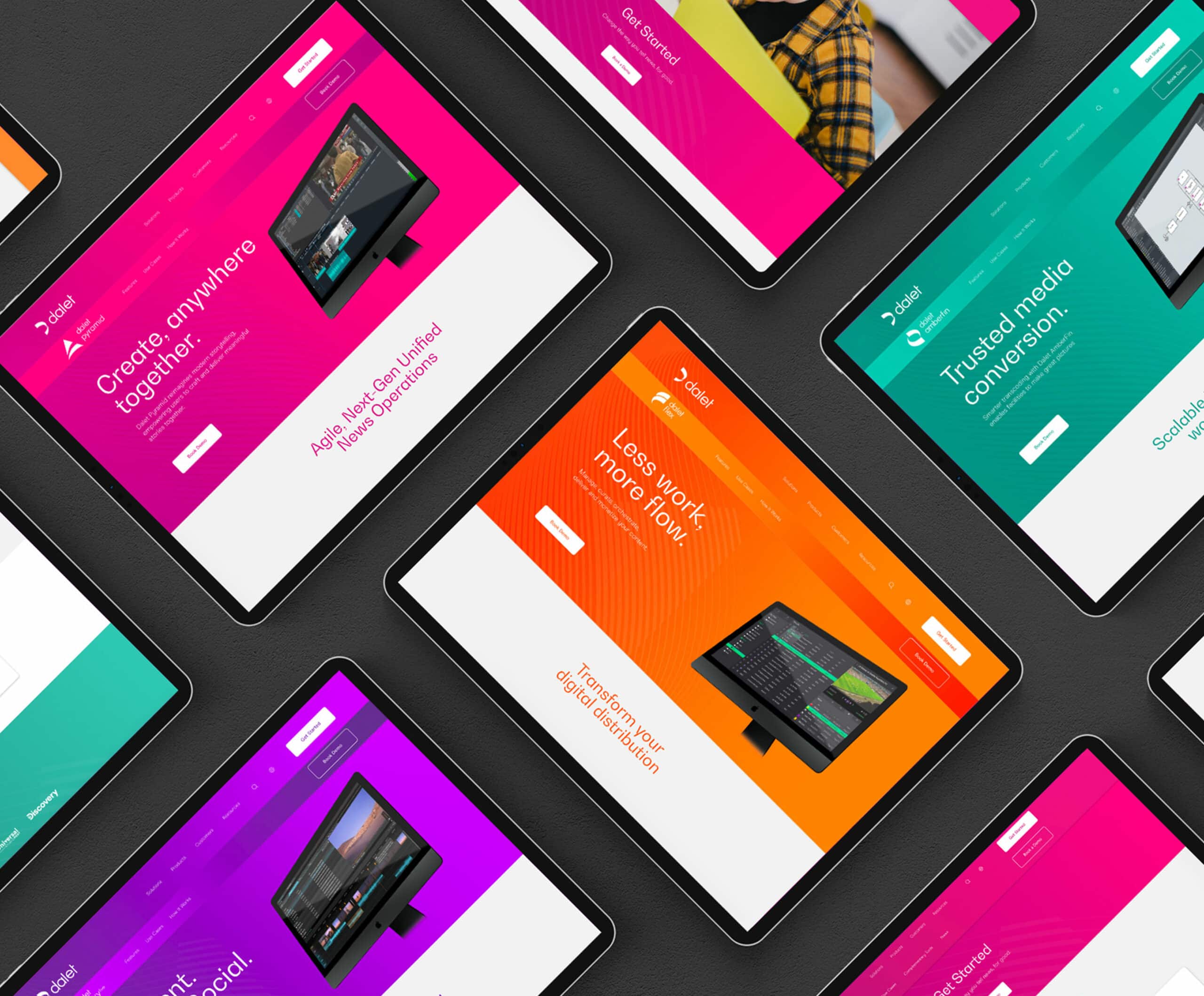
Dalet – Agile Media Solutions
Global Tech-Company Rebrand & Website
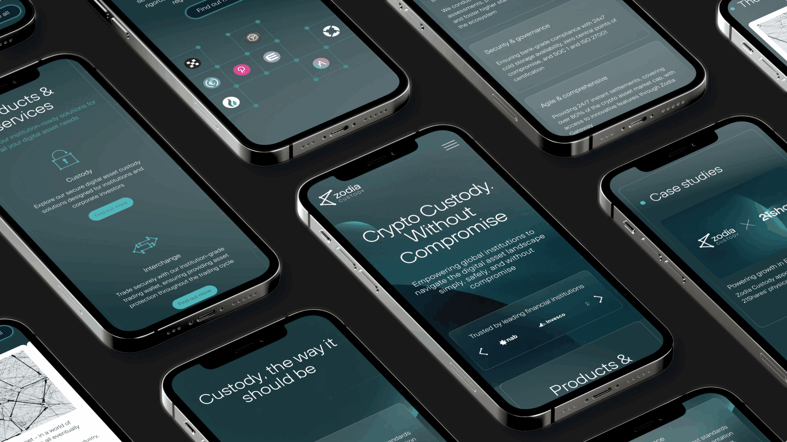
Branding & Website for FinTech Company
Zodia Custody - Digital Asset Custodian
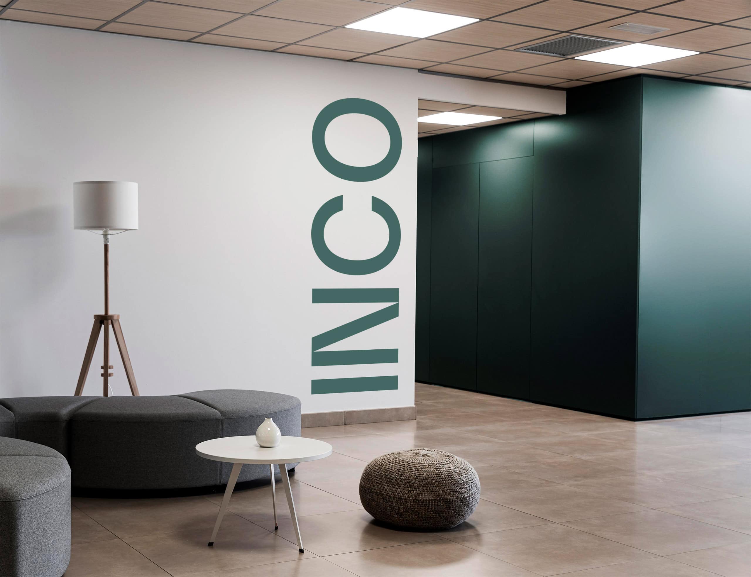
Insurance Broking – Branding & Website
INCO Broking - Insurance Rebrand & Website

