Disruptive Premium Finance Company
Fintech Branding & Website
Technology For Good
Upon conducting a tailored brand workshop, Fable&Co. quickly discovered PremFina is a business built on & for inclusion, but whilst they are proud of their diversity & driven by innovation, they are united by a bigger purpose.
PremFina’s technology enables brokers & insurance companies to increase the number of policies offered to customers by breaking down large, lump-sum payments into smaller, monthly installments – making flexible insurance more accessible & affordable for everyone. This purpose was clearly lived & breathed every day by employees, with innovation driving the launch of new products & features to help towards this goal.
Effortless Simplicity
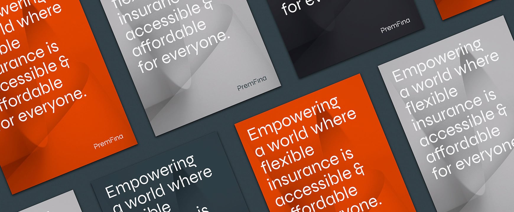
Natural flow & effortless simplicity inspired the concept behind the new visual identity. These natural forms represent the effortless collaboration, simplicity of integration & business efficiencies enabled by PremFina’s proposition.
It also visually reflects the harmonious balance between ‘technology’ & ‘premium finance’, whilst symbolising the ease at which customers can better manage their finances.

The Visual Identity
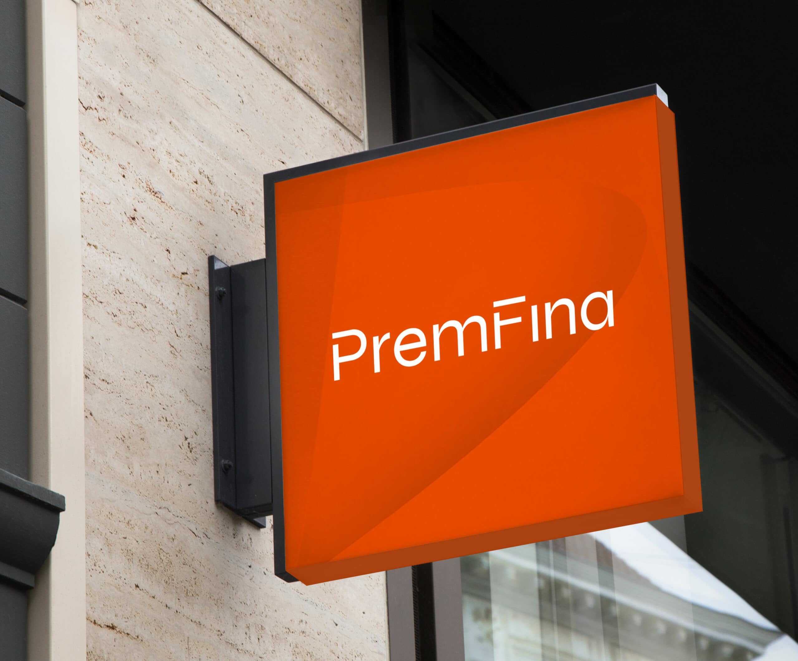
To capture the new positioning & purpose of PremFina, we created an identity that felt ‘fintech’ in nature, whilst embracing humanity through the imagery & promoting the impressive diversity throughout the company.
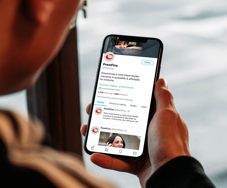
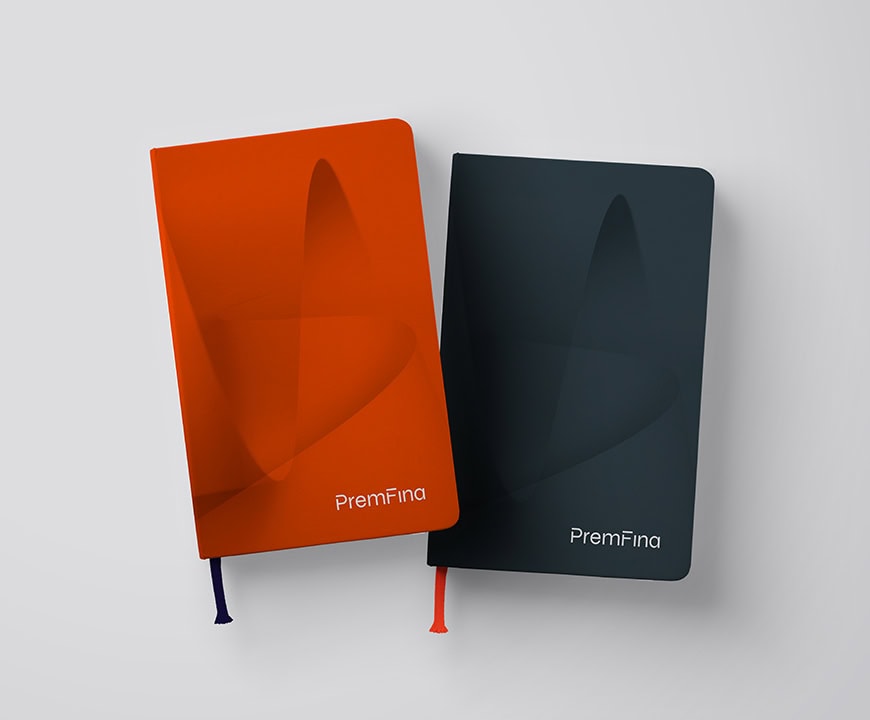
Imagery played a key role, looking to portray the diverse culture & personality throughout the business. Accompanying the new word marque was a brand icon. Whilst a 2D static version was created for print applications, we produced a 3D animated version for digital applications – illustrating a constantly evolving liquid form that captured our flowing, natural concept.
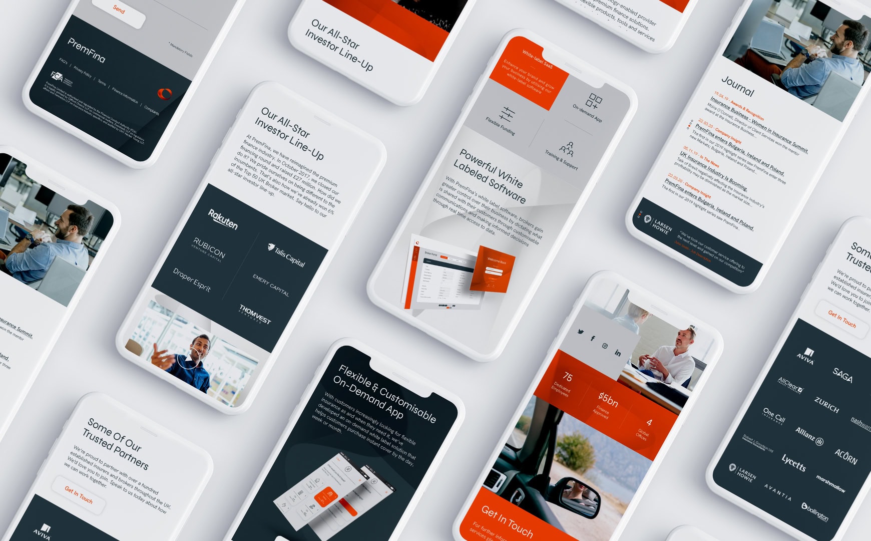
The Online Experience
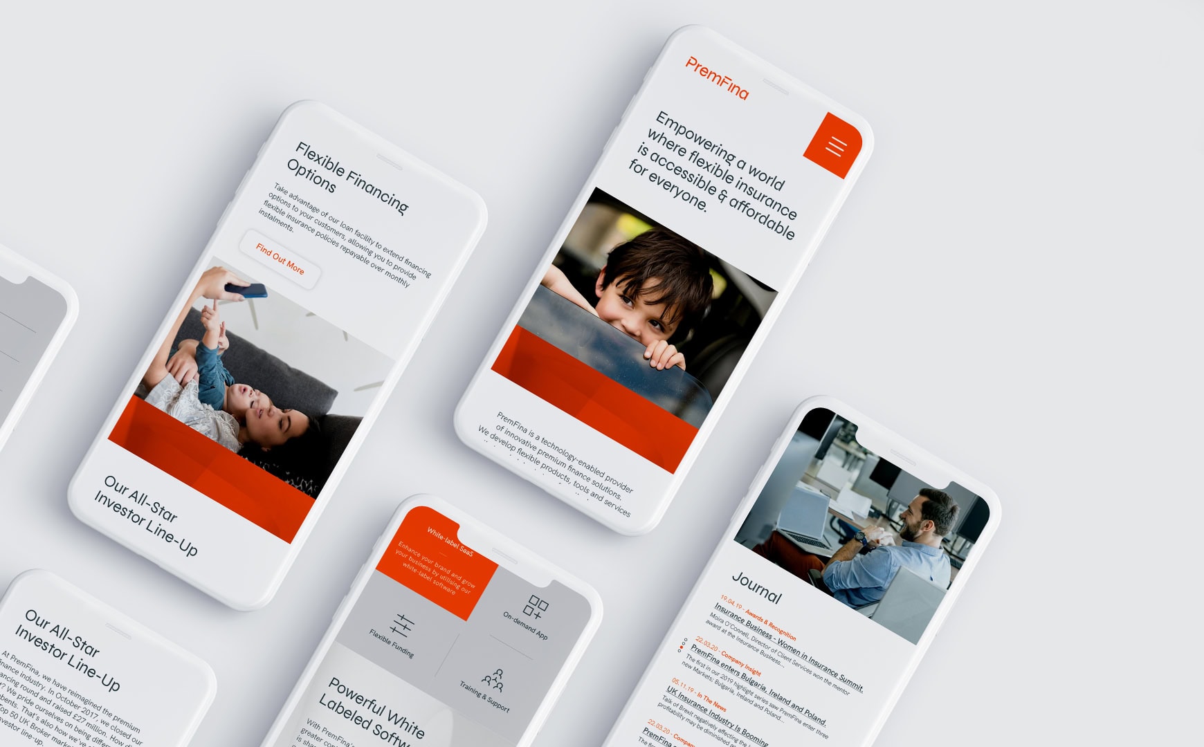
To reflect the new brand identity & shift to a more technology-focused proposition, the online experience needed to provide users with a much more user-friendly, efficient & engaging experience.
Careful consideration was given to the different audience personas & the user journey, ensuring the most important & relevant information was quick to find & easily discoverable. Subtle transitions that reward the user as they interact with the site, rather than distract, helped create an engaging & seamless digital experience.
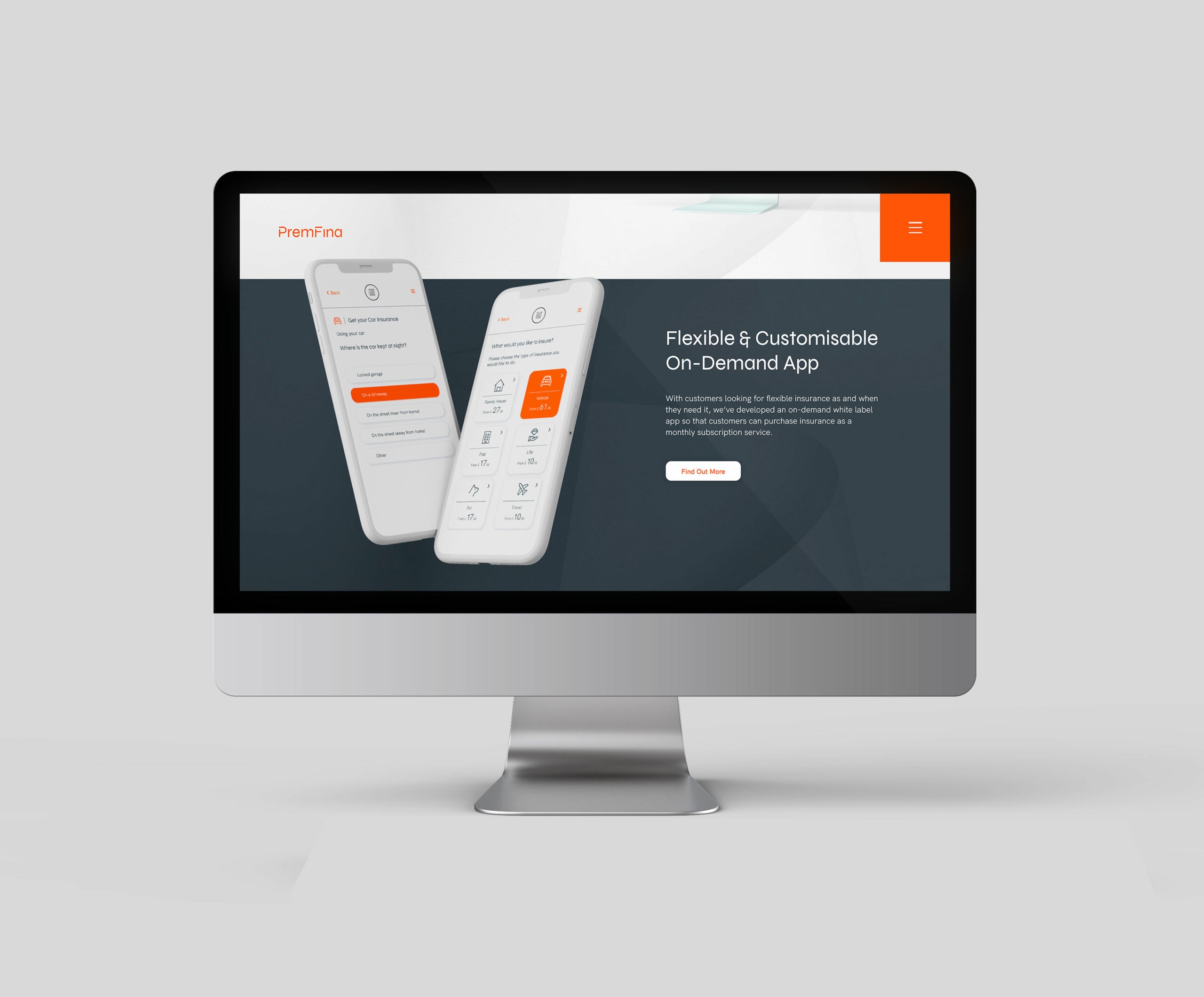

User Experience
It was important that the seamless front-end website experience continued for existing & new customers when engaging with the white-label SaaS portal or on-demand app interfaces.
PremFina’s powerful white-label SaaS enables brokers to gain full control & complete visibility of their business. They are able to dictate what is shared with their customers through customisable communications & make better-informed decisions through real-time access to data.
PremFina had also developed an on-demand white-label app that helps customers purchase instant cover by the day, week, or month. Fable&Co. were tasked with making sure that all aspects of the UX/UI of both products were in-line with PremFina’s new visual identity & that it maintained a consistent look & feel alongside the other digital deliverables that were completed.


Project Deliverables
Brand Workshop
Research & Brand Strategy
Brand Positioning
Brand Identity
Website Design & Development
Interface Design
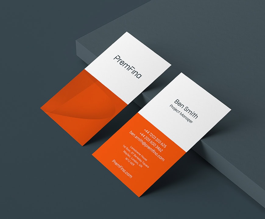
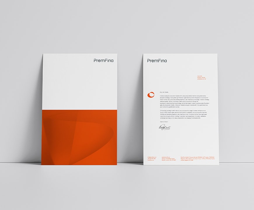
Corporate Stationery Design
Promotional Merchandise Design
Interior Office Graphics
Animation
Marketing Materials
Creative Consultancy & Project Management
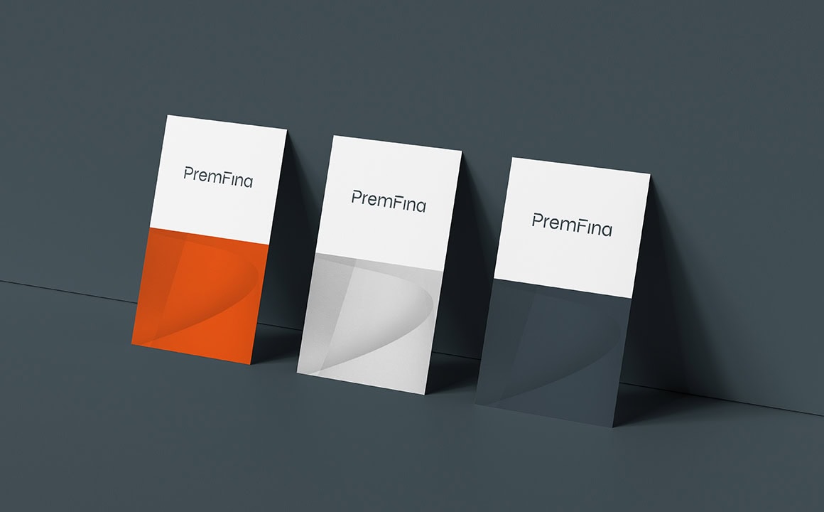

Branded Materials
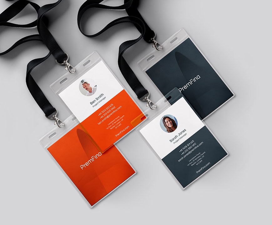
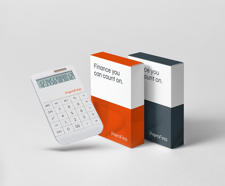
PremFina participate at various global events throughout the year, & so it was important to consider the marketing materials & merchandise required for each.
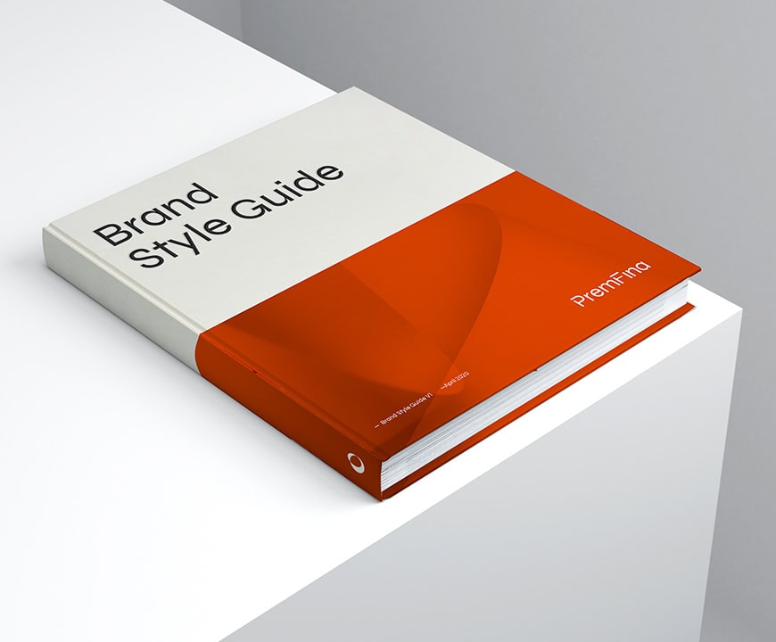
From PowerPoint decks & whitepapers, to calculators & umbrellas, teams were well-equipped with professional, cohesive & engaging tools to effectively communicate with their discerning audience. We also produced a comprehensive brand style guide to ensure consistency across the array of different deliverables, assisting partners when producing the diverse range of materials.

“Continuing to work alongside the team at PremFina is a real honour. We are all delighted with the results, & proud to be associated with this truly unique brand. It's a shining example of a transformational proposition & modern brand identity, within a traditionally conventional & somewhat formal industry.”

Related Work
Bikmo Rebrand
Cycle & adventure insurer Bikmo sets off on a rebrand.
Neon Insurance Branding
Re-Branding of Lloyds Syndicate Insurer
Obsequium Brand Identity
Regulatory Compliance Consultancy
Branding & Website for FinTech Company
Zodia Custody - Digital Asset Custodian
Insurance Broking – Branding & Website
INCO Broking - Insurance Rebrand & Website


