Rebrand & Website for Financial Services Company
The Housing Finance Corporation
Evolving Legacy
Yet as the landscape evolved, so too did the need for The Housing Finance Corporation to evolve with it. The challenge was to create a brand that honoured its heritage while positioning it for the future, one that could speak with authority, agility, and renewed clarity of purpose.
This was far more than a visual refresh. It was a redefinition, a chance to reposition The Housing Finance Corporation as a forward-looking leader at the intersection of finance and social impact. The aim was to build a brand that would not only lead today but inspire the possibilities of tomorrow.

Strategic Purpose
Grounded in deep research and strategic clarity, the rebrand set out to uncover growth and purpose in equal measure. At the heart of the transformation was a simple yet powerful belief: finance has the power to change lives. The new brand needed to reflect that conviction, championing collaboration, innovation, and progress as the driving forces behind lasting impact.
The strategy redefined The Housing Finance Corporation’s role within the sector, from a behind-the-scenes enabler to a visible catalyst for change. The brand now stands as a trusted partner that empowers progress, connecting finance with human outcomes such as homes, communities, and opportunities.
Every creative move was strategically led. The result is a purposeful, future-ready identity that feels elegant yet grounded, authoritative yet human. It speaks not only to who The Housing Finance Corporation is today, but to the progress it will drive for generations to come.

Enduring Connection
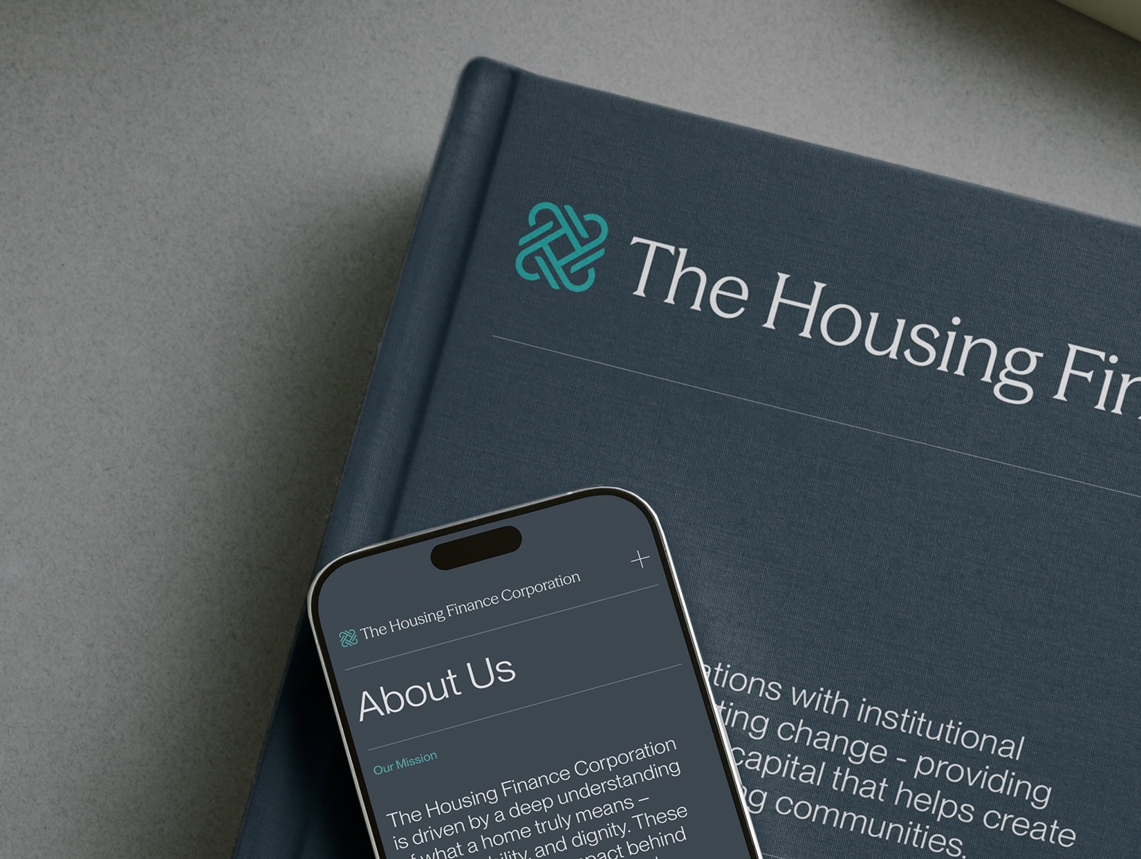
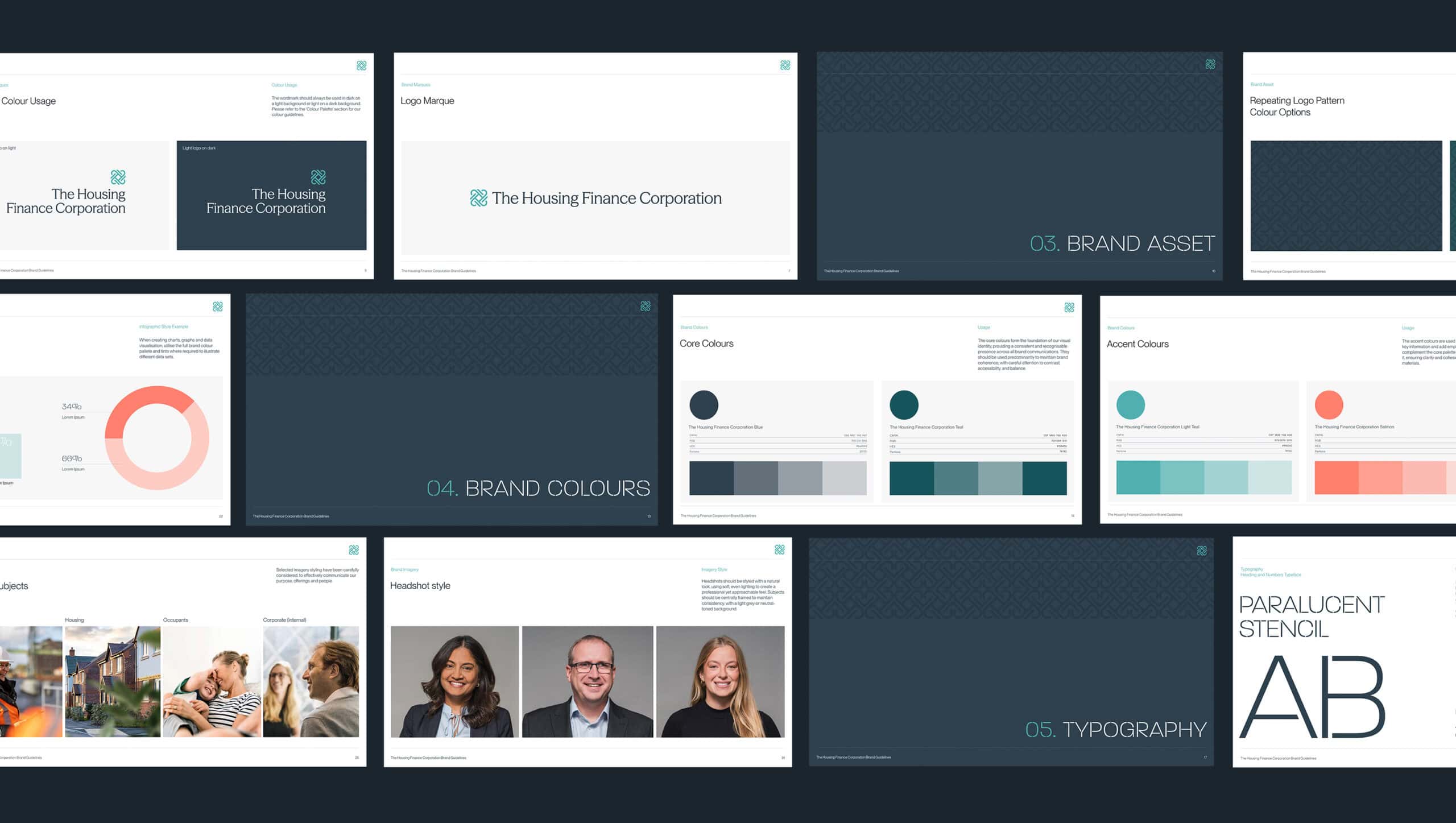
The new identity embodies strength, connection, and enduring trust, creating a visual language built for clarity and longevity. At its core lies a distinctive marque, an interwoven, symmetrical form representing unity, partnership, and collaboration. The mark captures the organisation’s role as a connector, linking capital with communities and ambition with opportunity. Its form is confident and precise, yet softened by flowing curves that reflect the humanity and empathy behind the organisation’s purpose.
The colour palette builds on this balance. Deep, confident blues communicate stability and authority, while soft greens and muted coral accents introduce warmth, optimism, and energy. This harmonious aesthetic ensures the brand feels both dependable and progressive, reflecting an organisation shaping tomorrow’s housing landscape with the strength of its experience and the optimism of its vision.
Typography further defines the brand’s personality. Paralucent Stencil, with its architectural precision, expresses confidence and sophistication, while Martens Sans provides balance through clarity and approachability. Together, they create a typographic system that feels intelligent, modern, and distinctively human. The result is a visual identity that communicates composure, structure, and purpose, designed not just to look timeless but to endure as a symbol of trust and progress.

“"Our new brand identity is a true reflection of our purpose and ambition - firmly rooted in our legacy as a trusted, long-term partner to the affordable housing sector. Fable&Co.’s creative approach brought fresh clarity to our mission, strengthening our connection with clients, investors and stakeholders across the sector. Their agility and dedication ensured every stage of the process was handled with care and insight, helping us celebrate our history while confidently embracing future opportunity.
This revitalisation empowers us to advance our impact with renewed purpose and integrity, reinforcing our commitment to delivering lasting value for the communities we serve." ”
Conceptual Thinking
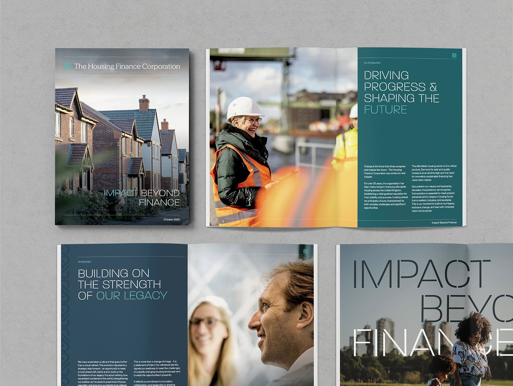
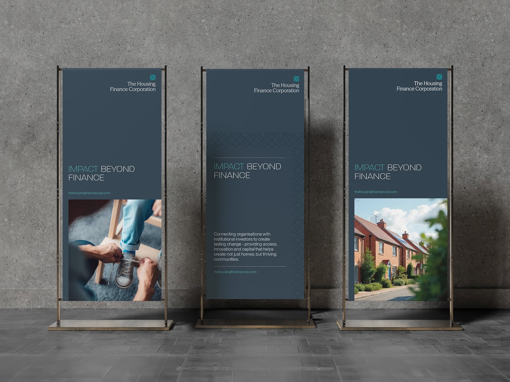
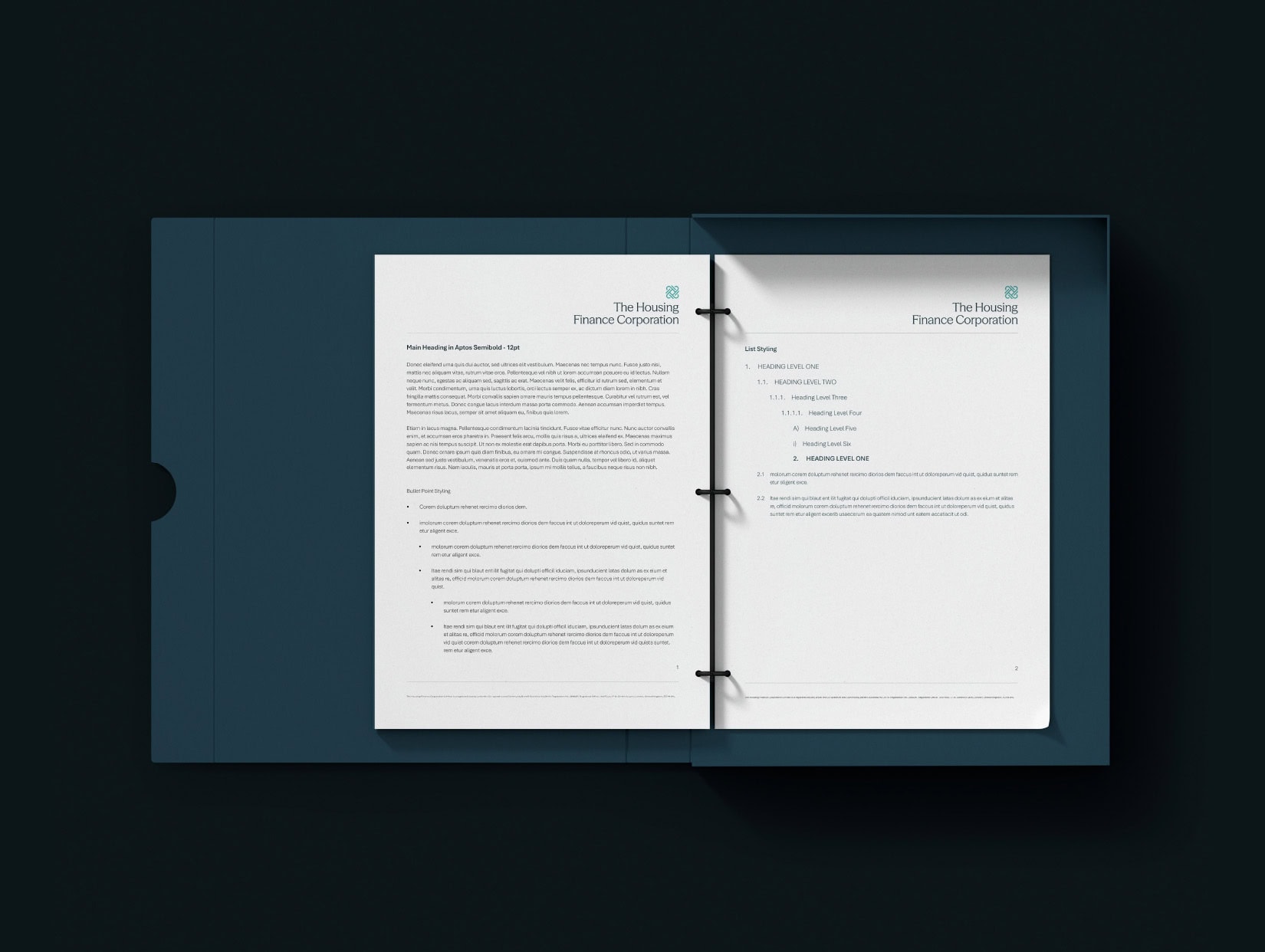
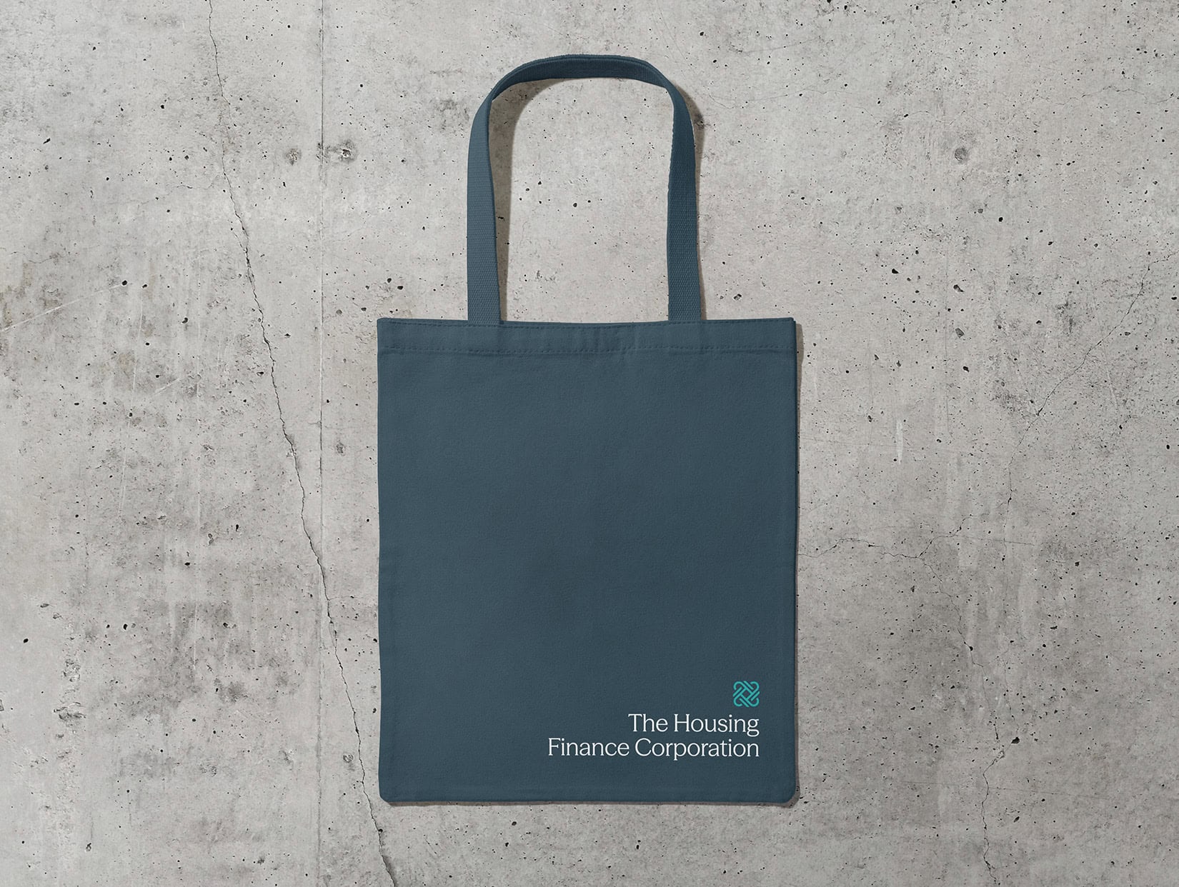
Across every touchpoint, the new identity reflects clarity, confidence, and trust. The repeating logo pattern, used subtly across print and digital materials, introduces a sense of structure and balance. Editorial design embraces generous space, refined typography, and authentic photography to create layouts that feel open, intelligent, and assured.
From corporate reports to social campaigns, the brand creates a seamless experience that embodies professionalism with a distinctly human touch. Grounded in strategy, guided by purpose, and crafted for impact today and momentum tomorrow.

Project Deliverables
Brand Workshop
Research & Brand Strategy
Brand Positioning
Brand Identity
Logo Design
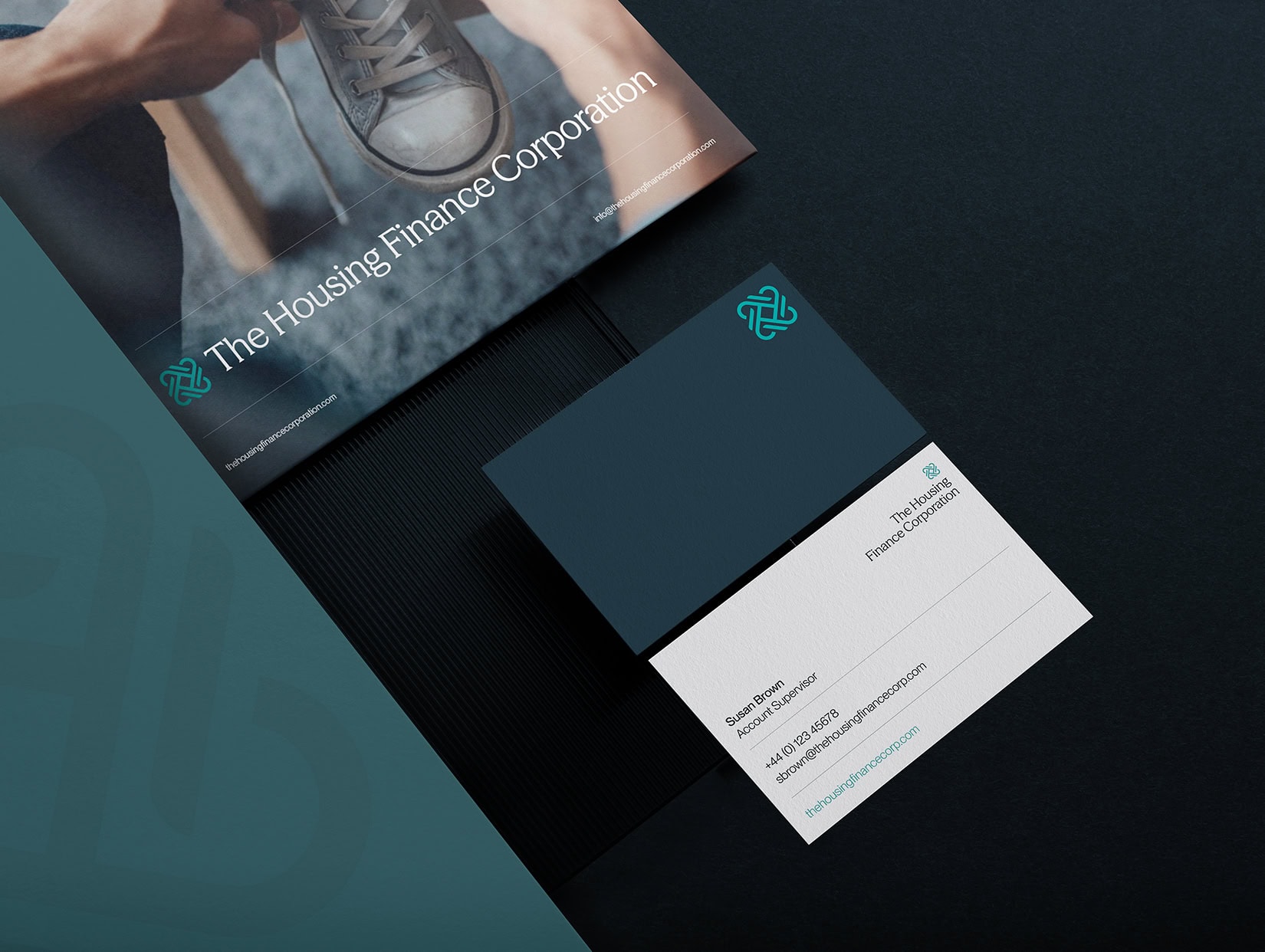
Corporate Stationery Design
Copy Writing
Website Design & Development
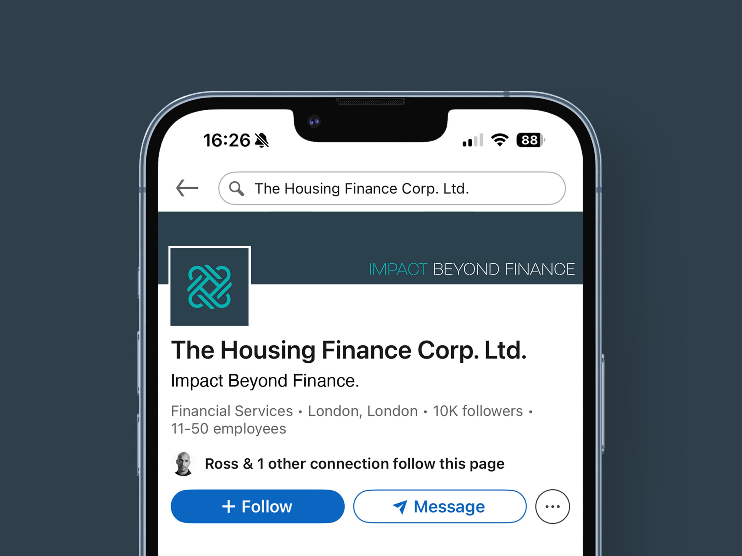
Social Media Page Design
Creative Consultancy & Project Management

The Online Experience
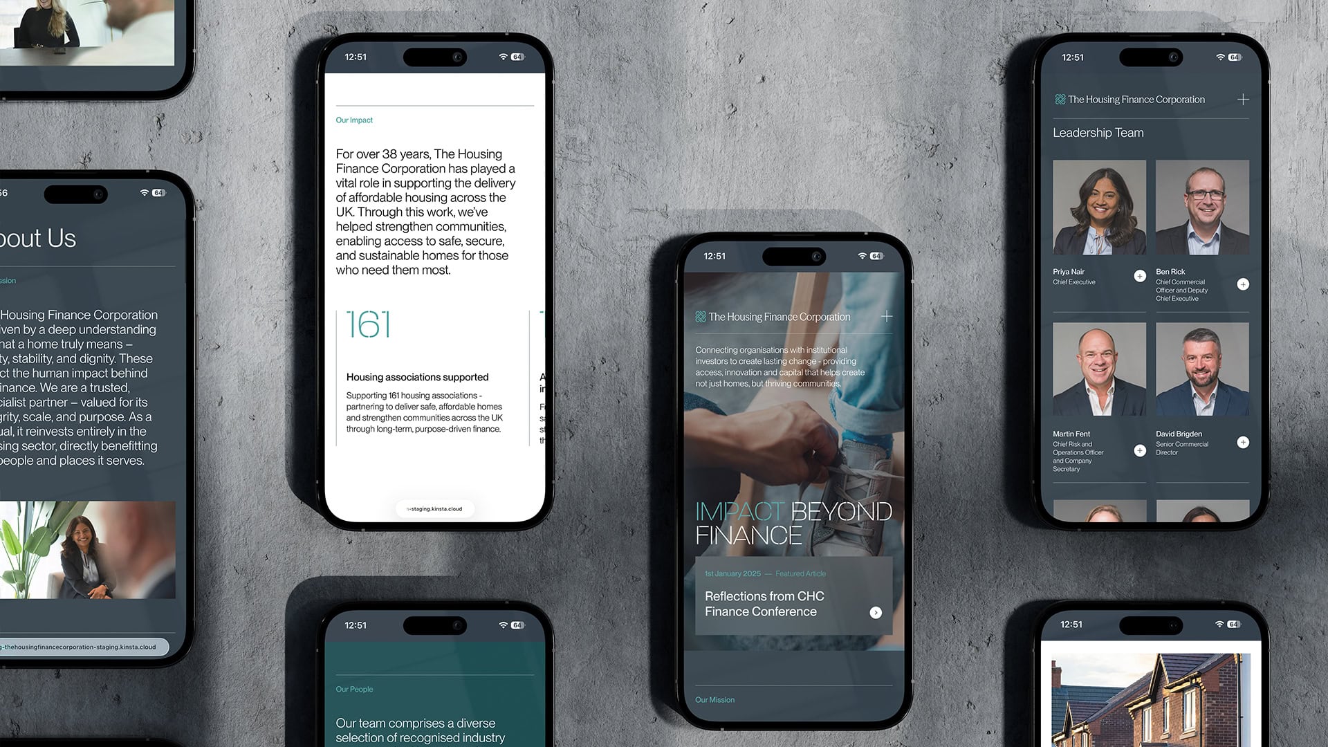
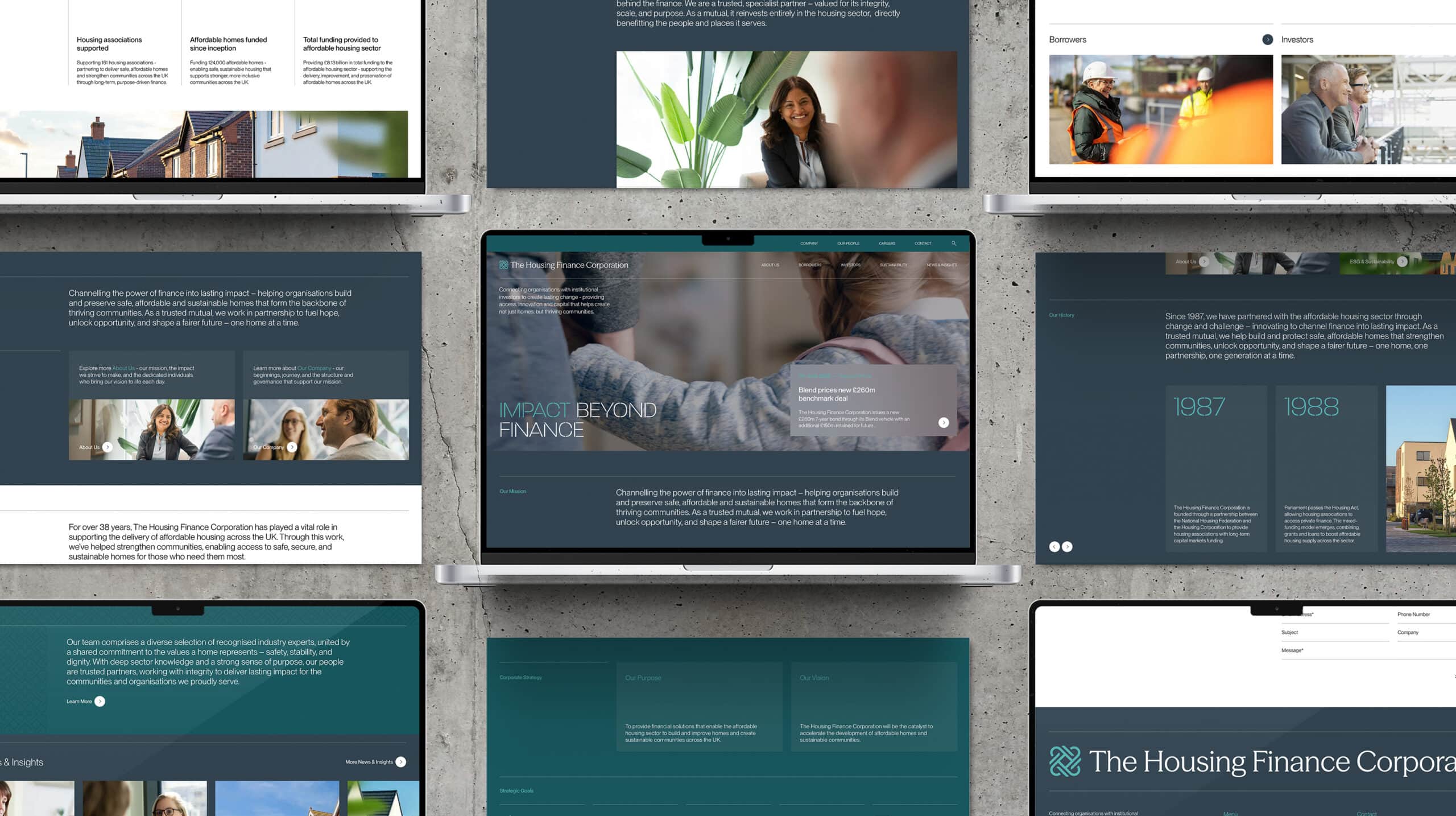
The new website brings The Housing Finance Corporation’s purpose to life through a calm, authoritative, and intuitive digital experience. Designed to inform, engage, and inspire, it translates complex financial and social themes into a clear, confident narrative.
Clean layouts, structured hierarchy, and purposeful use of colour guide visitors through content with ease. The result is a website that conveys trust and credibility while highlighting the organisation’s role as a driver of innovation and inclusion across the housing sector.
Built at the intersection of strategy and creativity, the site reflects a brand that is not only fit for today, but future-ready, advancing progress and opportunity for tomorrow’s world.


Progress with Purpose
The Housing Finance Corporation’s new brand represents far more than a change in identity. It signals a renewed sense of ambition, a clear vision for the future, grounded in experience and driven by purpose.
By uniting legacy with innovation, the rebrand positions The Housing Finance Corporation as a confident, progressive leader in its field. It captures the organisation’s belief that finance can be a force for good, empowering communities, enabling opportunity, and building a future where every home represents possibility.
This is a brand built for impact today and for momentum tomorrow.

“"When we launched our refreshed corporate strategy in 2024, it was clear our brand needed to evolve to match our purpose and ambition. The team at Fable&Co. proved to be invaluable partners, offering insightful consultation from the first conversation and demonstrating a deep understanding of our business and the sector we serve. They expertly modernised our identity, unifying our web and visual experience to honour nearly four decades of heritage while embracing bold new ambitions. Through thoughtful interviews and in-depth consultation with team members, Fable&Co. captured a brand identity that truly reflects who we are. Their creative process was both engaging and insightful, resulting in an outcome that exceeded expectations. Launching at our annual capital markets day, the rebrand has drawn outstanding feedback from both internal and external audiences. I highly recommend Fable&Co. to any organisation seeking a thoughtful and transformative rebrand."”


