Evolving Energy: Branding & Website for a Renewable Future
GMT Biogas
Evolving Energy
GMT’s challenge lay in communicating the depth of its expertise and pioneering innovation. The business needed to inspire trust from investors, local authorities, land owners, communities and partners, while also energising its internal teams. The identity had to bridge the scientific precision of renewable engineering with the emotive power of environmental purpose.
The visual system required enough flexibility to live across digital platforms, large-scale infrastructure sites, and investor communications, all while telling one cohesive, forward-looking story.

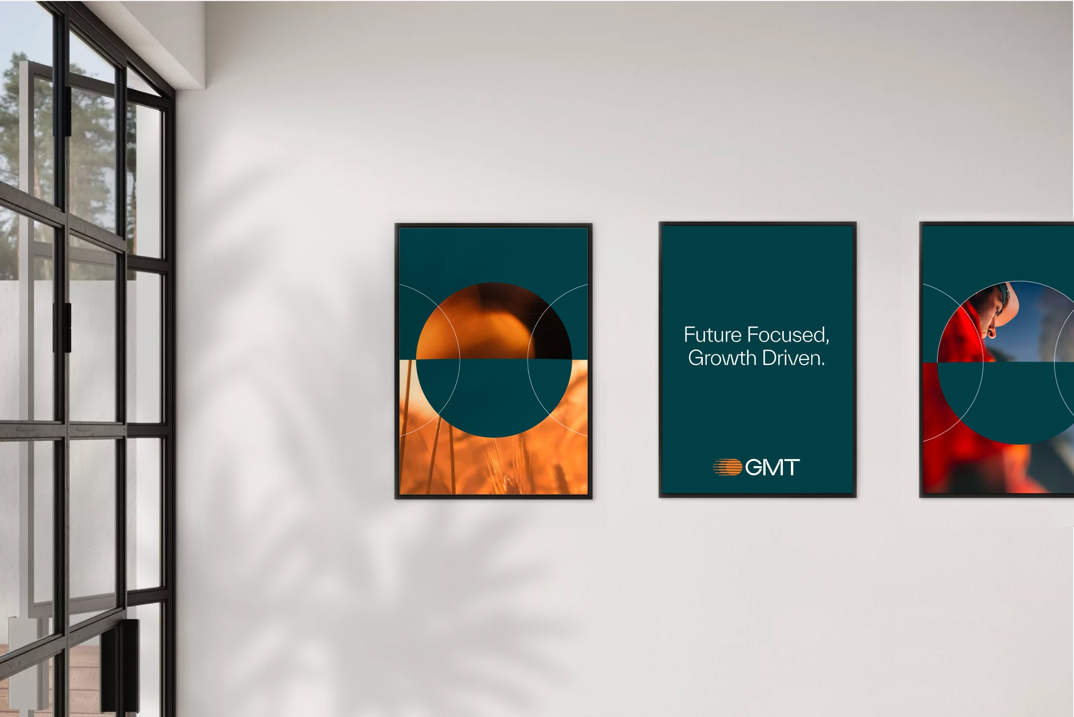
Future Focused. Growth Driven.
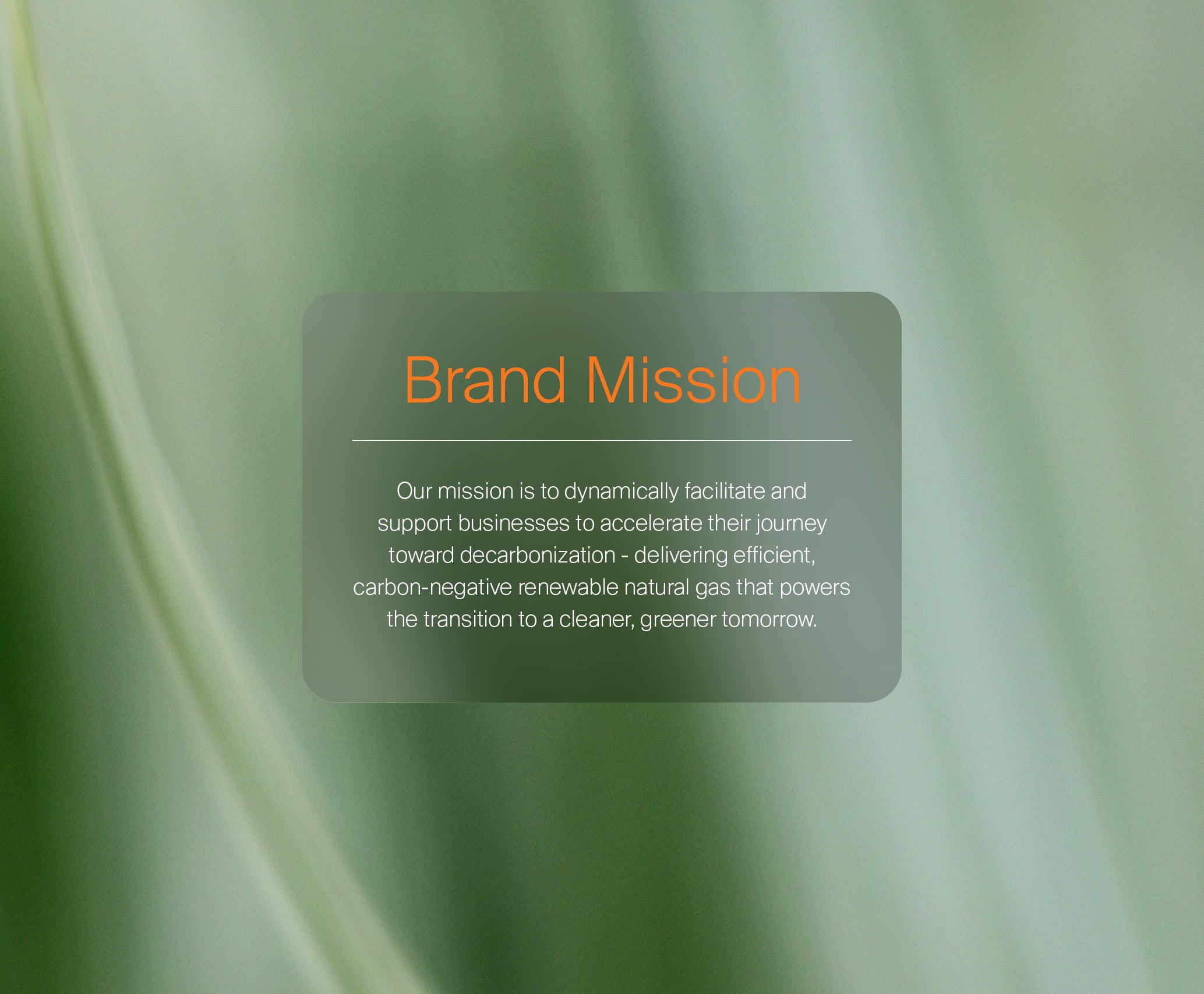
Our process began with immersion – understanding the sector’s pace of change and the essential role GMT plays within it. We uncovered a powerful duality at the heart of the brand: the balance between technological advancement and natural transformation.
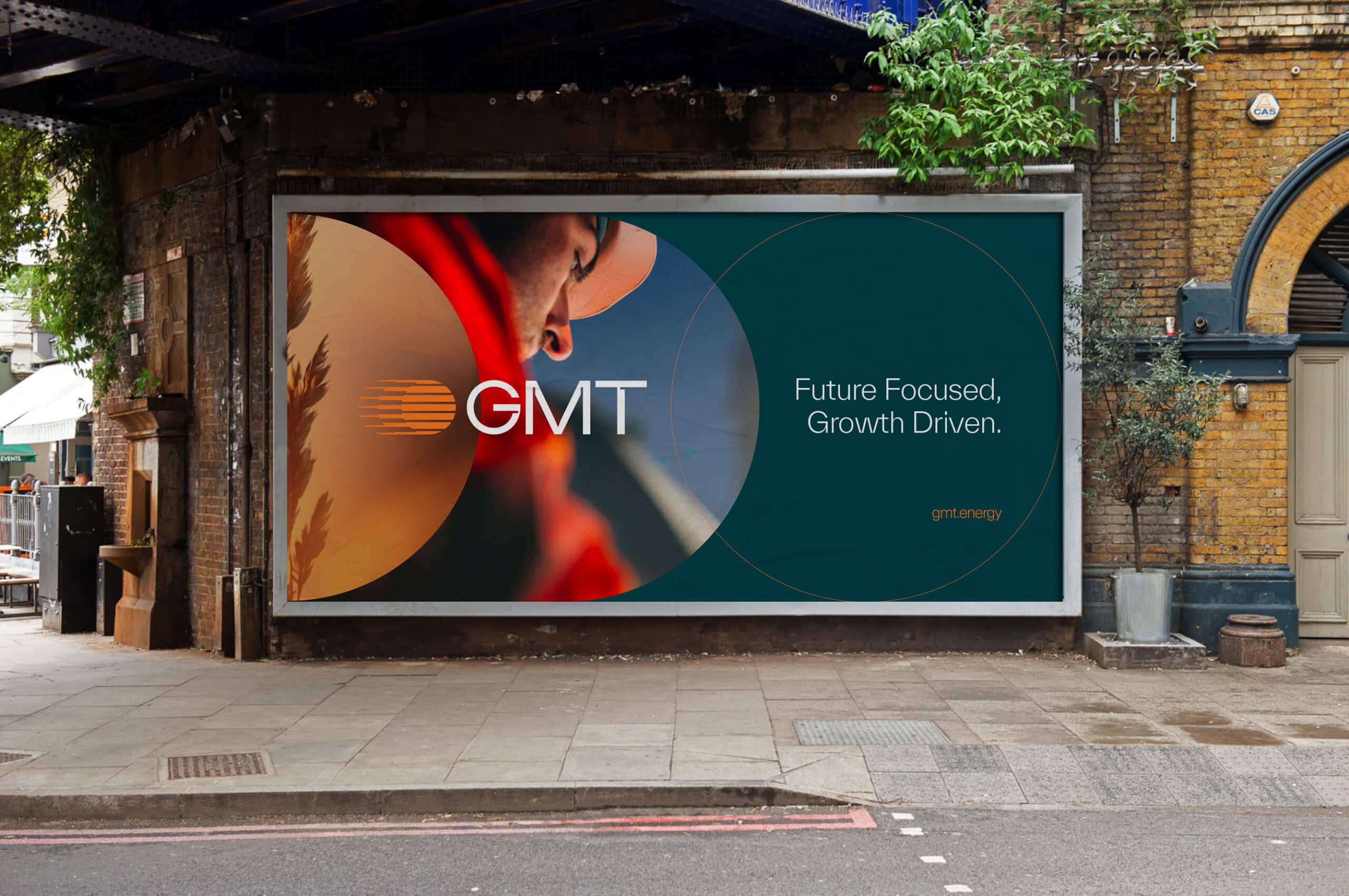
This insight became the foundation for a strategic platform built around progress and optimism. We defined a brand idea that captured GMT’s essence – a business constantly moving forward, enabling growth at every level. From this foundation, the phrase Future Focused. Growth Driven. emerged as both a rallying cry and a design philosophy.
Perpetual Change
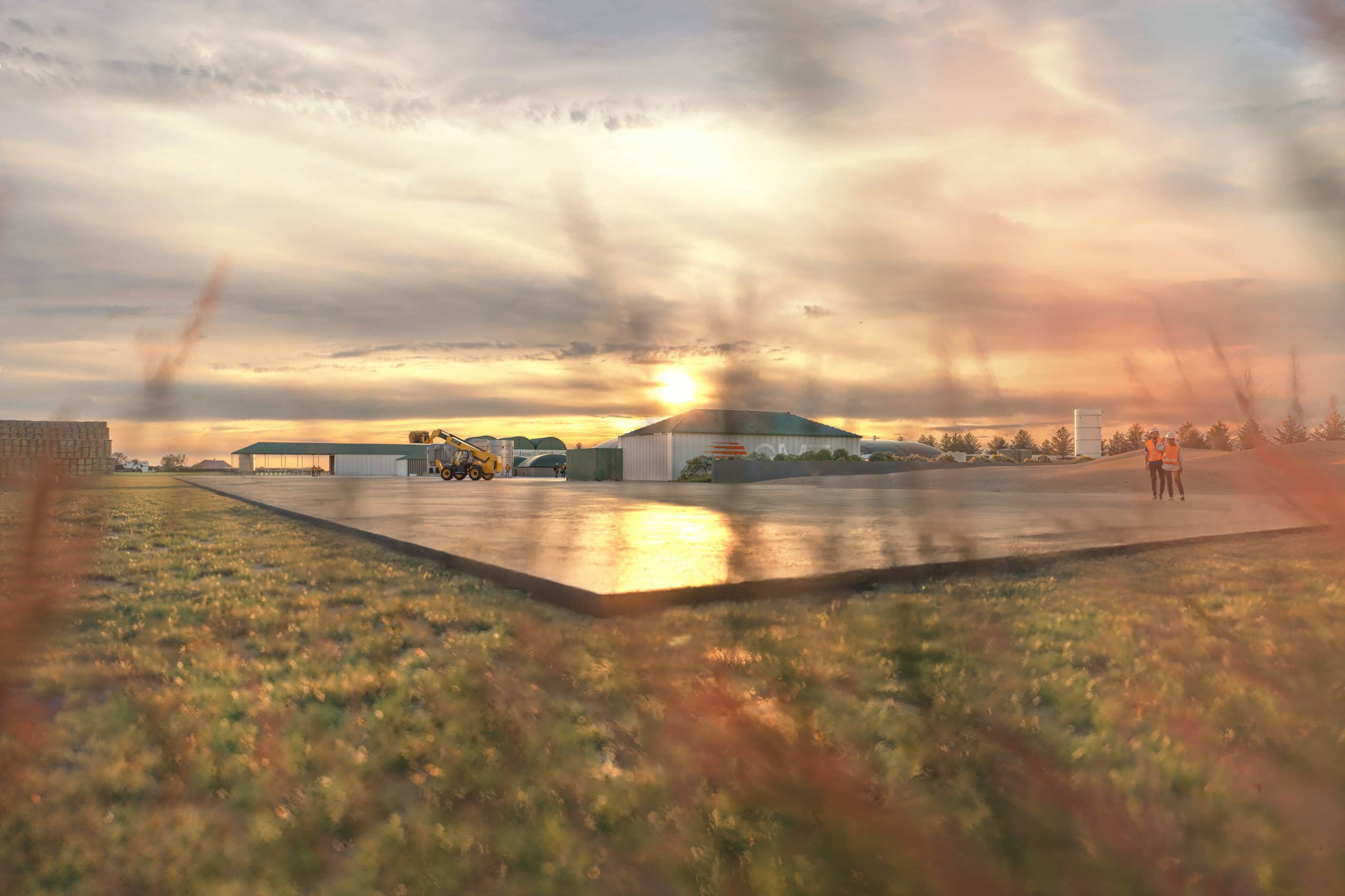
The new visual identity embodies motion, connection, and transformation. At its core sits a circular emblem composed of layered lines, symbolising the continuous flow of energy. It’s a mark of progress – representing both the cyclical nature of biomethane production and GMT’s commitment to dynamic innovation.
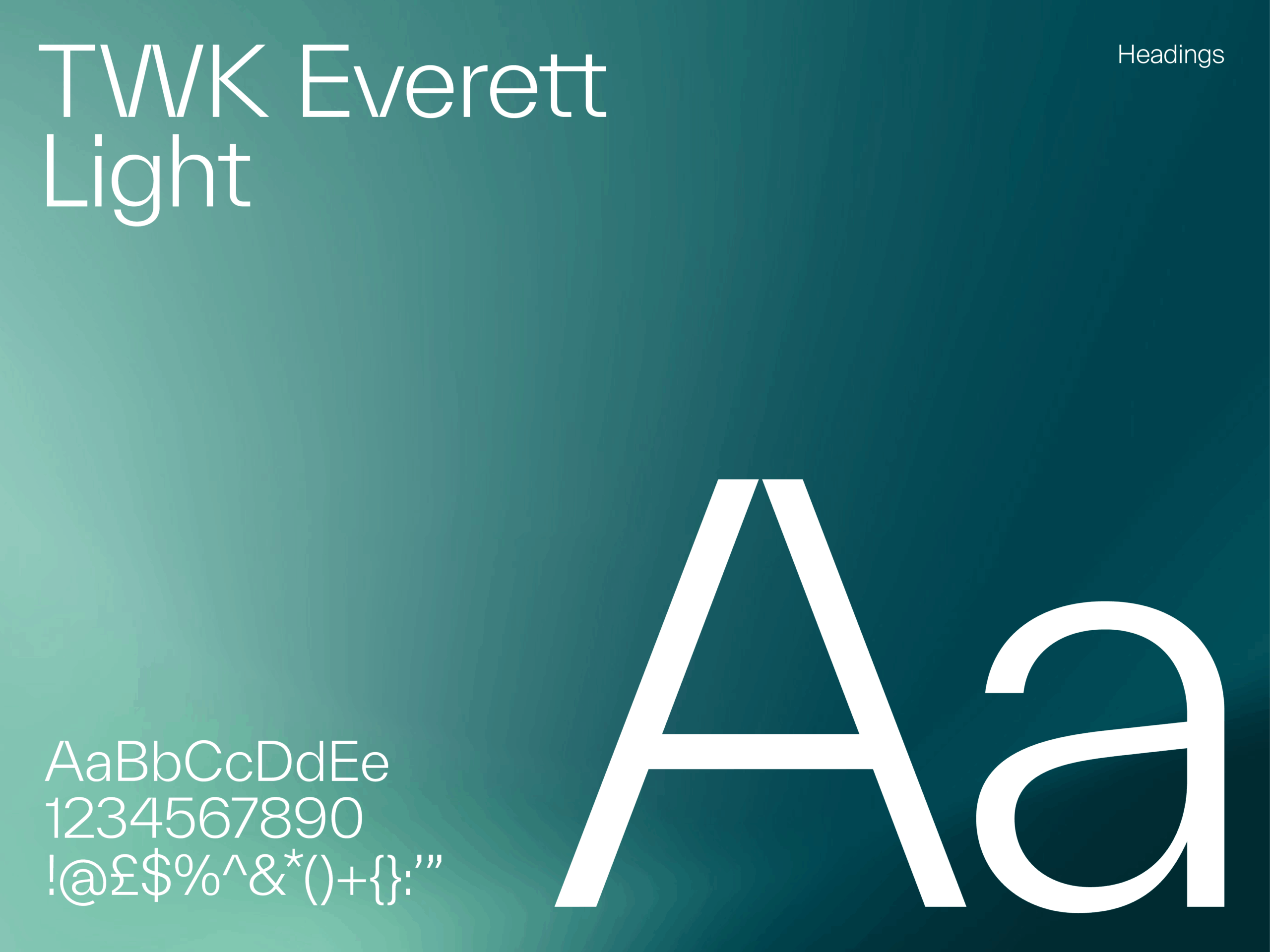
The logotype, clean and confident, complements the mark with precision and restraint, allowing the symbol to express momentum and depth. Typography plays an essential role in projecting this clarity. TWK Everett Light, chosen for its architectural refinement and modern structure, creates a calm confidence across all communications. It balances technological authority with human warmth – a reflection of GMT’s people-focused mission.
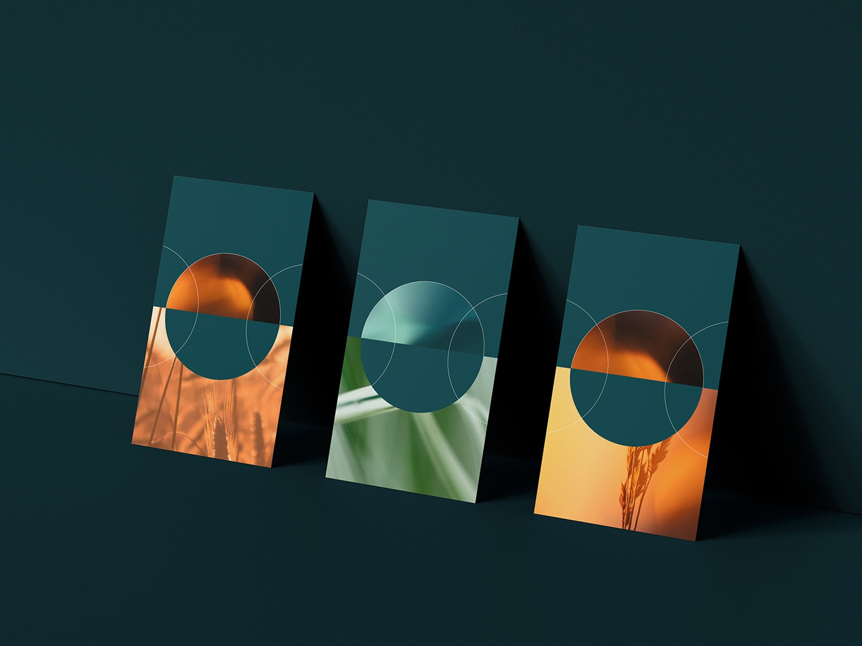
The colour palette deepens this narrative. Rich teal tones convey stability and sustainability, while vivid orange accents inject vitality and energy. The interplay of these colours creates a visual equilibrium between the natural and the engineered – between earth and innovation. Layered gradients, blurred photography, and soft circular forms build a sense of flow throughout the system. The aesthetic feels alive and evolving, echoing the process of energy transformation at the heart of GMT’s operations.
The Online Experience
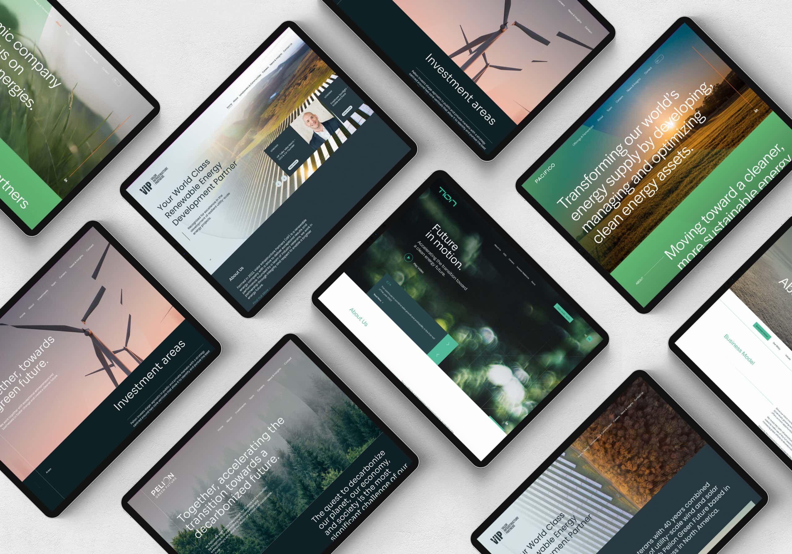
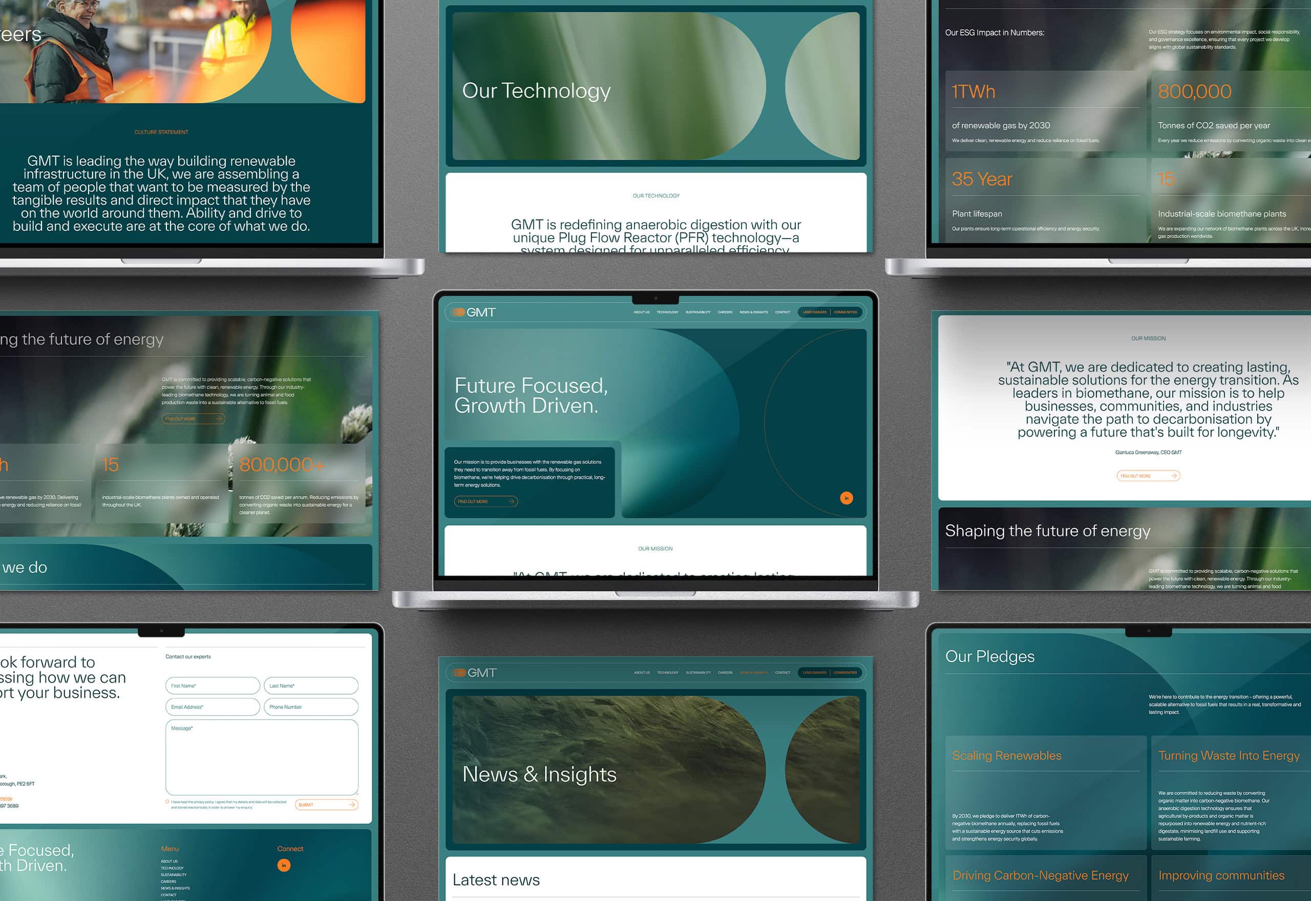
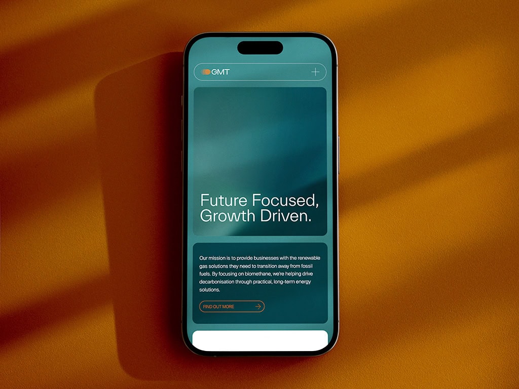
The website was designed as a living expression of GMT’s mission. Seamlessly combining clarity and inspiration, it guides users through a narrative of innovation, sustainability, and long-term impact. Transitions move fluidly, content reveals with precision, and photography immerses the viewer in a story of progress and potential. The result is a digital experience that’s as confident and refined as the brand it represents.
Project Deliverables
Brand Workshop
Research & Brand Strategy
Brand Positioning
Brand Identity
Logo Design
Corporate Stationery Design
Copy Writing
Website Design & Development
Social Media Page Design
Creative Consultancy & Project Management
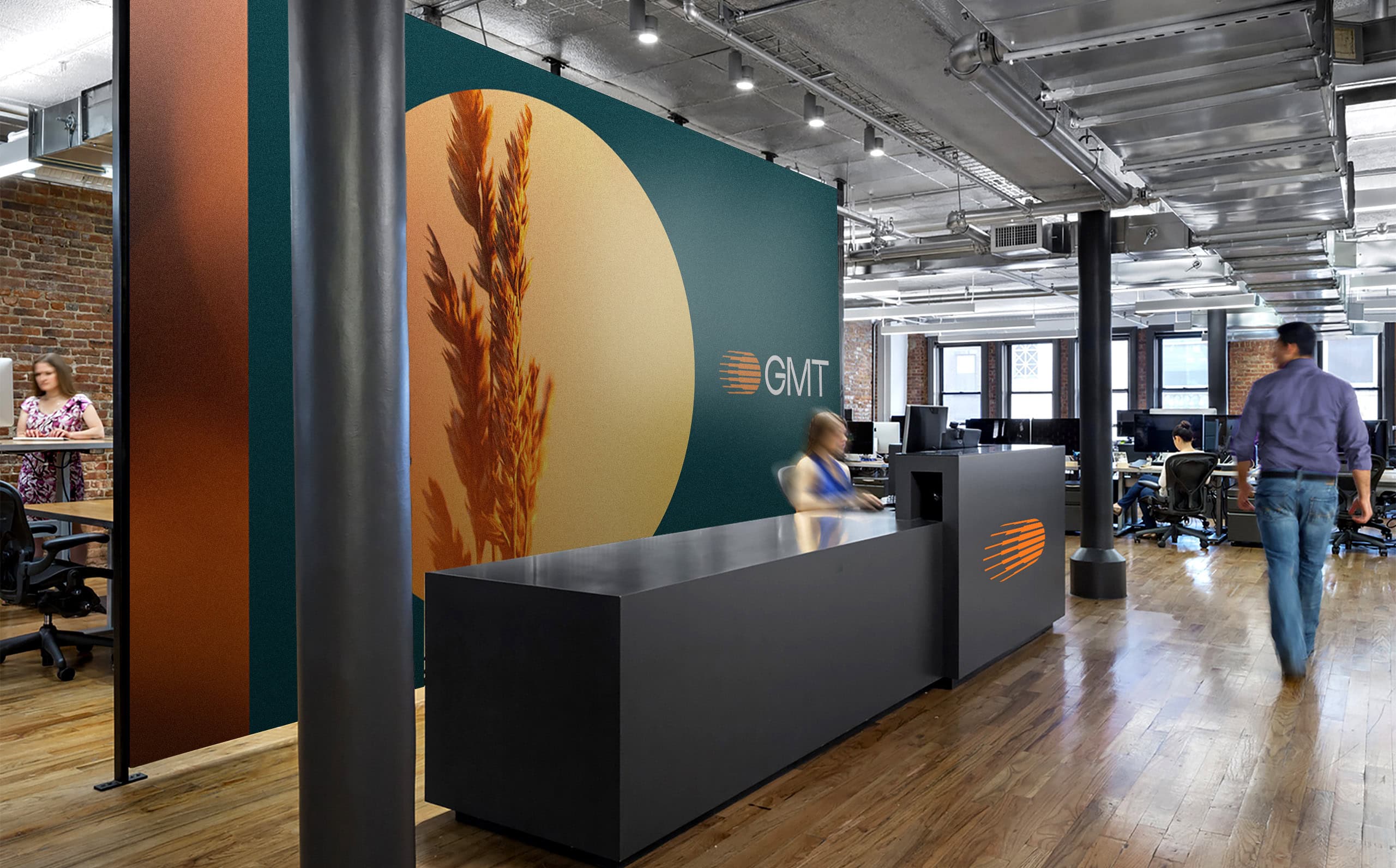
Brand In Application
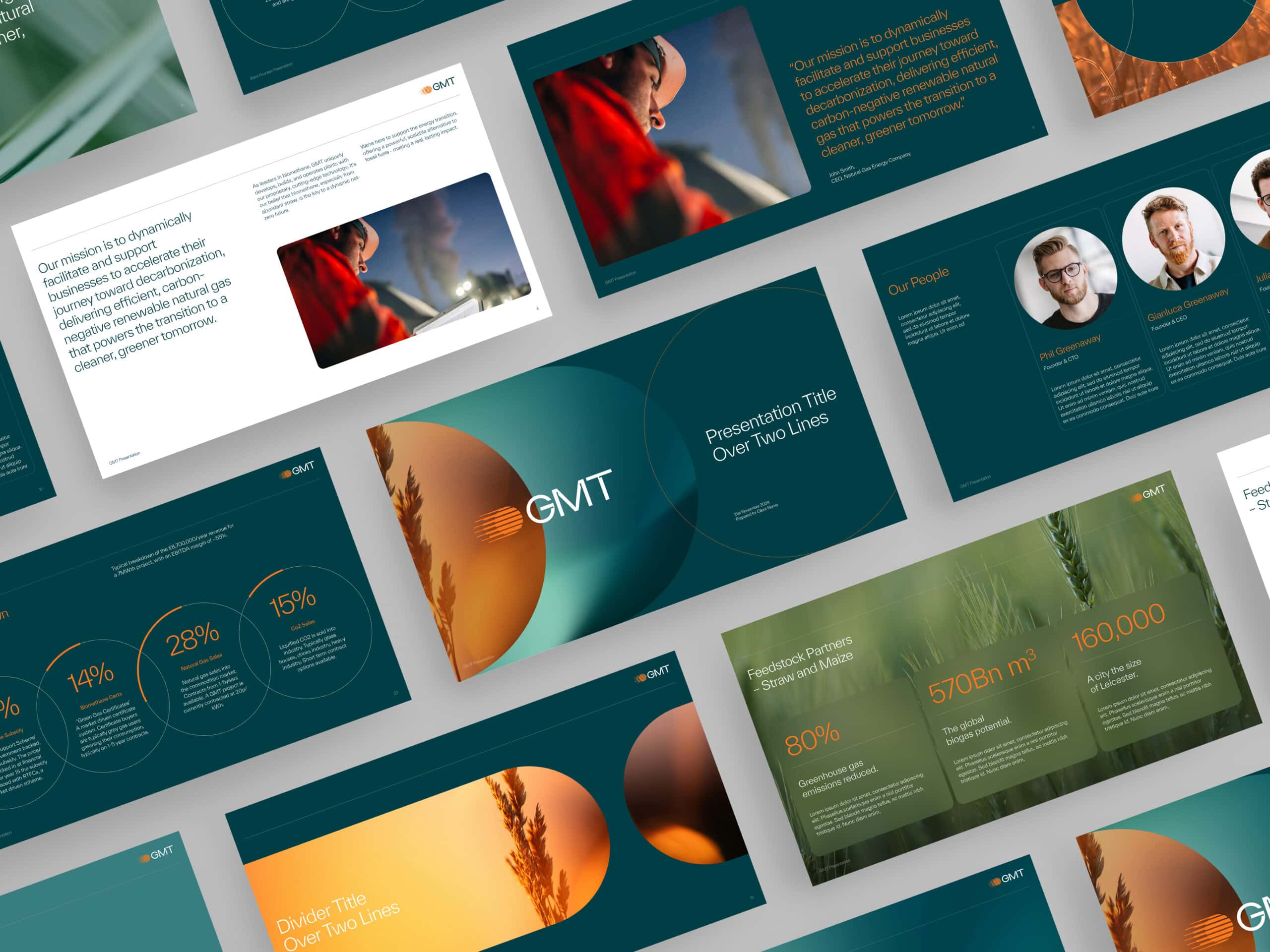
Across presentations, reports, and investor materials, the identity provides structure and sophistication. The circular motifs and layered compositions create rhythm and continuity, while the typography ensures effortless legibility.
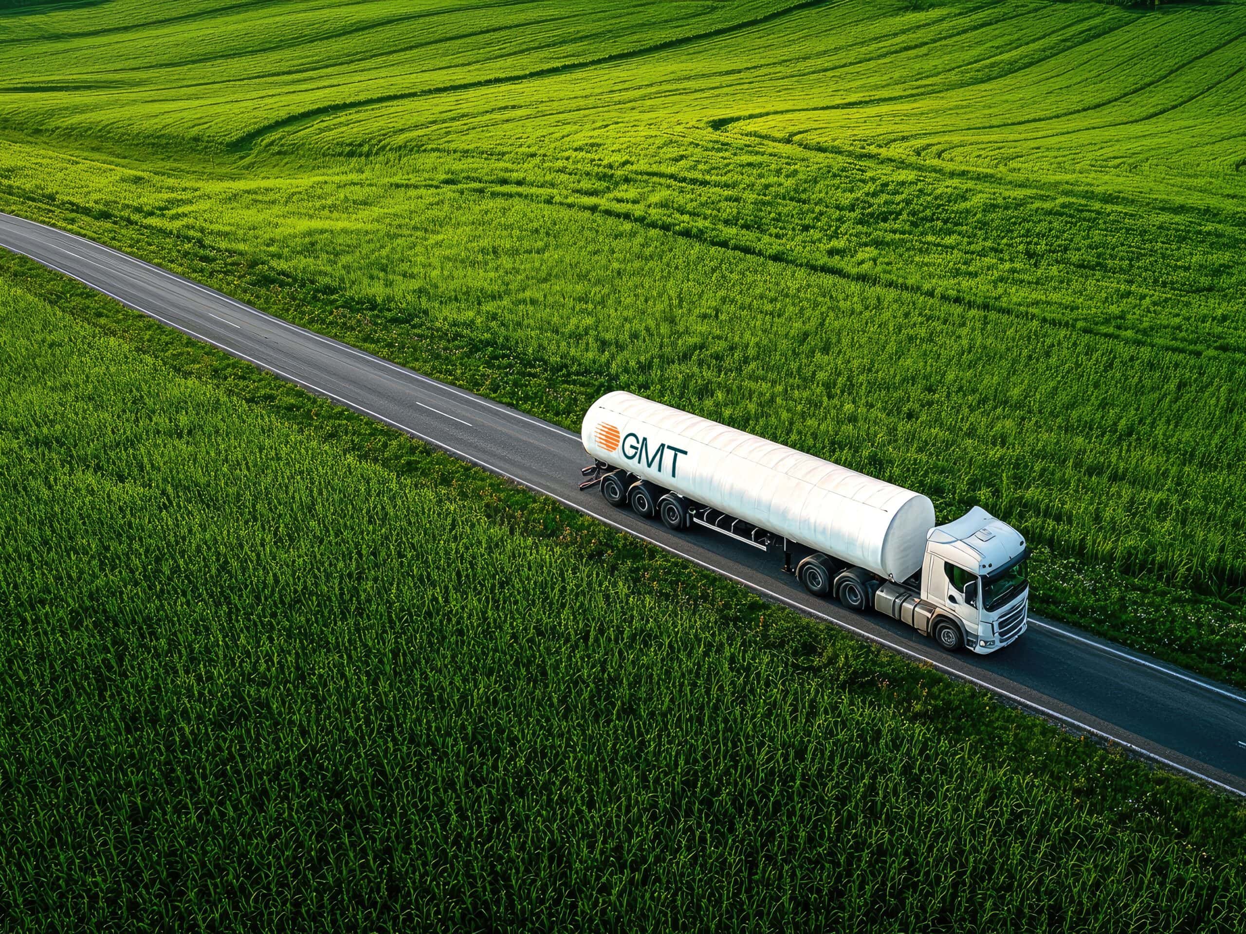
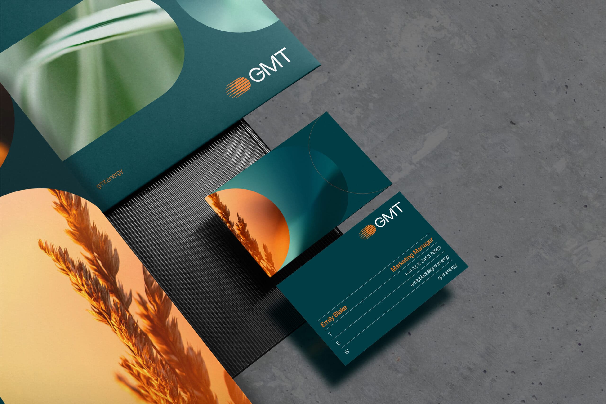
The new identity extends seamlessly across every touchpoint – from corporate stationery and slide decks to comprehensive brand guidelines, environmental signage, and advertising campaigns. Each element reinforces GMT’s commitment to clarity, innovation, and progress, ensuring a cohesive and confident presence across every interaction – within the organisation and out in the world. The brand feels powerful in motion yet measured in tone, a balance that mirrors GMT’s role in shaping the renewable future.
In Summary
The rebrand propels GMT into the future as a catalyst for the UK’s clean-energy transformation – a company defined by innovation, purpose, and progress. The new identity embodies both the precision of their technology and the optimism of a world powered by possibility. It positions GMT not just as a participant in the renewable transition, but as an enabler of tomorrow’s growth – for businesses, communities, and the planet.
With a unified and forward-looking visual and verbal language, GMT now speaks with clarity, ambition, and authority. This represents a strategic evolution – a cohesive expression of GMT’s purpose and long-term ambition.
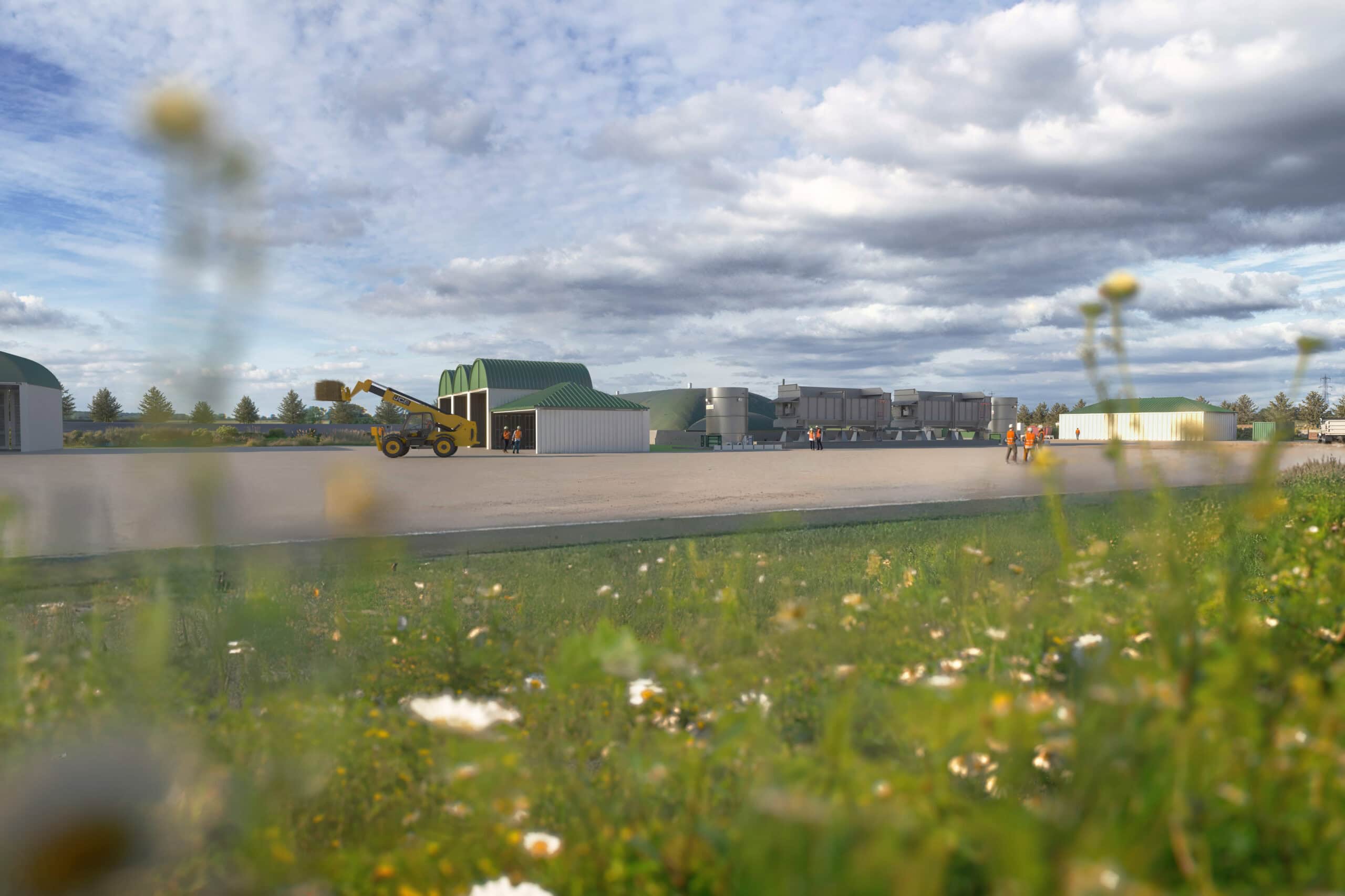
“What makes this project truly inspiring is its ability to balance innovation with integrity - creating a brand that feels both visionary and grounded in purpose. GMT’s new identity captures the essence of progress: intelligent, optimistic, and deeply connected to the future of sustainable energy.
For me, it’s a perfect example of how strategic creativity can transform perception and drive real-world impact. This rebrand doesn’t just redefine how GMT looks - it reaffirms what they stand for and the positive change they’re helping to shape.”
Related Work
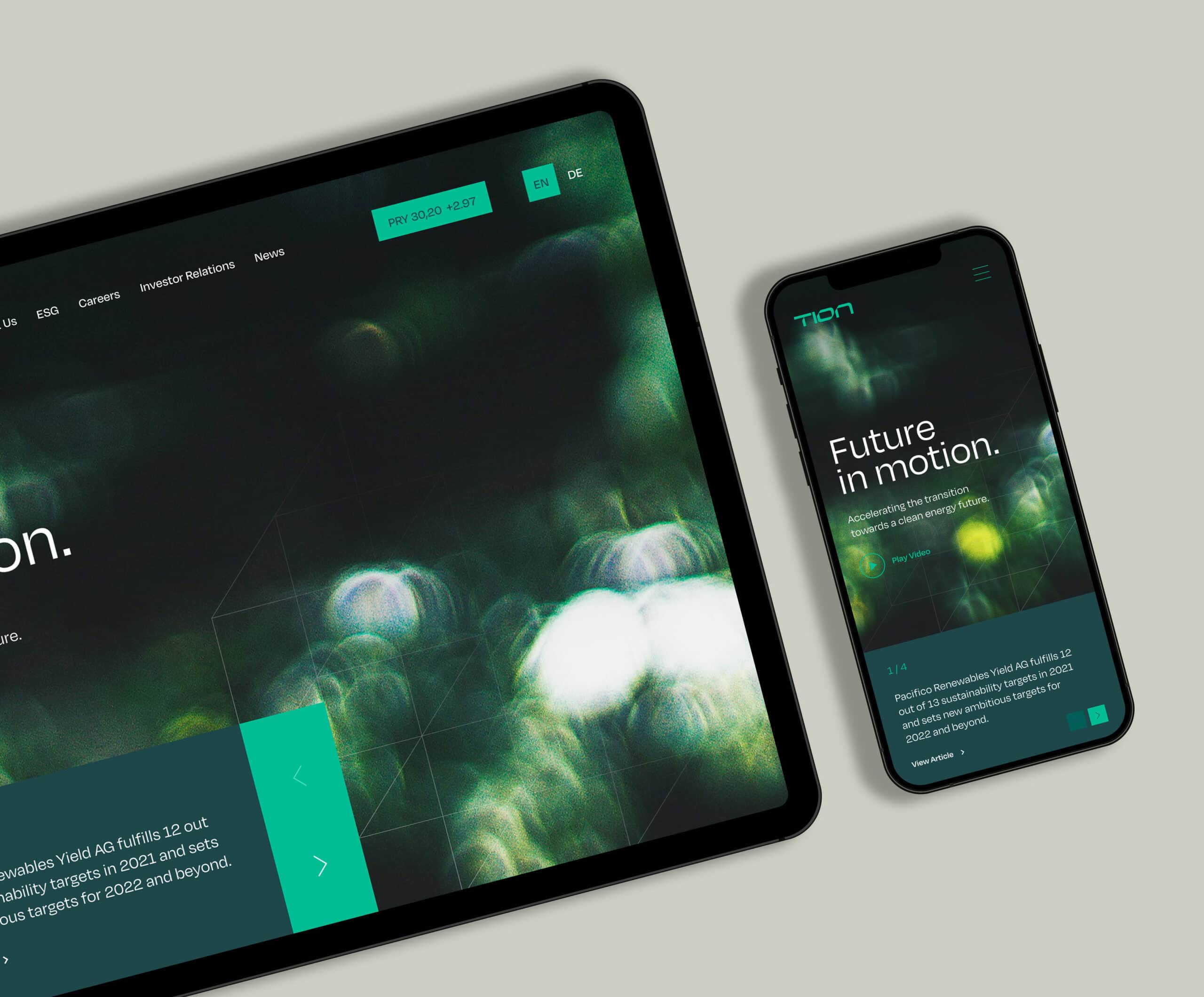
Renewable Energy Branding & Website
Tion Renewables
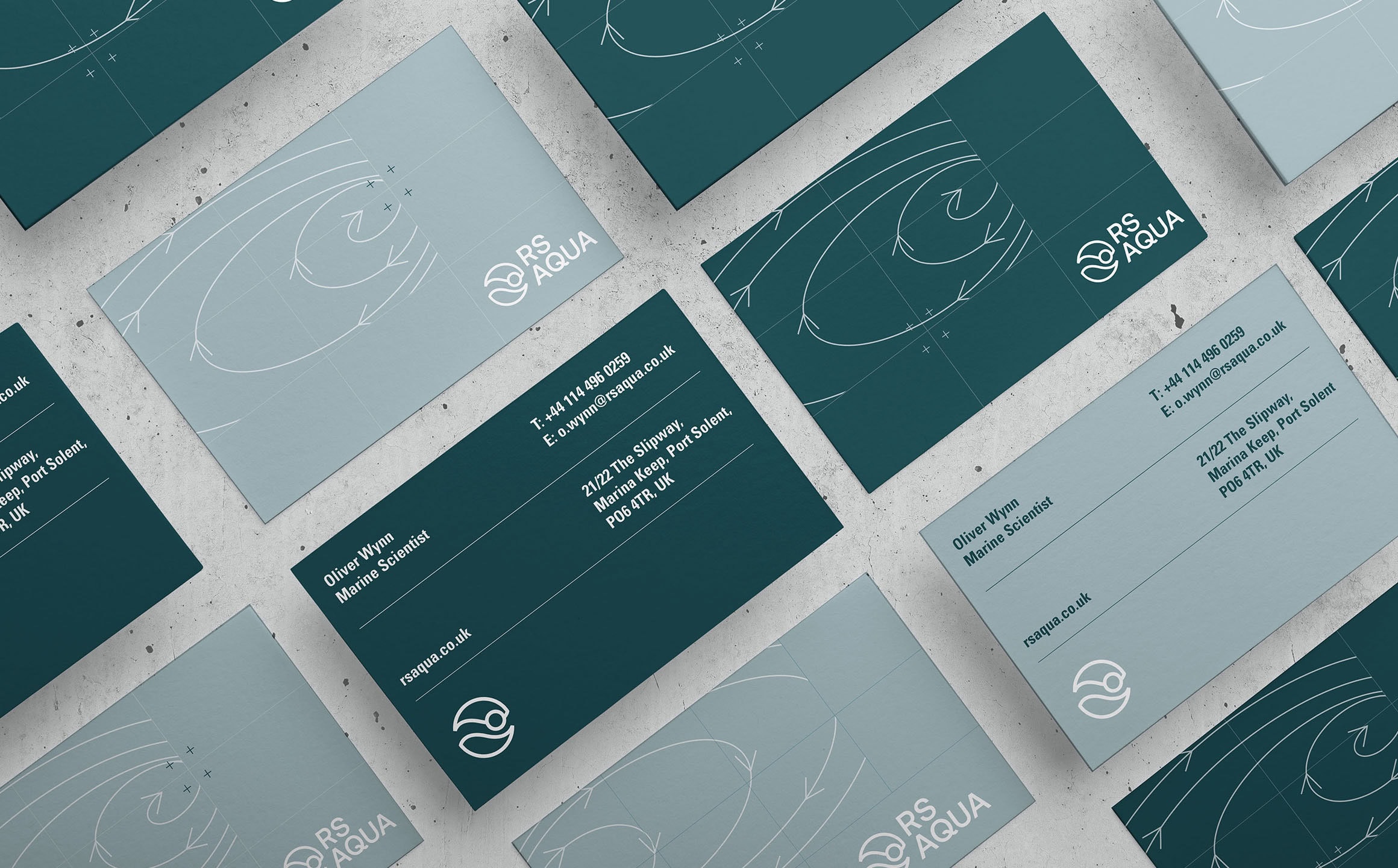
Marine Technology Rebrand & Website
RS Aqua
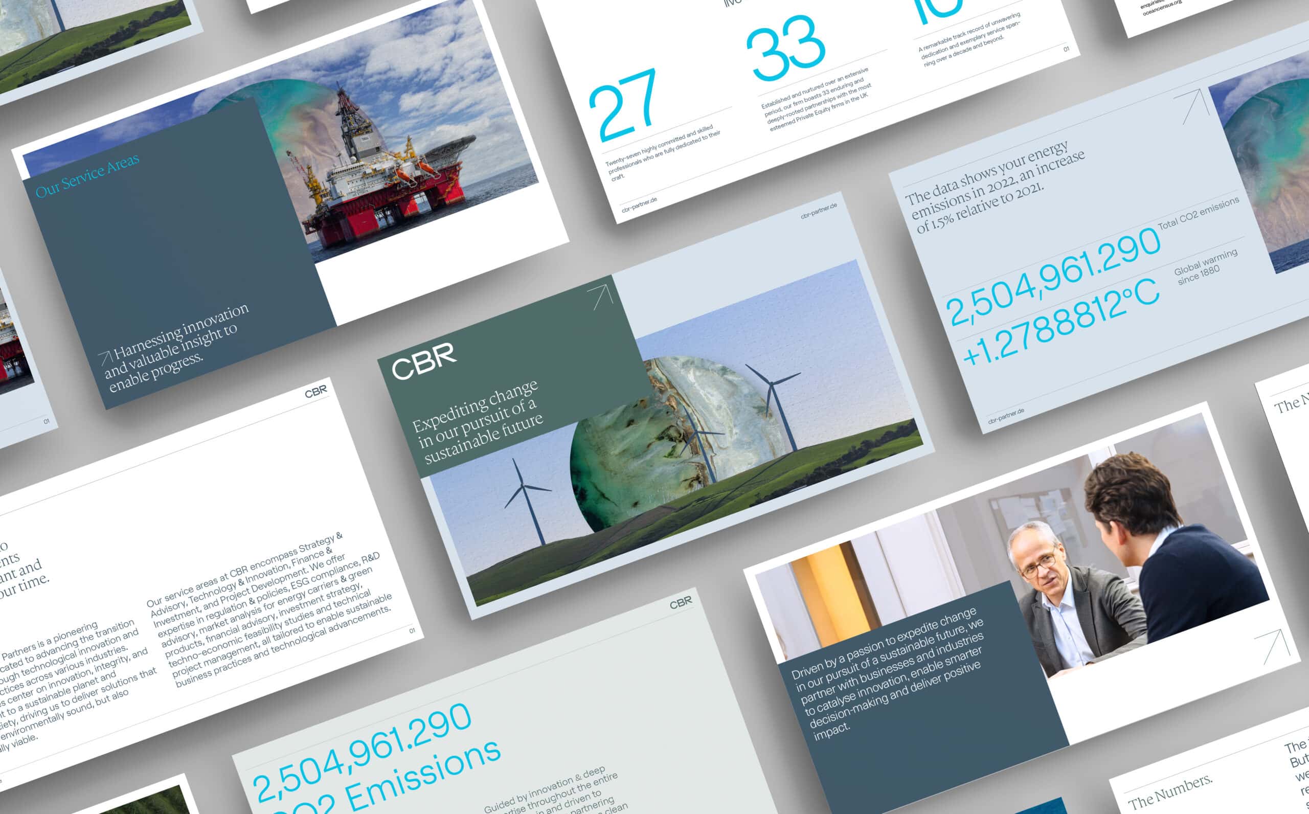
Branding & Website Design for Sustainability Consultancy
CBR Sustainability Partners
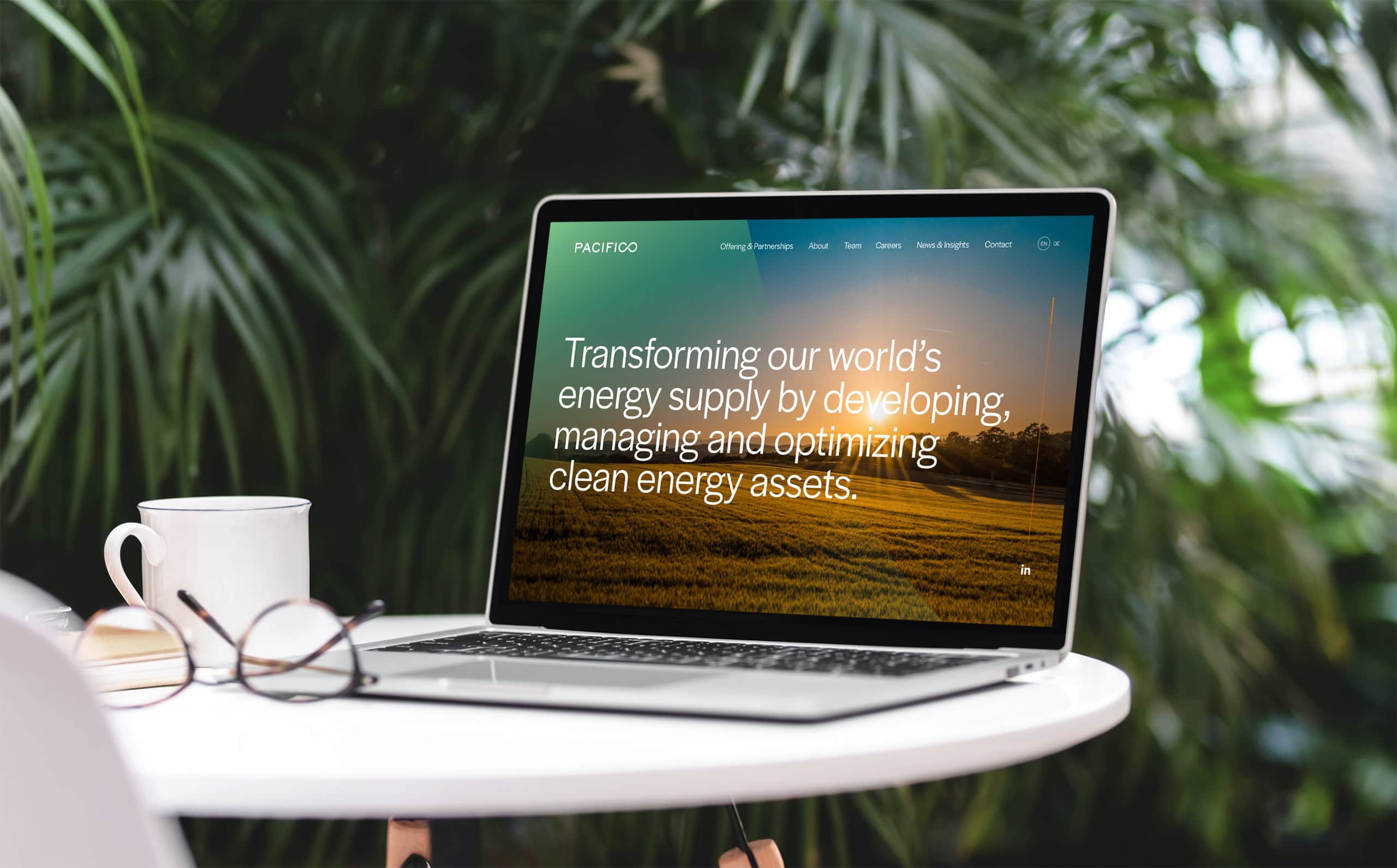
Renewable Energy Brand Identity & Website
Pacifico Energy Partners
Branding & Website Design for Sustainable Investment Firm
SUSI Partners

