Estate Agent, Uniquely Differentiated
Estate Agents Branding & Website
Working collaboratively with the team from Budgen&Co, we set out to define the unique proposition offered by these accomplished property professionals. Their ambition? To lead the way in Brighton & Hove’s property market, via a refreshingly straight-talking approach, committed to helping their customers realise their full potential within the local area.
A straight-talking voice of reason amidst a complex market, Budgen&Co’s personality is both approachable yet sophisticated. Their unique brand proposition, proudly positioned at the forefront of their identity – exuding confidence & connecting on an emotional level with their audience, identifying a clear ‘client-centric’ point of difference in both their professional values & their unique approach.
Adventurous By Nature
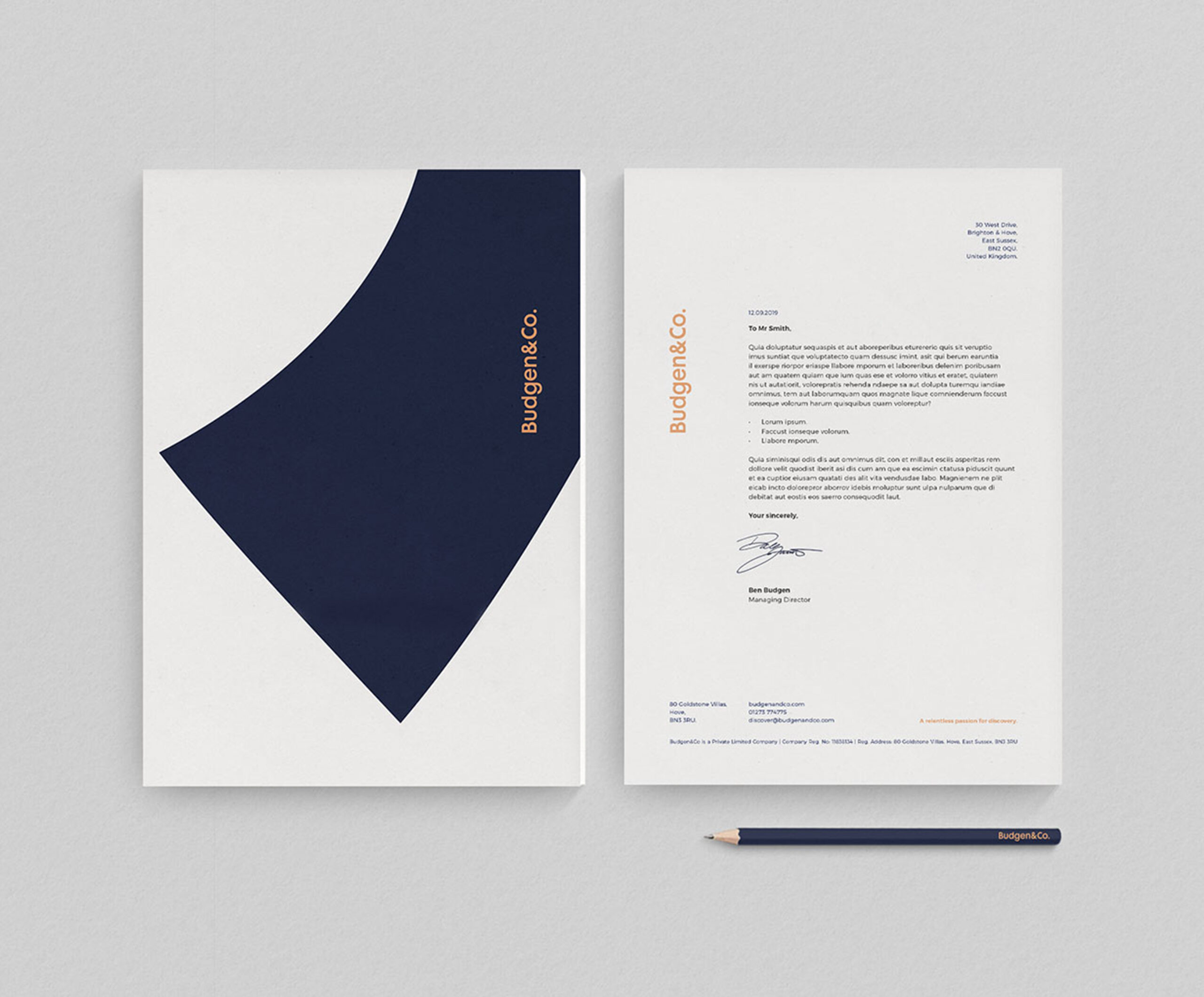
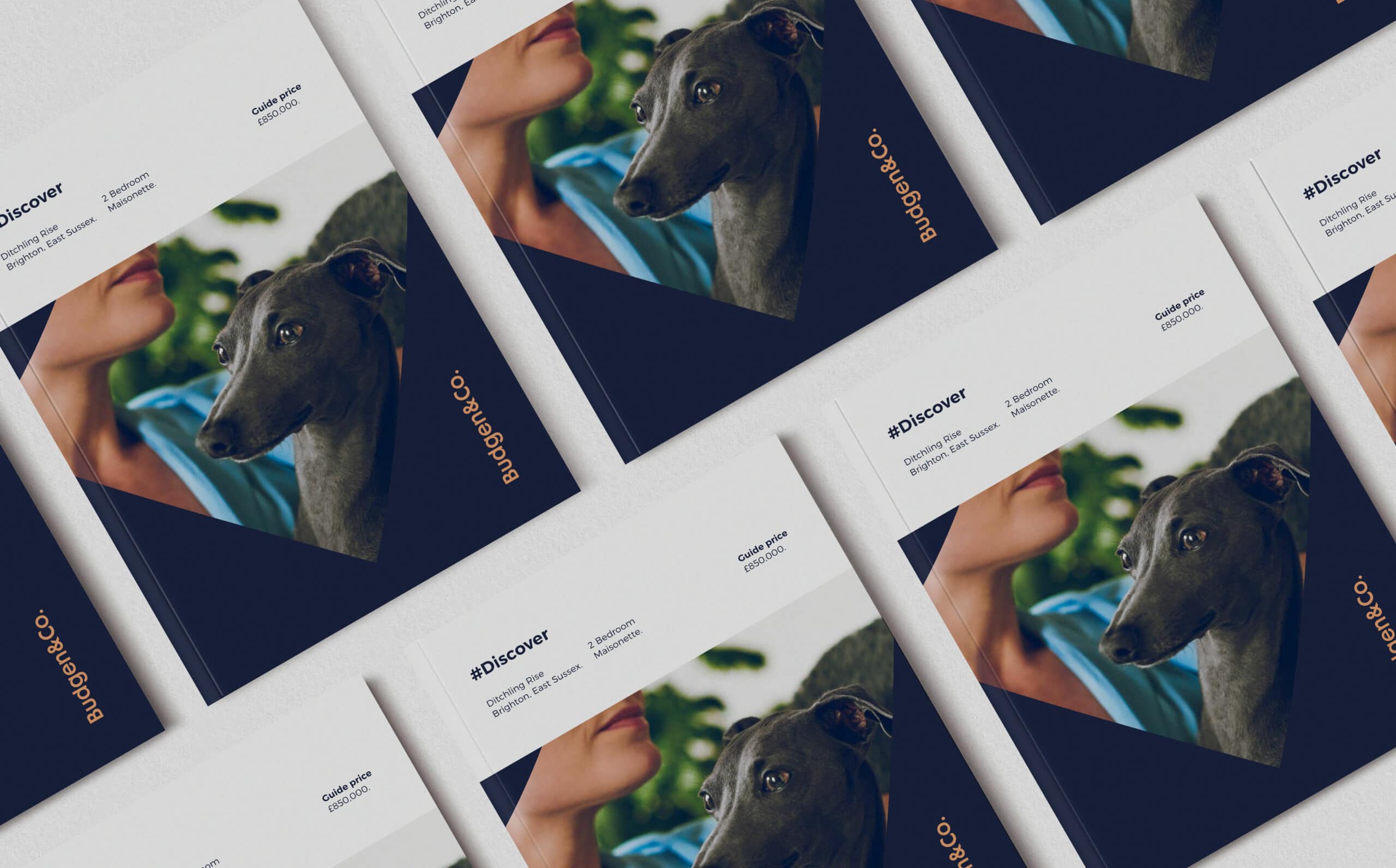
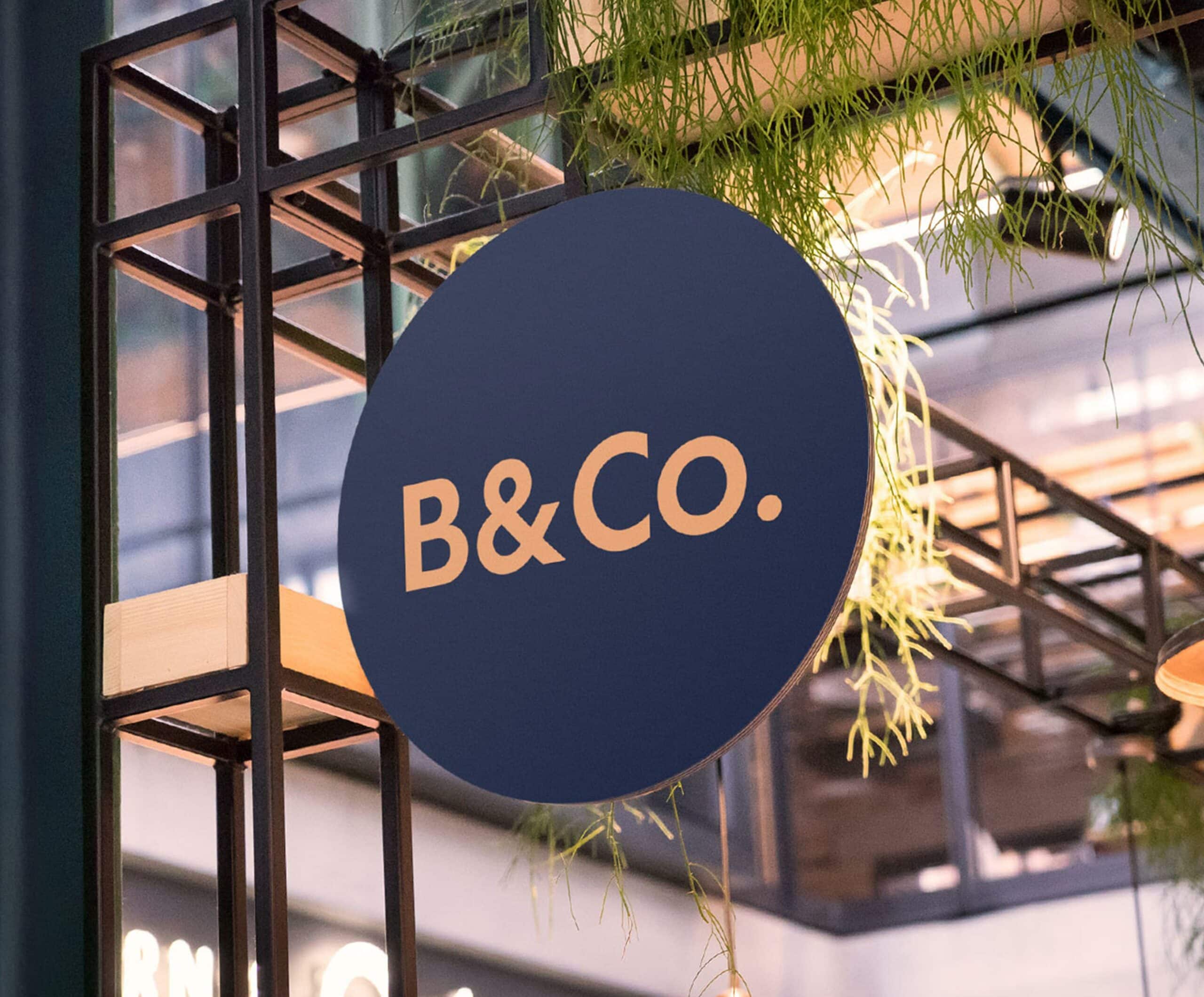
The logo encapsulates the confident, ambitious attitude that Budgen&Co. pride themselves on. Clean, sans-serif typography & bold use of punctuation make for a logo that cuts straight to the point. This balance of sophistication & assertiveness is a defining characteristic of the brand identity.
A Uniquely Differentiated Brand Persona
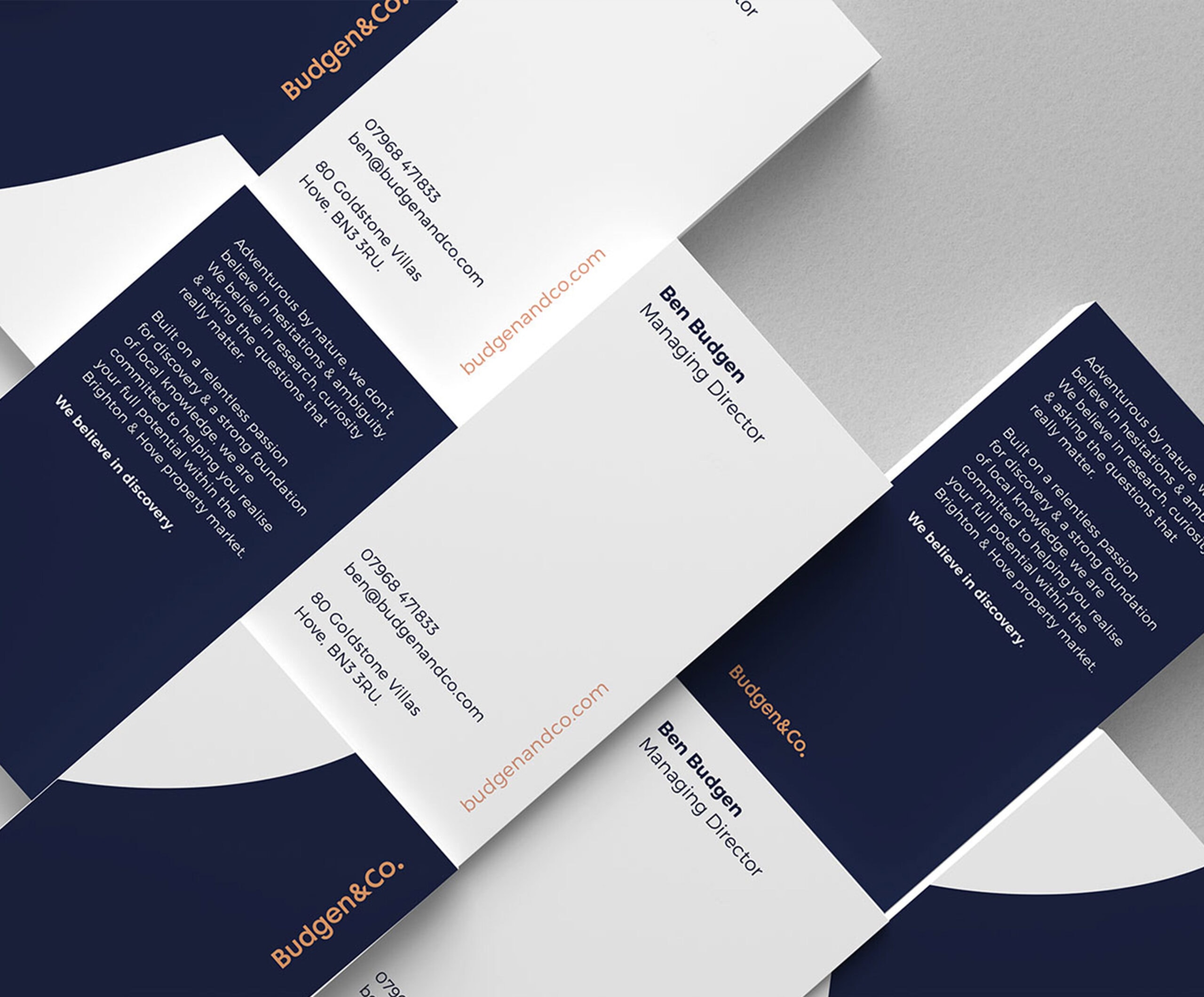
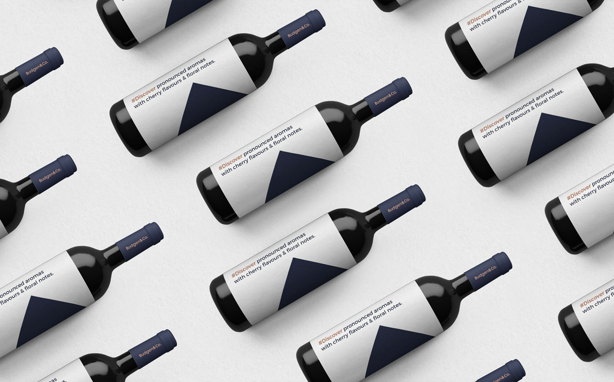
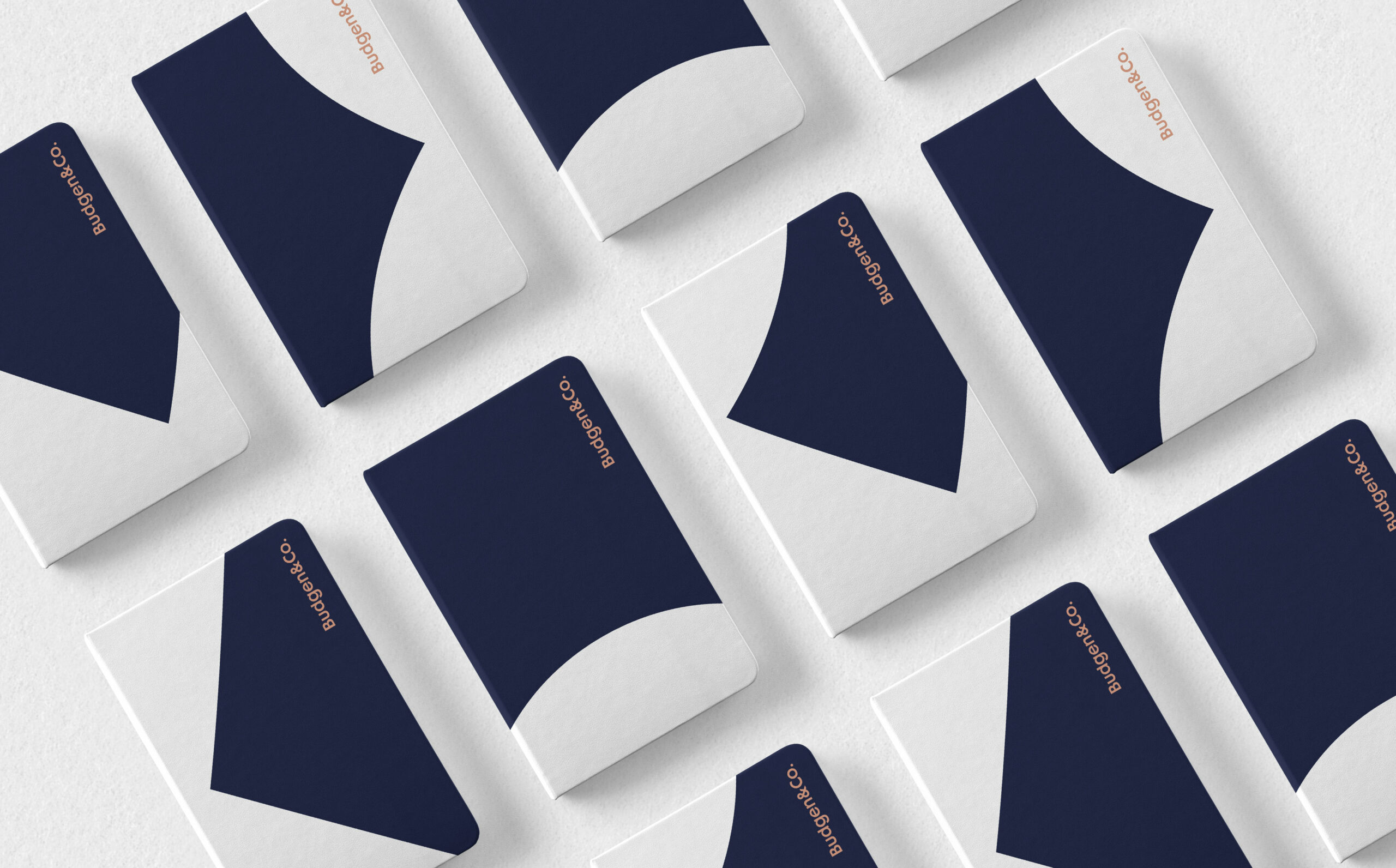
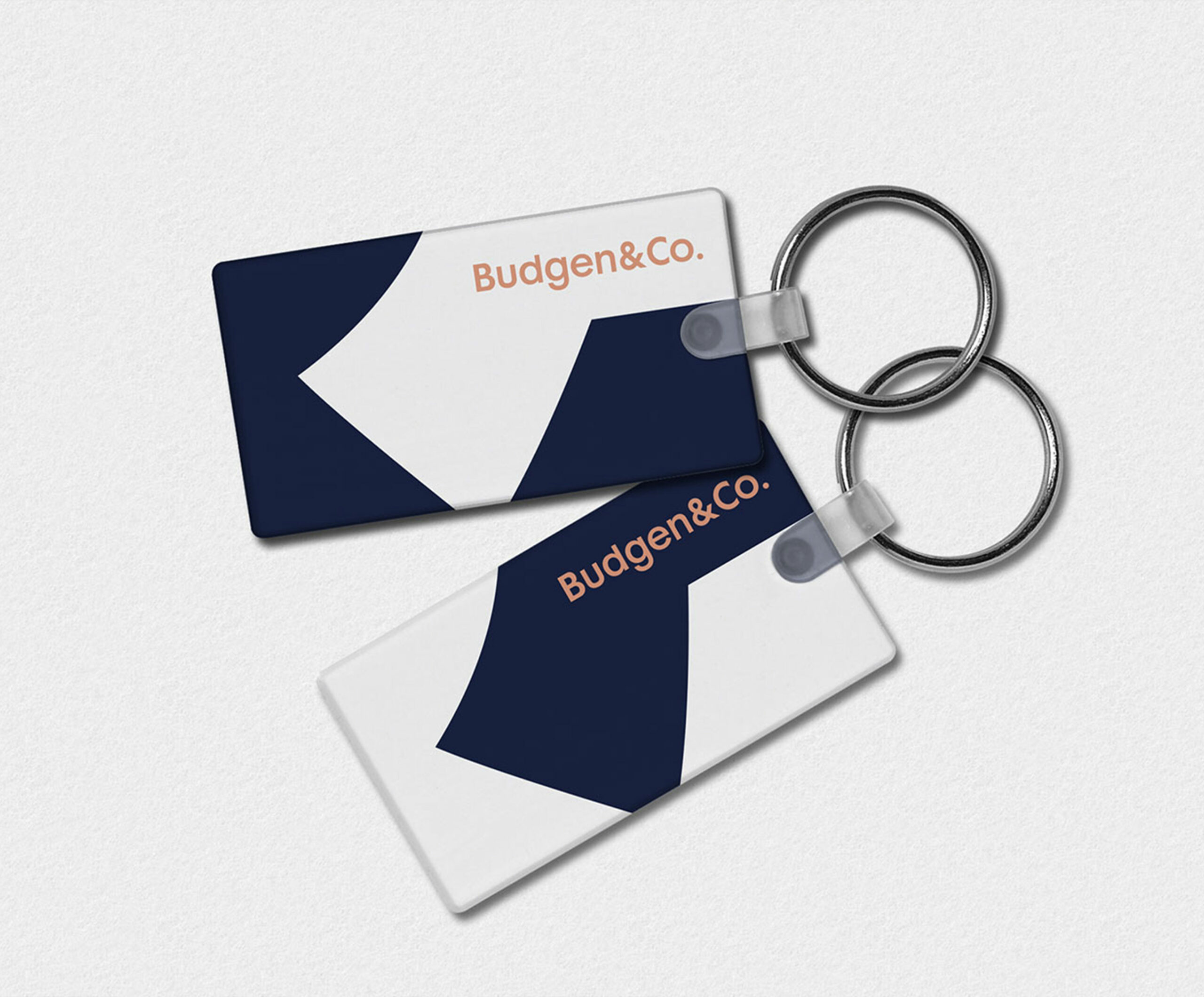
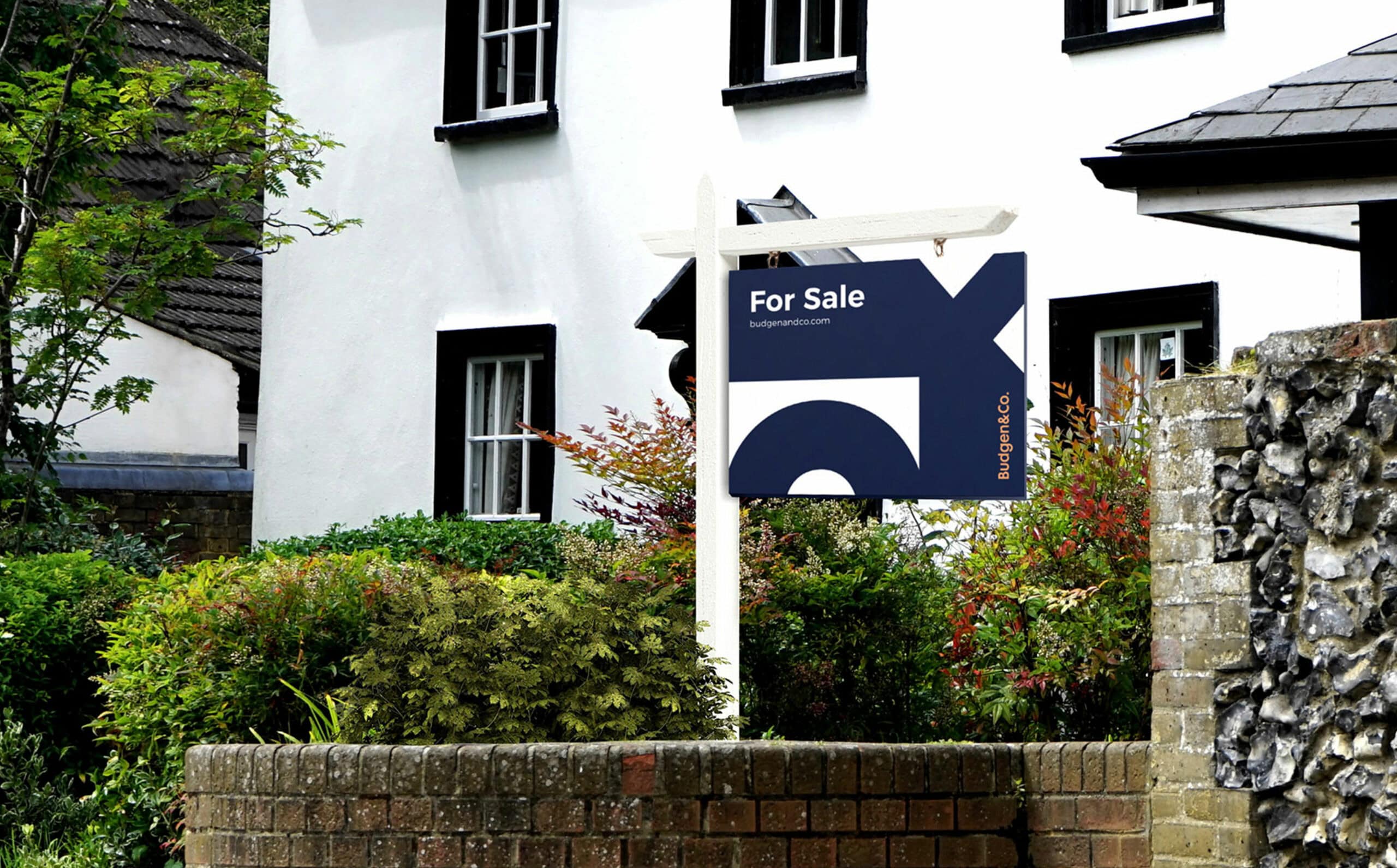
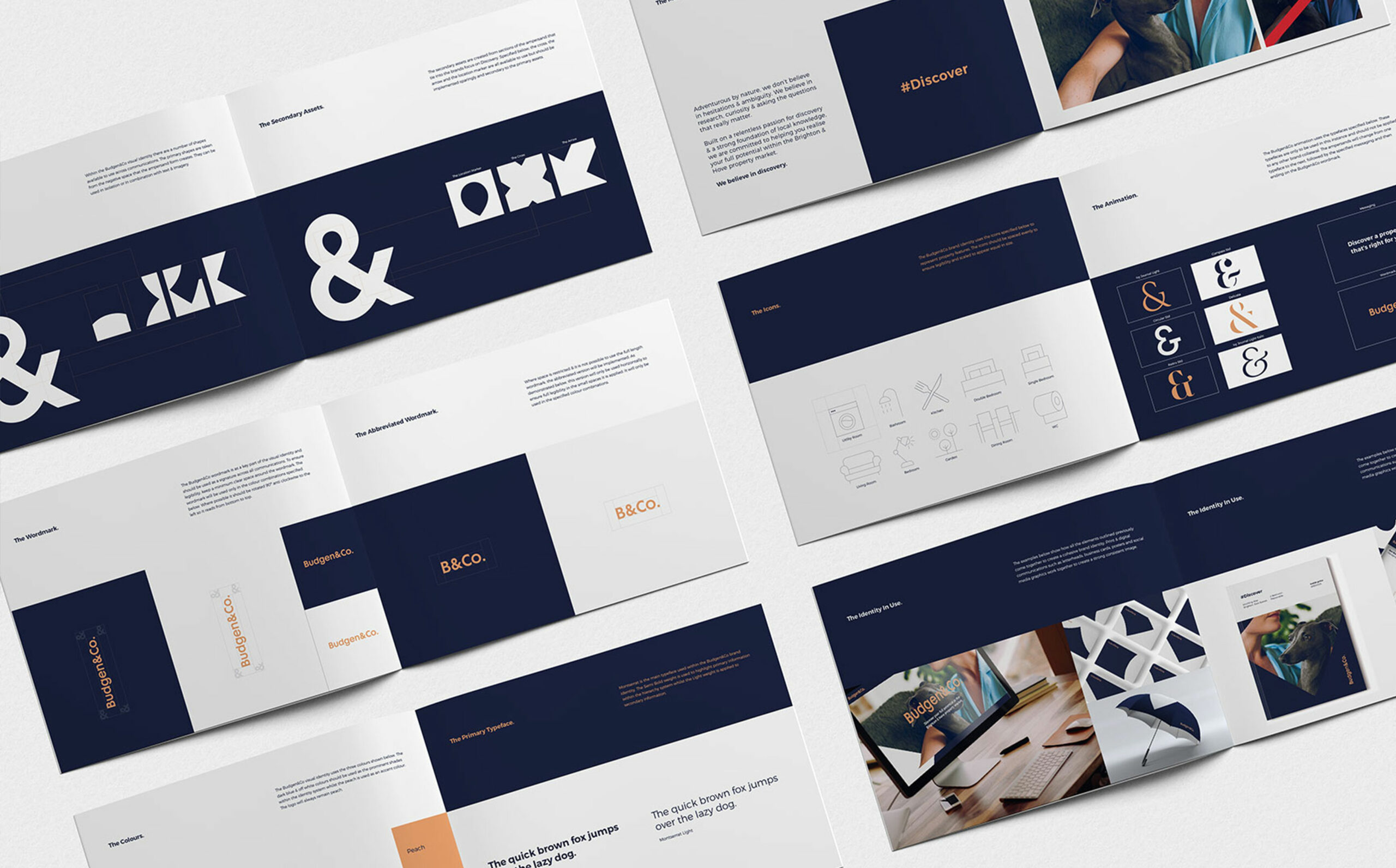
The creation of the brand identity uses a carefully considered balance of shapes & forms taken from the primary brand ampersand.
This is an abstract portrayal of the level of detail & insight that the team at Budgen&Co. unearth to accurately value their clients properties. This makes for a highly flexible & adaptable identity, which aids recognition & brand equity within a highly competitive landscape. The unique combination of dark blue & soft peach enables even greater standout & a uniquely differentiated brand persona.


Project Deliverables
Research
Brand Strategy
Brand Positioning
Logo Design
Brand Identity
Messaging & Copywriting
Photography
Interior Office Graphics
Marketing Materials
Animation
Responsive Website Design
Project Management

The Path To Discovery
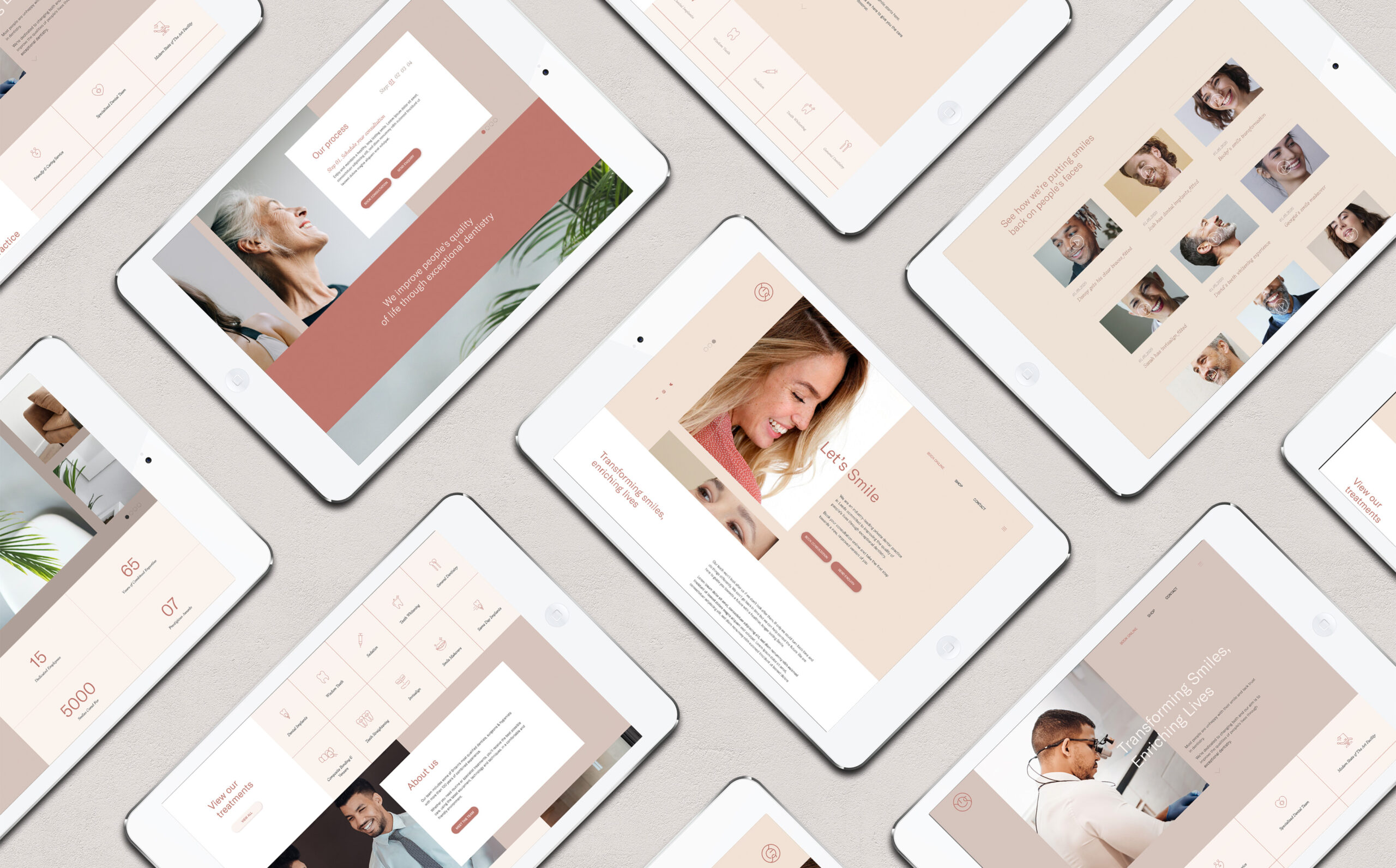
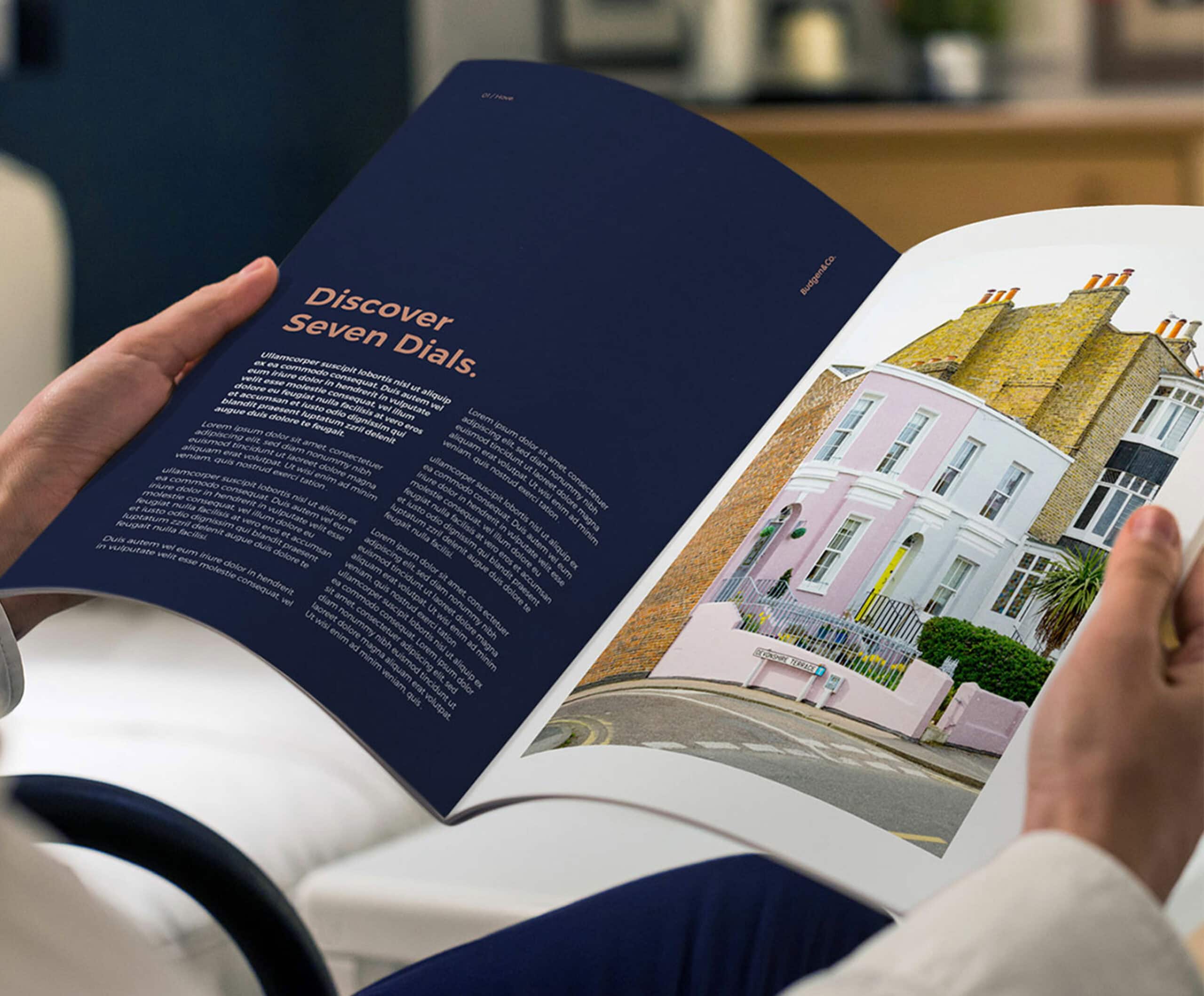
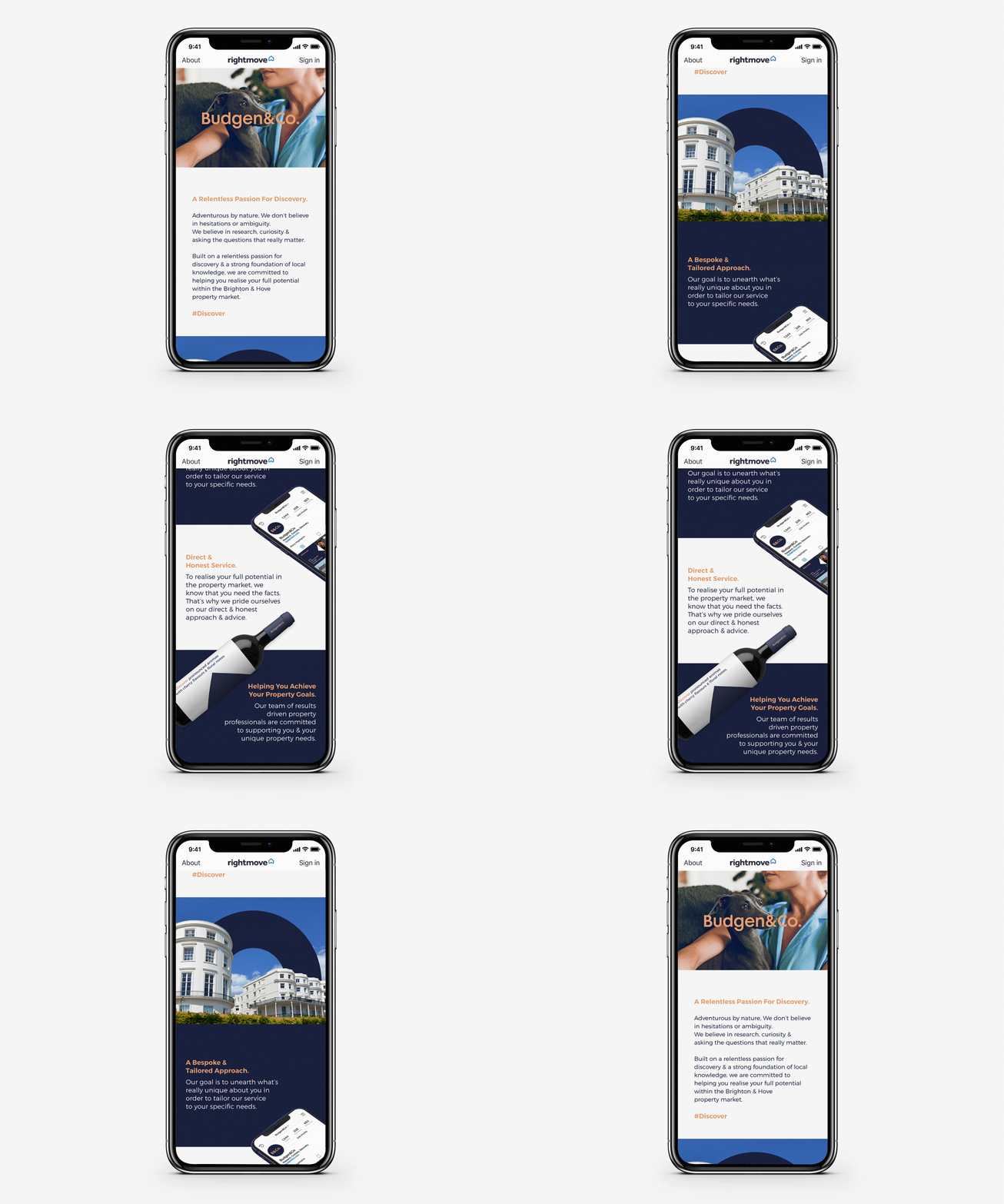
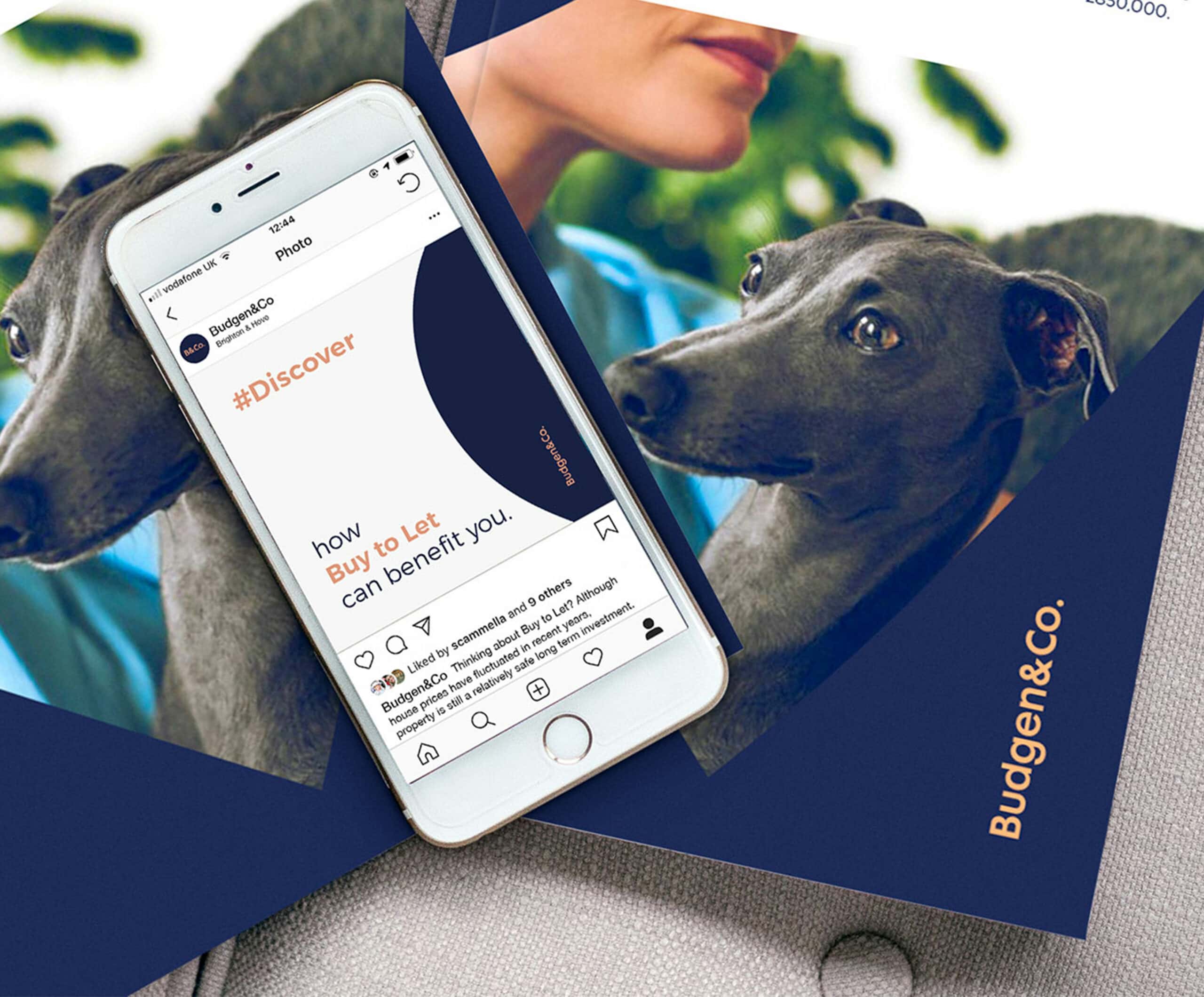
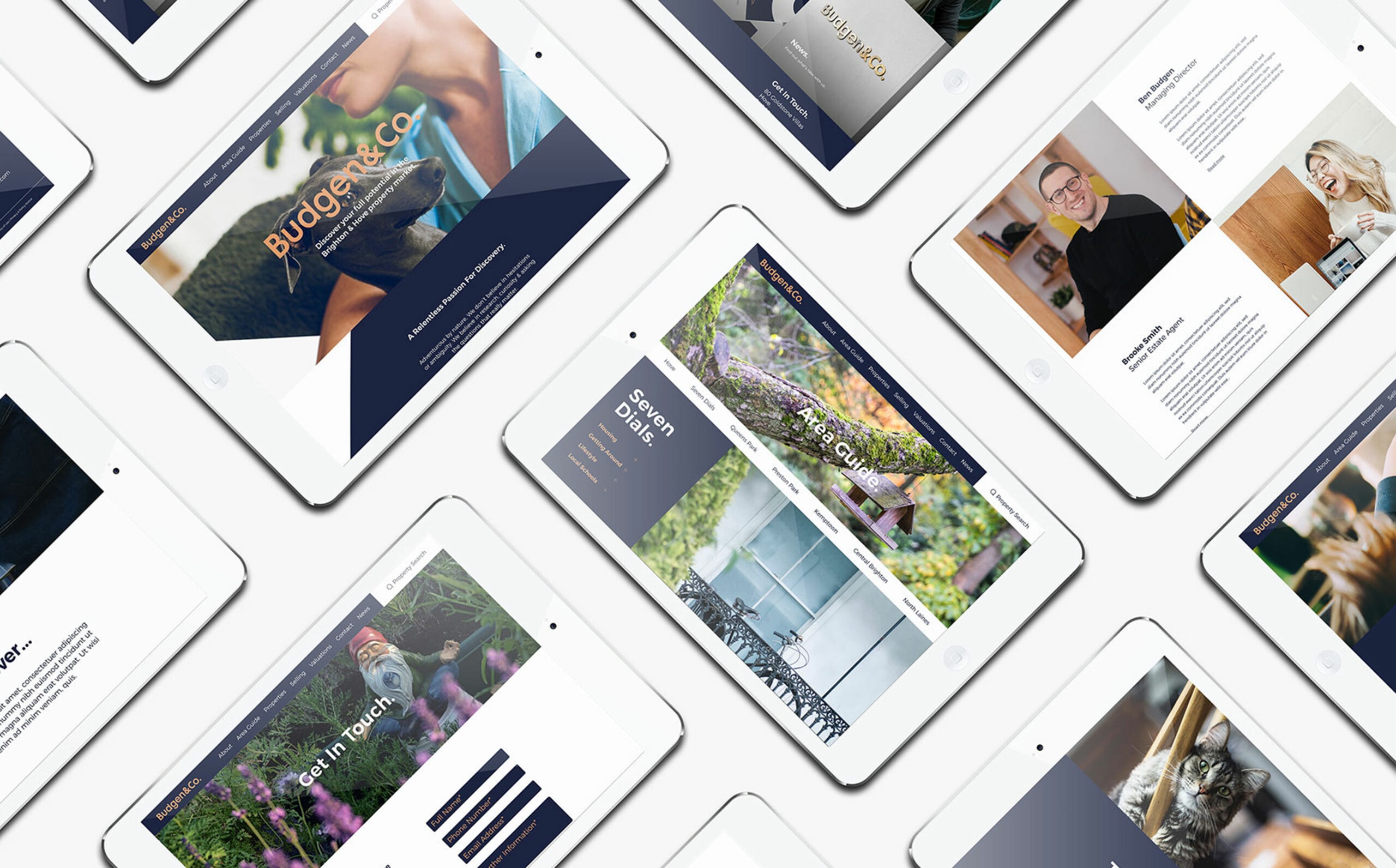
Imperative to Budgen&Co. standing out within the property market was a strong presence in the digital landscape. We used animation to inject energy across digital touch points & powerful lifestyle imagery to create a cohesive identity that really struck a chord with the audience.
“Working with Ben & his team has been a thoroughly enjoyable experience. They have a genuine passion for their industry & continue to prove themselves as aspirational individuals, who work with us to push the boundaries & think differently every step of the way.”

Related Work
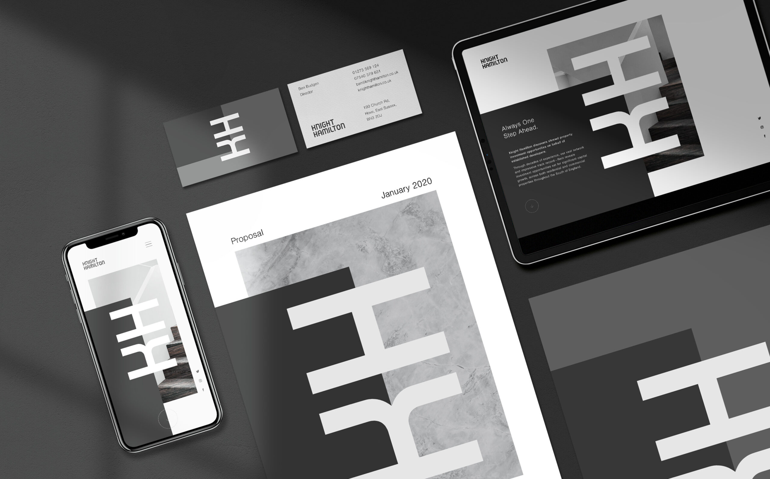
Knight Hamilton
Property Investment Brand Identity
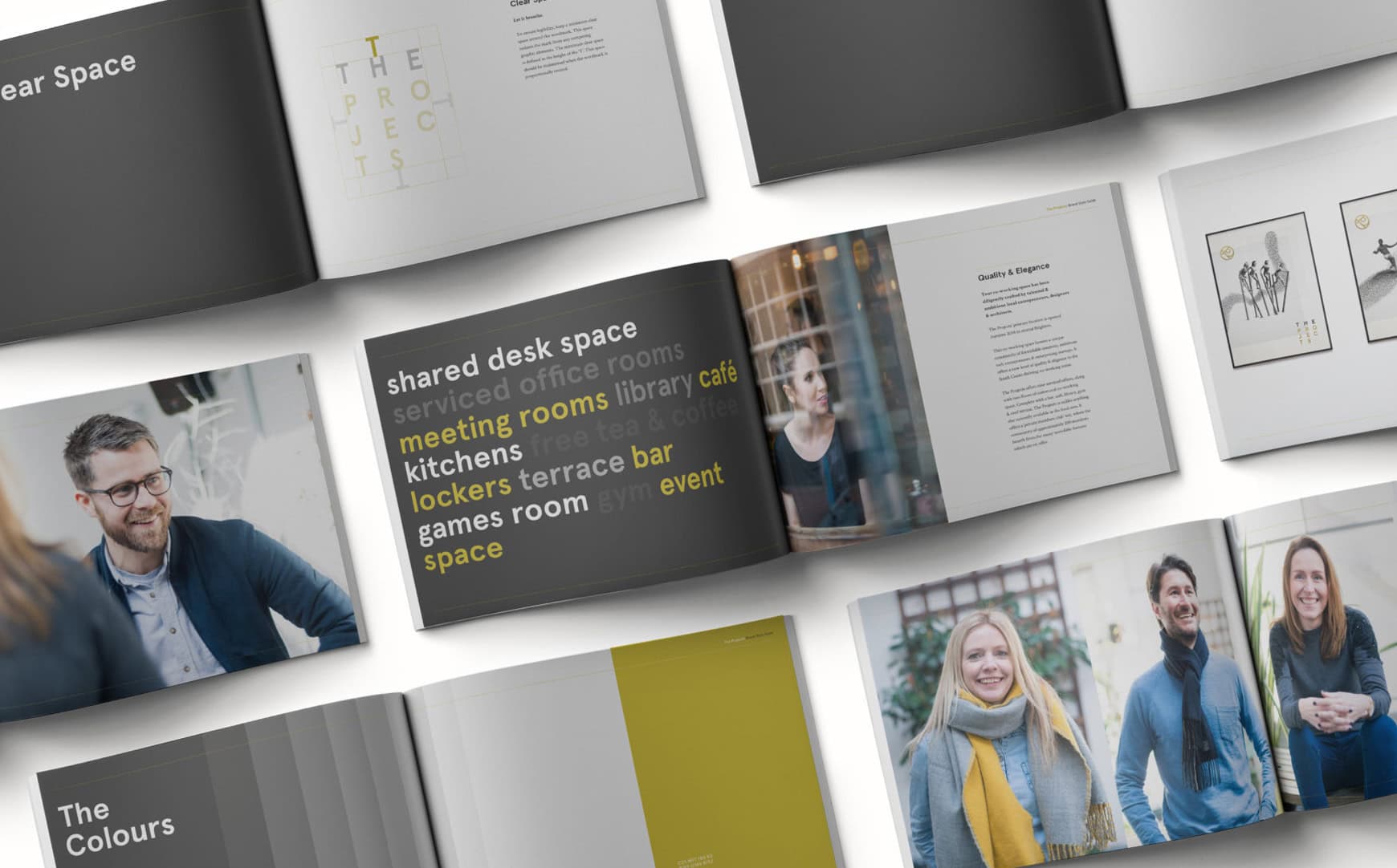
The Projects Brand Identity
Elegant Co-Working Brand Identity
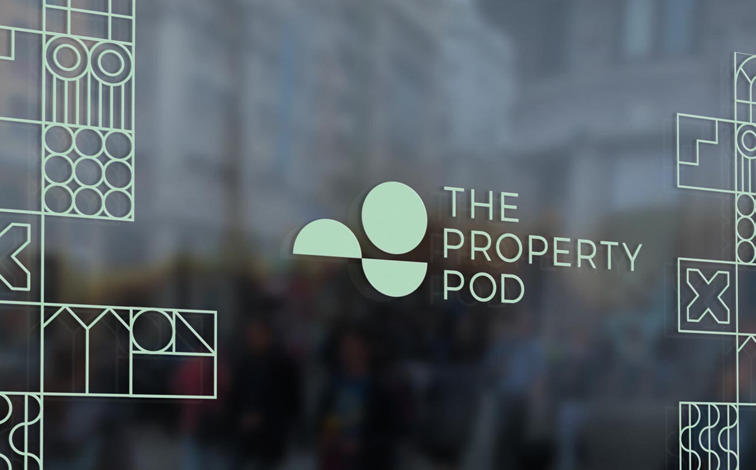
The Property Pod Rebrand
Leading Local Lettings Agent
Property Developer Brand Identity & Website
Reef + Partners Corporate Rebrand

Hospitality & Tourism Branding – Hoburne Holidays
Branding refresh for Hoburne Holidays


