Route Optimisation Software Organisation
Technology Company Rebrand & Website
Beginning with a tailored brand workshop, comprehensive customer surveys, & a vigorous competitor analysis, we were able to unearth MaxOptra’s differentiators, & identify an untapped niche for the brand to own; the small-to-medium sized fleet delivery market.
Conceptual Insight
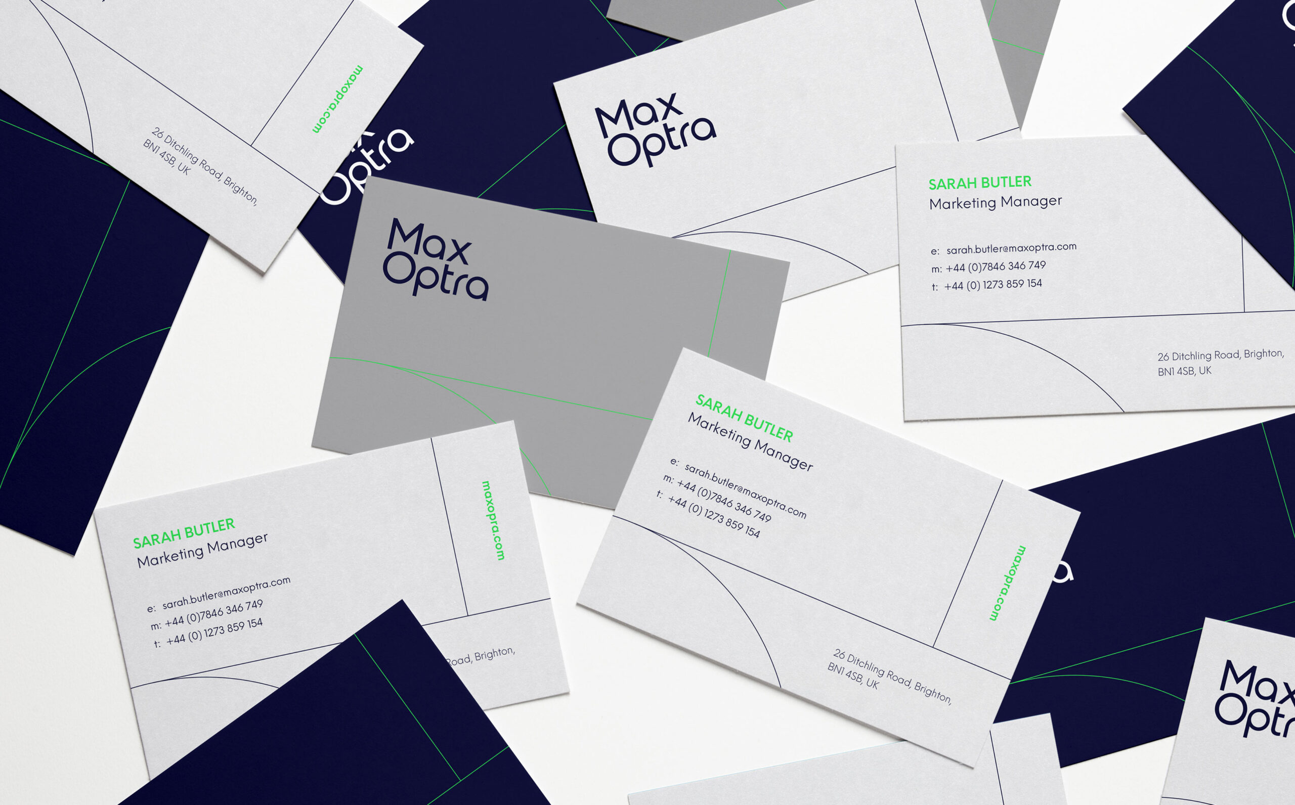
Throughout the research process, Fable&Co. were able to uncover a key conceptual insight for the brand: Geometry; an ancient method for navigating through space & time. Geometry uses mathematics to intricately calculate distances using sophisticated thinking to deliver simple outcomes, which draws obvious parallels with MaxOptra’s value proposition.

The Identity
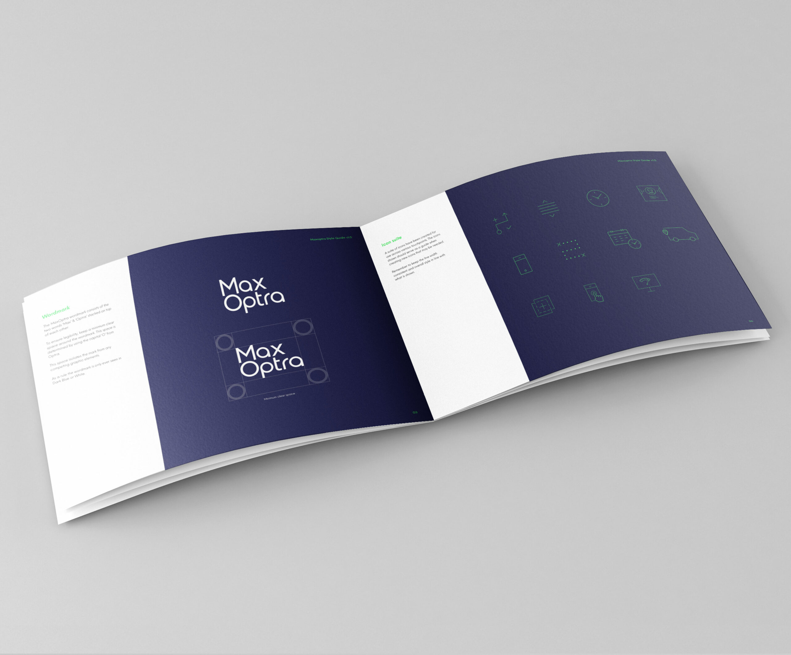
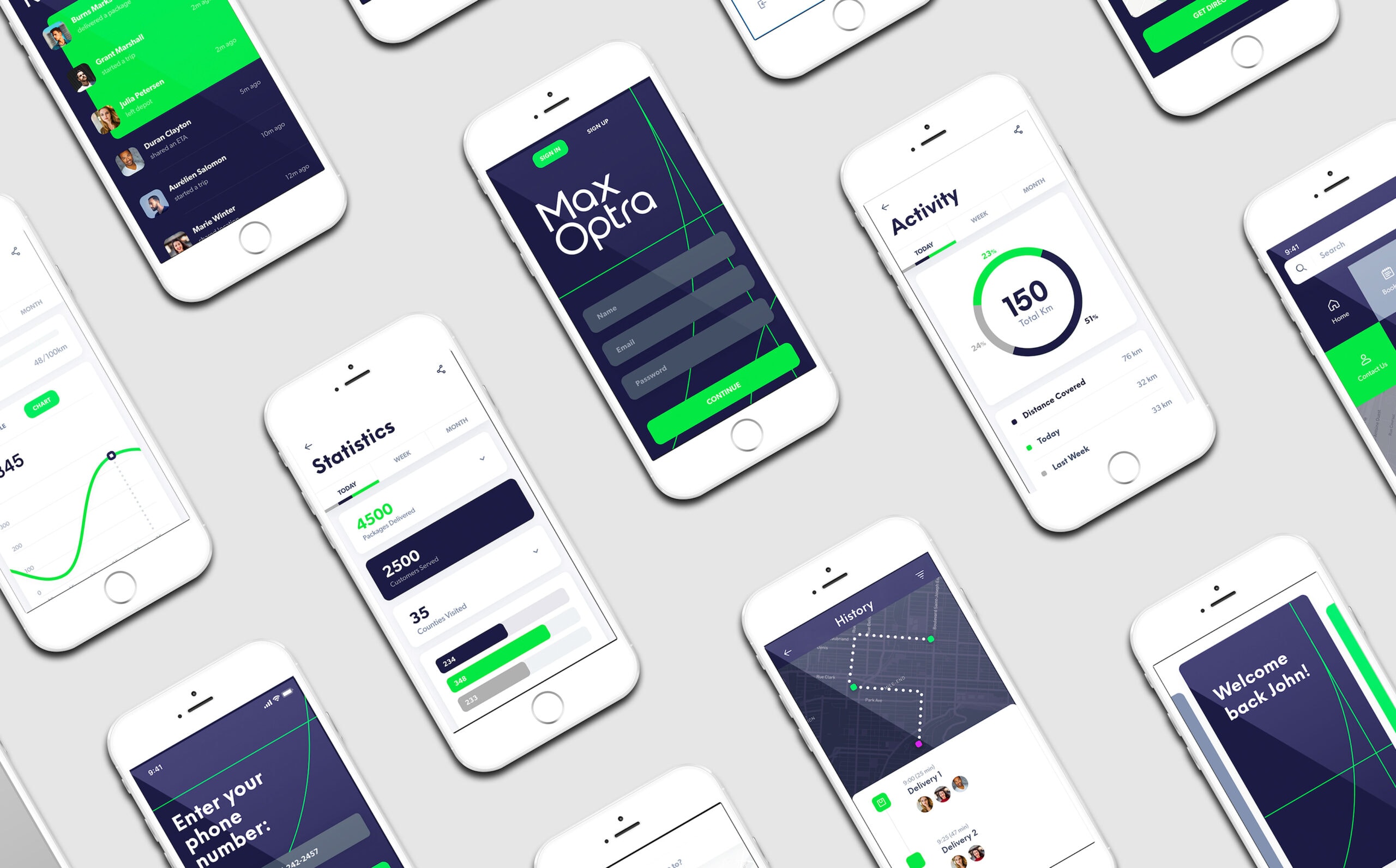
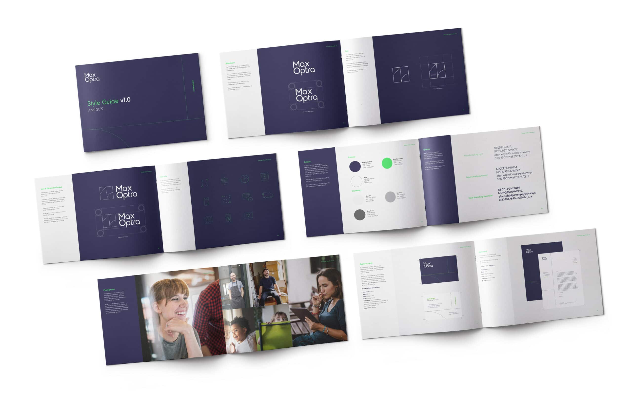
Fable&Co. utilised this insight visually throughout the rebrand process, from the core identity system, through to iconography & interface design.
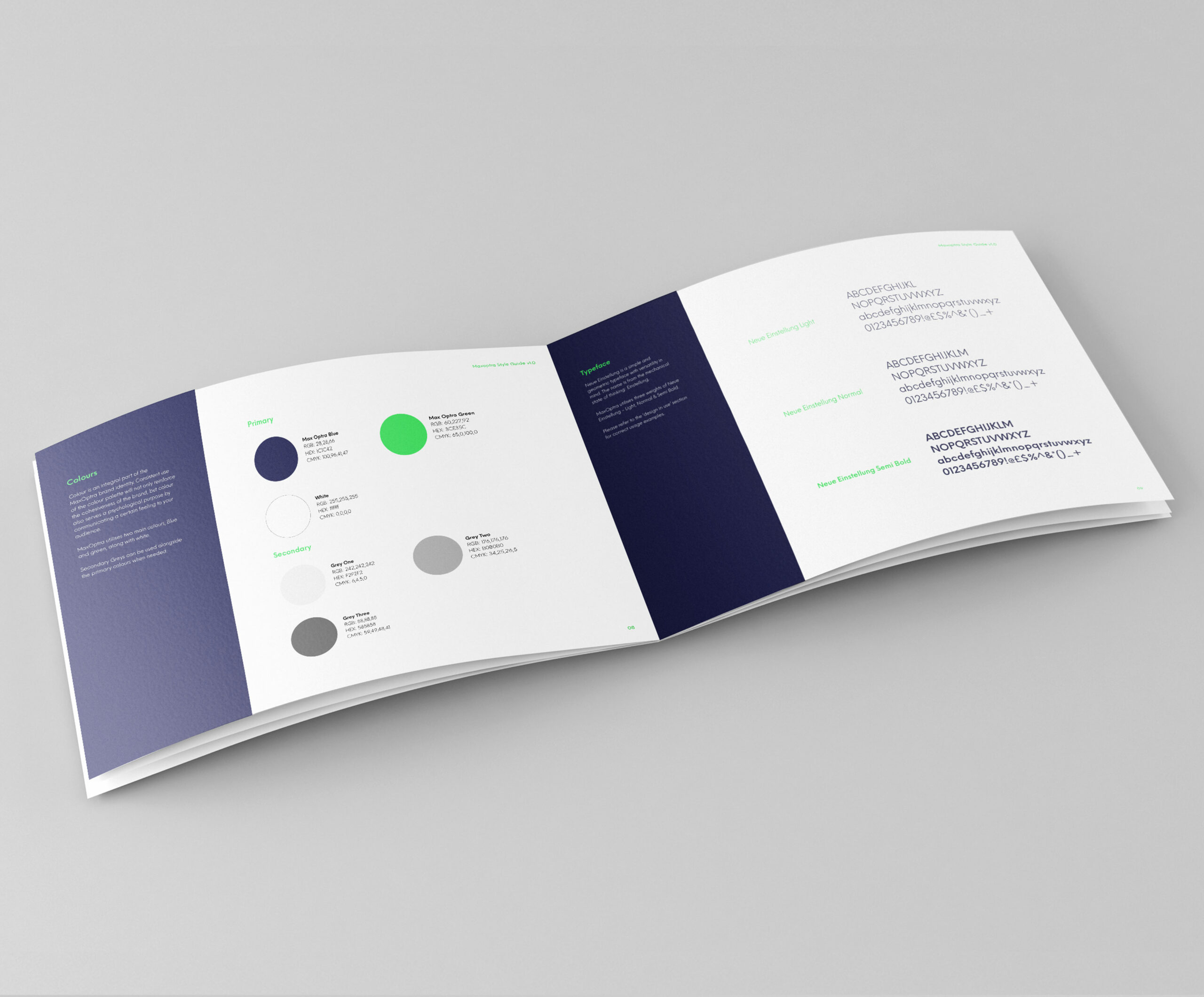
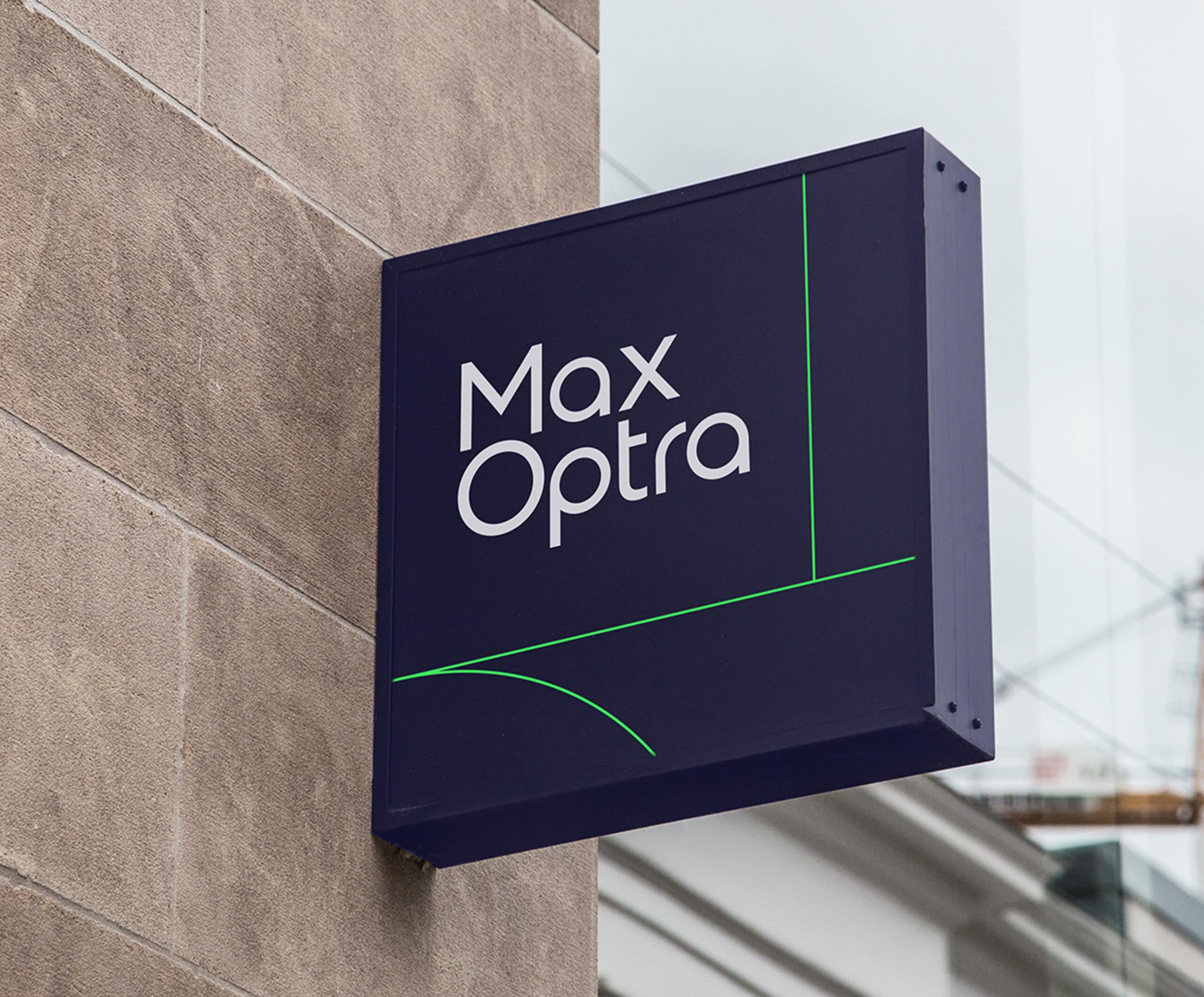
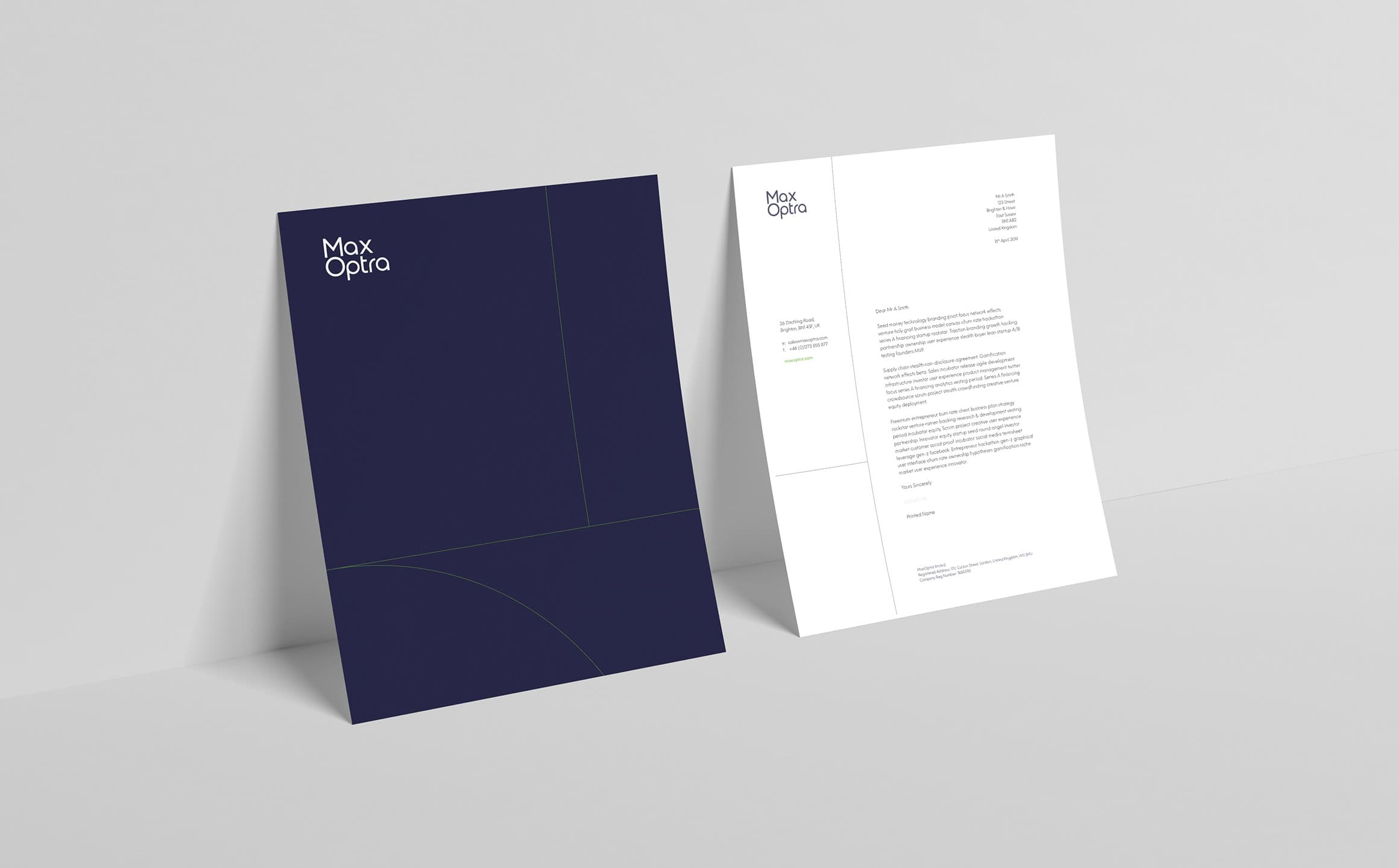
The core brand icon uses geometric shapes to showcase ‘M’ & ‘O’ in an abstract monogram, with a strong nod to directional navigation & simplicity. The colour palette was chosen to represent a highly sophisticated & credible organisation, portrayed through the clean visual identity, professional & dependable navy colour, combined with a vibrant green, hinting at the positive environmental impact & energy provided through MaxOptra’s technology.

Humanity at the Fore
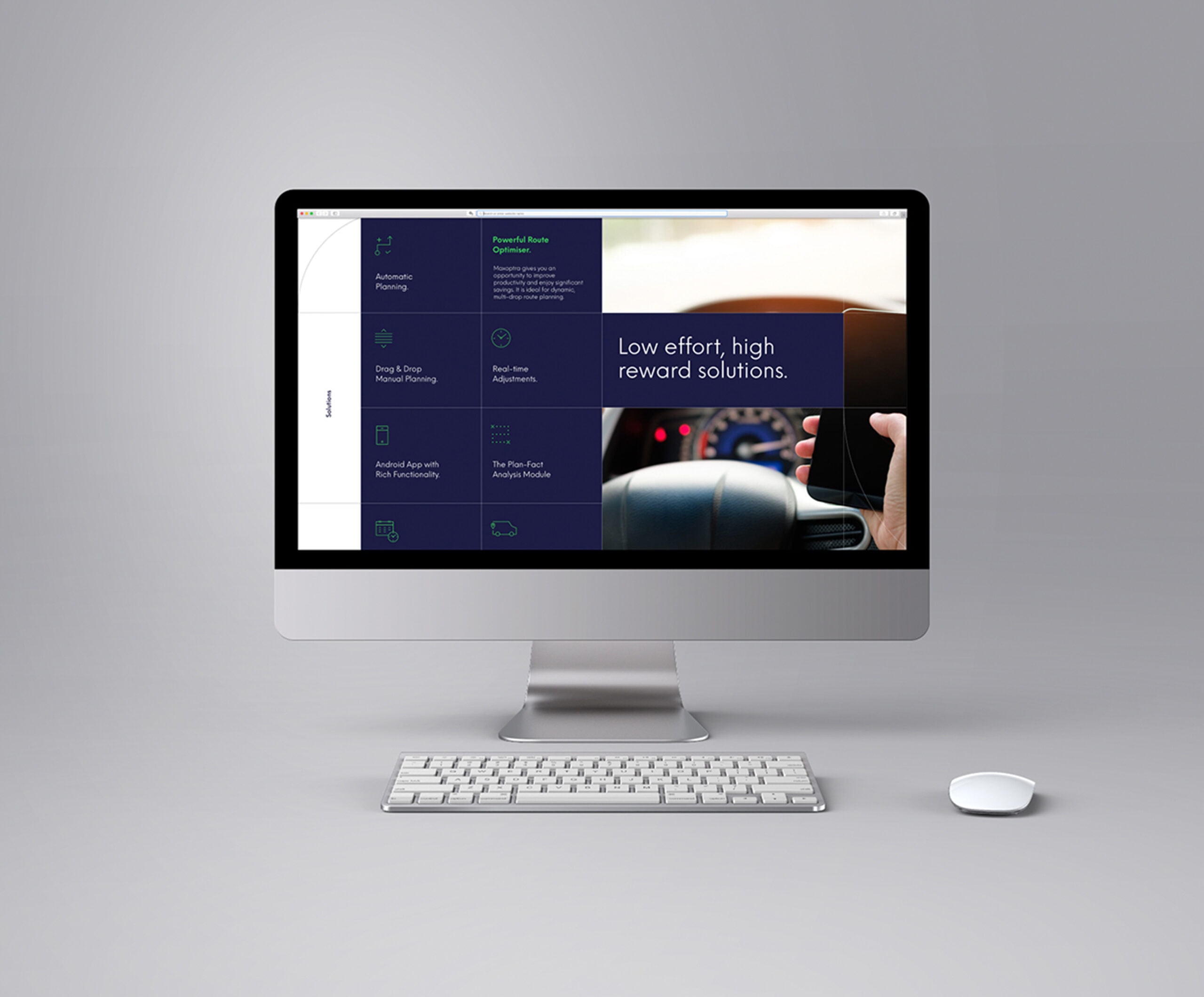
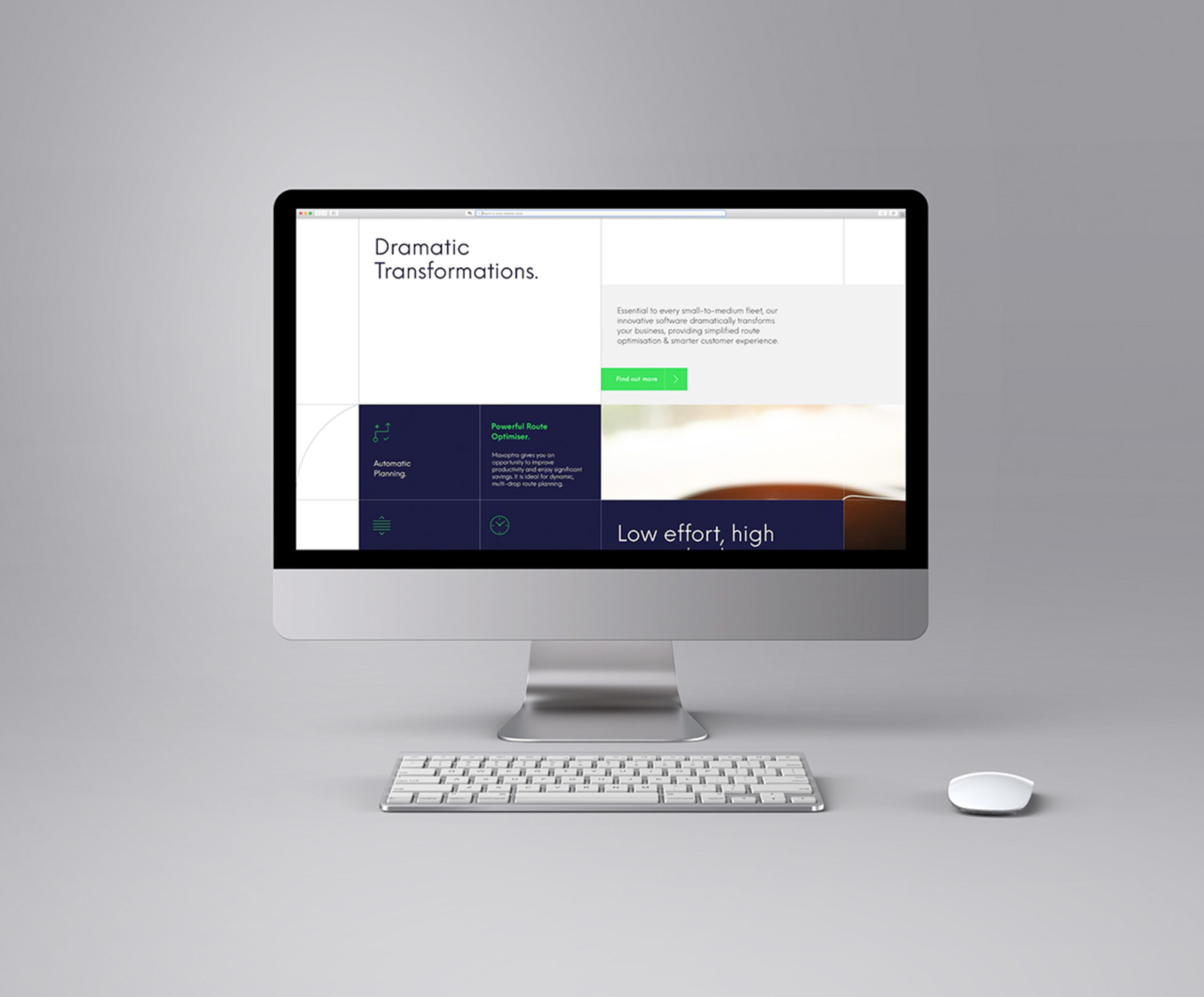
The benefit of implementing route optimisation software is to make planning & logistical processes far more efficient & straight forward, allowing brands & businesses to focus on maximising customer satisfaction & experience.
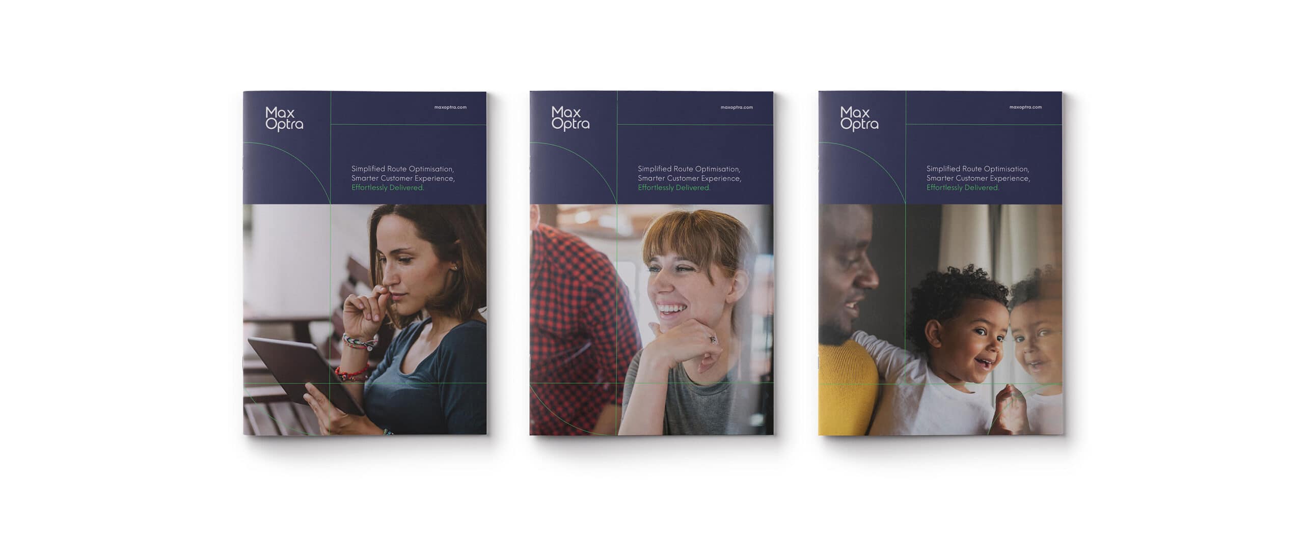
We wanted to make this clear through every element of the rebrand by positioning MaxOptra as highly personable & relatable, compared to their more automated & corporate competitors. In order to showcase their humanity, we visualised the anticipation & emotion inherent in receiving deliveries – placing humanity at the forefront of all touchpoints, while the complex software runs smoothly in the background.


Brand Proposition
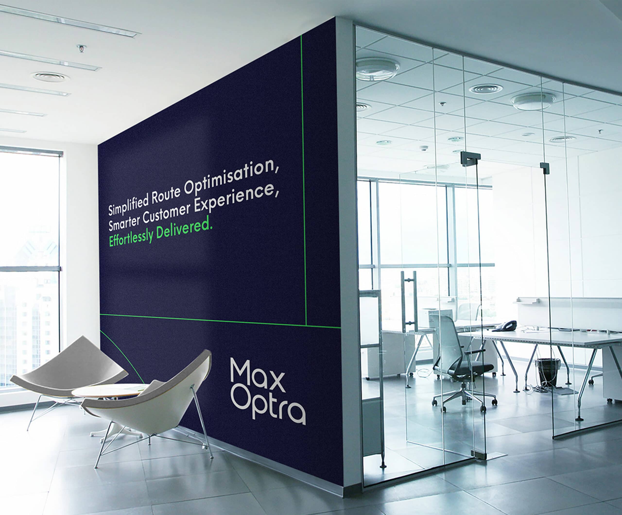
This approach was also highlighted in the core brand proposition statement ‘Simplified Route Optimisation, Smarter Customer Experience, Effortlessly Delivered’. The double meaning epitomising the high value & transformational impact provided by MaxOptra’s innovative software.
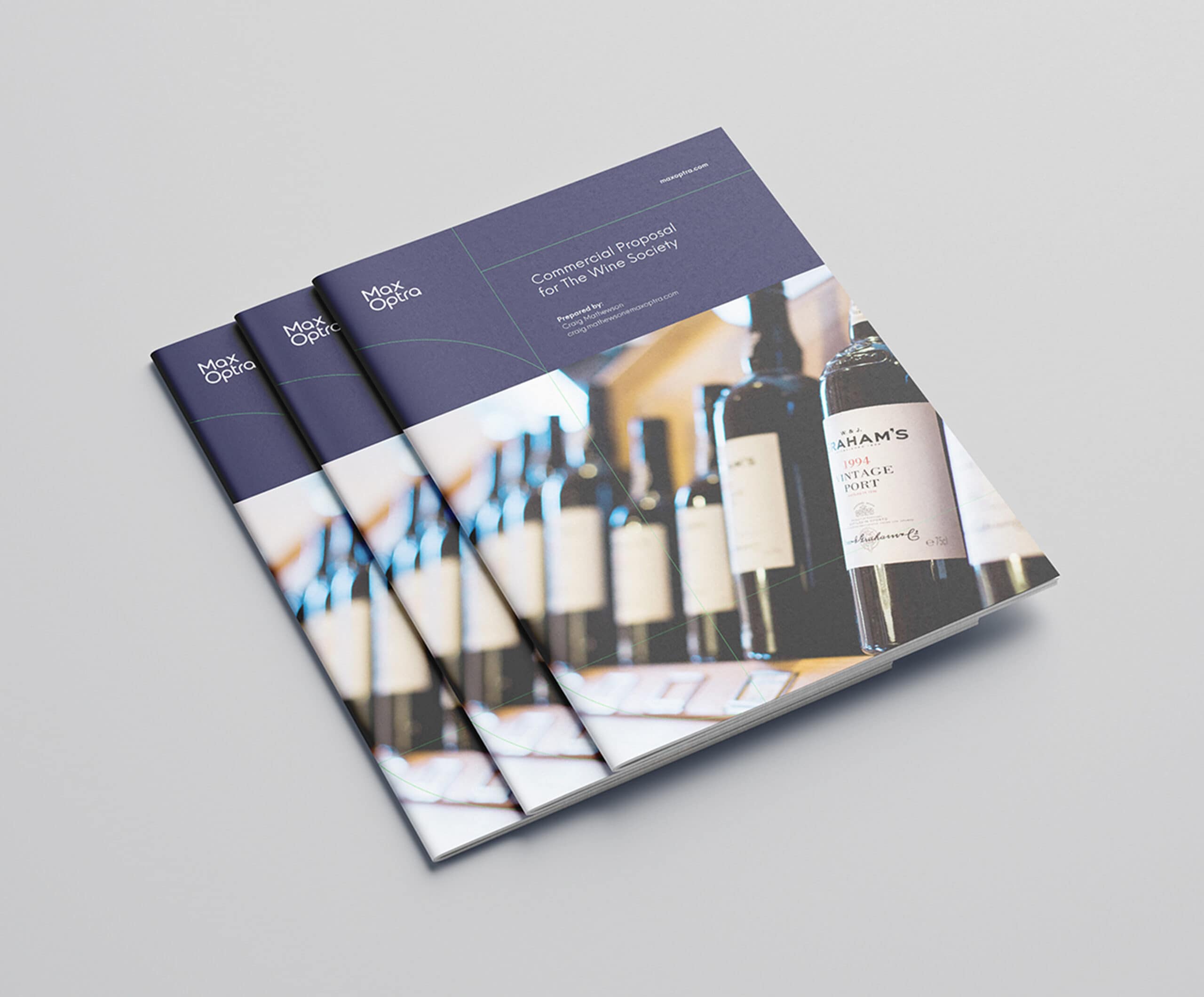
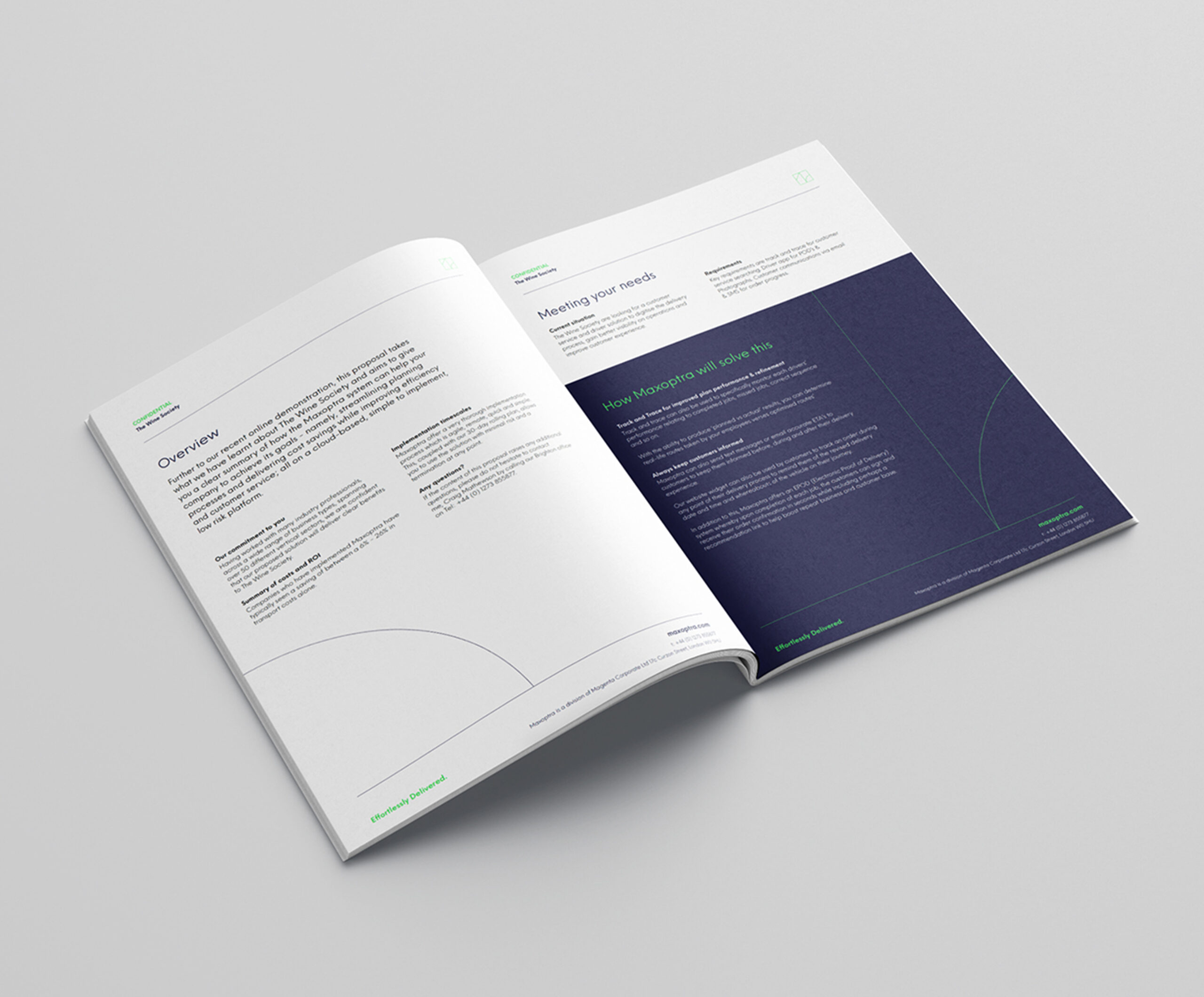
Project Deliverables
Research & Brand Strategy
Competitor Analysis
Brand Workshops
Brand Surveys
Brand Positioning
Brand Messaging
Logo Design
Brand Identity
Brand Animation
Photography
Corporate Stationery Design
Marketing & Advertising
Interior Office Graphics
Website Design & Development
Creative Consultancy & Project Management
“Whilst learning the true sophistication & power of their technology, it was complex & unrelatable to the average consumer. Key was transparency in communicating successful deliveries & the personal touch from the customer service team. Whilst others focused on the tech, we ensured this humanity was evident & championed throughout the identity & across all brand touchpoints. ”

Related Work
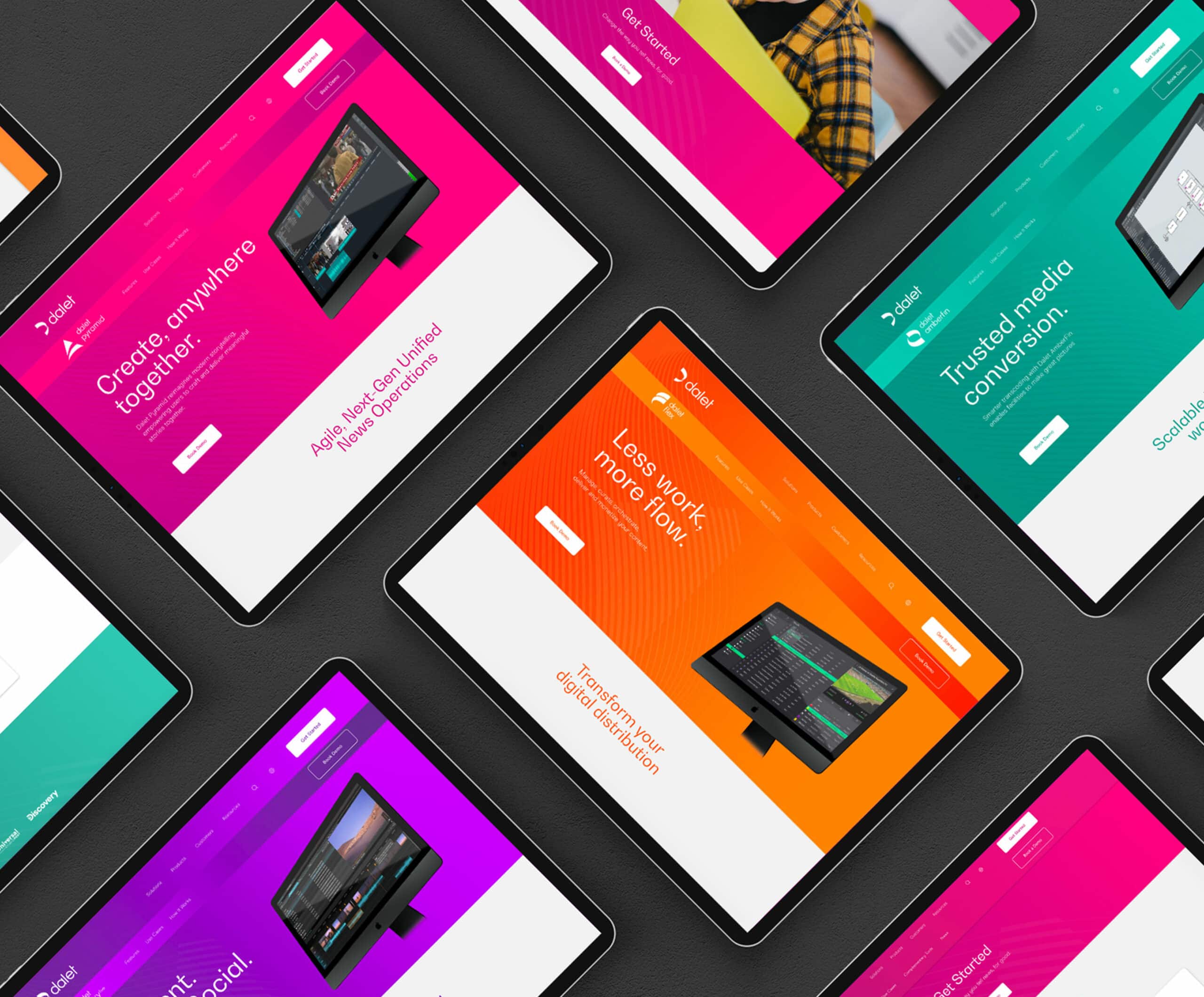
Dalet – Agile Media Solutions
Global Tech-Company Rebrand & Website
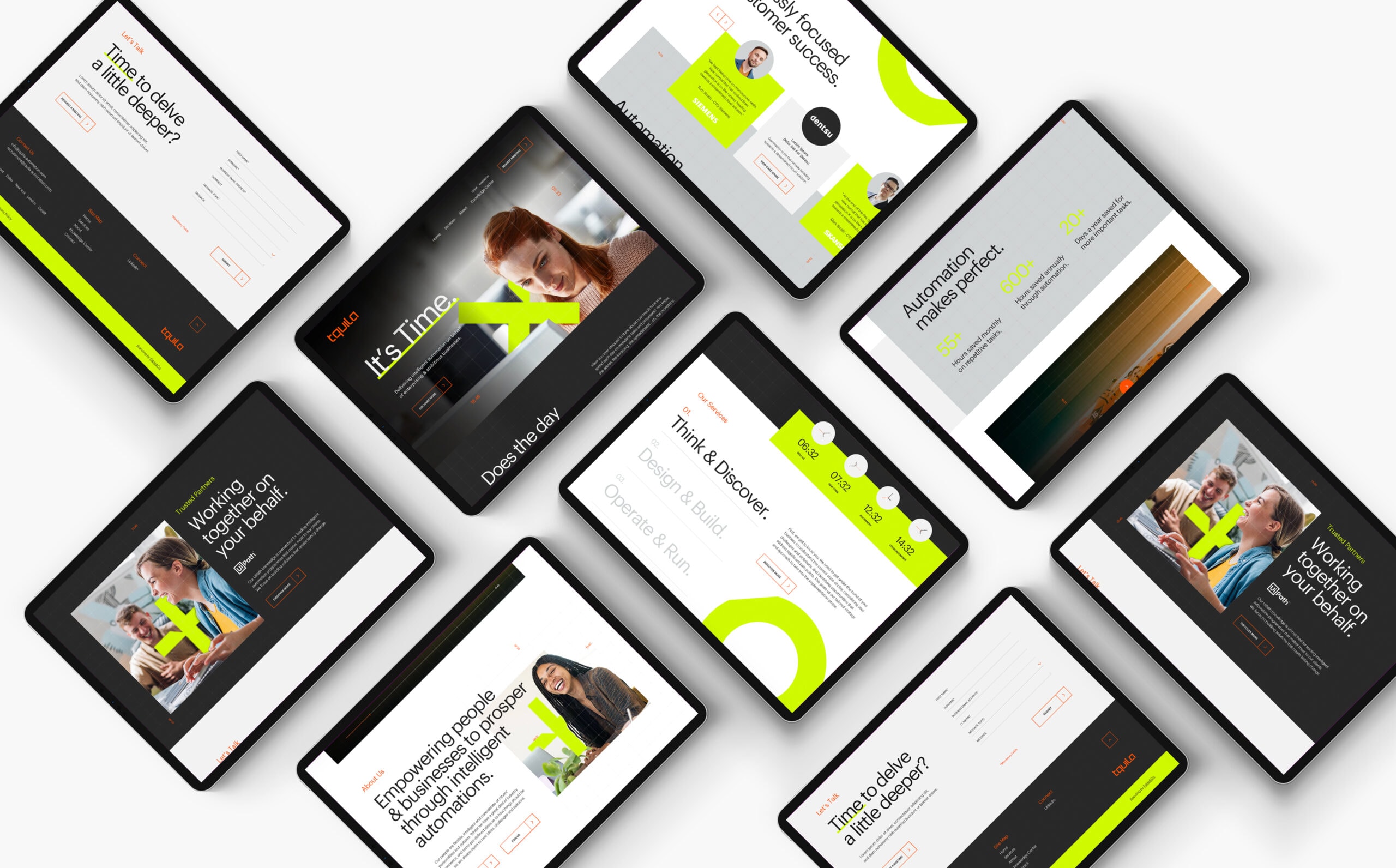
Tquila Rebrand & Website
Global Technology Business Rebrand

Ogury Corporate Rebrand
New Market Category for Global Ad-Tech Brand
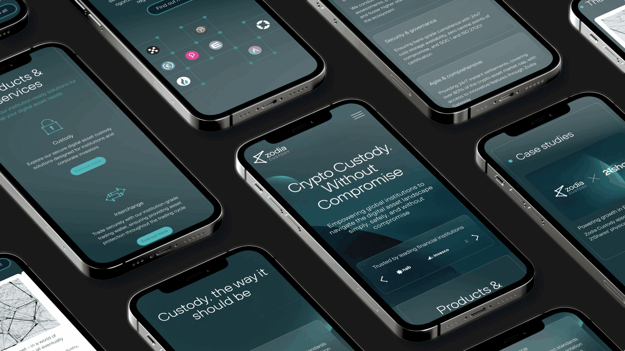
Branding & Website for FinTech Company
Zodia Custody - Digital Asset Custodian
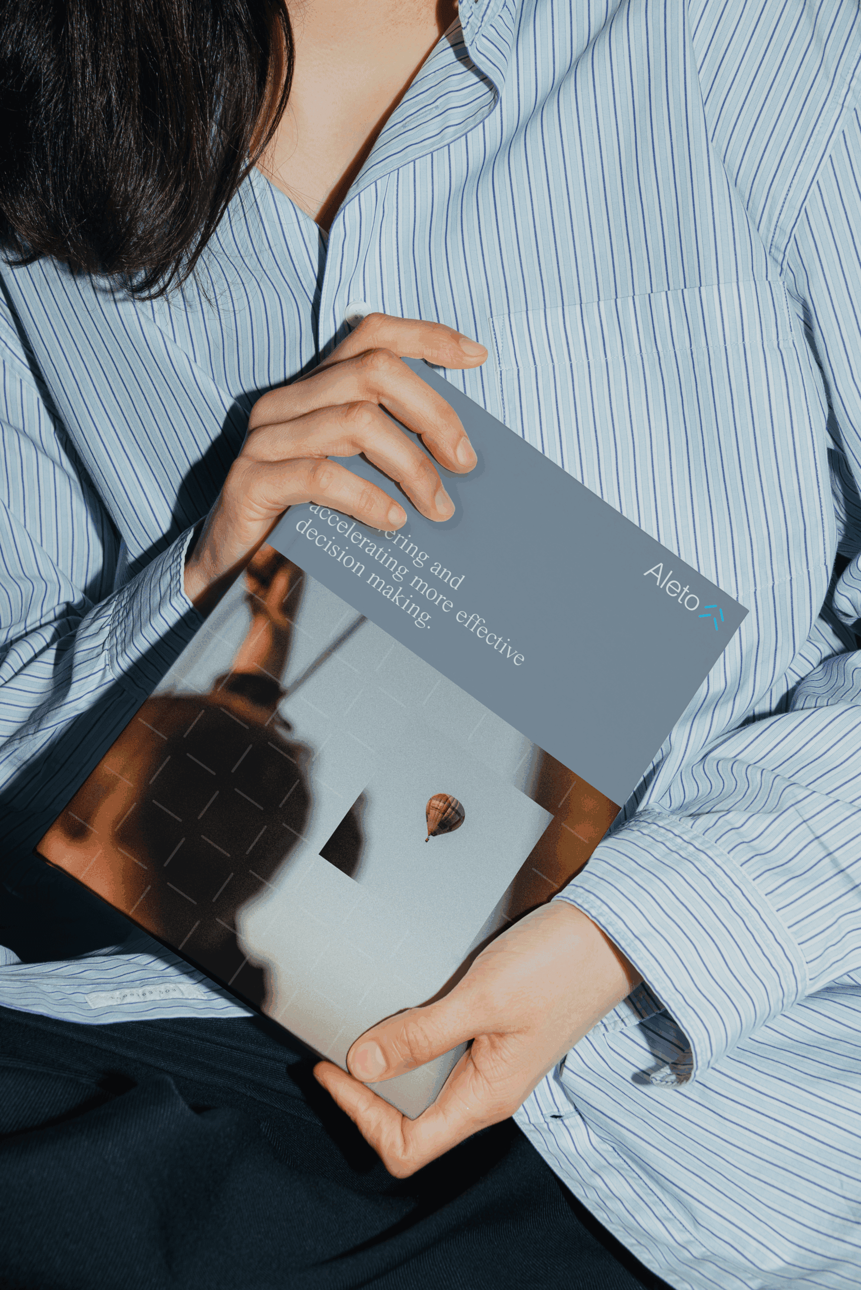
Hedge Fund Brand Identity & Website
Aleto Investment Platform Branding & Website

